Today I'm letting Urble out into the wild. It's a little geography game in which a new city (displayed as a small square) appears every 5 seconds until there are 10 dots on screen (example below). The aim of Urble is to guess the country before the country shape appears - 50 seconds into the video. You can pause the video after the 10th dot (at 45 seconds) if you need more time. If you turn the sound on, you'll notice that when the 10th city is added it makes a different sound. I'm releasing this in video format, just for fun, so people can play it how they want to, and share them across platforms - I have lots of them! Some you might find easy, others no so much. As you might be able to tell, Wordle is part of the inspiration here, hence the colours. You'll see more on my Twitter, where I'll post each Urble using the hashtag #urble. I may give clues for some of the more difficult Urbles.
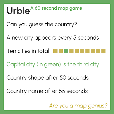 |
| Are you a map genius? |
 |
| This is what the end of an Urble looks like |
As well as posting these on my Twitter (@undertheraedar) I'll also put each one in The Urble Archive too. Each Urble is numbered, so it's easier to keep track of them, and of course I won't keep you guessing forever - the answer is always revealed 5 seconds before the end of each video. They're all 60 seconds long, so you can get on with the rest of your day, or pause the Urble on 10 dots until you figure it out.
Here's Urble 1 - always best viewed with sound on (there's no music, just a few sound effects). There's also a gif version of each Urble, which I will also post in the archive - you'll always find the original, high-quality Urbles there. Can you guess which country this first one is?
You can see the full size, high-resolution video on
The Urble Archive, where I'll put all Urbles after I share them on Twitter.
Urble - why?
Well, I make maps and look at geographic data a lot, and I'd always thought about doing some kind of fun game in a more formalised way. From time to time I've posted geography guessing games on my Twitter but until recently hadn't ever made something like Urble - but now I have. I've been playing this at home so far with my two sons and my wife, and since they like it I'm releasing it into the world now. In fact, my 9 year old son Isaac actually made a few of them himself, with me at his side giving instructions as he put them together in QGIS and Camtasia.
I've said more about Urble in the About file on The Urble Archive page. If you have a question, it may be answered below. Otherwise, check the About file.
The answer to the main 'why?' question here is that it's for fun, but also hopefully educational.
Questions you may have about Urble
What tools did you use to make Urble? I used QGIS for all the map stuff and Camtasia to create the mp4 and gif files. If you want to learn how to use QGIS, check out my
Map Academy course on Udemy.
Surely you'll run out of countries pretty quickly? Well, this is sort of true but I can easily re-use countries by selecting a different configuration of cities, in a different order. Watch out for this as new Urbles are released. Maybe I'll repeat countries. Be mindful of this.
What about a country with more than one official capital? Good question. There aren't many of these, but where I do have an Urble for a country with more than one capital, I will only show one of them and it will still be the third city to appear, always as a green square. I will not show other capitals in the same Urble.
How do you decide which cities to show? The capital city is always included, as well as nine other cities that are - usually - among the top 30 by population in a country. In general, I try to make sure the cities give some hint to the shape of the country, but at times you'll need to wait until the 8th or 9th city to see it. Occasionally I add in other cities that help me show the shape of a country, even if they are smaller settlements. But this is the exception.
Why don't you add the city names at the end? Because part of Urble is guessing the cities as well as the countries. At the end you can try to figure it out, if you want to. I also want Urble to be as accessible as possible for an international audience, and adding more text (using place names written in English) wouldn't help with that.
How do I win? I consider a true 'win' to be any Urble where you figure out what the country is before the country shape appears - i.e. before 50 seconds are up. But if you get it after pausing the video before the country shape appears, you can still count yourself a winner. In fact, if you don't get the country at all but you learn something new, then maybe you can count that as a kind of win as well. If you get the country before the capital appears, you are a true genius. If you get it before the fifth city appears, I salute you!
Can I steal Urble? Please don't, but I don't mind if people share Urbles, with a link back to my
Twitter, The Urble Archive, or this page.
Why didn't you make this into a website? I was going to, but in the end I decided it would be too much bother and actually I like the video-only approach as it's easier to share across different platforms and I don't have to mess around with code that I barely understand. I quite like the fact that you have 60 seconds to guess and also that you can just pause if you need more time.
Surely some countries will be impossible to guess? Well, I suppose that all depends where you're from and what you know. But even so, it is undoubtedly true that some countries are much more well known than others by the majority of people. But I see this as part of the fun - as an Urble unfolds, your brain is working overtime trying to figure out the country shape, country size, configuration of cities, possible patterns (e.g. coastal? river? borders?) and you're against the clock. If you're from Mongolia then you'll probably find it easy to guess Mongolia, but if you know nothing about Mongolia then you'll find it very difficult! But that's okay because if you do an Urble for Mongolia you'll learn something new.
Hasn't someone done this before? I wouldn't be surprised but when I went looking I couldn't find anything that looked like Urble. Lots of map quizzes and geography games online, but I didn't see anything Urble-esque. Obviously we have things like
Worldle but that's a different kind of geography game where you guess the country from one big shape. This is something I thought about back in January 2022 when I made
a few silly maps for Twitter (one of which is shown below).
 |
| This is not Urble |
Happy Urbling!