Wednesday 30 March 2016

How Urban is Deprivation in England?

The answer to the question above is 'very'. However, it's not all about the big cities, and there are significant pockets of deprivation in rural areas that don't often get the attention they deserve. In this post I take a little look at the distribution of England's most deprived areas (the 20%) in relation to the 2011 Rural-Urban Classification - developed for the government by Paul Brindley and Peter Bibby here at Sheffield. The ideas is to try to shed more light on the kinds of places that we find among England's 'most deprived'. Let's take a look at this in overview first of all.

This maps shows the 20% most deprived, with rural-urban area types

Sometimes it's a bit difficult to tell from a map like this how it all breaks down by category, so I also did two sets of charts - one each for the % and total in each deprivation decile in England (where decile 1 is most deprived, 10 least deprived). In the % charts below (click to enlarge) you can see the nature of the distribution by rural-urban classification type, followed by the total number in each decile in the second set of charts.

Green for rural types, red for urban types here

By absolute numbers, the urban areas dominate

Given the nature of what is being measured, and the distribution of the population by socio-economic status, this is not particularly surprising. What I do find interesting is the extent of deprivation among non-'conurbation' areas (one of the types in the rural-urban classification). You can see these in the map below, coloured blue, followed by a zoomed-in map for Blackpool.

These areas seem to get less press than the more famous examples

All these areas in Blackpool are among England's 20% most deprived

In some areas there is more of a mix of area types on the rural-urban classification, with rural, town and conurbation areas all featuring. Two examples here are County Durham and Barnsley, as you can see in the maps below (green for rural, blue for town, red for conurbation). This reflects the industrial heritage of these places but it also raises the issue that the policy solutions (or responses) may need to be tailored to meet the needs of very different local contexts. Well, that's for another day but at least this typology helps us identify the different character of areas that are often lumped together.

It's easy to spot the coalfield areas here

Barnsley also has a mix of areas

One area of the country that often seems to be overlooked - at least from a national perspective - is Cornwall. It's a very large local authority and the patterns of deprivation here are much more dispersed and not in conurbations. So, I've extracted a couple of maps here too - one with place names and one without.

Significant areas of deprivation here, but less obvious on a map


This time with labels, for anyone not from Cornwall...

To highlight one further kind of deprivation in England I have also produced a map of East Lindsey, which helps identify some areas of deprivation on the east coast. As you can see, they are a mix of rural (green) and town in the rural-urban classification.

East Lindsey is the 5th largest local authority in England

So, the answer to the question is of course that deprivation in England is 'very urban' but also that we find pockets of deprivation all across the country and often not in the kinds of inner-city locations we hear most about in the news, in government reports and in my maps. So, I'm trying to draw a bit more attention to it with this post.

Finally, here's all the areas together in a single animated gif, just to highlight the variable geography of the most deprived 20% by area type.


If you're looking for a map of deprivation in your area, see my IMD 2015 resources page.


Saturday 26 March 2016

The Road to Applecross

The road to Applecross, known as Bealach na Bà in Gaelic (the Pass of the Cattle), is a narrow, winding, single-track road in the west Highlands of Scotland. It's quite famous among cyclists, bikers and drivers - and notoriously snowy in winter. It's also not for the faint-hearted. It even has its own Tripadvisor page. As a Highlander in exile, I dream of remote, snowy places but don't get to go there much so of course I turned to Google Streetview to refresh my memory. As it happens, the Streetview car went on this route on a remarkably nice day. So I made a little time-lapse video, which you can see below, in addition to a map of the route.


Here's the warning sign before you hit the road...

Source: Neil G Hamilton, Flickr (CC BY 2.0)

This is the exact same route I used in the video.


This road is also part of the route of the north of Scotland's 'North Coast 500' which has recently become really popular among cyclists and other people who love driving rain and extreme pain. But, the scenery is amazing and there are plenty of good places to stop off on the route. Billed as 'Scotland's answer to Route 66' it also has an incredibly positive Tripadvisor page. This has inadvertently turned into a marketing piece for the Highland Tourist Board when all it was supposed to be was a bit of holiday blogging on a great Highland road, so I'll end here.


Further information: I used Brian Folts' brilliant Streetview Player to generate the frames and then just made an mp4 file on my own.

Sunday 20 March 2016

Ben Nevis 'gains a metre'

The news that the UK's highest mountain has 'gained a metre' was relatively big news here this week. It just so happens that this coincided with me teaching a bit of 3D GIS last Friday. So, since I'm a) Scottish, b) interested in mountains and c) have a hard drive with all the data on it, this means that I did of course have to produce a 3D animation of Ben Nevis using Ordnance Survey Open Data. So, here's what I've done, just for fun. Unlike some other mountains, and as some news outlets suggested, Ben Nevis didn't grow, it has just been measured with more accurate equipment by the national mapping agency. In global terms it's still a bit of a midget (now 1,345 metres compared to 1,344 on the old maps) but at nearly 57 degrees north and with nothing to shelter you from a few thousand miles of North Atlantic weather, it's not to be underestimated!


I also did an interactive version if you want to explore it yourself. For this, I used the excellent Qgis2threejs plugin created by Minoru Akagi. It might load a little slowly in your browser but it should work okay and allow you to explore the terrain. It works pretty well for me, even on my phone.

Try it yourself here


I also extracted a few static images from ArcScene, as you can see below. If you do happen to visit, you'll be lucky if you actually see Ben Nevis as it's normally shrouded in cloud but on a good day you can see it towering over Fort William in all its glory. If you want to see some really great Scottish mountain imagery, check out Iain Cameron on twitter.

Fort William, a few miles away, is just about at sea level

You can get a sense of the scale of the Nevis massif here

The view from 'over the back', looking down towards Fort William


For a much more beautiful video take a look at this view of the Càrn Mòr Dearg arête in winter. Absolutely stunning. 

The video from this point is really fantastic

Technical details: I did this in ArcScene using the following OS layers: Terrain 50, tile NN17 and OS VectorMap District (Raster), also tile NN17. There is no vertical exaggeration on the elevation. I just enabled animated rotation and then set it spinning quite slowly and then used the Animation toolbar in ArcScene to record the view. I then exported this (to the default avi) and then uploaded to YouTube and added some titles.

Wednesday 16 March 2016

Airbnb in London: 'micro-entrepreneurs'?

In today's Budget, the Chancellor outlined some new tax allowances for 'micro-entrepreneurs', such as those doing business on Airbnb or eBay. Basically, there's a new £1,000 tax-free allowance on income from these kinds of activities. However, this 'sharing economy allowance' may also serve to benefit big landlords, if data from Airbnb are to be believed. Using figures from Inside Airbnb I did a little analysis to see how much of the room sharing in London is of the 'micro' scale. It turns out it's a bit more complicated than the 'sharing economy' label would suggest. But first, here's a map with the 25,000 or so London rentals listed on Airbnb, just to make the point that it's 'a lot'.

As of September 2015, there were 25,361 London listings

Alex Hern in the Guardian picked up on this almost instantly, and has already written a 
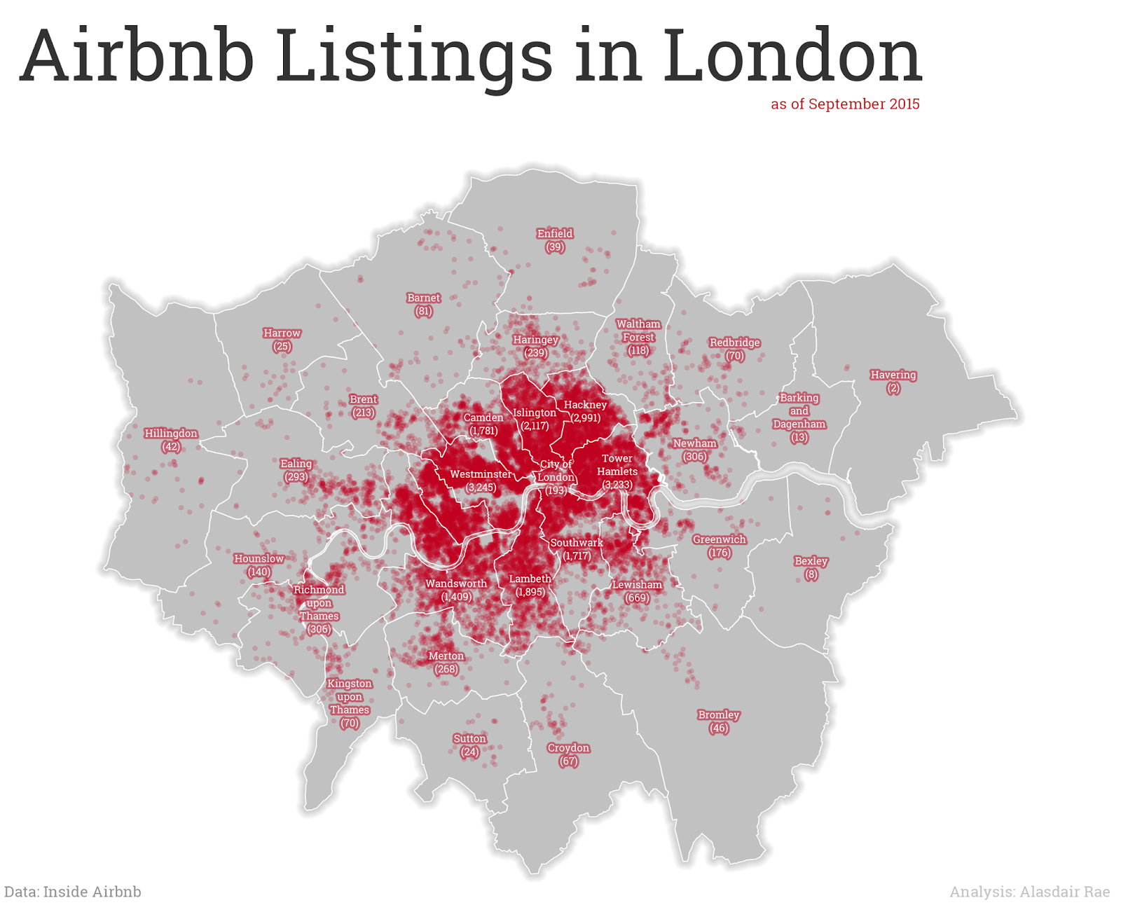
good piece on the issue. I'm just trying to add a little more in the way of a geographical breakdown, since I'm thinking about things like lack of affordable housing, loss of housing stock to the 'sharing economy', the impact on rents and issues related to displacement and gentrification. When you break it down by Borough, as I've done in the map below, it's clear that there is a big inner/outer London divide and that Tower Hamlets (3,233 listings), Hackney (2,991) and Westminster (3,245) are real 'sharing economy' hotspots. But bear in mind they also face intense housing market pressure and suffer from a severe lack of affordable housing.

Not much 'sharing economy' demand in Havering, it seems

If this is really aimed at the kind of 'micro-entrepreneur' that the Budget talked about, that sounds reasonable enough. But what do the data show? Well, by my calculations based on the latest Inside Airbnb data (September 2015), 14,923 of 25,361 London hosts only listed one property. But 599 hosts had three or more, and 139 had 10 or more (just over 11% of all listings). At this end of the spectrum it looks a lot less like 'micro-entrepreneurs' and more like nice tax breaks for buy-to-let landlords with multiple properties. Well, that's the obvious conclusion you'd draw from looking at the data. Whether this is the reality or not requires further investigation. Just to see whether these patterns looked anything like clustered property portfolios on the ground, I mapped all those hosts who had 50 or more listings against their name. The data are publicly available so I have just mapped this using the host name obtained from Inside Airbnb. I don't know exactly what's going on here but it doesn't seem very 'micro' to me.

Don't read into this too much - check the data yourself

I thought about whether this is really about the 'sharing economy'. I think a large proportion is, but it's also reasonable to assume that a good chunk is not. One way to look at this is to consider how many hosts allow stays of more than 90 nights, as per Section 44 of the Deregulation Act 2015. According to the publicly available data scraped by Inside Airbnb, 78% of listings allow maximum stays of more than 90 nights. Whether this actually happens or not is unknown, but if this was the case then landlords would need to apply for planning permission. Of the 590 properties in the map above, only 4 are not available for more than 90 nights. 

I also took a little look at the patterns at the micro-level and broke it down by LSOA. In the image below, I've shown the top 5 LSOAs in London by Airbnb listings. These were the only five small areas with more than 100 listings, which does seem like quite a lot.

The five LSOAs with more than 100 Airbnb listings

What's the point of all this? It's not a rant against Airbnb (I like the idea), individual hosts (the big ones often get great feedback) or even the Chancellor. The point is that giving tax breaks to 'micro-entrepreneurs' in the 'sharing economy' may not be as straightforward as it first seems. This is the case with just about any policy and perfect targeting of policy is impossible but it seems that by using data from fantastic sources like Inside Airbnb we can get a better understanding of what's actually happening and - perhaps - local authorities might be able to take enforcement action if people are breaking the rules. The point is to demonstrate that the headline announcement of tax breaks for micro-entrepreneurs will, it seems, be very beneficial to 'macro-entrepreneurs' as well, particularly in areas of acute housing shortage.

...also, as a little bonus feature, I also decided to look at the distribution of Airbnb listings by area type, using the Indices of Deprivation 2015 data. In the bar chart below you can see the distribution of listings by deprivation decile, where 1 is most deprived and 10 is least deprived. It's skewed towards the most deprived end of the spectrum. This raises further questions in my mind about the impact of the sharing economy in these areas. But more work is needed to figure all this out.

Not many listings in the very least deprived areas!

Data source: Inside Airbnb - see the data pages for London data and other cities across the world. go to the London interactive page for a great breakdown of the issues and impacts. The author, Murray Cox, has done a great job of explaining things.

Monday 14 March 2016

Deprivation and the 1%

There's a lot of talk these days about the 1%, or the global elite in terms of wealth. Danny Dorling's  'Inequality and the 1%' is a recent example of a powerful polemic on this issue. This post is about a slightly different kind of 1%, within England. As keen observers may know, I've been producing a series of map extracts based on the English Indices of Deprivation, so I'm now adding to this by looking at the 1% most and least deprived areas across the country.

Cheltenham features prominently at one end of the spectrum

Middlesbrough features prominently at the other end of the spectrum

It's a very simple concept, and I was particularly interested to see which local authorities came out of this with no representation at either end of the spectrum - in addition to those which feature at both ends. In total, 160 local authorities feature in the map series which looks at the top and bottom 1% most deprived in England and 10 local authorities have areas that fall within the 1% most and least deprived, as follows: Bradford, Bury, Chesterfield, East Riding of Yorkshire, Leeds, Newcastle, North Somerset, Sheffield, Stockport and Wirral. See below for more maps.

Wirral - features at both ends of the 1% most/least spectrum

Sheffield also features in the 1% most/least divide

Leeds has quite a distinctive inner/outer deprivation pattern

Look closely at the north east coast here

If you want to see all 160 maps to find out if your area is included, I've set up a separate page for that - you can see a preview below. If you're looking for other IMD maps, please take a look at my Indices of Deprivation 2015 maps and data page. I've done the 1% versions today to highlight the extent to which deprivation is concentrated spatially in the areas at the very top and bottom of the rankings - and also as an exercise to see which local authorities have areas in the top and bottom. I didn't know this before and I think the results are quite interesting.


You can explore all the areas here

Finally, a bit of map-related trivia. I couldn't help notice that in this map series Guildford looks like some kind of animal, but I can't quite think what. I'll add this to my previous observations.

I'll add this to my 'boundaries that look like animals' file

Note: I missed out the East Riding of Yorkshire in the original list. Thanks to Adrian Bailey for spotting this. 22 Oct 2017.