Have you ever wondered what a city would look like if it only included areas within 45 minutes of the centre? Of course you have, otherwise you wouldn't be here. Well, even if you haven't, please read on and be sure to check the
nerd notes at the bottom of the page. The idea here was to produce a set of maps, based on a central point in 26 different British cities, and a 45 minute time cut off. More specifically, from everywhere shown on the maps below you should be able to reach the centre (in this case I chose a main railway station)
within 45 minutes of leaving home (note, not from when you get on a train or in your car). I included travel by public transport, driving, or driving plus train in my model and an arrival time of 08:45 on a Monday morning. I then calculated the population within each area and the maps you see below are the result. These '45 minute cities' are of course not actual cities from an administrative point of view, although they are a kind of functional entity that makes more sense from an economic point of view. But really this is just a first-stage experiment and I thought the results were interesting so I'm sharing them here.
What's this all about, then?
Partly it's about me using a new tool more regularly -
TravelTime platform's QGIS plugin - and partly it's about some other work I've been doing over the past few years relating to functional urban areas, polycentricity, functional regionalisation, and whatnot. You can read a bit more about one of the off-shoots of this work
here, which is all about a little graphic I tweeted in February 2020. It also relates to some of my previous research, including this work on
transport-related barriers to employment for the Joseph Rowntree Foundation.
But for now, in this case, it's mostly about curiosity and me wondering 'how big are these cities if we see them as 45 minute commuter-sheds based on arriving at some central point with enough time to get to work for 9am on a Monday morning?'.
What about Marchetti's constant?
The idea that on average we travel
30 minutes each way to work each day is of course well known, but I thought a 45 minute time frame, from leaving the house to arriving at the workplace (and including interchanges, walking, and the actual realities of the daily commute) would be more interesting and also realistic. My door-to-desk journey these days takes about 20 to 25 minutes but in the past it used to take anything from 50 minutes to an hour and a half when I commuted between Liverpool and Manchester each day.
How does this compare to travel-to-work-areas?
I'm glad you asked, because I had the same question early this year so I added up the 2018 population data for most TTWAs and the results are shown below, as well as on this
Twitter thread. This is particularly interesting when we look at, say, Leeds and compare it to the Leeds map above. Or even the Warrington one above. But of course TTWAs are based on a commuting self-containment threshold and my maps here are just experimental outputs created as part of a little curiosity project (for now at least).
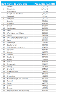 |
| I only had English and Welsh data for this |
The numbers for my city look wrong
This may be the case, but it may be a bit more complicated than that. The specific point of arrival I have chosen (the central railway station in each city - or three in London) and the specific time I chose can have an impact on the results. However, I've been through the maps and I think they look right, or at least plausible for sure. In some cases it may very well be
possible to get from a location off the map to the central point I chose, but the idea here is it needs to be reliable and without rushing for connections and allowing enough time to get to and from the mode of transport at either end. It's a whole journey commute time rather than a single point-to-point, best case scenario trip. So, you
may be able to do better yourself but this is based on a daily journey that most people can realistically make within 45 minutes.
'Why is Warrington so big?', and other FAQs
The population of Warrington isn't 4 million, so let's all calm down.
But maybe it is and nobody had noticed. Okay, maybe not. Yet at the same time it is highly accessible, with the M6 and M62 plus the Liverpool-Manchester railway line passing through as well as the West Coast mainline. I'd say Warrington has the Connectivity Double Whammy (CDW) nailed down pretty well. I used to travel through Warrington each day on my day to work and I definitely had the 'if I lived here I'd be home by now' thought more than once. In this sense, then, Warrington may be the Ultimate 45 Minute City.
You might also ask why Leeds has such a high population in this little 45 minute city experiment, when we compare it to the TTWA population above. I suspect it's due to a mix of possibly unique not-very-good internal connectivity and other things
Tom Forth knows a lot more about. Also probably has a bit to do with overlapping job markets nearby - e.g. Manchester, Sheffield and the like.
What's the deal with Glasgow vs Edinburgh? Well, if you take the combined populations in the 45 minute city for both of them, you get a good chunk of Scotland - more than half. But why is Glasgow so much bigger than Edinburgh? Again, a mix of things but Glasgow has excellent suburban rail, a subway, motorways and so on, whereas Edinburgh has epic congestion and a good few buses and not too much other stuff, despite the new-ish tram system. Plus the wider Glasgow area just has more people in it.
Why did you choose the central railway station? Just because it is generally very central and close to the jobs. I could have put the arrival point somewhere else in the city centre without it making too much of a difference but I wanted to be consistent and there is no agreed 'this is definitely the city centre' point in each city anyway.
I've spotted something wrong, who do I tell? Feel free to get in touch. You should probably treat this in the spirit it is intended - i.e. an experimental take on functional urbanism - but if you do see something that looks egregiously wrong please let me know. I can also feed back to the people who make the TravelTime platform tool as they're always trying to improve their models and are very keen on feedback.
Nerd notes
I mapped this in QGIS 3.4 using the
TravelTime platform plugin. I created a little model (see below) to automate the process than ran a batch process on it for the 26 cities I chose. The 26 include a few that may seem like odd choices but I did try to include places far and wide. For the population counts, this is based on the most recent LSOA (England and Wales) or data zone (Scotland) population estimates from mid-2018. The boundaries here do not align perfectly with the 45 minute isochrone so I suggest you consider the specific numbers in each case as being 'roughly' or 'about' rather than exact. I did use the population-weighted centroids though so having said that I expect the population figures are close to the real numbers. The TravelTime platform api used real-world transit information and if you want more details on it just
check out their website.
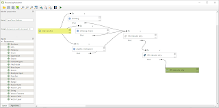 |
| This is the QGIS model I made |


