Showing posts with label liverpool. Show all posts

Saturday, 5 November 2022

Two decades of city centre population growth in England

Back in 2013 I published a paper in the journal Cities with the following title: 'English urban policy and the return to the city: A decade of growth, 2001–2011'. I actually wrote it in 2012 and it drew upon some of the urban policy things I'd written about in my PhD a few years earlier. If I had access to the paper now, or if I wanted to spend $27.95, I could even read it again but the gist of it was this: people came back to the city centre, in quite big numbers, between 2001 and 2011. 

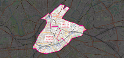
You don't need an academic journal paper to tell you that because you couldn't see it just by walking around, obviously. But really it was about a bit more than population and it discussed New Labour urban policy, the Urban White Paper of 2000 and lots of other stuff. I've also just discovered that it has 61 citations on Google Scholar, which means as many as 61 people were at one point potentially aware of its existence and some might even have read it. Okay, too much preamble, time for a map - showing the population of the central Manchester and Salford wards that more than doubled in population between 2001 and 2020 (I don't have the census data for wards yet).

Source data: ONS ward-level population estimates, 2001-2020

Why was I thinking about this? 

It's because of the release this week of a big wodge of local Census 2021 data for England and Wales. I thought I'd go and look at the changes from 2001 to 2021 but then I couldn't find quite what I was looking for (ward population data) so I went and looked at the mid-year population data for wards instead, and how I find myself writing about it here because it's quite interesting.

If you haven't already spotted these things, three observations from the map above:

  1. Salford Quays ward had less than 1,000 people living in it in 2001.
  2. Central Manchester/Salford has the largest collection of contiguous wards (6) in England and Wales that more than doubled in population between 2001 and 2020 - the population now in the six wards above is about 85,000, compared to 24,000 in 2001 and 50,000 in 2011.
  3. Deansgate and Piccadilly wards in Manchester look like a rabbit (Piccadilly) getting a piggyback on a goose (Deansgate - see below). This is the unintended consequence of me looking at map data for too long, but it's a clear fact. 
I'm not wrong, am I?

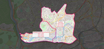
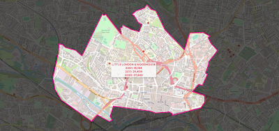
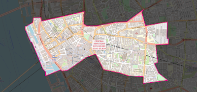
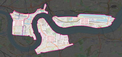
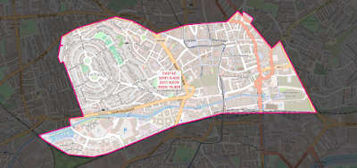
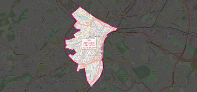
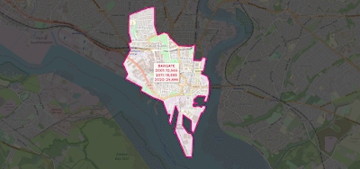
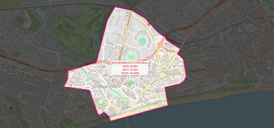
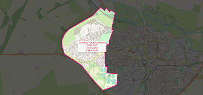
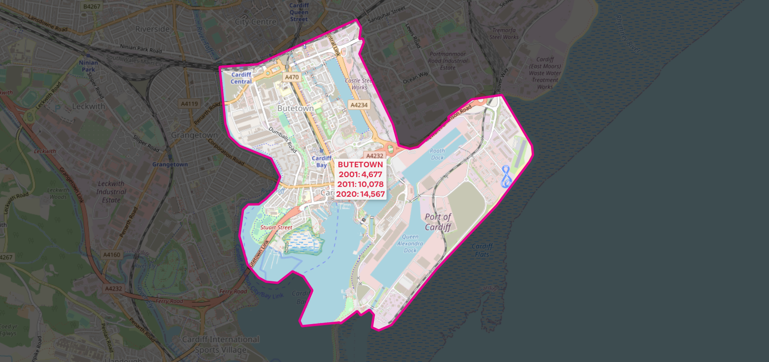
The numbers are of course not surprising if you've ever stepped foot in an English city centre over the past 20 years but it's quite interesting to be able to put a number on things. So now I'll share more maps of different cities, showing the 2001, 2011 and 2020 population data, like I have for central Manchester above (all areas shown more than doubled in population from 2001 to 2020).

Birmingham

Bristol

Leeds

Leicester

Liverpool

East London (1) - plus a bit non-East London

East London (2)

Newcastle

Nottingham

Sheffield - check out those numbers!

Southampton

Who are all these new people? Well, again it's not that hard to fathom if you have been paying any attention but a mix of students in new private sector accommodation, the so-called 'young professionals' estate agents seem to love and a mix of other folk, including some families and whatnot. Could also say stuff about brownfield sites here, as well as New Labour urban policy (the old 60% target) but that doesn't interest me much these days so I'll leave it at that.

Oh, go on then, a few more.
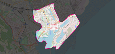
Cardiff - yes, 100% NOT in England! But interesting

Bournemouth

I can't unsee it

Poundbury

This one was missing a label in the version above


Saturday, 21 May 2022

English Green Belt Atlas, v5

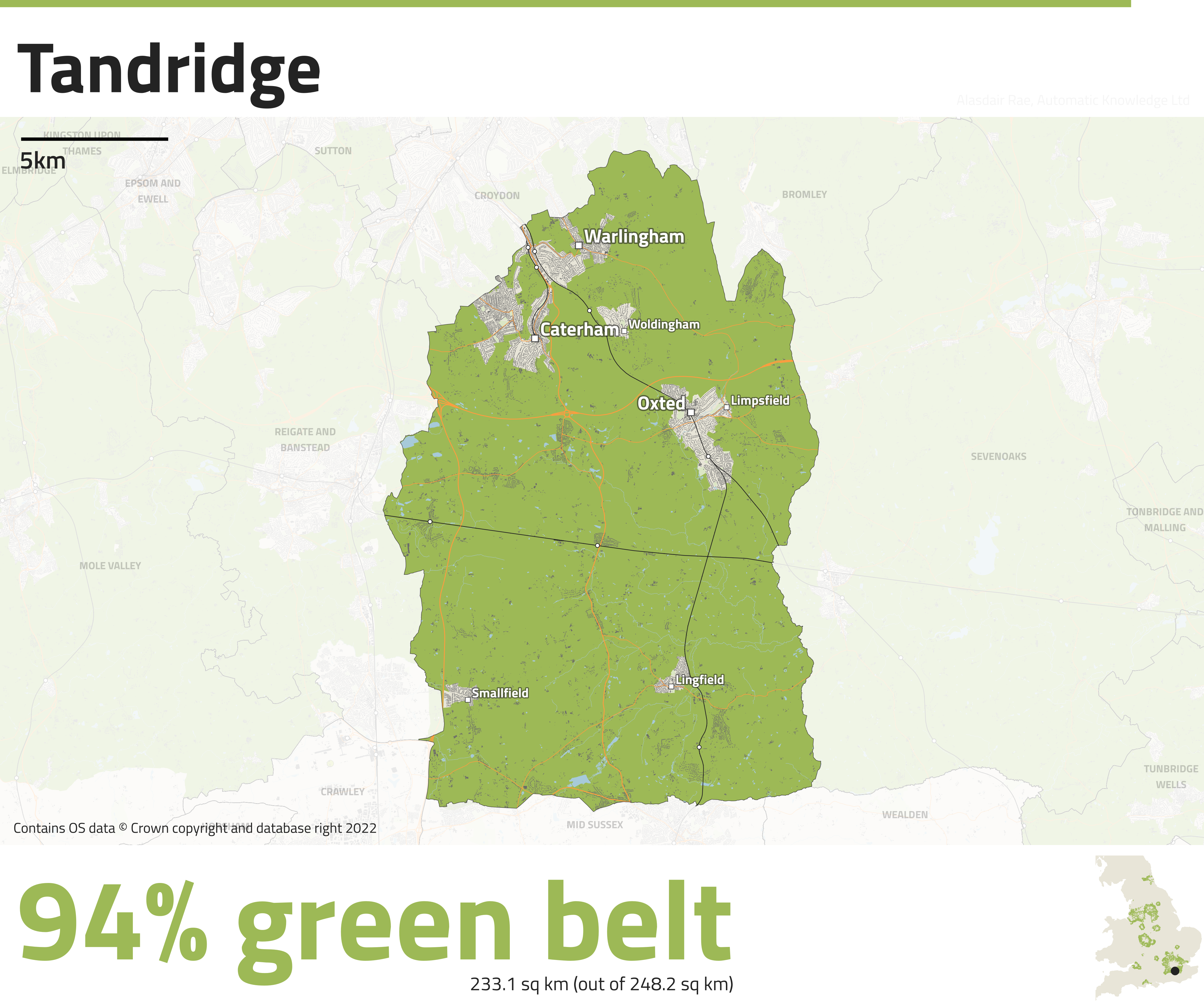
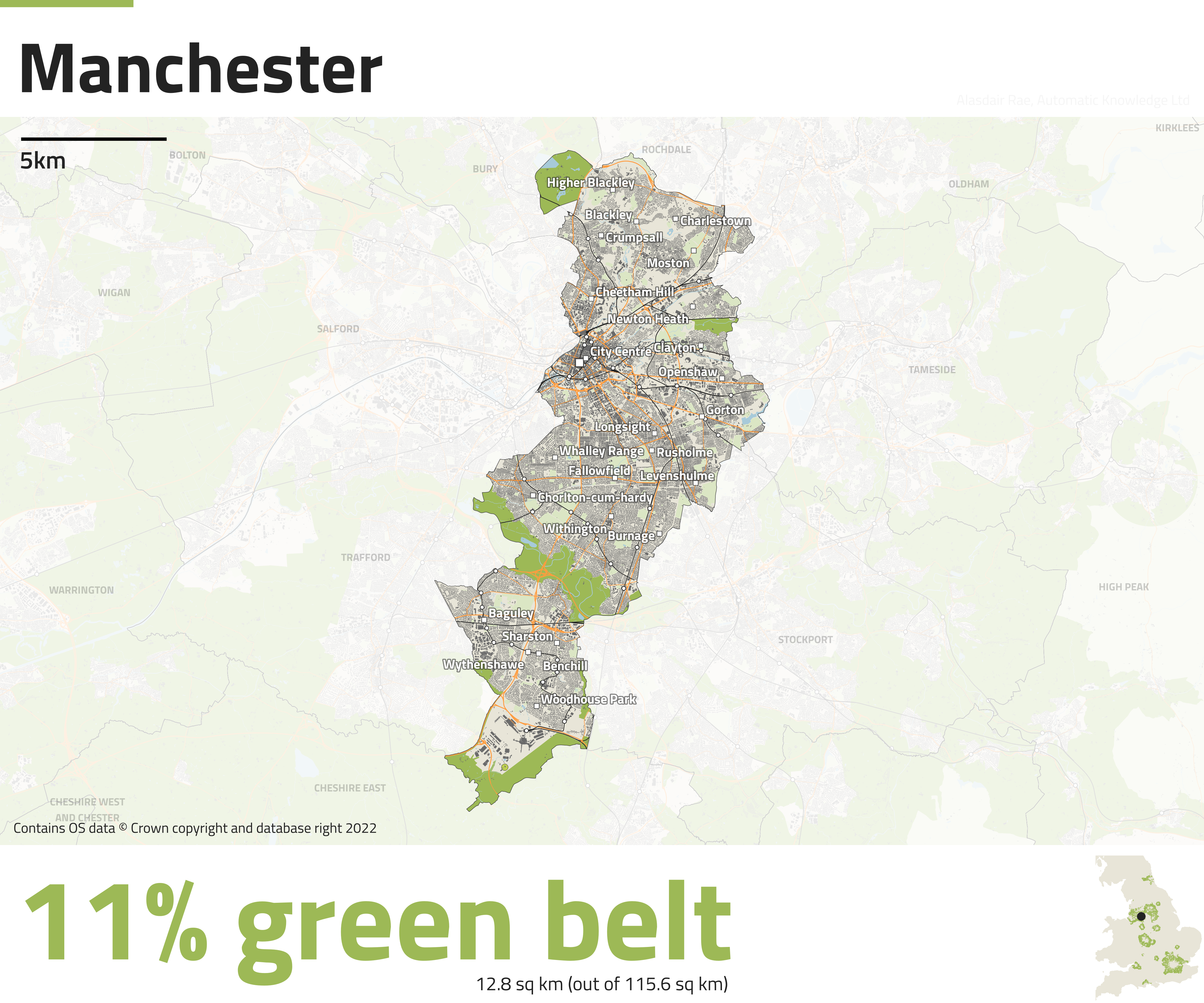
Where is the green belt? Where are the green belts? How much of my area is green belt land? These are excellent questions, but it's not always super easy to find the answer, and that's why I originally began investigating this topic back in 2012. This then eventually led to me producing maps for each English local authority that had green belt land in it, thanks to an idea suggested to me by geo legend Prof Bob Barr. Since I last did this in 2018 the number of local authorities in England has changed and there is a more recent green belt dataset, so I'm returning now with version 5 of my English Green Belt Atlas. Currently, 12.4% of land in England is designated as green belt, across 180 local authorities, but it varies a lot between places, as you can see below. I have made one map for each of the 180 areas, listed alphabetically (they are really high resolution images). How big is 12.4% of England? It's 16,140 square kilometres or 6,232 square miles. This is just a little bigger than the South East region or Yorkshire and the Humber, and about 80% the size of Wales, just to give a sense of scale. From 2020 to 2021 there was a 0.1% decrease in the amount of green belt land.

I did my best with the labelling

I've tried to keep the maps fairly simple


An example of a very split local authority area (rail line)


This area has the highest % green belt land in England


Not an awful lot of green belt land here


Okay, so you get the idea with the maps - I've shown rail lines (dark), railways stations (little circle dots), places (square dots, different sizes), major roads (orange), buildings (dark), water, green space (light blue) and green belt land in a darker green. The little dot in the bottom right inset map shows you where a local authority is, just in case any are not familiar. I've automated the labelling but it's not 100% perfect, but I can't spend any more time on it. Want to use one of these maps, or all of them? Be my guest.

Here's a few more that I found interesting. You can find the full set, listed alphabetically, right here.


Thursday, 9 September 2021

10km City Squares

In 2020 I wrote a piece on here along with some maps showing 10km by 10km (that's 6.21 miles) city squares for places across Great Britain. I'm fascinated by the different forms and types of urban development we see on the ground, so I'm back for more - this time adding in blue and green to the grey of building footprints. You may even have seen my Twitter thread on this, but here I'm sharing some final versions of these grey-green-blue maps and also saying a bit more about what they actually are - and are not. But first, let's look at a few of the final map outputs for some interesting places. There are currently maps for 199 different places across Great Britain in the project folder. Sadly I don't have the data for Northern Ireland, otherwise I'd have included that too.


What are all the different colours?

The grey bits are buildings, roads and railways. The blue bits are surface water (lochs, lakes, ponds, rivers and the like) as well as coastal water. The green bits are less straightforward in that they do not represent every bit of green in a place - and are not intended to. They are the areas included in the OS Open Greenspace dataset from Ordnance Survey. You can read more about it on the dedicated webpage for it but in short it includes public parks, playing fields, sports facilities, play areas, allotments and more. So, things like some large green areas (e.g. national parks, gardens, and the like) are not green on these maps. What I am trying to do here is compare like-with-like across the country to examine density, the patterning of urban fabric, water coverage and a particular kind of green. Nothing too profound but something I find particularly interesting.


My town isn't included - you scoundrel!

I can in theory do this for about 43,000 places across Great Britain so if the place you want to see has been overlooked and is not included in the web folder then feel free to get in touch and I might be able to add it. Alternatively, strike me off your Christmas card list and consider me a non-person from this point onwards.


Can I print one of these and hang one on my wall?

Be my guest. I have outputted them at 300dpi (png files) so they should print at a reasonable size. I may yet add some to my print store but not sure yet.


How did you make these?

I downloaded the map data from Ordnance Survey and then put the layouts together in QGIS. I then automated the exporting of each map using the QGIS Atlas function. If you're desperately keen to learn how to do such a thing then I also do training on that. Once you get one layout set up, it's fairly straightforward to export a big batch, so long as your computer is up to it. See below for how they look in QGIS just before I export them.

This is how it looks in QGIS Print Layout

Why did you choose 10km?

Partly because it's a nice round figure within which a lot of towns and central cities fit, and partly because 20km was too big and 5km was too small. I chose it through trial and error and it works reasonably well for most places.


That's all for now. Happy browsing.