Monday 29 February 2016

Spinning globes with NASA's Visible Earth

Time for a little fun today, seeing as how it is the 29th of February and therefore a bonus day. I've recently been experimenting with more NASA data and have become somewhat addicted to looking at Visible Earth, an absolutely stunning collection of images and animations of our world. So, naturally, I decided to make a few animated gifs. I did this with NASA's 2012 night globe, the next generation Blue Marble image and the Bathymetry image. You'll see the results below, followed by a little bit of information on how I made the gifs, should you have a burning desire to do so.

Beautiful images of our planet

First of all, here's an animated globe using the classic 'Blue Marble' image of earth. You can find this in lots of different varieties on the Blue Marble pages of Visible Earth. 

This is 75 frames, at 125ms per frame (Credit: NASA)

I also did a version of the spinning globe using NASA's Night Lights 2012 image. This is captured by a satellite 512 miles above the surface in a polar orbit, circling the planet about 14 times a day. And here I am turning it into another animated gif.

This one is 50 frames, at 100ms per frame (Credit: NASA)

Finally, I decided to take a different view and use the Bathymetry image. Bathymetry is the underwater equivalent of land topography. This shifts the focus on to the sea rather than the land, and provides a different take on things.

This is also 50 frames, but this time 150ms per frame (Credit: NASA)

Okay, so that's already three too many gifs for one blog post. But I had fun so it's all good. Read on below if you want more info on how to make these - or similar images. It's very simple.


How to make your own spinning globe (should you have nothing better to do)

1. Find an image from Virtual Earth that you like.

2. Turn it into a square by re-sizing in your chosen image programme. I used IrfanView and/or GIMP for this. I'd aim for no more than 800 x 800 in size. If you don't turn it into a square you'll end up with a spinning rugby ball.

3. Use GIMP (or PhotoShop or similar) and open the image. In order to avoid blocky, pixely edges you need to add an Alpha Channel and then Semi-Flatten it. See below for how to do this in GIMP - the image shows my selecting 'Semi-Flatten' after already adding the Alpha Channel, which is in the same menu. It will still work if you don't do this but instead of a smooth circle you'll end up with a slightly pixellated circle, and it won't look as nice.

Always do this for a smooth globe outline

4. The next step is just to use the Spinning Globe tool in GIMP (as below) and then select some options (also below). As you can see, it's here where you can choose clockwise or anti-clockwise, specify the colours and say how many frames you want - more than 100 will take a little while, but gives a much smoother globe (but bigger file size).

This is a nifty little tool in GIMP

I ticked the first box to make the earth go the right way

5. Once you've done step 4, GIMP will extract individual frames in the layers list on the right and then you're ready to export to gif. This is just done via the File > Export As... menu option. Once there, you just change the file type to gif and select the options you want - e.g. the duration of each frame - I've used 100 to 150 milliseconds above. Then you just click Export. The file will save quickly and then you'll have your spinning globe. 

This is how you get to the gif options

Note that you need to tick the 'As Animation' box

There are other options you can play with and other ways of doing it - including not using GIMP - but I've shown you this here because it's free and easy. You just need to know how.

As for the underlying data, that's another great thing. Nearly all of Virtual Earth is available for re-use, commercially or otherwise. Here's what NASA have to say about it:

"Most images published in Visible Earth are freely available for re-publication or re-use, including commercial purposes, except for where copyright is indicated. In those cases you must obtain the copyright holder’s permission; we usually provide links to the organization that holds the copyright.
We ask that you use the credit statement attached with each image or else credit Visible Earth; the only mandatory credit is NASA."

I'll be back with another frivolous 'how to make a gif' post in four year time.

Saturday 20 February 2016

More commuting map experiments

Following on from an earlier blog post about mapping commuting patterns in the United States, I've been experimenting again. I finally got round to looking at more of the comments on the Reddit thread on the map and I spotted one about topography, so I wanted to go back and add in a topographic layer to the map to see if it added any additional explanatory value. It's a difficult balance trying to show so much, but I thought it was interesting so I'm sharing it now. The underlying topographic data are from NASA's Visible Earth catalogue, and I've used a dark one below, as you can see. First of all, here's the large updated map and following that a little commentary. I've also added some different extracts at the bottom of the post, including a blue version.

Just a map of where people live? Not quite. Huge version.

I've got a bit of work to do on this as quite a few things need to be fixed (labels, colours, transparency, etc) but I think the addition of the topographic base layer is quite useful. Well, it's useful in parts, particularly in the western United States where the density of lines is much lower. Some examples below to illustrate this, starting with California's Central Valley.

Central Valley is like a container for commutes

From Redding in the north to Bakersfield in the south, it's clear that the Central Valley acts as something of a container for commuting. Obvious if you live there perhaps, but I like the way that this comes through from the topographic base layer. A similar kind of example, though less obvious, from Idaho is shown below, stretching from Boise to Idaho Falls in the east of the state.

Not exactly Central Valley but interesting nonetheless

The impact of the North Cascades as a barrier between the west of Washington and the east of the state is clear when you look at commutes, but it's more obvious why this is the case when you add the base layer as I've done below.

The topography of the Pacific North West explains a lot

Talking of mountains, I thought I'd also add in an example from the much more densely populated east of the US. Here you can see the impact of the Appalachians on commutes, at least in part. Well, what you can see is that there is a big gap in the map, and not too much more. But, if you look closely, you can see the way some connections follow a linear path where we might expect a more hub-and-spoke pattern if the land were flatter.


Nobody's going to commute across the mountains, are they?
I expect I'll come back to this again some time. If you're interested in playing around with the data and making your own map, be my guest. It took a good bit of work to put together but I'd be interested to see what others can do with it. See below for some further maps I exported during my late night/early morning flow map session, starting with a blue version...


I think I like these colours better - a bit more subtle and less dazzling

I wanted to zoom in to a few different areas to take a closer look at the relationship between commuting flows and topography, so first of all I chose Colorado and Idaho as they are very interesting in that regard.

Take a closer look at the patterns around Grand Junction

Because nobody wants to commute from Lewiston to Boise

Two more maps of individual states below. As in the case of the above, I've restricted it to flows of 200 miles or less (just to make sure that the most extreme commutes are accounted for) and I've shown all flows that end up in a state, so you should see some cross-state-boundary flows on the maps. First of all, you can see more clearly the east-west split in Washington and the extent to which Spokane serves as a kind of regional commuter hub. Then I've done another map, this time for West Virginia, just because it's one of the most interesting ones in a very crowded eastern United States.


Washington is a good example of where topography matters

Definitely one of the best state shapes

That's all for now. I may add more states in future.

I find this one very interesting

Sunday 14 February 2016

More automated mapping in QGIS using the Atlas tool

Back in 2014 I did a tutorial on how to automate map production in QGIS, followed by another on my idea to turn the map legend into a 'bargend' (aka a frequency histogram legend). I promised a follow-up on how to do this, so here it is, complete with QGIS project file and data. I used the Indices of Deprivation 2015 data for London as a sample dataset here but you could use just about anything. Before I share more of the method, here are some results. If you have trouble following any of this, I suggest you go back to the first tutorial, which explains the QGIS Atlas functionality in more detail.

[Update 13 February 2020: this all still works in QGIS 3 but you'll have to change the Atlas syntax to @atlas_featureid rather than $atlasfeatureid as it was in the version of QGIS I used to create this back in 2016.]

[Update 9 November 2016: I have zipped all files into a single download so when you get to the Google Drive link further down you should be able to download a single file package called Download_this_all_files_in_a_single_folder.zip and then just unzip it and open the london_example.qgs file in that folder. If it has a ~ after the file name, you may need to delete it to get it to work.]

This was done using the QGIS Atlas tool and open datasets

Much of the text and numbers are based on the underlying data table
Note that the small lower case labels only appear in one area - see below for how

So, this is all done using the QGIS Atlas tool, plus a few little tricks. There are only four different data layers. I have one layer with the deprivation dataset (the red to blue one), another for London Boroughs, one more for place names, plus I've also added in London buildings in a light colour to give some sense of the underlying urban fabric.

The map legend shows the % and total number of areas within each London Borough that fall into each of the ten national deprivation deciles from the 2015 Indices of Deprivation. There are many ways to achieve what I did here (no doubt it's about five lines of code in R), but this is my method...

1. I took the deprivation data for London LSOAs (which I extracted from the national dataset - available on my IMD15 page) and then dissolved it so that the Borough boundaries would be a perfect fit on top of my LSOAs. I just like to do this to make sure the boundaries are a perfect match in the final map series, but if you already have matching boundaries then it's not necessary.

2. Separately, I used a Pivot Table in Excel to summarise the number of LSOAs in each decile using the district codes as labels - I also calculated percentages as shown below and then saved this as a dbf (xlsx is also fine). The deciles are already calculated in the IMD15 dataset so this made it simple.

This was done in Excel, but could be done easily other ways too

3. I then imported the Borough summary file above into QGIS and joined it to my dissolved Borough shapefile (using the common label code field) to create a new layer I could use as the coverage layer in Atlas. Since I now have summary stats for each decile I can then use this information to size features dynamically in Atlas based upon the values in the attribute table. More on that later.

4. I then added in building and place name files using Ordnance Survey open data.

5. I then set up my layers in QGIS using a variety of different styling techniques. I used version 2.10 for this. Here's what it looks like in the main QGIS view:

Note that some layers are copies, styled differently
6. I used $id = $atlasfeatureid and NOT $id = $atlasfeatureid in some of the duplicated London Borough layers. This means that when you have Atlas turned on in Print Composer only the active Atlas coverage feature will be displayed (or everything but the active feature - that's what the NOT does).

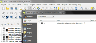
7. To make the place names appear only on the active Atlas feature, I used a trick I learned from colleague Ruth Hamilton -  intersects($atlasgeometry ,$geometry) - this tells QGIS to only draw the features which geographically intersect with the active Atlas feature. I find this useful as otherwise the map is completely swamped with place names. Note that in newer versions of QGIS you can use slightly different syntax to achieve the same result: intersects( @atlas_geometry, $geometry). Also, if you use this but no place names show, it's probably because your point layer is in a different projection to your polygon layer. The solution is to save a new version of your point layer with the same projection as the underlying polygon layer. This has caused me to tear my hair out once or twice before figuring it out!

This is just a rule applied in the Style dialogue

8. In my Print Composer, I then get everything set up as I want it. I use the London Borough shapefile as the Coverage layer, I use the field name variable to call in the Borough name and some other text, and I use the percent and total decile fields to position and size the features in the bargend. With the Atlas tool turned off, it looks like this (below) where you can see the field names instead of the final map text.

Atlas > Preview Atlas (or the Atlas button) makes this go live

9. The histogram legend? That is just manually drawn rectangles, duplicated and coloured to match the map data and then sized dynamically using the % figures from fields in the underlying Coverage layer. Since the percentages are a good match for millimeters here I didn't need to apply a multiplication factor to scale them - as you can see below.

This is really very simple, but can take a bit of thought to get right

10. What about the position of the % and total labels for each bar? Again, this was done dynamically using the decile % fields in the London Borough shapefile I used as the Coverage layer. You can see this in the screenshot below.

You need to do this to make the labels appear in the right place

That's about it really. I'm sure there are other ways of achieving similar results, but right now this works for me and I like the additional information provided by the histogram style bargend. If you want to get your head round what I've done the best way is to download the QGIS project file and data layers that I've made available below. You can then explore the properties in the different layers and examine the way I've set up the Print Composer. Once you've done this then you can go wild with your own data. Here are a few more maps before I finish.

Brent, home of Wembley (among other things)

Kensington and Chelsea - actually quite a mixed Borough

Westminster - also a very mixed Borough

Want to try this yourself using the project and data shown here? If so, here's what to do:
  • Go to the Google Drive folder I created with the QGIS project file (the .qgs file) and data layers and then download the qgs and the zipped shapefiles (and then unzip them).
  • Open the .qgs project file in QGIS (I'd use version 2.10 or above if I were you). When you do this QGIS will ask you where your layers are located (this is the rather worrying-sounding Handle Bad Layers dialogue), but you'll only have to do this once - just click 'Browse' and point to where the relevant data layer is located.


  • Once you've done this, you should have a QGIS project on screen that allows you to replicate (and modify) what I've done here. If you then go to Project > Print Composers you'll then be able to go to the London SUMMARY one I created and start exploring the properties (remember, by default Atlas will be turned off so just go to Atlas > Preview Atlas to turn it on). Then you can use the arrows to go through the individual Atlas pages.

One final map, just for fun. Hopefully some people find this useful. Or maybe you have some questions - in which case, feel free to get in touch on twitter or by e-mail.

Richmond upon Thames - home to Twickenham (and other Hams)


Notes: as I said at the beginning, you might need to have a go at the first tutorial for any of this to make sense. If you're already proficient with QGIS and the Atlas tool then it should all be pretty easy. One thing you may not immediately notice is that one of the layers is filtered (the place names layer has "FONTTYPE"  <=  2 AND "FONTHEIGHT"  >=  6 AND "FONTHEIGHT" <= 10 so that not all places and all place types are shown - the Ordnance Survey dataset is very detailed and I didn't want to show them all). 


Sunday 7 February 2016

Spotlight on Higher Education participation and deprivation

There has been quite a lot in the news recently about participation rates in higher education in the UK, with universities defending their access records after criticism from the Prime Minister. Part of this is about gender and ethnicity but it's also about socio-economic class, so I thought I'd take a little look at higher education participation rates in relation to deprivation, as a kind of proxy for socio-economic class. I took the the participation of local areas data from HEFCE (the dataset known as POLAR3) and data on deprivation using the official indices from across the UK (IMD, NIMDM, SIMD, WIMD). I looked at how participation in higher education varies in the most deprived fifth of the country - bearing in mind that the deprivation data is unique to each country of the UK and that there are differences between the data in Scotland and elsewhere. So, it's best to compare within rather than between nations in the maps below. Having said all this, it's time for some maps, first for England.

Only 20% most deprived are in the spotlight here

We can see from the first map, of London, that across the 20% most deprived areas participation in HE is quite variable and actually in the highest quintile in places. But this is something of an anomaly and London is a bit different in this respect, as noted by scholars such as Sol Gamsu. The situation is a little different in Bristol, below, where areas amongst the 20% most deprived nearly all have the lowest HE participation rates. A couple of points to note here, though. This says nothing about cause and effect (i.e. this isn't a finger-pointing exercise, even if the HE sector in general can do more). Also, the geographical scales are different - POLAR3 is available at ward level and deprivation data at lower scales (LSOA in England and Wales, SOA in Northern Ireland and Data Zone in Scotland). So, let's call this 'indicative' and move on.


HE participation and 20% most deprived - Bristol

Moving from the South West to the North East of England, there is slightly more variation in HE participation among the most deprived 20% of areas, but not much. There are many good reasons why we shouldn't be surprised about it (some historic, some socio-economic) but the patterns below do indicate that there is a need (or opportunity) to widen access.


HE participation and 20% most deprived - North East

Now it's time to run through a few more maps from the rest of England - West Yorkshire, South Yorkshire, Merseyside, Greater Manchester, East Midlands and the West Midlands.

HE participation and 20% most deprived - West Yorkshire

HE participation and 20% most deprived - South Yorkshire

HE participation and 20% most deprived - Merseyside

HE participation and 20% most deprived - Greater Manchester

HE participation and 20% most deprived - East Midlands

HE participation and 20% most deprived - West Midlands

As you can see from the maps above (remember, only the 20% most deprived of areas are highlighted - the rest have the 'lights off' effect), there is a good bit of variation in HE participation rates in some urban areas. I've shown the LSOA boundaries in white and it's a bit frustrating/tantalising with the POLAR3 data being at the larger ward scale, but I think these patterns merit further investigation. Maybe this has already been done, in which case do let me know. To complete the UK picture, here are some more maps, starting with Glasgow and Edinburgh. Just remember that in some cities (such as Glasgow) there are more areas in the most deprived 20% than others - and Glasgow and Edinburgh provide an obvious contrast in this regard. 

HE participation and 20% most deprived - Glasgow
HE participation and 20% most deprived - Edinburgh

To Northern Ireland now with a map of Belfast, followed by Cardiff. In both cases there is a little variation but most of the areas shown - all within the 20% most deprived -  overlap with wards with the lowest HE participation rates. 

HE participation and 20% most deprived - Belfast

HE participation and 20% most deprived - Cardiff

What does this all mean? Well, at first glance, it appears that in some cities - and in particular in London - there are higher levels of HE participation in some of the most deprived areas. In others, the opposite appears to be the case. Overall, it appears HE participation is low in the 20% most deprived areas. But, there are many caveats here. Even in areas where the participation is higher, we don't know where that participation is taking place - or why. These are things I'd like to know more about. In the first instance, I was most interested in the patterns. Also, some areas have a lot more deprived areas so this affects how we might interpret the maps - a point reinforced if I include maps for Oxford and Cambridge, which have very few areas in the 20% most deprived in England. 

HE participation and 20% most deprived - Oxford
HE participation and 20% most deprived - Cambridge

Notes: as I said above, the datasets used here are at different geographical scales, so this makes it all a bit frustrating. The within-ward variation in HE participation we might be interested in cannot be discerned from these maps, but these patterns appear consistent with results reported elsewhere. The best way to interpret these maps would be to say that the areas shown are within wards with a specific HE participation quintile, rather than to read anything more into it from a statistical point of view. I think this is a useful initial exercise but ideally we'd have more fine-grained POLAR3 data to do this with - maybe it already exists, but I couldn't find it. If you want to look at the POLAR3 data yourself - including in an interactive map - go to the POLAR web pages.