Friday 17 November 2023

Thanks for stopping by

It's time to bring the curtain down on Stats, Maps n Pix now, after 1.5 million page views and 150 posts. I'll leave the blog archived here, but if you're looking for me, you can always find me via my business website

When I started this blog as a replacement for my original one I was still working at a university doing academic stuff and it kind of fitted in with that. But now I'm not working in academia and instead I'm doing lots of interesting work with my company, Automatic Knowledge, so it's time to wrap it up here on the blog.

Overall, it's now been 15 years of blogging from me so I think I'm ready to do something else online, maybe a bit more on my Map Academy YouTube channel, who knows.

In the spirit of the age, here's an image to symbolise the end of the era, created using the Microsoft Bing Image Creator (powered by DALL·E 3) based on the following prompt: 

"create a photo of a party with lots of people in a dark room with drinks, lots of maps on the wall and in the background, overhead, is a banner that reads "thank you for stopping by".

We had a lovely imaginary party

We all know that this generative AI stuff is addictive, so I then decided to do another prompt, as follows:

"create a photo of someone looking really sad about a blog that is no longer online, with lots of cats and rabbits in the frame, plus candles and moody lighting and tilt shift"

And these were the results.

What does

Any of this

Have to do with

Stats, maps or pix?

The reason I'm adding these images here, beyond the fact that it is good fun to play with and also the obvious self-indulgence, is that I've been asked a few times recently about the potential and power of AI in the mapping and data space. I think there is lots of potential (e.g. with the kind of amazing stuff Steve Attewell is doing with overpass turbo queries and OSM data). I also think our jobs are mostly pretty safe but that the geo world will grow in size at the same time because of it. 


Some blog numbers

I have had a look at the blog stats as of 17 November 2023 and it seems that anything I wrote about population density got lots of clicks, which proves it's not just me that is interested in it. At the time of writing here are the top 10 most popular blog posts on Stats, Maps n Pix.

Density is cool, yeah


I think that's just about all there is to say, so let's end with one more generative AI image.

Thank you for having me

"create a realistic photo of a man working in a dark room, at a computer, logging off for the last time, with a bright neon sign on the wall saying "THANK YOU FOR HAVING ME" - and the man has a dog in the room and it's in silhouette and there is a desk lamp on"


Thursday 26 October 2023

How many people live in the English green belt?

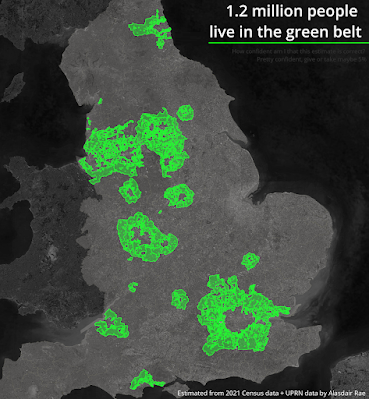
Over a decade ago I set out to understand exactly where England's green belt land was by getting my hands on the raw data. Eventually it became open data and there's an update every year, along with loads of stats. At the time of writing, the proportion of land in England designated as green belt* was 12.6% of the total. But nobody lives in the green belt, right? Or at least hardly anyone, right? Or at least not that many, right? If you search online you won't find an answer to this question so that's why I've been looking at it on and off for a few years and now I have what I think is a good approximation of the total number of people who live in green belt land in England - 1.2 million or, to put it another way, more than in any single English local authority area (Birmingham has about 1.1 million people). That's 2.1% of the population of England.


I believe this estimate is pretty accurate

Are you sure?

How can I be sure that this number is correct, after all we don't actually have population data that fits the boundaries of the green belt. For example, you can't just add up Census Output Area populations within the green belt because they do not nest neatly (at all) within the green belt and if you try this approach you will get a wildly wrong figure. That's why I used the OS Open UPRN dataset from Ordnance Survey because this allows you to identify individual properties. There's also AddressBase Plus but a) that costs a lot of money and b) we'll get to that later. So, because I used address-level data I am confident that my figure of 1.2 million people living in the green belt is pretty accurate but you will see some independent verification below too. Update: read on for more but my 1.2 million people in the green belt figure compares very favourably to the 1.15 million figure calculated using the 'ONS average occupancy count for "in use" properties (by OA)' stats in the spreadsheet from Drew.

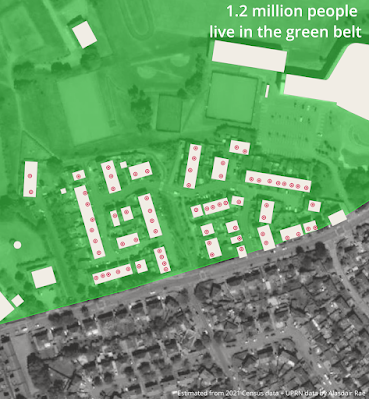
The dots are UPRNs in buildings, green = green belt

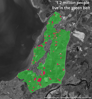
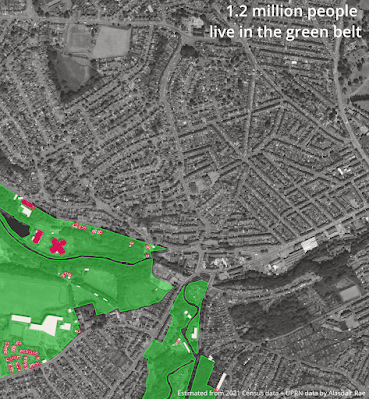
York's green belt is very much like a big green donut

My methodology, for anyone who is interested

How did I go about this? Well it went a bit like this...

  • Get the latest green belt boundary file from DLUHC
  • Get Open UPRN data from Ordnance Survey
  • Get building footprint data from OS Zoomstack
  • Add all data to QGIS
  • Extract only those UPRNs (UPRNs are the authoritative identifier used to uniquely identify addressable locations in Great Britain) that fall within a building footprint, so that you're not including non-buildings etc
  • Identify how many of these UPRNs within buildings fall within the green belt (I got about 34 million UPRNs in buildings out of 40 million total, and 593,273 were in buildings in the green belt in England)
  • Then we do a comparison between the population of each English local authority area and each of the following: number of building objects from the OS Zoomstack dataset, total area covered by buildings, total count of UPRNs in buildings
  • Then we bust out Occam's Razor to do a few simple scatterplots - compare each of the above to the population - to cut a long story short, you multiply my UPRN number by about 2 to get a total population
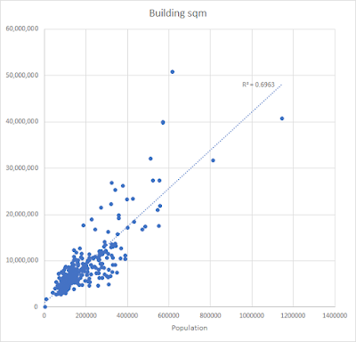
Building area vs population: a bit messy

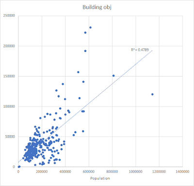
Building object count vs population: too messy

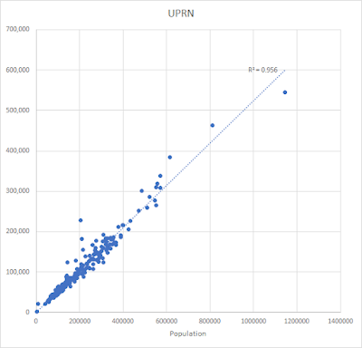
UPRNs in buildings vs population: quite neat


  • So once I saw a fairly linear relationship between my 'UPRNs in buildings' count and the total population of each local authority district in England I decided to use this to estimate population
  • Not all local authority areas have green belt though, only 180 of just under 300 do
  • For those areas with green belt the relationship between 'UPRNs in buildings' and the population was even stronger so that's why I have a good degree of confidence that we can multiply by 2 here to get a decent population estimate

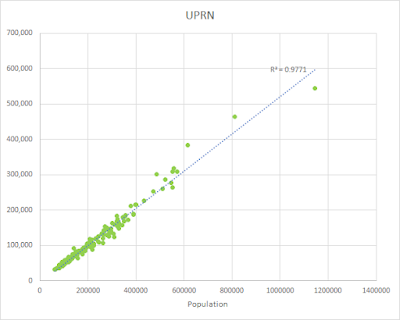
UPRNs in buildings in green belt vs total population

  • This all leads me to a population estimate for the English green belt of: 1,186,546 - but this is too precise so I'm just saying 1.2 million. 


Verification?

I did all these calculations myself and got a figure that seems pretty reasonable based on the methodology described above. It also feels about right - 2.1% of the population of England on 12.6% of the land area. The 2x multiplier for UPRNs in buildings to get population holds pretty much all across England as we can see from the charts above, and the relationship is even stronger when we look only at those areas that contain some green belt land.

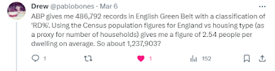
If you check out an earlier post of mine on Twitter you'll see some other numbers which back me up, calculated using the very expensive and not-open AddressBase Plus dataset. I will add these below for reference. 

Here are some screenshots of calculations that use AddressBase Plus, including some populations for the different bits of green belt in England. Thanks of course to Drew for these numbers derived from AddressBase Plus - here's more on his methodology.

ABP is AddressBase Plus - similar figure to what I got

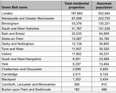
Estimates for the different bits of English green belt

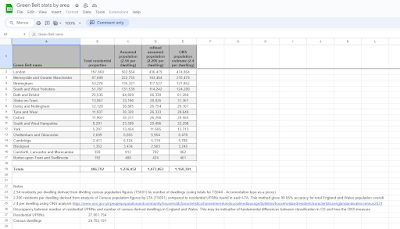
A spreadsheet you can explore and have fun with

If you look at the spreadsheet shown above you will see three different estimates for the population of the green belt in England, ranging from 1,073,863 to 1,236,452. My figure of 1,186,546 is very close to the middle figure in the spreadsheet of 1,168,301 which was calculated from the ONS population estimate of 2.4 people per dwelling. You will also notice a tab in the spreadsheet with green belt population by local planning authority.


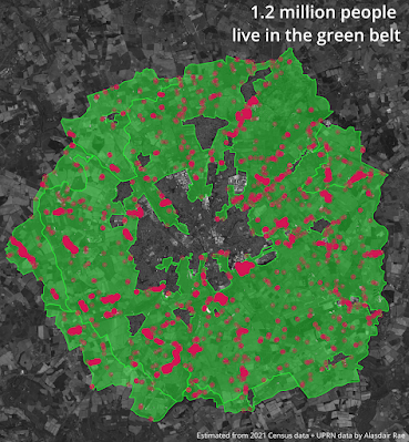
The dots are UPRNs, the shapes are buildings

So there we go. Why am I writing about this again? It's a long-standing interest of mine, plus it has also been in the news recently so I thought I'd take another look at it. Oh, also, I discovered that I'm only 430 metres from the green belt even though I'm in a very densely populated area.

Want to look at a map that has current green belt boundaries on it? Check out the National Map of Planning Data for England and then just turn on the green belt layer.

Green belt near me, I didn't realise so close

*'green belt' is how I'm writing it here but the government tend to use 'Green Belt' but of course if you're being proper you might say 'green belts' but we also see 'greenbelt' and 'Green belt' - I'm not fussed, it's all talking about the same thing

Sunday 20 August 2023

GB railway stations + nearest station

I'm sharing a file of the location of all railway stations in Great Britain, put together from Table 1410 of the UK's Office of Rail and Road (ORR). So, clearly, a momentous occasion. I published something similar years ago and I see people still using it but the old one doesn't have new stations like Reston, Inverness Airport or Marsh Barton in it. Oh, and I also calculated the nearest station (as the crow flies) for each station, just out of curiosity. Here's the spreadsheet. 

The real blockbuster of the summer

I posted a few maps I made of this on my twitter, as a kind of annoying map quiz - these are copied below too. What on earth are these maps showing? Well, for each of the 2,573 stations in my dataset I simply drew a line to its nearest station. Sometimes the lines are reciprocal - e.g. for Aberdeen, Dyce is the nearest station as the crow flies, and for Dyce, Aberdeen is nearest. In these cases the lines on the map look a bit glowy because there are two overlapping each other. But this kind of thing isn't always the case. That's why the maps look kind of disjointed and weird.


Now, if you can't be bothered clicking on to the spreadsheet then here are the numbers on furthest gaps between stations and also nearest to each other according to my calculations. And remember that a) this is straight line distance, as the crow flies, and b) it doesn't mean you can actually travel between these station pairs. It's purely a measure of how far away - in a straight line - the nearest station is.

  1. Malton to York - 27.4 km / 17.0 miles
  2. Stranraer to Barrhill - 26.1 km / 16.2 miles
  3. Wick to Georgemas Junction - 22.2 km / 13.8 miles

and at the bottom of the list

  • Catford to Catford Bridge - 0.09 km / 0.06 miles
  • Catford Bridge to Catford - 0.09 km / 0.06 miles
  • St Budeaux Victoria Road to St Budeaux Ferry Road - 0.12 km / 0.08 miles


Hmm, but what about actual distance along the railway? Could we try and figure this out? Yes we could. But first here's a map or two comparing the longest straight lines to how bendy the real lines are.


Bendy

VERY bendy

Surprisingly bendy

And my quest to find the longest gap between stations - again, regardless of whether you can get a train from one to the other - has led me to the following maps.

More interesting if you're into this stuff

I do believe we have a winner

Not very bendy, so similar distances

Okay, so, to sum up.

  • Some stations are far away from others.
  • Some stations are close to others.
  • Some stations are even further away if you are a train.
  • Malton to York is the 'furthest nearest' station gap at 27.4 km / 17.0 miles
  • Stranraer to Barrhill is the 'furthest nearest' station gap if you follow the railway line, at 41.4 km / 25.7 miles.
  • Coatbridge Central and Highbury & Islington are both the nearest station - as the crow flies - to four other stations. That's more than any other.
  • What about tube stations, tram stops, subway, etc? I'm only looking at the national network of rail stations included in the ORR data here so that's not part of this.


The clue is in the name!

Centre of a universe


Another more bendy one


Monday 14 August 2023

Global terrain maps

A short post today, with some visuals. I used some Blue Marble imagery from NASA - one layer was topography and the other was the colour image of the earth for August - and then I used the prelease v2 of Aerialod to visualise it. I tweaked the Blue Marble colours slightly and the elevation and bathymetry (in the final images) is greatly exaggerated, for effect.

I had a bit of fun with this. And this is the result.

NASA Blue Marble + topography

A few bumps in Europe and North Africa

Some nice colours and interesting bumps here

A view across most of North America

A slightly different angle on South America

I quite like this perspective, very interesting

Gosh, The Himalayas are quite big

So many mountains here!

Another pretty interesting view

Same as the first one, but with a few more light effects


That's all for now :)

With exaggerated bathymetry too

Classic mid-Atlantic wrinkles

Maps without New Zealand should not exist


Thursday 13 July 2023

A new UK constituency hex map

There are new constituency boundaries in the UK so we made a new hex map. This means that the ones used in previous elections have been replaced by a new set. There are still 650 constituencies but they are in many cases quite different so any election boffins/mappers will need to get used to them, and their new shapes and names, pretty quickly. Take a look at this interactive map if you want to compare them (will load slowly, is best on big screen). When is the next UK general election? Well, nobody knows the date but it has to be no later than 28 January 2025. Philip Brown and I knew all this was in progress because we keep track of these things - particularly Philip - so many months ago we began the process of creating a new hex map, which you can see below. After that I say a bit more about the process of putting this together. Here's the direct link to the geo files if you want a shp, gpkg or geojson of the new hex map. Don't like hexagons? See this new video on my channel for how to change them to other shapes.


The new hexmap - web version


Search constituencies by name

A bit of preamable

You can make these things automatically, programmatically, algorithmically etc etc but the results will normally be very sub-optimal. Why? It's because of the difficulty of putting the hexagons together in a 'least-worst' configuration. They are all in the wrong place, but some are less wrong than others. That is, hex maps are about portraying each area with a shape covering the same area rather than geographical accuracy. 

Why? Because sometimes we want to size things by population rather than land area, but this means we have to sacrifice overall shape and individual area locations. But you probably already know all about this if you're reading my blog.

Each constituency has (very roughly, and with a few notable exceptions) a fairly similar population. Here's what the Parliamentary Constituencies Act 2020 says about it.

The Act sets out a number of Rules in Schedule 2 which are relevant to the detailed development of proposals for individual constituencies. Foremost among these is Rule 2, which provides that – apart from five specified exceptions – every constituency we recommend must have an electorate (as at 2 March 2020) that is no less than 95% and no more than 105% of the ‘UK electoral quota’. The UK electoral quota for the 2023 Review is, to the nearest whole number, 73,393.

Accordingly, every recommended constituency (except the five ‘protected’ constituencies) must have an electorate as at 2 March 2020 that is no smaller than 69,724 and no larger than 77,062.


The four Boundary Commissions in the UK published their new electoral maps (after previously publishing the initial proposals) in June 2023 and then we finalised the process. There are a total of 650 constituencies, just like before, with the following number in each country of the UK.

  • England (543)
  • Northern Ireland (18)
  • Scotland (57)
  • Wales (32)


The process of making this hex map

The process of making the map involved the following things, with me proposing the idea to Philip initially because he's really an electoral genius with boundary knowledge that quite frankly I'm surprised can be contained in just one brain. Anyway, he took up the task and got to work and we have our initial 'final' set - though as you can see from the web map url we consider this a 'beta' release because we're very aware that we are capable of making mistakes, even if we did go through a fairly rigorous quality assurance process!

Okay, so here's what we did. Then below that you'll see some images of how this all worked, including a few WhatsApp screenshots as proof of the level of thought behind this (and probably also evidence that we may need new hobbies).

Here's how we did this
  1. Meet at Dunkin Donuts many months ago to discuss doing this.
  2. Create blank hex grid in QGIS.
  3. Agree that we should start with final shape in mind.
  4. Agree that out of all previous UK constituency hex maps Ben Flanagan's (Esri UK) shape was the best shape, so model ours on that.
  5. Agree that we should generate a unique three letter code for each hex - so that (e.g.) we can label each hex within the shape and because official names often too long!
  6. Get loads of sheets of A2 and A3 paper printed with blank hex grids on them.
  7. Leave Philip to do his thing.
  8. Meet to discuss from time to time.
  9. Let Philip get on with it, region by region (England) and then UK countries.
  10. Monitor initial proposals from Boundary Commissions.
  11. Come up with final configurations on paper.
  12. Spend day working together on converting paper into digital.
  13. Revise, tweak, move a few polygons, re-shape Northern Ireland, move things around a little bit.
  14. Check for errors, duplicates, typos, and suchlike.
  15. Check again, then generate geo files for sharing (shp, gpkg, gejoson).
  16. Make web map available, as well as file repo.
  17. Add ONS area codes as soon as they become available (not sure when this will be).

That is more or less it, but it took many months and most of the hard work here was done by Philip. 


Some photos and screenshots for anyone who might be interested

It was quite an interesting process. Working on paper was actually very useful so we'd recommend starting with a final shape in mind plus some big bits of hex grid paper if you are trying to do this yourself, but really all the hard work is in figuring out how best to arrange the hexagons. This is what takes so long. Imagine if you had a Word document with 650 text boxes in it and you move just one box - everything else gets totally messed up. Well it's a bit like that. A real headache. All maps are wrong. All hex maps are wrong. But we created the least-wrong hex map we could and we hope others might use it and find it useful.

Happy mapping!