Showing posts with label uk. Show all posts

Thursday, 13 July 2023

A new UK constituency hex map

There are new constituency boundaries in the UK so we made a new hex map. This means that the ones used in previous elections have been replaced by a new set. There are still 650 constituencies but they are in many cases quite different so any election boffins/mappers will need to get used to them, and their new shapes and names, pretty quickly. Take a look at this interactive map if you want to compare them (will load slowly, is best on big screen). When is the next UK general election? Well, nobody knows the date but it has to be no later than 28 January 2025. Philip Brown and I knew all this was in progress because we keep track of these things - particularly Philip - so many months ago we began the process of creating a new hex map, which you can see below. After that I say a bit more about the process of putting this together. Here's the direct link to the geo files if you want a shp, gpkg or geojson of the new hex map. Don't like hexagons? See this new video on my channel for how to change them to other shapes.


The new hexmap - web version


Search constituencies by name

A bit of preamable

You can make these things automatically, programmatically, algorithmically etc etc but the results will normally be very sub-optimal. Why? It's because of the difficulty of putting the hexagons together in a 'least-worst' configuration. They are all in the wrong place, but some are less wrong than others. That is, hex maps are about portraying each area with a shape covering the same area rather than geographical accuracy. 

Why? Because sometimes we want to size things by population rather than land area, but this means we have to sacrifice overall shape and individual area locations. But you probably already know all about this if you're reading my blog.

Each constituency has (very roughly, and with a few notable exceptions) a fairly similar population. Here's what the Parliamentary Constituencies Act 2020 says about it.

The Act sets out a number of Rules in Schedule 2 which are relevant to the detailed development of proposals for individual constituencies. Foremost among these is Rule 2, which provides that – apart from five specified exceptions – every constituency we recommend must have an electorate (as at 2 March 2020) that is no less than 95% and no more than 105% of the ‘UK electoral quota’. The UK electoral quota for the 2023 Review is, to the nearest whole number, 73,393.

Accordingly, every recommended constituency (except the five ‘protected’ constituencies) must have an electorate as at 2 March 2020 that is no smaller than 69,724 and no larger than 77,062.


The four Boundary Commissions in the UK published their new electoral maps (after previously publishing the initial proposals) in June 2023 and then we finalised the process. There are a total of 650 constituencies, just like before, with the following number in each country of the UK.

  • England (543)
  • Northern Ireland (18)
  • Scotland (57)
  • Wales (32)


The process of making this hex map

The process of making the map involved the following things, with me proposing the idea to Philip initially because he's really an electoral genius with boundary knowledge that quite frankly I'm surprised can be contained in just one brain. Anyway, he took up the task and got to work and we have our initial 'final' set - though as you can see from the web map url we consider this a 'beta' release because we're very aware that we are capable of making mistakes, even if we did go through a fairly rigorous quality assurance process!

Okay, so here's what we did. Then below that you'll see some images of how this all worked, including a few WhatsApp screenshots as proof of the level of thought behind this (and probably also evidence that we may need new hobbies).

Here's how we did this
  1. Meet at Dunkin Donuts many months ago to discuss doing this.
  2. Create blank hex grid in QGIS.
  3. Agree that we should start with final shape in mind.
  4. Agree that out of all previous UK constituency hex maps Ben Flanagan's (Esri UK) shape was the best shape, so model ours on that.
  5. Agree that we should generate a unique three letter code for each hex - so that (e.g.) we can label each hex within the shape and because official names often too long!
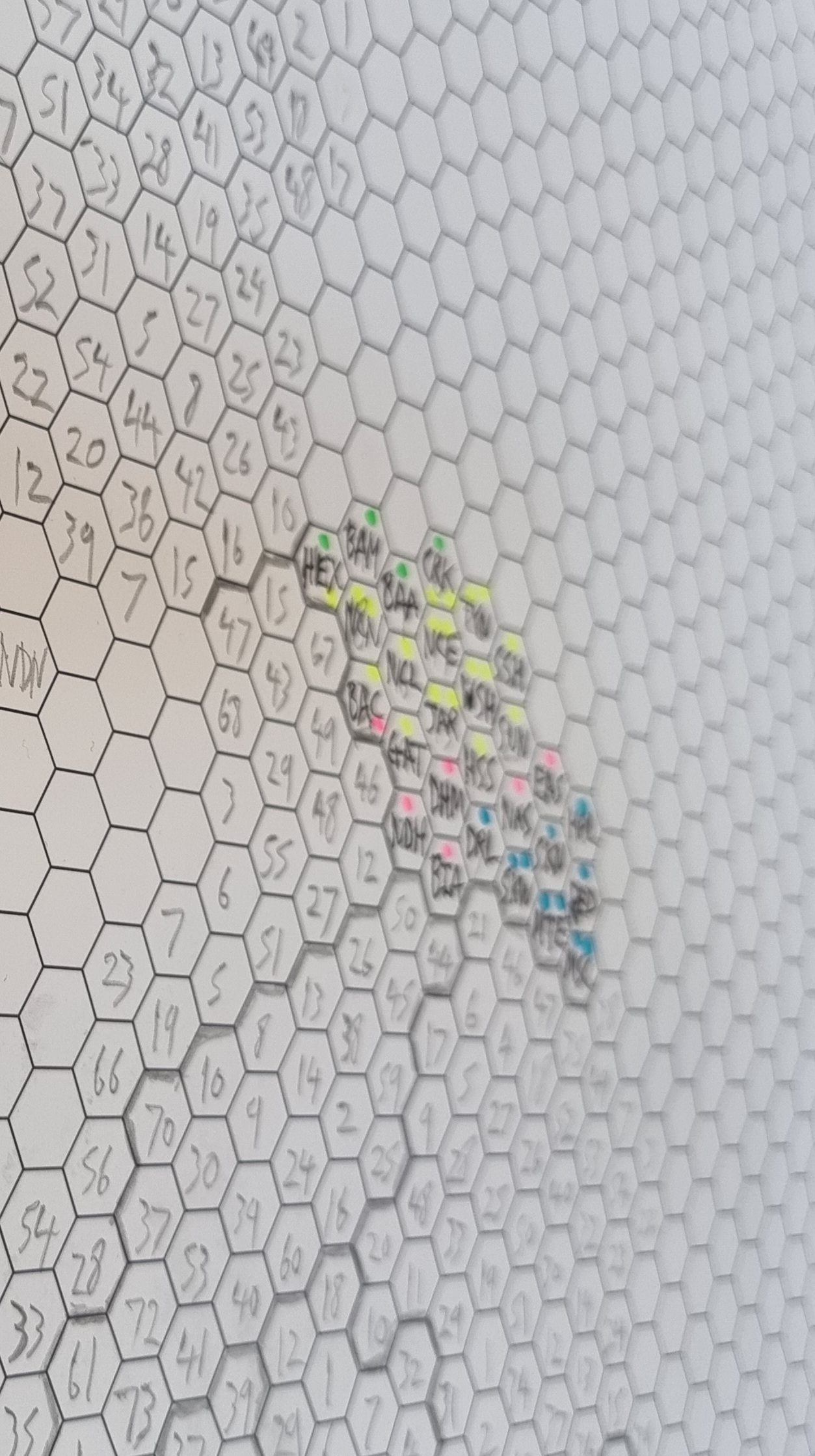
  6. Get loads of sheets of A2 and A3 paper printed with blank hex grids on them.
  7. Leave Philip to do his thing.
  8. Meet to discuss from time to time.
  9. Let Philip get on with it, region by region (England) and then UK countries.
  10. Monitor initial proposals from Boundary Commissions.
  11. Come up with final configurations on paper.
  12. Spend day working together on converting paper into digital.
  13. Revise, tweak, move a few polygons, re-shape Northern Ireland, move things around a little bit.
  14. Check for errors, duplicates, typos, and suchlike.
  15. Check again, then generate geo files for sharing (shp, gpkg, gejoson).
  16. Make web map available, as well as file repo.
  17. Add ONS area codes as soon as they become available (not sure when this will be).

That is more or less it, but it took many months and most of the hard work here was done by Philip. 


Some photos and screenshots for anyone who might be interested

It was quite an interesting process. Working on paper was actually very useful so we'd recommend starting with a final shape in mind plus some big bits of hex grid paper if you are trying to do this yourself, but really all the hard work is in figuring out how best to arrange the hexagons. This is what takes so long. Imagine if you had a Word document with 650 text boxes in it and you move just one box - everything else gets totally messed up. Well it's a bit like that. A real headache. All maps are wrong. All hex maps are wrong. But we created the least-wrong hex map we could and we hope others might use it and find it useful.

Happy mapping!


Wednesday, 8 January 2020

Land, people and political maps

This is a final map wrap-up following the UK General Election at the end of 2019, but also a follow-on from my last blog post: Land doesn't vote but it does matter. I'll explain more below, but let's start with a little gif, which fades in and out between the new political map of the UK at the start of 2020 and a different version of the same map, but showing only where there are buildings (in an attempt to scale the data to the underlying population more closely). I've included some interesting facts about people and land below, so do keep reading. Teaser: only 4.4% of the UK land area is Labour constituencies, in contrast to the 32.8% of the population who live in Labour constituencies, which is very close to their 32.2% vote share at the election.


Land matters, but it's good to see both

Here are the individual frames from the gif, below, in case you want to look at them a little more closely. It's a bit of a balancing act deciding upon what line width to use for the buildings-only map - too thick and it's just massive blobs of colour. Too thin and everything disappears, so what you see here is a kind of compromise that is supposed to reflect the pattern of the underlying urban fabric that would be visible on a satellite view, for example.

Buildings file available here

The political map of the UK in 2020


How many people live in areas with a Conservative, Labour, SNP or Lib Dem MP?
This is an interesting question, but not one I came up with by myself. I was asked for an answer to this question, and because I'd compiled all the data already it was a relatively quick bit of analysis to arrive at some answers. So, here we go - below - based on the latest UK mid-year population estimates from 2018.


  • 55.3% of the UK population (36.7 million people) live in areas with a Conservative MP. The Conservatives have 56% of the seats (365 out of 650). The Conservatives won 43.6% of the UK vote in the 2019 General Election.
  • 32.8% of the UK population (21.8 million people) live in areas with a Labour MP. Labour have 31% of all UK seats. Labour won 32.2% of the UK vote in the 2019 General Election.
  • 7.4% of the UK population (4.5 million people) live in areas with an SNP MP. But of course that's a bit of a silly statistic because the SNP only stand in Scotland, obviously. So, the relevant figure here is shown below. The SNP won 3.9% of the UK vote in the 2019 General Election. Note: obviously, the % population and % seat shares will be quite similar owing to the sort-of-equal population per constituency. For Scotland, both figures are 7.4% of the UK in terms of seats and population living there.
  • 82.7% of the Scottish population (4.5 million people) live in areas with an SNP MP. The SNP won 45.0% of the Scottish vote in the 2019 General Election and have 81.4% of all Scottish seats.
  • 1.7% of the UK population (1.0 million people) live in areas with a Liberal Democrat MP. They also have 1.7% of all seats. The Liberal Democrats won 11.5% of the UK vote in the 2019 General Election.

You can see the full spreadsheet here if you like - it includes all parties and has separate tabs for England, Scotland, Wales and Northern Ireland and it has a map of the results. It looks like this (below). I've used total population here rather than electors because that was the question I was given and of course MPs are representative for all people.

More interesting than you may imagine, perhaps

None of this is of course particularly profound or surprising but I'm thinking about it in the context of the maps above and in relation to overall vote share, so I find it interesting. 


How much of the UK land area does each party 'hold'?
Describing this correctly is a bit tricky, but what I mean here is what percentage of the UK's land area does each party 'hold' or 'represent'? That is, what proportion of the new political map of the UK is shaded blue, red, yellow, orange, green and so on? I do like the different kinds of political maps we see these days (including the now-ubiquitous hex cartograms) but I also like to see things mapped in a more traditional manner, so long as we also have a different way of looking at it and are aware of the underlying numbers and settlement pattern (hence the gif at the very top of the page).

Okay, prepare to be blown away, or not, by this geographical trivia.

  • 62.4% of the UK land area is covered by Conservative constituencies.
  • 4.4% of the UK land area is covered by Labour constituencies - yes, 4.4% (but of course that's because they are mostly urban and therefore geographically small, but still this low figure surprised me).
  • 19.5% of the UK land area is covered by SNP constituencies.
  • 60.4% of the Scottish land area is covered by SNP constituencies.
  • 5.6% of the UK land area is covered by Liberal Democrat constituencies (with thanks to Caithness, Sutherland & Easter Ross, clearly).
  • The full spreadsheet above has the rest of the data, including the individual UK country breakdowns.

The mid-2018 population estimates from the ONS put the UK population at about 66.5 million, with 56 million in England, 1.8 million in Northern Ireland, 5.4 million in Scotland and 3.1 million in Wales.

For land area, the UK as a whole is about 244,000 sq km (about the same size as Oregon, or almost exactly the same as the total area of the Great Lakes in North America). England covers 130,000 sq km, Northern Ireland 13,600 sq km, Scotland 79,000 sq km and Wales 21,000 sq km. The figures are in square miles as well as sq km in the spreadsheet.

What was that? You want more gifs, but different speeds and different sizes. Okay then, see below. 

More seriously - and there is a rationale here - switching relatively quickly between the two maps in this way helps highlight the ways in which the standard map view can, if we're not careful, give a distorted view of political representation. That's why I think in political mapping a mix of methods and numbers works best. Also, where we can use different kinds of approaches to explain this (like gifs) we probably ought to.

Fast enough for you? 

A mini version

This is a bigger version - click to zoom

Help


Okay, one last stat. 

What percent of the UK population lives in Constituencies where more than 50% of the votes went to the Conservatives? 

By my calculations the answer to that is 28,258,422, so 42.5% of the UK population which, it so happens, is not so far away from the 43.6% share of the vote. But that is definitely not a defence of first past the post!

Bye for now. 


Tuesday, 3 December 2019

Land doesn't vote, but it does matter

A short post today on the well-work topic of election mapping and, specifically, how to represent the results of elections in a way that reflects the true proportions of who voted for who. This isn't an attempt at a solution or a definitive answer, just some ideas and maps to provoke further thinking on the topic. Let's start by looking at two election maps (below). The one on the left colours in all constituencies according to the party of the MP at the end of the most recent UK parliamentary session. The one on the right is coloured in the same way but only where there are buildings. People like to use these kinds of maps with accompanying comments like 'land doesn't vote' or 'because sheep don't vote' (although I would like to see some polling on how they'd vote if they were so enfranchised). Scroll to the bottom to see the method for this in QGIS.

Standard map vs 'dasymetric' map
Some obvious stuff first... There's a lot of blue on the map to the left above. There is also quite a bit of yellow, and not much red. So, when we look at the map on the left it might give the impression of Tory dominance, when in fact they are not as far ahead as the colour share would suggest and  things are nowhere near as bad for Labour as it might appear from the colour share. Reasons include population density, urban voting patterns, etc, etc. But, but, but, when we get to this point, I always think "yes, true, but the vast majority of people know that". But then again maybe the vast majority of people have more exciting lives and don't think about this kind of stuff at all and end up being inadvertently misled my maps. Perhaps. SO, ENTER THE HEXAGON!!! Yes, it's our old friend, the hex map - example below from a new book. This definitely helps shift the story of the conventional election map from 'wow, the Tories are crushing the competition' to 'it looks quite close'. I quite like this approach, but with only a small quite and probably because of my own biases.

Hex for the win?

Yes, this hex map is better in many respects, but I'm not a huge fan of using these on their own and wouldn't really mind not seeing them again. But I do agree it provides a more useful representation of the vote share and as a compromise it's a fairly good one if we're interested in displaying vote share. I just think in this case a bar chart might be better if we're most interested in vote share, given how hard it is to get the hexagons arranged in a way that matches the underlying geography and what it does to my brain. That's why I've been experimenting recently with the dasymetric map style you see above. Talking of which, here are a few zoomed-in versions, with place labels, and a bit more discussion below.

What colour is your town?

This is a bit more informative I think

But I wouldn't use this approach on its own

Although I do think there is a place for this style

The colour balance is a bit more satisfying here

The last thing to say in this bit is that I also like the buildings-only maps with labels as it allows us to say a bit more about specific places. Let's imagine for a moment that there was a human being out there who didn't know the precise boundaries of the Berwickshire, Roxburgh and Selkirk constituency. I know it's hard to believe but I'm told such people do exist. They know it's a blue constituency and on the first map above they can actually see Selkirk (to the bottom right of the first labelled map) in blue, rather than a giant block of blue covering the entire area. 

Of course, this overlooks the fact that not everyone in the constituency voted for the Conservatives but that's another issue, and in a first-past-the-post electoral system I think shading by winning party is quite logical. Anyway, my point here is really that we can focus in on individual towns and how they voted without being distracted by giant wodges of colour that strictly speaking we do not need. I think the North of England map above does a good job of this - so you can just look at the east coast  of England and see that Bridlington or Scarborough are represented by the Conservatives and that Blackpool has a red wedge between two blue blobs on the west coast.

If you did want to colour areas by the strength of vote for one party then you could use what I call a 'staunchmap' approach, like the example below that I've shared previously. The deeper the colour the higher the vote share - e.g. see Merseyside and its deep Labour reds.

Who will win in 2019? I predict nobody will win.

So, what's my final verdict on how best to map elections? I think a mix of approaches is best, and because most of what we view is on multi-media platforms I think some use of animation might be useful, as in the gif I made already and shared on Twitter. In print or static format this could just be a simple side-by-side version, like the image at the top of the page. Actually, having just written this, I think broadcasters and print media should do both - perhaps standard map + hex + dasymetric or standard map + one other. Not that it matters that much but if we've got the data and tools seems like it would be a good idea to use them here and, maybe, pass on a little more information with this slightly different encoding.


Ooh, fancy - but it does add a bit of value I think


("land doesn't vote, but it does matter" is my usual thought on this, so I'm adding it here, and that's why I'm using a technique that does at least show the land at some point, before switching to a view that more closely reflects the numbers we're probably interested in. Plus, we can't have the Highlands zapped from the map, or at least not permanently.)


Data and method: a cumbersome way to do this would be to use a buildings layer to clip the constituencies but that would take ages. I did this in QGIS using a simple blend mode but it's possible with other tools as well. The data I used are from the spreadsheet I put together and shared on Github previously. You'll also find a constituencies file there to to join it to. You can grab the buildings layer from this page and then you've got all you need to replicate what you see here. Just take a look at the screenshots below to see how I did it. Just make sure your map canvas background is black (via Project > Properties > General).

This is the layer order you need

The constituency colours come from the attribute table

The buildings are all white, with a thin outline


Sunday, 26 May 2019

Did you realise wards were actually very interesting?

More map and data fun today. I know there's a massive market for blog posts about administrative geographies, so here I am. It's partly inspired by the fact that I look at this kind of data all the time and get to know it quite well, and partly because of this Twitter exchange some time ago with Mags Hall and Allan Faulds, who truly do know too much about this kind of thing.

Did you know that the UK's biggest ward accounts for 2% of the total area of the UK? You did? Ok then, did you know that only one UK ward out of more than 9,000 begins with 'z'? Perhaps you did. But did you know that 'Plumpton, Streat, East Chiltington and St John (Without)' is the longest ward name in the UK, and also perhaps the best? How about the fact that there are 11 UK wards bigger than Greater London and the smallest ward in the country (in the City of London) is not very big at all - 0.044 square km (about 6 football pitches). The ward that you'd most like to drink? Why, that's the ward of 'Speyside Glenlivet' (in Moray), surely.

Time for some maps now. They all have the name of the local authority they're in in the top left, with the ward name along the bottom.


Not quite as big as Trinidad and Tobago, but close enough

It's small, ancient and has about 320 people

Zetland ward, in Redcar and Cleveland

If you're a local Councillor in the UK's biggest ward you have an awful lot of ground to cover, as you can see below for the journey between Achiltibuie and Kinloch Hourn, which are both in the same ward. Extra points if you can pronounce Achiltibuie (I can but I have a bit of an advantage on the Highland-place-names-as-Shibboleth thing).

The route between Achiltibuie and Kinloch Hourn (in same ward)

There are two really, really big wards in the UK. One is shown above and it's Wester Ross, Strathpeffer and Lochalsh, and the other is North, West and Central Sutherland. Both are in the north west Highlands, and are more than 4,800 sq km in size (that's over 1,800 sq miles, which is close to 3x Greater London or 18 City of Edinburghs). The biggest ones in other parts of the UK are a good bit smaller, and here they are below. Overall, the 10 biggest UK wards account for more than 10% of the land area of the UK, and the 100 biggest account for just over 30% of the UK's land area. You could fit almost 3,000 of the smallest UK wards in Wester Ross, Strathpeffer and Lochalsh but I don't think it's a very sensible idea so I'd advise against it.


By far the biggest ward in England

Just a smidgen bigger than Torr Head and Rathlin

The biggest ward in Wales is also a donut ward

The other humongous ward 

All this isn't supposed to be profound or anything like that, just a bit of map trivia, so read on for a bit more about the little wards. The smallest wards in the UK are all in the City of London, and we've seen the smallest of those above (Queenhithe) so let's look at smallest ones in different parts of the UK instead.

Northern Ireland's smallest ward

Scotland's smallest ward

The smallest ward in Wales

Not the street of Charles Booth fame, but it is small

Wards are actually very important though, and they represent a very important part of local democracy in the UK, so there are some practical implications to this kind of thing, particularly when you consider the different areas people represent and how widely they can vary, even within a single local authority. For example, in Northumberland the biggest ward is more than 1,100 times the size of the smallest. In the Highland Council area in Scotland the biggest ward is over 1,300 times the size of the smallest.

But did you know that wards can also be mapped with a basemap in greyscale? You didn't? Okay, here's proof, with a selection of wards covering more than 100 sq km.

Lots of big wards in this neck of the woods

Not anywhere near Bolton

Another donut ward - I'm not sure how many there actually are

10th biggest ward in Northern Ireland

Yes, the Isle of Skye is a single ward (pop about 10,500)

I like the name of this ward


Notes: I used ward boundaries for 2018 from the ONS Open Geography Portal. This file contains 9,114 wards for the UK, with 7,446 in England, 462 in Northern Ireland, 354 in Scotland and 852 in Wales. Scotland has relatively few wards compared to Northern Ireland and England but I won't go into that here. My favourite ward? Not sure, but Aird and Loch Ness is definitely a contender - see below. It contains all of Loch Ness, is pleasingly-shaped and is only a little bit smaller than Luxembourg. Then there is 'Highland' ward which is not in 'Highland' (the council area) but is in the Highlands but in the Perth and Kinross council area. I have loads more of these maps but that's enough for today.


The midgie capital of the world (at least in my experience)

Hmm