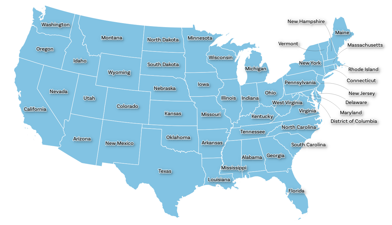
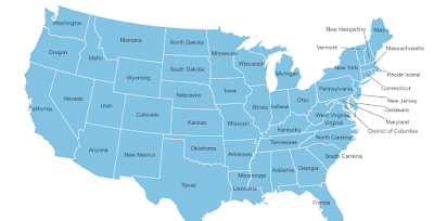
This is a short tutorial about how to display label callouts (sometimes referred to as 'leader lines') in QGIS. This has been possible for a while, but not everyone knows it's possible, or how to do it. So long as you're using QGIS version 3.10 or later, you create callouts for your labels very easily. Before going any further, here's an example of a map where label callouts would be useful (below). And here's the map layer I'm using for this tutorial, in case you want to follow along with the same data.
 |
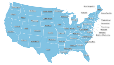
| Very crowded labelling in the Northeastern United States |
In the example above, some labels are okay, but in New England in particular things are a bit crowded, and in some other cases as well we might need to move things around. And note that I won't bother making things look particularly pretty here at all, this is all about the method.
So, here's two useful things to know for now - this is just for information right now, we'll look at how to change things further below.
- The Label Toolbar (it looks like the image below, and if you don't see it you can turn it on via the View menu then Toolbars). We can place labels wherever we like using the Label Toolbar.
- Where to find the Callouts options for a layer. For this, you need to go to Layer Properties (easiest done via a double-click on the layer name in the Layers Panel, or via a right-click then Properties... then Labels and then the separate Callouts section - again, see below for a screenshot of how it looks, in this case in QGIS 3.26).
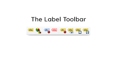 |
| Yes, this is what it looks like! |
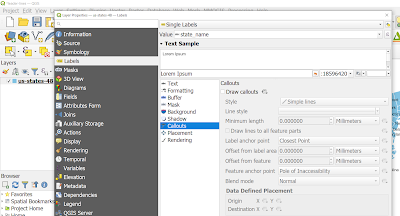 |
| Here's where you find the Callouts options |
Okay, but why would we want to use callouts?
Well, we want to make labels easier to read and because some states are small (NH, VT, etc) we just can't fit the labels on top of - or inside - the shape of the state. Not everywhere can be a Texas or a Colorado! And that's fine.
Also, anyone who has done any mapping - or even looked at a map - knows that labelling is super important. Done well it can make a massive positive difference. Done particularly badly and it could ruin a map.
Let's draw some Callouts
Now I'm going to add some callouts to my US lower 48 states layer that I showed you above. This is done in Layer Properties > Labels for the layer you want the callouts on. So the first thing I'll do in Layer Properties is tick the Draw callouts box (below) and then click OK to activate callouts. Oh, boo. Nothing happens, but that's actually fine.
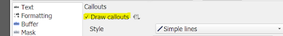 |
| This is how we make callouts active |
Next I'm going to use the Move a Label, Diagram or Callout button to move some of the labels in the Northeastern United States. It looks like this (below) in QGIS version 3.26 and should look the same - or very similar - on your version of QGIS too.
 |
| This is the important button! |
Next, I hit the Move a Label, Diagram or Callout button as shown above, then I select the first label I want to move, just by clicking on it - in my case I did this for Vermont and as soon as I did I got a pop-up, which unless you know what it's asking you can be baffling! It's not a problem, just keep reading for how to deal with this.
This little window (shown below) is QGIS asking you to use a unique column in your attribute table so that QGIS can store the X and Y coordinates of where you move your labels to, more or less. But you don't really need do know that so just click OK when you see the Auxiliary Storage: Choose Primary Key window, as shown below. It should just be on fid by default but really unless you're into this kind of thing you can click OK. At the bottom of the blog post I tell you how you can reset this, if you need to.
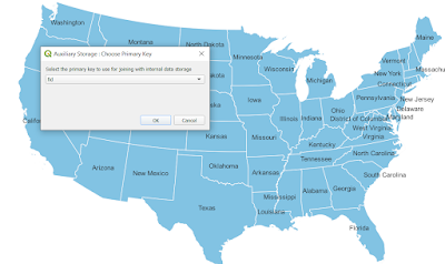 |
| You can just click OK here |
Then, making sure you've still got the Move a Label, Diagram or Callout button selected, you can move a label to somewhere where it has more space - so it's easier to read. This takes a bit of time, judgement and skill but don't worry if you don't get it right first time.
See below for where I've done this for lots of states - quite messily I might add. But that's fine at first, you can experiment with it later. At this stage I'd usually move some of the other state labels as well, to improve upon their positions - e.g. Florida, California, etc. This won't add a leader line because that only appears if you move the label further away from the feature.
 |
| We've made some progress! Oh yeah |
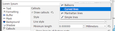
But let's say we want curved callouts, because they're nice, right?
Let's try that instead. To do this, we go back into the Layer Properties, then Labels and then in the Callouts section we change the Style from Simple lines to Curved lines, as shown below.
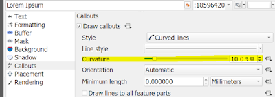
If you don't see all the same options as me, it's more than likely because you're using an earlier version of QGIS - or perhaps a later one. At this point you can also experiment with different curve options, like Curvature (a higher value here = a bendier line). For now I'm just going to accept the defaults and hit OK. You can always experiment with the settings later, including the different anchor points options.
 |
| The different callout options |
 |
| Curvature, and other options |
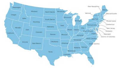
I've gone with curved callouts in the map below, and I've moved the labels a bit too, in an attempt to try and tidy things up.
 |
| Staring to look a little better now |
Couldn't we just use state abbreviations in these states, like NH for New Hampshire? Yes we could. But sometimes we want full names, plus not everything can be abbreviated.
What about callout colours, widths, font sizes, styles and so on? Good question. You can go back into Layer Properties and then Labels and then change all that in the Text and Callouts section, as shown below when I did it. I used a callout stroke width of 0.1 instead of 0.3 and I changed the font, added a buffer and a little shadow too.
 |
| This is starting to look a little better |
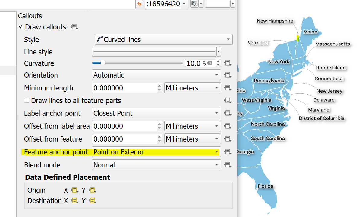
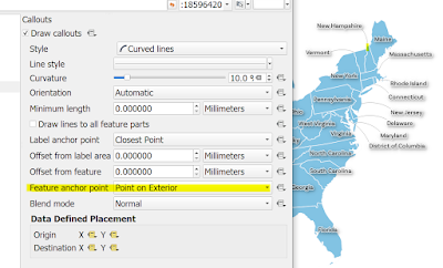
What if, say, we want the callouts to point to the edge of the state rather than the middle? Well, that's something we can change in the callout options by changing the anchor points, as I've done below where I set the Feature anchor point to Point on Exterior.
 |
| The callout now points to the edge of the shape, not the middle |
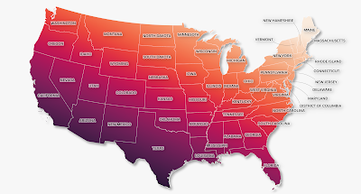
As you can see, I've gone a bit wild with the colours now (below), but just for fun. But you can also see that I've tried to make the labels all neat and tidy and get the callouts looking good too.
 |
| This is more like it - at least in terms of the callouts |
So, to recap on this bit...
- Make sure you can see the Label Toolbar
- Turn Callouts on via the Layer Properties, in the Labels section, and pick what kind of callout you want.
- Experiment with placement, as well as font styles, line styles and so on.
- Experiment a bit more.
Other things to think about - e.g. different kinds of data
The example above uses US states, but there are lots of cases in countries, regions and cities across the world where such an approach is useful - e.g. where some labels will fit within features but some won't and you need to find a solution.
Sometimes callouts are the solution. But sometimes we might want to have callouts on every feature. We can do that too, but it's not necessarily that obvious at first so let's have a look.
To turn callouts on for every feature (e.g. points, lines or polygons) - and actually see the callout lines...
- Go to Layer Properties for the layer you want the callouts on.
- Go to the Labels section and turn labels on.
- Within the Labels section go to Callouts and turn them on.
- I tend to use curved lines rather than straight lines, but it's up to you - it all depends.
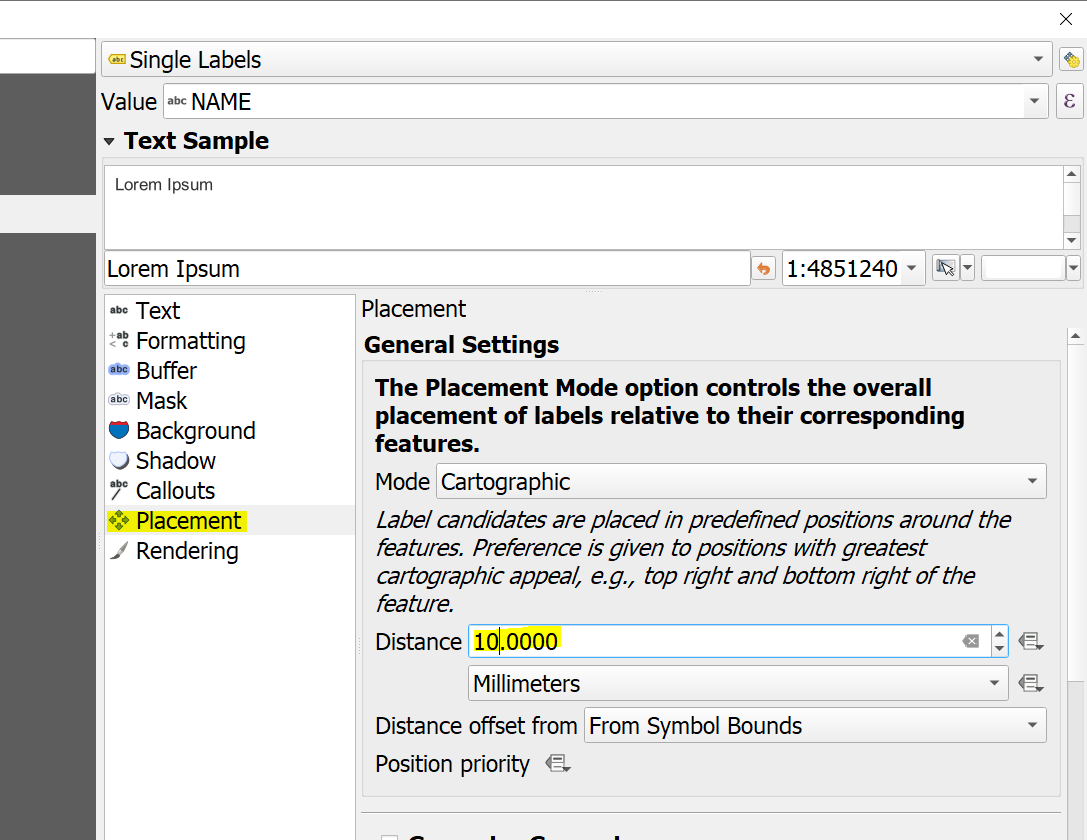
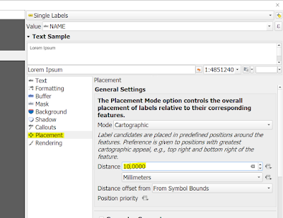
- Now go to the Placement section, still within Labels - it should be below Callouts (see screenshot below).
- By default, the Distance in Placement will be 0, so when you turn callouts on you won't actually see a line unless you increase the Distance. The Distance here refers to how far the label is away from the feature (e.g. a point).
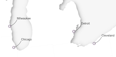
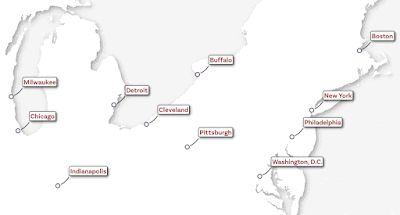
- You probably won't want to have callouts on every feature most of the time, but that's what this does. See below for an example with a US cities layer. Once you click OK to exit Layer Properties you'll see the result.
 |
| Placement is very important with callouts |
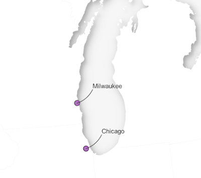 |
| We don't always want callouts, but sometimes we do |
Once you've done this, you can of course move labels around using the Label Toolbar, just like you did before.
Other useful/important stuff
Okay, so we've got some callouts now, and that's fine. But as you can probably tell there are LOADS of other things you can tweak with labels so I'm not going to cover everything. It's just a case of trying this and then experimenting with all the options. However, there are a few extra useful and/or important things I think you should know.
Once I've manually moved labels using the Label Toolbar, how do I reset the label positions to get them back to how they were originally?
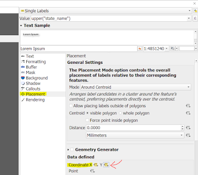
A good question! Further above when we started to move labels I mentioned how you get that mysterious Auxiliary Storage: Choose Primary Key window pop up when you start to move labels. I said to click OK, and that was fine because it works. But you may not have noticed that it changes the label placement settings under Data defined, as shown below. To reset this, just click the X and the Y and hit Deactivate and you should be back to the original default placement.
 |
| Not a lot of people realise this is here |
When I turn on labels the callout goes to the centre of a point feature and I don't like that!
Okay, yes, this is a good thing to know how to fix. You can see below in my US cities example how the callout goes right into the centre of the dot. I don't want this so I need to change some settings.
 |
| Callout goes to centre of the point feature |
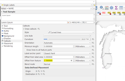 |
| Offset from feature is what you need to edit here |
As you can see from the screenshot above, I've edited the Offset from feature setting to move the callout line away from the point a little bit - I think it looks better this way. You can also experiment with lots of other settings here, depending upon what you want to achieve.
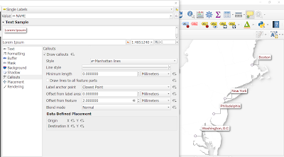
What do Manhattan lines look like?
Another good question. They look just like the example below. They are called Manhattan because of the street grid in Manhattan, which is all right angles - well, a lot of it.
 |
| Just take time to experiment here |
Okay, that's it for now. This post is a bit messy but I'll fix any errors or clarify anything that isn't clear if anyone gets in touch. See below for a little animation of different callout types - using a dataset for US cities. I wouldn't normally need to use callouts here, so this is just for demonstration purposes.
Hope you find this useful!
 |
| But I wouldn't usually use callouts in this case! |