In 2020 I wrote a piece on here along with some maps showing 10km by 10km (that's 6.21 miles) city squares for places across Great Britain. I'm fascinated by the different forms and types of urban development we see on the ground, so I'm back for more - this time adding in blue and green to the grey of building footprints. You may even have seen my Twitter thread on this, but here I'm sharing some final versions of these grey-green-blue maps and also saying a bit more about what they actually are - and are not. But first, let's look at a few of the final map outputs for some interesting places. There are currently maps for 199 different places across Great Britain in the project folder. Sadly I don't have the data for Northern Ireland, otherwise I'd have included that too.
What are all the different colours?
The grey bits are buildings, roads and railways. The blue bits are surface water (lochs, lakes, ponds, rivers and the like) as well as coastal water. The green bits are less straightforward in that they do not represent every bit of green in a place - and are not intended to. They are the areas included in the OS Open Greenspace dataset from Ordnance Survey. You can read more about it on the dedicated webpage for it but in short it includes public parks, playing fields, sports facilities, play areas, allotments and more. So, things like some large green areas (e.g. national parks, gardens, and the like) are not green on these maps. What I am trying to do here is compare like-with-like across the country to examine density, the patterning of urban fabric, water coverage and a particular kind of green. Nothing too profound but something I find particularly interesting.
My town isn't included - you scoundrel!
I can in theory do this for about 43,000 places across Great Britain so if the place you want to see has been overlooked and is not included in the web folder then feel free to get in touch and I might be able to add it. Alternatively, strike me off your Christmas card list and consider me a non-person from this point onwards.
Can I print one of these and hang one on my wall?
Be my guest. I have outputted them at 300dpi (png files) so they should print at a reasonable size. I may yet add some to my print store but not sure yet.
How did you make these?
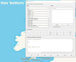
I downloaded the map data from Ordnance Survey and then put the layouts together in QGIS. I then automated the exporting of each map using the QGIS Atlas function. If you're desperately keen to learn how to do such a thing then I also do training on that. Once you get one layout set up, it's fairly straightforward to export a big batch, so long as your computer is up to it. See below for how they look in QGIS just before I export them.
 |
| This is how it looks in QGIS Print Layout |
Why did you choose 10km?
Partly because it's a nice round figure within which a lot of towns and central cities fit, and partly because 20km was too big and 5km was too small. I chose it through trial and error and it works reasonably well for most places.
That's all for now. Happy browsing.


