Showing posts with label gif. Show all posts

Monday, 30 May 2022

Let's play Urble!

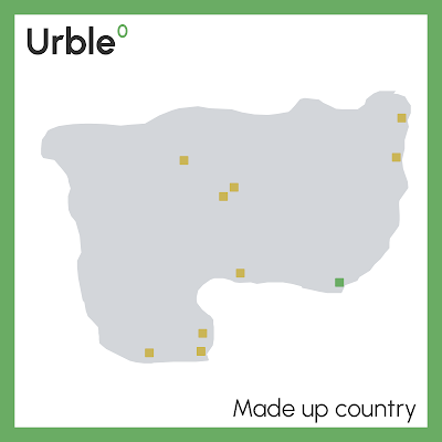
Today I'm letting Urble out into the wild. It's a little geography game in which a new city (displayed as a small square) appears every 5 seconds until there are 10 dots on screen (example below). The aim of Urble is to guess the country before the country shape appears - 50 seconds into the video. You can pause the video after the 10th dot (at 45 seconds) if you need more time. If you turn the sound on, you'll notice that when the 10th city is added it makes a different sound. I'm releasing this in video format, just for fun, so people can play it how they want to, and share them across platforms - I have lots of them! Some you might find easy, others no so much. As you might be able to tell, Wordle is part of the inspiration here, hence the colours. You'll see more on my Twitter, where I'll post each Urble using the hashtag #urble. I may give clues for some of the more difficult Urbles.
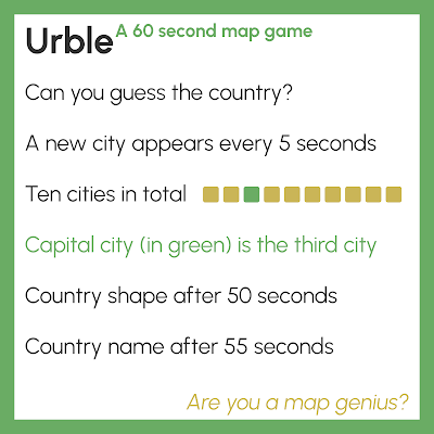
Are you a map genius?


This is what the end of an Urble looks like

As well as posting these on my Twitter (@undertheraedar) I'll also put each one in The Urble Archive too. Each Urble is numbered, so it's easier to keep track of them, and of course I won't keep you guessing forever - the answer is always revealed 5 seconds before the end of each video. They're all 60 seconds long, so you can get on with the rest of your day, or pause the Urble on 10 dots until you figure it out.

Here's Urble 1 - always best viewed with sound on (there's no music, just a few sound effects). There's also a gif version of each Urble, which I will also post in the archive - you'll always find the original, high-quality Urbles there. Can you guess which country this first one is?


You can see the full size, high-resolution video on The Urble Archive, where I'll put all Urbles after I share them on Twitter.


Urble - why?

Well, I make maps and look at geographic data a lot, and I'd always thought about doing some kind of fun game in a more formalised way. From time to time I've posted geography guessing games on my Twitter but until recently hadn't ever made something like Urble - but now I have. I've been playing this at home so far with my two sons and my wife, and since they like it I'm releasing it into the world now. In fact, my 9 year old son Isaac actually made a few of them himself, with me at his side giving instructions as he put them together in QGIS and Camtasia.

I've said more about Urble in the About file on The Urble Archive page. If you have a question, it may be answered below. Otherwise, check the About file.

The answer to the main 'why?' question here is that it's for fun, but also hopefully educational.


Questions you may have about Urble

What tools did you use to make Urble? I used QGIS for all the map stuff and Camtasia to create the mp4 and gif files. If you want to learn how to use QGIS, check out my Map Academy course on Udemy.

Surely you'll run out of countries pretty quickly? Well, this is sort of true but I can easily re-use countries by selecting a different configuration of cities, in a different order. Watch out for this as new Urbles are released. Maybe I'll repeat countries. Be mindful of this.

What about a country with more than one official capital? Good question. There aren't many of these, but where I do have an Urble for a country with more than one capital, I will only show one of them and it will still be the third city to appear, always as a green square. I will not show other capitals in the same Urble.

How do you decide which cities to show? The capital city is always included, as well as nine other cities that are - usually - among the top 30 by population in a country. In general, I try to make sure the cities give some hint to the shape of the country, but at times you'll need to wait until the 8th or 9th city to see it. Occasionally I add in other cities that help me show the shape of a country, even if they are smaller settlements. But this is the exception.

Why don't you add the city names at the end? Because part of Urble is guessing the cities as well as the countries. At the end you can try to figure it out, if you want to. I also want Urble to be as accessible as possible for an international audience, and adding more text (using place names written in English) wouldn't help with that. 

How do I win? I consider a true 'win' to be any Urble where you figure out what the country is before the country shape appears - i.e. before 50 seconds are up. But if you get it after pausing the video before the country shape appears, you can still count yourself a winner. In fact, if you don't get the country at all but you learn something new, then maybe you can count that as a kind of win as well. If you get the country before the capital appears, you are a true genius. If you get it before the fifth city appears, I salute you!

Can I steal Urble? Please don't, but I don't mind if people share Urbles, with a link back to my Twitter, The Urble Archive, or this page. 

Why didn't you make this into a website? I was going to, but in the end I decided it would be too much bother and actually I like the video-only approach as it's easier to share across different platforms and I don't have to mess around with code that I barely understand. I quite like the fact that you have 60 seconds to guess and also that you can just pause if you need more time.

Surely some countries will be impossible to guess? Well, I suppose that all depends where you're from and what you know. But even so, it is undoubtedly true that some countries are much more well known than others by the majority of people. But I see this as part of the fun - as an Urble unfolds, your brain is working overtime trying to figure out the country shape, country size, configuration of cities, possible patterns (e.g. coastal? river? borders?) and you're against the clock. If you're from Mongolia then you'll probably find it easy to guess Mongolia, but if you know nothing about Mongolia then you'll find it very difficult! But that's okay because if you do an Urble for Mongolia you'll learn something new.

Hasn't someone done this before? I wouldn't be surprised but when I went looking I couldn't find anything that looked like Urble. Lots of map quizzes and geography games online, but I didn't see anything Urble-esque. Obviously we have things like Worldle but that's a different kind of geography game where you guess the country from one big shape. This is something I thought about back in January 2022 when I made a few silly maps for Twitter (one of which is shown below).
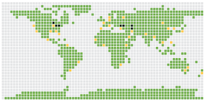
This is not Urble


Happy Urbling!


Friday, 26 February 2021

A super-simplified US election map

I admit that the world needs no more election maps, so I'll keep this brief.

I've been experimenting with animations and different kinds of data for my current series of QGIS training sessions so I'm always looking for interesting data to use. The coming week I'm doing a short course on animated maps so I thought I'd use the US county-level election results (lower 48 states only) to create a super-simplified map. The spikes are sized by total population in each county (e.g. you can see Los Angeles county to the west as the big spike) and they're coloured red for the GOP and blue for the Democratic Party. I've done some gifs and some still images and posted them below.

This gif will loop forever - click to enlarge

I consider this something of an experimental play thing but I think it's quite interesting so I'm posting it here. Again, just to be clear: 

  • Colour = party
  • Vertical size = total number of votes for a party, within each county 
  • Direction = animated from west to east based on the x coordinate of country centroids
  • Speed = fast, over 3,000 counties in 10 seconds
  • Purpose = a little carto/data experiment for my training sessions

Here's the mp4 version, hopefully no weird compression on here, but there often is.


Here's a still frame showing blue and red spikes side by side - a bit crowded but you get the idea.

I've added some transparency to the spikes here


Here are some still images.

Easy to spot Los Angeles County

Population centres are quite clear

Chicago stands out

As does NYC


It's a fake 3D effect

Animated by longitude

Speed appears to vary, due to density

Possibly helps highlight voter density

A one second blinking gif

Another one of my experiments


Another simple map - top ten Dem, vote count


Tools: QGIS, ffmpeg.
Data: https://github.com/tonmcg/US_County_Level_Election_Results_08-20/blob/master/2020_US_County_Level_Presidential_Results.csv


Wednesday, 8 January 2020

Land, people and political maps

This is a final map wrap-up following the UK General Election at the end of 2019, but also a follow-on from my last blog post: Land doesn't vote but it does matter. I'll explain more below, but let's start with a little gif, which fades in and out between the new political map of the UK at the start of 2020 and a different version of the same map, but showing only where there are buildings (in an attempt to scale the data to the underlying population more closely). I've included some interesting facts about people and land below, so do keep reading. Teaser: only 4.4% of the UK land area is Labour constituencies, in contrast to the 32.8% of the population who live in Labour constituencies, which is very close to their 32.2% vote share at the election.


Land matters, but it's good to see both

Here are the individual frames from the gif, below, in case you want to look at them a little more closely. It's a bit of a balancing act deciding upon what line width to use for the buildings-only map - too thick and it's just massive blobs of colour. Too thin and everything disappears, so what you see here is a kind of compromise that is supposed to reflect the pattern of the underlying urban fabric that would be visible on a satellite view, for example.

Buildings file available here

The political map of the UK in 2020


How many people live in areas with a Conservative, Labour, SNP or Lib Dem MP?
This is an interesting question, but not one I came up with by myself. I was asked for an answer to this question, and because I'd compiled all the data already it was a relatively quick bit of analysis to arrive at some answers. So, here we go - below - based on the latest UK mid-year population estimates from 2018.


  • 55.3% of the UK population (36.7 million people) live in areas with a Conservative MP. The Conservatives have 56% of the seats (365 out of 650). The Conservatives won 43.6% of the UK vote in the 2019 General Election.
  • 32.8% of the UK population (21.8 million people) live in areas with a Labour MP. Labour have 31% of all UK seats. Labour won 32.2% of the UK vote in the 2019 General Election.
  • 7.4% of the UK population (4.5 million people) live in areas with an SNP MP. But of course that's a bit of a silly statistic because the SNP only stand in Scotland, obviously. So, the relevant figure here is shown below. The SNP won 3.9% of the UK vote in the 2019 General Election. Note: obviously, the % population and % seat shares will be quite similar owing to the sort-of-equal population per constituency. For Scotland, both figures are 7.4% of the UK in terms of seats and population living there.
  • 82.7% of the Scottish population (4.5 million people) live in areas with an SNP MP. The SNP won 45.0% of the Scottish vote in the 2019 General Election and have 81.4% of all Scottish seats.
  • 1.7% of the UK population (1.0 million people) live in areas with a Liberal Democrat MP. They also have 1.7% of all seats. The Liberal Democrats won 11.5% of the UK vote in the 2019 General Election.

You can see the full spreadsheet here if you like - it includes all parties and has separate tabs for England, Scotland, Wales and Northern Ireland and it has a map of the results. It looks like this (below). I've used total population here rather than electors because that was the question I was given and of course MPs are representative for all people.

More interesting than you may imagine, perhaps

None of this is of course particularly profound or surprising but I'm thinking about it in the context of the maps above and in relation to overall vote share, so I find it interesting. 


How much of the UK land area does each party 'hold'?
Describing this correctly is a bit tricky, but what I mean here is what percentage of the UK's land area does each party 'hold' or 'represent'? That is, what proportion of the new political map of the UK is shaded blue, red, yellow, orange, green and so on? I do like the different kinds of political maps we see these days (including the now-ubiquitous hex cartograms) but I also like to see things mapped in a more traditional manner, so long as we also have a different way of looking at it and are aware of the underlying numbers and settlement pattern (hence the gif at the very top of the page).

Okay, prepare to be blown away, or not, by this geographical trivia.

  • 62.4% of the UK land area is covered by Conservative constituencies.
  • 4.4% of the UK land area is covered by Labour constituencies - yes, 4.4% (but of course that's because they are mostly urban and therefore geographically small, but still this low figure surprised me).
  • 19.5% of the UK land area is covered by SNP constituencies.
  • 60.4% of the Scottish land area is covered by SNP constituencies.
  • 5.6% of the UK land area is covered by Liberal Democrat constituencies (with thanks to Caithness, Sutherland & Easter Ross, clearly).
  • The full spreadsheet above has the rest of the data, including the individual UK country breakdowns.

The mid-2018 population estimates from the ONS put the UK population at about 66.5 million, with 56 million in England, 1.8 million in Northern Ireland, 5.4 million in Scotland and 3.1 million in Wales.

For land area, the UK as a whole is about 244,000 sq km (about the same size as Oregon, or almost exactly the same as the total area of the Great Lakes in North America). England covers 130,000 sq km, Northern Ireland 13,600 sq km, Scotland 79,000 sq km and Wales 21,000 sq km. The figures are in square miles as well as sq km in the spreadsheet.

What was that? You want more gifs, but different speeds and different sizes. Okay then, see below. 

More seriously - and there is a rationale here - switching relatively quickly between the two maps in this way helps highlight the ways in which the standard map view can, if we're not careful, give a distorted view of political representation. That's why I think in political mapping a mix of methods and numbers works best. Also, where we can use different kinds of approaches to explain this (like gifs) we probably ought to.

Fast enough for you? 

A mini version

This is a bigger version - click to zoom

Help


Okay, one last stat. 

What percent of the UK population lives in Constituencies where more than 50% of the votes went to the Conservatives? 

By my calculations the answer to that is 28,258,422, so 42.5% of the UK population which, it so happens, is not so far away from the 43.6% share of the vote. But that is definitely not a defence of first past the post!

Bye for now. 


Sunday, 14 July 2019

All English Premier League Grounds in 60 Seconds

I've been thinking a lot about information design, urban density and mapping things in context lately as part of my day job so I thought I'd experiment with all these things using an interesting example. To cut a long story short, I took Ordnance Survey data, extracted all 20 Premier League grounds, edited them slightly to match what's on the ground and then did some mapping. The results are shown below for all 20 teams (as of the 2019-20 season), starting with a gif and followed by some further explanation. All you need to know for now is that the main image in each graphic shows the stadia at the same scale as the rest and the little stadium silhouettes at the bottom are all shown at the same scale as well so you can make comparisons between the size of different grounds. I've made all files (including geo files of the stadia) available on this page.

Three seconds per frame, 60 seconds in total - mp4 here

I've always been interested in cities, urban history, football, deprivation street patterns and that kind of thing - and how they all interact - so this seemed like an interesting way to look at it. I did map this before in relation to deprivation but this post is just about showing each ground in its local context - all at the same scale and with just a little bit of additional information for each one.


What I've attempted here is to produce a set of individual images and a gif (I also did an mp4 version) that loops through each ground, gives some basic information about each, shows where it is in England and also shows you how it compares in size and local context to all the others. I've added in some street names but not all, because that makes it far to busy and harder to read. 

I've been to a few of these grounds to watch a match - most recently to Goodison - and I used to drive past Old Trafford almost every day on my way back from work but for lots of others I'm not familiar with them so I wanted to produce a set of simple visuals that clearly shows each ground in context. I really find some of the older ones interesting, the way they are packed tightly into their surroundings - like Anfield. But this was really an experiment in layout and map design more than anything else; I just used this dataset as it was interesting.

As for the colours along the bottom, I used the colours for each team on their official website, though for some there are more than one and for at least one (e.g. Man City) I used a darker one so it would show up better on the stadium silhouette. 

And, oh yes, I was probably thinking about this topic because for the first time in a decade Sheffield will have a team in the Premier League (just not the one in my neighbourhood!).

You can find all the original files - 20 high resolution images plus a gif and an mp4 - here.

Data sources: for the club information it was a mix of Wikipedia and the Premier League website. For the outlines of the grounds I extracted these - then edited them - from Ordnance Survey's OpenMap Local product. The background imagery is Google satellite view. The street names are also from Ordnance Survey but I extracted these from the OS Open Zoomstack local roads layer and then symbolised them just to show a few of the road labels. I thought this was important given the significance of some local roads and how several grounds are named after them - or parts of grounds are. 

Software: I did the mapping in QGIS 3.4, I created the gif with GIMP, and the mp4 I made with ffmpeg. For resizing and cropping and otherwise editing the image outputs I used IrfanView. The font is Montserrat, one of the free Google Fonts and a current favourite of mine.


Sunday, 20 January 2019

A little post about a geogif

This is a short post about map-based animated gifs (i.e. the humble geogif). It's not about general elections in the UK because that would not be a sensible topic. It's a bit about design choices, just in case anyone is interested, and it's also a bit about the method and data. Here's the final gif, below, which I posted on twitter recently. I wanted to make something that told the story of the 2017 General Election in a short time frame - in this case 30 seconds.

This is about 4.7MB

In the original version of this, the large font was too thin so in this version it's bold and easier to read. You could probably tell what it shows and how long it takes to show it, but with this text there is no doubt. This stems from the redundancy principle that you'll hear John Burn-Murdoch talk about in relation to his work with the FT. I've used Raleway as the font, though I think perhaps I should have chosen something slightly cleaner. I'm not that keen on the numbers with Raleway, though it is a lovely font. By the way, this was all done with QGIS Atlas and only one map layer. See bottom of page for the sources.

The constituency names are displayed incredibly quickly below the main text (for 46 milliseconds each). Not because I want them to be read; more for effect so that people can pick out names they know as it runs through. Of course, it's also so that when you pause it you can see which constituency we're up to (more relevant in other formats). Then when the name of a constituency appears, the corresponding hexagon to the right has a black border to it. Not thick enough here probably, but you should be able to see it.

Since the results file from the House of Commons Library is so detailed, I was able to add the time each result was declared, which I did as a digital clock. Again, adding a bit of redundancy in making the times work like a clock, just in an attempt to speed up cognition. Below the clock the number shows the order of the result (from 1 to 650) and whether the result was a hold or a gain from another party. I added a green banner to the top left to say when the General Election was. I did use the numeric format for this in an earlier version, but there are two problems with this: i) I think it's more difficult to process compared to seeing the word 'June' in there; and ii) we can't have our US friends thinking the election was on August 6th. I like to avoid doubt in such situations. That's why I moved house on the 8th of August 😉.

I also wanted to add a chart because you can't tell just by looking who actually wins the most seats. That's why in the final version I added the animated bar chart in the top right (previously it was a boring, non-animated one). This was also done using QGIS Atlas. I think this helps tell the story of the night as it's often the case that in more urban, tightly-packed constituencies (where Labour do well) the counts are quicker and they race off to an early lead. It also gives it a bit of jostling for position/race feel to it, which I like.

At 03:12 Labour are in the lead

According to the data, it wasn't until Daventry, the 498th declared result, that the Conservatives gained the lead from Labour. This happened at 04:09 in the morning.

Celebration or desolation, depending upon your allegiance (possibly)

"Hey, why did you lump my favourite political party into the 'other' category"?

Fair comment. You're right, it's not very nice, but I didn't want to add ten bars so this is what we have. Plus, I thought it wouldn't be too much of a stretch since the lower numbers of the individual groups within the 'Other' category mean they can easily be counted.

I added the numbers to the bars for completeness, and because it wasn't that difficult, and of course the party labels below the bars.

All I wanted to do here was tell the story of the 2017 General Election in a 30 second gif, deliver a lot of information in doing it and have a bit of fun. The idea is that you watch it multiple times to get the story of the evening. Each frame is on for about 0.046 seconds, so the whole thing lasts about 30 seconds. Well, it would have lasted 29.9 seconds but I kept the last frame on for 5 seconds to give viewers a breather and some time to process things before it re-loops.

Now for a few words on the method.

Method
The basic method is to create a set of individual images which are then used as single frames displayed for a short duration in a gif. I do this using QGIS Atlas. You can create gifs from a set of images in a number of different ways, but I use GIMP because it works really well, is open source, not that difficult and you can optimise the animation so the file size is low. The method is described in an earlier blog post I did, from about half way down the page.

When exporting the gif you can choose the duration of each frame, but I like to have the final frame on for longer, at least a few seconds, so that people have time to take in what they are seeing after the rapid fire sequence of frames before it. There's a nice script you can use to set the frame duration of all frames automatically and then you can change the final one manually.

Export options for gifs in GIMP

What I normally do is export individual images from QGIS Atlas at 300dpi and then I batch re-size them in IrfanView, normally to max width/height of 1000 pixels. IrfanView is simple but surprisingly powerful and I've used it for about 15 years now. It can do just about anything, apart from solve Brexit (though I suspect it could do that too). I have found that I get a higher image quality doing it this way, rather than exporting images at 1000 pixels from QGIS.

If I need to convert images to mp4 instead of gif, then I'll use ffmpeg, which is a command line tool. If that scares you, then you'll probably find ezgif very useful - and I believe it uses FFmpeg behind the scenes anyway. The advantage of mp4 is of course that you can more easily pause/rewind and add music and suchlike. But if you upload a gif to twitter it will actually convert it to a slightly different gif format that can be paused.

When I follow this method, gifs on twitter always look nice and crisp.

In a QGIS Atlas of this kind, it's normally the case that only one feature would be showing at a time, but thanks to a tip from GIS guru Ian Turton I've done it cumulatively so that previous features remain on the map and it builds up until the map is fully coloured in.


Software
As above, it's a mix of QGIS, GIMP, IrfanView, FFmpeg, and hardly ever anything else for geogifs. If you've not used FFmpeg for creating/editing/converting video files then you might want to check it out. It can be confusing but it's really, really powerful. I also used it recently to create an mp4 file from a series of Google Earth Studio images, as below (though I cheated and added in the text and audio using Filmora).

Check this out for the method

Data sources
For the hex grid of the 650 UK Parliamentary Constituencies, I used Ben Flanagan's file, which you can download from ArcGIS online. This file is licensed under a Creative Commons Attribution 4.0 International License, which in simple terms means you can use it, adapt it, share it and so on. For the colours, I used those from the BBC website because a) I like them, b) people are familiar with them and c) they know what works. I also used the 'detailed results by constituency' file (see bottom of this page) from the brilliant team at the House of Commons Library.