Showing posts with label render. Show all posts

Friday, 11 June 2021

Arterial Cities

I was recently experimenting with some circular city layouts in QGIS in preparation for my Automatic Knowledge QGIS training sessions. After a bit of playing around, I ended up creating a set of city models in Aerialod. I'm calling them 'arterial cities' because they show cities criss-crossed by major arterial road and rail routes but also because they're kind of art as well. I've now done this for 50 towns and cities across Great Britain - using a 5 mile diameter circle on top of a 10x10km plinth. Here's a close-up of one of the London ones (below). I've posted a selection of the others further down, but if you want the original high resolution images for 50 towns and cities you can find them all in this folder. As one of my earlier tweets said, this might be a useful way to show how cities are divided by road and rail infrastructure and highlight things like urban permeability. If you want to learn about the method, scroll to the bottom of the page.

London in a new light

Some examples

The final set of 50 arterial city models include the major cities plus a selection of other places, chosen for a variety of reasons such as location, urban form, size, and a bit of personal preference. For London, Cardiff, Birmingham, Leeds, Manchester, Glasgow and Edinburgh I also created some large, re-coloured, and also zoomed-in renders and you can find them in the shared folder as well. Ok, so let's take a look at some of them, starting with Leeds, because it's really quite fascinating. I'll say a bit more about specifics below, but in all the graphics the rail lines are the highest features, followed by major roads and then minor roads, with buildings being slightly higher than the minor roads. This 'major' / 'minor' thing isn't perfect of course but that can always be tweaked.

Lots of big roads and rail lines (I've recoloured this one)

Glasgow has lots of roads and rails

Spot those motorways

Quite a pleasing ring road here

A real cross-cross of routes

No hills are shown in any of these

Lots of barriers

A very interesting one I think

Interesting compartments here

A real mix of old and new patterns


Hopefully there is something here that you find interesting. Let me also post a few of the zoomed in versions I did, focusing on the lettering in the top left of the plinths. I've changed the sun direction on these ones so it's coming from the north.


Little details that I find interesting
I've done quite a lot of visualisation with Aerialod before and written up a few tutorials but this is the first time I've made this kind of graphic and it wasn't planned. Even so I think the approach can be quite useful at highlighting city structures and there are a number of elements in the design that interest me. The first is when the text of the city name overlaps the city fabric, like in the Newcastle & Gateshead example below.

I just like the way it looks

I also like the way the railway lines in some cities appear to fray at the end, as the lines diverge to different platforms - like in the example below showing Euston, St Pancras and King's Cross in London. 

I just like the way these look

Then of course we have other features like roundabouts and grid patterns, for which we can use Milton Keynes as the pre-eminent example. I think the light and shadow does a good job here.

There are more roundabouts than you can see


In quite a few of the coastal cities it looks like there is only half a city, just because when I extracted the images from QGIS I did so using a distance of 2.5 miles from the city centres. So for places like Hull, Brighton and Bournemouth you'll see half a circle. But in other places it shows how they are connected to places across the water, as in Liverpool or in Dundee (below) and I quite like this tethering effect.


Tethered across the Tay

Also quite interesting, given that Euro 2020 is now in progress, is the way you can see many football stadiums and this can often help us get our bearings when we see them. So, for example, in the snapshot below we can see Celtic Park to the east of the image and Hampden to the south of it. This one below has also been recoloured, like the Leeds example above, but they are both available in the original gold tones in the shared folder.

Hampden: home of the Euro 2020 champions

There are loads more interesting details, so I'll leave you to look for yourself. For now, I'll leave you with Oxford because I think the urban structure here is both unusual and fascinating. 

Take a look at the real place on Google maps


Okay, so that's the graphics and what I think about some of the details. The rest of the post is about how I made these so read on if you want more information on that.

If you want to make your own prints out of any of the graphics on the shared folder, be my guest.


Stage 1: prepare your images in QGIS
For these graphics I used OS Open Zoomstack data and specifically the five layers below - they are layered in this order in the QGIS Layers Panel and the greyscale colour I used for each of them is shown in brackets. The greyscale colour values determine how much or how little Aerialod extrudes features because that's just how it works - white (#ffffff) will be the highest and black (#000000) shows up as a hole, just like the little Ordnance Survey credit in the bottom left of my images above. I quite like using black to give a kind of cut-out effect with text.

  • roads_national (0.35 line thickness, #4d4d4d - this is 30% greyscale)
  • rail (0.25, #595959 - this is 35%)
  • roads_regional (0.25, #404040 - 25%)
  • roads_local (0.1, #262626 - 15%)
  • local_buildings (#2b2b2b - 17% and with a 0.05 mm stroke width on the building polygons)
I prepared these in the QGIS Print Layout using the Atlas tool so I could automate it (see my previous tutorial on that) and I added text labels for the city, my twitter handle (bottom left) and the OS credit (bottom right). The background page colour in the Print Layout is #1f1f1f (12% greyscale) rather than black because if it's black it won't show up in Aerialod - although this is good if you want to make these without a square plinth. 

What they look like before adding them to Aerialod


Then I just exported the images at 1200dpi as png files straight out of the QGIS Print Layout. I have put all the images in this shared folder for anyone who wants to try making the graphics in Aerialod but doesn't want to do the QGIS bit.


Step 2: load the images into Aerialod and go wild with the settings
Aerialod is an interactive path tracing renderer for height maps in Windows and that's what I used to create the graphics on this page. It is pretty easy to get started but it can also be a bit baffling and there are so many options - many of which may not be obvious to the casual user. So, rather than mess about telling you what I did and making all kinds of suggestions I'll just show you the settings I used to create these images, in the screenshot below.

I exported these at 3840x2160 pixels

The only thing you need to be aware of is that it could take hours to render just a single image at this size - it all depends upon your computer. I have quite a powerful machine with 64GB of RAM, an i7-10700KF CPU running at 3.80GHz and a NVIDIA GeForce RTX3070 graphics card. Without the latter piece of equipment in your machine - if you just have a basic graphics card - the rendering could take hours, or maybe never.

You can spend hours, days, months messing about with the settings in Aerialod and there are an almost infinite range of possibilities in terms of light, shade, colour, tone, extrusion and so on. You can of course achieve similar things using tools like Rayshader or Blender but Aerialod is deceptively simple, yet impressively powerful in my opinion (once you get past the initial steps of what does what).

One thing that is not immediately obvious, or indeed obvious at all, is how to achieve the blurred/focal point tilt-shift effect you see in the example below for London. This is done by clicking on the area of the map you want to be in focus. When you do that, the Focus setting on the right of Aerialod changes and you see the blur effect everywhere you didn't click.

You can go round in circles with this kind of thing


Note the Focus value on the right

Want to achieve a totally different, less glowy kind of aesthetic? Well here are some other settings you might like.

The key difference here is the 'SKY' setting on the left

And one more, like above but slightly tweaked.

Intensity (left) and Exposure (right) adjusted in this one

And if you want to remove the plinth completely, you just need to reduce the Offset value on the right in Aerialod, as shown below.

I also quite like the plinth-less approach

This is the big plinth-less version, rendered as above


This is my way of doing it although if you see the original twitter thread mentioned above you'll see loads of different kinds of examples. 

Hey, could you do it with buildings extruded more realistically in 3D? Yes, but that's for another day.

In this example I've used building height data from Emu Analytics


Thursday, 12 November 2020

How to make a 3D population density render for any country in the world

This blog post explains how to make a 3D population density render for any country in the world, using open data and free software. The main tool I'll use (Aerialod) is Windows-only at the moment, but it is amazing. I say 'render' rather than 'map' here because the images you'll generate are rendered by Aerialod, which is, technically, a 'path tracing renderer' rather than a piece of mapping software. But feel free to call them 3D maps - either way, this is an example of what they look like. 

Global population density print


But why do this? Well, partly because it's an interesting and often informative way at looking at population and settlement patterns, but also partly because this particular method produces nice-looking graphics. Perhaps the best answer I could give here is that's it's a combination of aesthetics, insight, and interest. In the image below, for example, we can see a lot of what we might already know, but it's often in the comparisons within and between places that we learn new things and that's also part of the point here - it can give us a new perspective on the world.

Singapore, KL, Medan, Ho Chi Minh City, etc


The ingredients

What do we need to make a population density map like this of a single country? Well, it can be done in different ways, and you may have your own method, but the basic ingredients are outlined below. I'm going to use the example of the United Kingdom as a single country, but the data source I use has data for all countries in the world, so you can pick whatever you like and replicate the method. So, here's what we need:

  • Some population data, preferably in raster format
  • A tool to render it in 3D
For the data, there are a few different sources, including the European Commission's GHSL data and NASA's GPWv4 but here we're going to use WorldPop population density data. These datasets are all free and open (CC BY 4.0), and all have 1km resolution versions, but WorldPop allows you to download individual countries, for each of the years from 2000 to 2020, so I'll use that here. Just a note of caution now to say that '1km' means '1km at the equator', or 30-arc-seconds - so if you're at 50 degrees north then the cell will still be 1km in height but it will only be about 80% of that width. Also, you should read the WorldPop - Mapping Populations page about the data, so that you understand what it is, and how it was created.

For rendering the world as a 3D population surface, there are again lots of options, the best of which is probably Blender. This is free, open source and extremely powerful but it's not what I'm using here. Instead, I'm using Aerialod by @ephtracy. I've previously written tutorials on how to use this for different kinds of data, but here' I'll focus on population density renders. 


About the vertical dimension of population density datasets

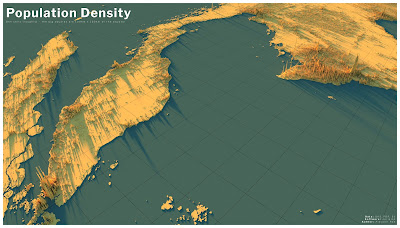
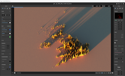
You can just download some data from WorldPop for a single country, in tif or asc format, and then just dump it in Aerialod, but when you do that with population data, something like this will probably be the result (below). This is the 2020 UK population density file from WorldPop, opened in Aerialod. I'm showing you this here as a way of explaining what Aerialod does and what you need to understand before you try to map population density in this way. 

What the tif?


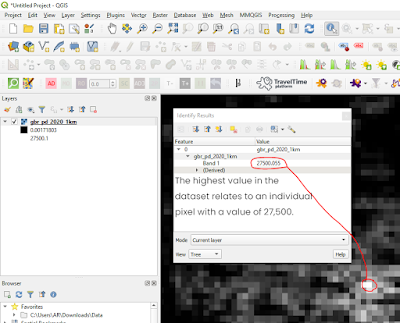
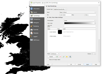
The gbr_pd_2020_1km.tif file from WorldPop (2,372KB) is a simple black and white raster image, measuring 1,250 by 1,321 pixels (you can see this in the image properties when you download it). But the individual pixel values have population counts in them. So, when I open the file and inspect it in QGIS (below) I can see that the highest pixel value is 27,500 - and since Aerialod extrudes the vertical dimension according to individual pixel values, what we see in the image above when we open it in Aerialod is a kind of population density tower 27,500 high and only 1,250 wide by 1,321 high. Not exactly very useful. So, we have a 1km area of London with 27,000 people in it and this then gets extruded 27,500 units on the z dimension in Aerialod, while our x and y units max out at 1,250 and 1,321 respectively. Next step is to fix this.

We need to re-scale this file in order to use it


Scaling population density data in QGIS

This is probably the most important bit. I will say now that there are lots of different ways to do this next bit, but ultimately what we are trying to do is arrive at a situation where we can show population density patterns in 3D that provide a useful overview of the settlement patterns in different countries, or the world as a whole. I used a different approach in the image at the top of this blog post, plus different data (GHSL), but it is based on the same principle. The following is a simple workflow to take a tif file from WorldPop and then rescale it so you can use it in Aerialod. If you were mapping something with much lower actual values (e.g. elevation) then you don't need to do this re-scaling.

  • Open the population density tif in QGIS. It should just display as a black-to-white image, with low population counts in darker colours and lighter shades for the highest values. You can see this in the screenshot from QGIS above.
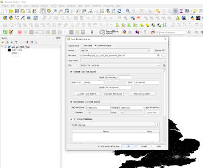
  • Right-click the layer > Export > Save As... and then you want to change the Output mode to Rendered image, select a folder to save it to, plus a file name, and then click OK. This will add another raster layer to QGIS. You can see a screenshot of this below.
  • You'll see that the new raster layer in QGIS looks exactly the same, but it's not. Instead of the actual population values in each pixel, the values go from 0 to 198. This is what the Rendered image save option does - it scales the image using pixel values in the range from 0 to 255, where 0 is black and 255 is white. 

Saving as a rendered image

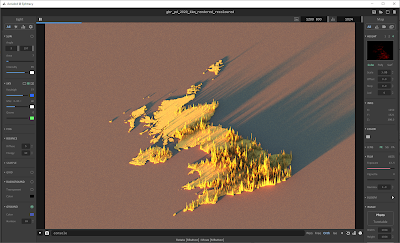
  • When we add this new rendered image to Aerialod, and then change some of the settings (as in the screenshot below), we do get quite a good visual representation of population density.
  • But, there's no land and the old 0 to 27,500 range has essentially been reclassified from 0 to 198, which means that the full range of classes (up to 250) hasn't been used. We'll fix that in a minute but first here's the result, below. As you can see, this does a pretty good job of illustrating the broad sweep of population density across the UK. If you're struggling with Aerialod here, you may need to go back to the links at the top of the page and see my tutorials on it, but all I did here was drag and drop the tif into the main Aerialod window and then change the settings, as per the screenshot.
This works pretty well - but there's no land


How do we get the land to appear? (don't use black for 0)

This next bit is about how to change the raster image before exporting it so that when we add it to Aerialod we can see the land as well. There are loads of ways to do this, but here's one simple way that works well. This step is only really necessary if you want land to appear. I prefer doing this because it then gives me the option of including the land, or not (i.e. you can make the land disappear by changing the Offset value in Aerialod to something like -2.0 in this case). 

  • Go to the original raster layer (in our case the one that goes from 0 to 27,500) and then in the Layer Properties, Symbology section, we change the Render type to Singleband pseudocolor
  • What you need to do here is edit the colours so that the ramp goes from almost black (but NOT black - so don't use RGB 0, 0, 0 or #000000) to white. Aerialod will interpret the darkest colours as low values and white as the highest values - see below for a screenshot on this.
This is one way to do it


  • Once you've done this, you can then save the layer as a Rendered image from QGIS, just like we did above. It will then add a new dark to light raster layer to QGIS, just like before. Unlike before, however, when you click on a cell in QGIS with the Identify Features (i) tool, you'll get a value from just above 0 to 255, instead of the population count. 
  • Check: are all your highest population spikes the same height, meaning they look truncated or flat-topped? If so, this means you probably need to adjust the light-dark colour gradient again in QGIS before exporting it and loading it in QGIS. This sometimes happens in the highest density areas so it's worth looking closely at it and then if it does happen, re-scale the data in QGIS using a different kind of classification (e.g. instead of Continuous you could try equal Interval or even Quantile). Also, just remember that this approach is quite a simplified visualisation approach to displaying population density data. The vertical extrusion is not super-precise, and of course depends upon the method you use to create the rendered tif. The idea with the approach outlined here is to give a good general overview of population distribution and density in a country.
  • N.B. there are loads of different ways you could do this step, including the use of different colour ramp modes (e.g. continuous, equal interval, quantile) or you could re-classify the raster using a scaling factor (e.g. divide all values by 1,000), or do it in an image program, but here I am aiming at simplicity and a method that allows us to quickly arrive at a result that is both interesting and broadly representative of the spatial patterns of density on the ground. 
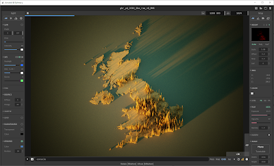
  • So, what does it look like when we add it to Aerialod now? Well, see below for the new image.
Reduce the Offset (on the right) to remove the land


The point of this is to be able to create a 3D render of population density in any country, and this is one way of achieving that. For things like this, where I am striving for broad-brush patterns and workflow efficiency, rather than precise measurement from pixel values, I will often take shortcuts to achieve what I want - so for example, in the image below I have 'reprojected' the data by manually re-sizing it in IrfanView and then saving it as a png file, which ended up being 289KB in size. Try downloading it and dropping it into Aerialod and then replicate the settings I've used below - I think this one has the makings of something quite nice, and you can replicate it for any country. I have also added a similar file for France (as of 21 Nov 2020).

All this from a 289KB png file + Aerialod


I want to map the whole world this way!

Okay, no problem. You can get global population density layers in a few places, but probably the most convenient are WorldPop or GHSL. The WorldPop ones can be found at the bottom of this page - look for the 'Unconstrained global mosaics' link. For the Global Human Settlement Layer (GHSL) data, published by the European Commission, you'll want to head to their excellent Download page. Once again, I'd advise anyone using this data, or any kind of data, to read about what it is and in this instance the FAQ page is particularly useful. 

Most of my population density mapping in the past has used GHSL data. One great thing about the GHSL download options is the ability to pick different projections, so that you don't just have to use WGS84 - this is still good, but the further you go from the equator, the narrower the area represented by each cell. This is not the case with the Mollweide option, since it is an equal-area projection. But this is something you should look into further yourself if you're interested. 

If you do download a global file, you need to be aware that Aerialod can handle images at a maximum of 16,384 pixels in width or height, and the world is more than 16,384km wide. So, if you do download a global population raster, you will need to re-size it in whatever software you use (I always use IrfanView for this) so that it is less than the maximum pixel size allowed in Aerialod - I normally just re-size to 16,000 pixels. 

This means that the 1km cells are no longer 1km but closer to 2km, but at a global scale the pattern is very similar. I've created a small-file-size global raster (2.21MB), with the Pacific in the middle rather than the Greenwich Meridian, and shared it via Dropbox so that you can experiment with it as well. See below for what it looks like when you drop it in to Aerialod with the settings as per the screenshots.

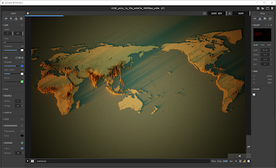
This is the whole world, from a 2.2MB png


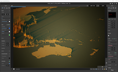
Zoomed in, and exaggerated heights


Recap

I could say a lot more about methods and how to tweak this and that, but the aim of this post was just to show you how to create a 3D population density render of any country in the world, and I've done that now, using the United Kingdom as the example country. All I would add is that if you're struggling with Aerialod, then you should go back to my original blog post on it, plus the earlier one linked to in it. It's definitely also worth spending time reading about the data sources I have mentioned.

I hope you have found this useful. If you get a lot of use out of Aerialod, and you are able to, perhaps consider making a donation to @ephtracy - the creator of this great piece of software. I have done so in the past and hope to do so again in the future.


Data sources

I've linked to the data sources throughout this post, but I'll do it again here so they're all in the same place. This is all open data, with each one licenced under the Creative Commons - Attribution 4.0 licence (CC BY 4.0). 

  • Worldpop.org - WorldPop really is an amazing project and in fact one of the best data resources currently in existence, in my opinion. It has so much beyond population data, so even if you don't want to map population patterns it's 100% worth checking out. Note that in the data section of the website you'll see both 'Population Density' and 'Population Count' but here I've used the population density data. It's worth spending some time on the website to see what's available and also to understand what the data represent and how it is all collected. You can get this data either as a tif, like I've used above, or as a csv file.
  • Also one of the best population data resources currently in existence, the Global Human Settlment Layer has the advantage of going further back in time, with a total of four time points - 1975, 1990, 2000 and 2014. The GHSL project is supported by the Joint Research Centre (JRC) and the DG for Regional and Urban Policy (DG REGIO) of the European Commission, together with the international partnership GEO Human Planet Initiative. If you download this data, there are LOTS of options, but what you need if you want to map population density is the GHS-POP option. I've mostly used the 2015 data, at 1km resolution, in Mollweide or WGS84 projection for the whole earth, but you can also just download single tiles. This data is available in tif format.
  • NASA's Gridded Population of the World, version 4 - another excellent source of global population data. The GPW v4 home page explains everything about it, and all the different variants available, as well as previous versions. 


Friday, 8 November 2019

Amazing 3D rendering with Aerialod - a tutorial

One of the more exciting developments in recent years for those of us into geospatial things is the arrival at the end of October 2019 of Aerialod by ephtracy. What am I talking about? I'm talking about being able to create the kind of images you see below in only a few minutes using free software and open data. Scroll past the images for some tips on how to do this, and note that this write up was completed on 8 November 2019 and refers to v0.0.1.

The Cuillin ridge in Skye

Part of the City of Belfast in Northern Ireland

This is indeed a little bit of London

A little circular bit of London

This is also London, for Millwall fans

The Cuillins in Skye, featuring Sgùrr Alasdair

This is Sheffield, around the area where I work

Okay, so how do you get up and running? First of all, go to the Aerialod website and download the package you need. It's Windows 64- or 32-bit only for now and you just download and unzip and then run the .exe to launch Aerialod.

You do get some sample raster data in the zipped download (in the 'map' folder) but if you also download the 'Sample Maps' archive next to the software download button you'll get a central Manchester Lidar png and a Mars (yes, the planet) png. This is a nice reminder that Aerialod is able to handle different formats, including .asc, .png. and .tif for example. I haven't tried any other formats though I think you'll be okay with .jpg too.


They don't look like much here, but wait and see!

When you launch Aerialod you'll see something pretty much like the image below - and it will have that blocky sample layer in there. This is useful for playing around with so you can get to grips with navigation etc. Just note that when you zoom or move around Aerilod may briefly look pixelly/fuzzy as it re-renders, so don't worry about that. It sharpens up perfectly once it's done, although with more complex layers it takes a bit longer.

You may be a bit bewildered at first, but it won't last long

Before I forget, be sure to look in the config folder and open the hotkey.txt file, which I've shown below. That's really useful. But I find mouse navigation easier, so read on. Also note that the second section of hotkey actions below combine a left mouse button click with keyboard actions too.


Hit D and be amazedx

If you are finding the interface too small and can't actually see the icons easily (e.g. if you have a 4k monitor or something like that) then you can use CTRL + or - to scale the UI but you could also just edit this bit of the config.txt file (in the config folder) so instead of 1.0 it says 2.0, like below:

view :
{
// 0.5 ~ 3.0
ui_scale : '1.0'
}


Okay, we're all set now so here are the basics of moving things around:


  • Scroll wheel/middle mouse button - you can scroll forwards and backwards to zoom in and out and with the button pressed down you can position the layer wherever you want. 
  • Right mouse button - tilt/pan/rotate etc. Just have a play and you'll see what I mean.
  • And of course with keys, as above, W to zoom in S to zoom out, D to rotate clockwise and A to rotate anti-clockwise.

You loaded the software, figured out navigation with the sample data but now want to render some real world stuff. See below for how to do that.

There are tons of sources for this, including things like NASA's 30 metre SRTM but really it's going to look best with high-resolution DSM or DTM data and for this Lidar is ideal. On the Aerialod page they link to two potential sources of this - the UK's Defra Lidar page where you can download a variety of 25cm, 50cm, 1m and 2m Lidar data for England or get NASA's HiRISE data for elsewhere in the universe.

To get data into Aerialod, the easiest method in my opinion is just to drag and drop a raster file straight in, so that's what I just did with the Manchester.png layer you can see in the screenshot below. To be clear, what you see below is just the result of me dragging and dropping a png file into Aerialod. I haven't done anything else yet.

That was easy!

Before I say more about settings, a word on getting data into Aerialod in other ways. In the top right of the window you'll see a save icon. That will save the raster layer (not the 3D render) to a location of your choice. The next button (the open folder icon) will let you open a new single layer instead of dragging and dropping into the window. The next button (the closed folder icon) is a bit different, but it effectively allows you to stitch together all layers in a single folder, and it's amazing. Just click one item in the folder and it will add them all, as you can see below. The final button (blank page) just starts a new Aerialod blank view.

Stitch multiple files!

Okay, see below for where I've used the open folder button to add a single layer. This is for a single tile (of about 7MB) near the University of Sheffield. In the image below this, I've used the closed folder icon to select the first item and then all layers are added. You don't actually have to select the first item though, just any of the files in the same folder. This is really handy as when you download Lidar data it's more than likely going to be comprised of lots of little chunks as individual files.

Single layer from within a folder

All layers from within a folder

If you get too greedy and try to add a gazillion zigabytes of data, Aerialod may crash. I know, I've tried. Anyway, for the rest of this tutorial I'm mainly going to use the Manchester.png sample file provided on the Aerialod download page - and what you see below is the result of me just dragging and dropping it into the viewer. This covers a good chunk of Manchester city centre and also a bit of Salford and Trafford and to the left of the image below you might just spot Old Trafford - both the football and cricket ground.

Just another sunny day in Manchester


Okay, so the rest of this will cover the main things you need to know but I can't cover everything because a) that would take too long and b) I don't actually know enough to tell you everything and I'm kind of learning as I type here. So the two annotated screenshots are my main contribution for now. Look at the images closely though and you should learn enough to produce great visualisations in not much time at all.

Click on the next two images for a little explainer of what does what and then try it yourself.

This covers the basics, click to expand

Some more tips - including on Focus


Offset - actually quite useful for flood viz
A full screenshot so you can see some of the settings here

That's basically it for now. All that's left to say is don't forget to check the #Arielod hashtag on twitter as well as the @ephtracy Twitter feed. Last of all, don't forget that you can drop all kinds of things into Aerialod, not just terrain models and suchlike. I've experimented with adding in photos of people, which often looks sort of cool but also weird, and I've tried all sorts of other stuff but I'll end with one of the MiniScale raster relief maps of Great Britain which are part of their open data offering. It's not intended to be used this way but I think it looks quite interesting.

This actually turned out alright