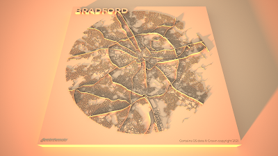
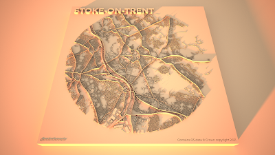
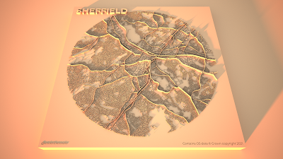
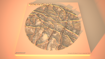
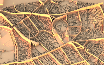
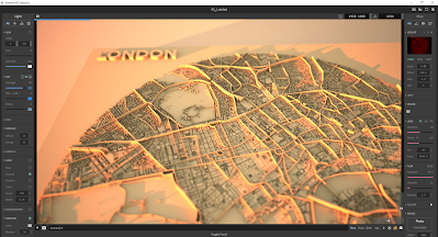
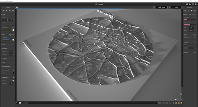
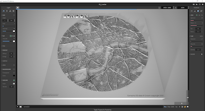
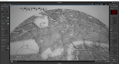
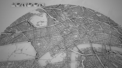
I was recently experimenting with some circular city layouts in QGIS in preparation for my Automatic Knowledge QGIS training sessions. After a bit of playing around, I ended up creating a set of city models in Aerialod. I'm calling them 'arterial cities' because they show cities criss-crossed by major arterial road and rail routes but also because they're kind of art as well. I've now done this for 50 towns and cities across Great Britain - using a 5 mile diameter circle on top of a 10x10km plinth. Here's a close-up of one of the London ones (below). I've posted a selection of the others further down, but if you want the original high resolution images for 50 towns and cities you can find them all in this folder. As one of my earlier tweets said, this might be a useful way to show how cities are divided by road and rail infrastructure and highlight things like urban permeability. If you want to learn about the method, scroll to the bottom of the page.
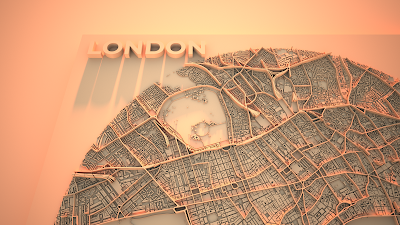 |
| London in a new light |
Some examples
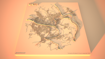
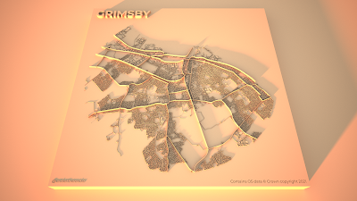
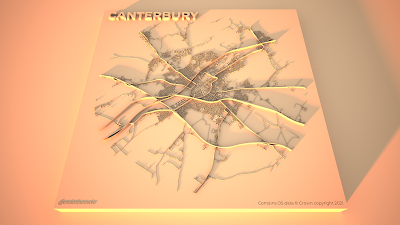
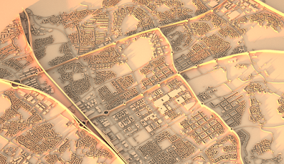
The final set of 50 arterial city models include the major cities plus a selection of other places, chosen for a variety of reasons such as location, urban form, size, and a bit of personal preference. For London, Cardiff, Birmingham, Leeds, Manchester, Glasgow and Edinburgh I also created some large, re-coloured, and also zoomed-in renders and you can find them in the shared folder as well. Ok, so let's take a look at some of them, starting with Leeds, because it's really quite fascinating. I'll say a bit more about specifics below, but in all the graphics the rail lines are the highest features, followed by major roads and then minor roads, with buildings being slightly higher than the minor roads. This 'major' / 'minor' thing isn't perfect of course but that can always be tweaked.
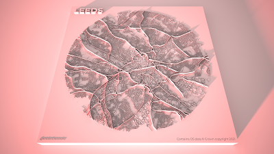 |
| Lots of big roads and rail lines (I've recoloured this one) |
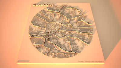 |
| Glasgow has lots of roads and rails |
 |
| Spot those motorways |
 |
| Quite a pleasing ring road here |
 |
| A real cross-cross of routes |
 |
| No hills are shown in any of these |
 |
| Lots of barriers |
 |
| A very interesting one I think |
 |
| Interesting compartments here |
 |
| A real mix of old and new patterns |
Hopefully there is something here that you find interesting. Let me also post a few of the zoomed in versions I did, focusing on the lettering in the top left of the plinths. I've changed the sun direction on these ones so it's coming from the north.
Little details that I find interesting
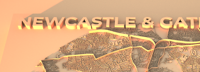
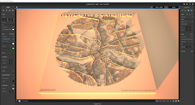
I've done quite a lot of visualisation with Aerialod before and written up a few
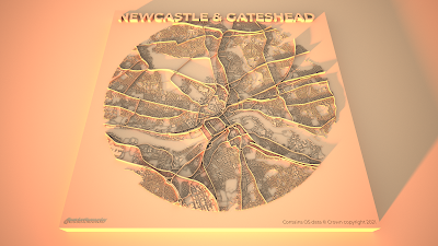
tutorials but this is the first time I've made this kind of graphic and it wasn't planned. Even so I think the approach can be quite useful at highlighting city structures and there are a number of elements in the design that interest me. The first is when the text of the city name overlaps the city fabric, like in the Newcastle & Gateshead example below.
 |
| I just like the way it looks |
I also like the way the railway lines in some cities appear to fray at the end, as the lines diverge to different platforms - like in the example below showing Euston, St Pancras and King's Cross in London.
 |
| I just like the way these look |
Then of course we have other features like roundabouts and grid patterns, for which we can use Milton Keynes as the pre-eminent example. I think the light and shadow does a good job here.
 |
| There are more roundabouts than you can see |
In quite a few of the coastal cities it looks like there is only half a city, just because when I extracted the images from QGIS I did so using a distance of 2.5 miles from the city centres. So for places like Hull, Brighton and Bournemouth you'll see half a circle. But in other places it shows how they are connected to places across the water, as in Liverpool or in Dundee (below) and I quite like this tethering effect.
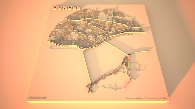 |
| Tethered across the Tay |
Also quite interesting, given that Euro 2020 is now in progress, is the way you can see many football stadiums and this can often help us get our bearings when we see them. So, for example, in the snapshot below we can see Celtic Park to the east of the image and Hampden to the south of it. This one below has also been recoloured, like the Leeds example above, but they are both available in the original gold tones in the
shared folder.
 |
| Hampden: home of the Euro 2020 champions |
There are loads more interesting details, so I'll leave you to look for yourself. For now, I'll leave you with Oxford because I think the urban structure here is both unusual and fascinating.
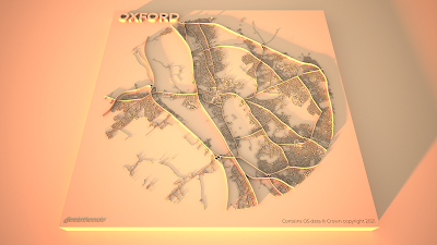 |
| Take a look at the real place on Google maps |
Okay, so that's the graphics and what I think about some of the details. The rest of the post is about how I made these so read on if you want more information on that.
If you want to make your own prints out of any of the graphics on the
shared folder, be my guest.
Stage 1: prepare your images in QGIS
For these graphics I used
OS Open Zoomstack data and specifically the five layers below - they are layered in this order in the QGIS Layers Panel and the greyscale colour I used for each of them is shown in brackets. The greyscale colour values determine how much or how little Aerialod extrudes features because that's just how it works - white (#ffffff) will be the highest and black (#000000) shows up as a hole, just like the little Ordnance Survey credit in the bottom left of my images above. I quite like using black to give a kind of cut-out effect with text.
- roads_national (0.35 line thickness, #4d4d4d - this is 30% greyscale)
- rail (0.25, #595959 - this is 35%)
- roads_regional (0.25, #404040 - 25%)
- roads_local (0.1, #262626 - 15%)
- local_buildings (#2b2b2b - 17% and with a 0.05 mm stroke width on the building polygons)
I prepared these in the QGIS Print Layout using the Atlas tool so I could automate it (see
my previous tutorial on that) and I added text labels for the city, my twitter handle (bottom left) and the OS credit (bottom right). The background page colour in the Print Layout is #1f1f1f (12% greyscale) rather than black because if it's black it won't show up in Aerialod - although this is good if you want to make these without a square plinth.
 |
| What they look like before adding them to Aerialod |
Then I just exported the images at 1200dpi as png files straight out of the QGIS Print Layout. I have put all the images in this shared folder for anyone who wants to try making the graphics in Aerialod but doesn't want to do the QGIS bit.
Step 2: load the images into Aerialod and go wild with the settings
Aerialod is an interactive path tracing renderer for height maps in Windows and that's what I used to create the graphics on this page. It is pretty easy to get started but it can also be a bit baffling and there are so many options - many of which may not be obvious to the casual user. So, rather than mess about telling you what I did and making all kinds of suggestions I'll just show you the settings I used to create these images, in the screenshot below.
 |
| I exported these at 3840x2160 pixels |
The only thing you need to be aware of is that it could take hours to render just a single image at this size - it all depends upon your computer. I have quite a powerful machine with 64GB of RAM, an i7-10700KF CPU running at 3.80GHz and a NVIDIA GeForce RTX3070 graphics card. Without the latter piece of equipment in your machine - if you just have a basic graphics card - the rendering could take hours, or maybe never.
You can spend hours, days, months messing about with the settings in Aerialod and there are an almost infinite range of possibilities in terms of light, shade, colour, tone, extrusion and so on. You can of course achieve similar things using tools like Rayshader or Blender but Aerialod is deceptively simple, yet impressively powerful in my opinion (once you get past the initial steps of
what does what).
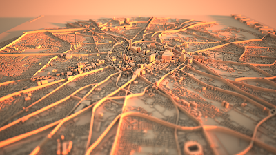
One thing that is not immediately obvious, or indeed obvious at all, is how to achieve the blurred/focal point tilt-shift effect you see in the example below for London. This is done by clicking on the area of the map you want to be in focus. When you do that, the Focus setting on the right of Aerialod changes and you see the blur effect everywhere you didn't click.
 |
| You can go round in circles with this kind of thing |
 |
| Note the Focus value on the right |
Want to achieve a totally different, less glowy kind of aesthetic? Well here are some other settings you might like.
 |
| The key difference here is the 'SKY' setting on the left |
And one more, like above but slightly tweaked.
 |
| Intensity (left) and Exposure (right) adjusted in this one |
And if you want to remove the plinth completely, you just need to reduce the Offset value on the right in Aerialod, as shown below.
 |
| I also quite like the plinth-less approach |
 |
| This is the big plinth-less version, rendered as above |
This is my way of doing it although if you see the original twitter thread mentioned above you'll see loads of different kinds of examples.
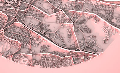
Hey, could you do it with buildings extruded more realistically in 3D? Yes, but that's for another day.
 |
| In this example I've used building height data from Emu Analytics |


