Monday, 30 March 2020

Making 3D landscape and city models with Aerialod

This is my second post on Aerialod - the interactive path tracing renderer for height maps, by @ephtracy. It's available in 32 and 64-bit versions on Windows and it's super-lightweight but you can do some really amazing things with it. My previous post covers more of the basics, including controls and interface settings, so here I'll share some more information on how to tweak the settings (of which there are many) to create nice looking vistas. But as a quick reminder, hold down your right mouse button to rotate the map and use the space bar plus the left mouse button to move it around. Scroll wheel to zoom in and out. Keyboard shortcuts are here.

First I'll show you some new visuals I created in Aerialod, then I'll show you some of the settings I used to create them - in screenshots and in a small slide set. All the images I've posted below are in a shared folder, as well as a sample Lidar dataset for Cheddar Gorge in England that you can just drop in to Aerialod and then tweak the settings as you wish. You can of course create these kinds of images in other software (notably Blender) but Aerialod is much easier to use, though can be confusing at first.

Update (3 Nov 2020): here's an alternative shared folder on Dropbox, just in case either one is blocked where you are. The Dropbox folder is the best one to use though. I've left the other one above online as an archive.

So, let's begin with the highest peaks in Scotland, England and Wales, plus one other view that I like.

I did this using a 5m DTM (not open data)

See the curved horizon? - that's the SG lens setting

A very nice looking mountain

I've added Glen Etive because it's so lovely

But of course we don't always have to map things like mountains. If we have good quality Lidar data, as we do in much of the UK, we can create quite interesting cityscapes, as you can see below.


Here's a little Salford Sunset to get things rolling

A Newcastle-Gateshead vista, along the Tyne

The example data I've put in the shared folder is of Cheddar Gorge in the south west of England, and it looks like this once you fiddle with a few settings.

Sun low in the sky, dusky effect

I've tweaked some of the settings here to make it glow

Different angle, light filtering through the gorge

A foggier, early morning effect

So how do you do all this?
If you've not used Aerialod before then you'll really need to read my first blog post on it in order to get to grips with the controls, etc. Once you've done this, look closely at the screenshots below as the settings in them show you how I achieved the effects in the four images above. Study them closely and then see further below for a short slide set with more annotation on the settings options in Aerialod.

Take some time to Google some of the different terms and they'll begin to make a lot more sense - e.g. the Rayleigh setting refers to Rayleigh scattering, which relates to the blue colour we see in the sky. So, using the default Rayleigh setting in Aerialod you'll see a blue sky but if you reduce the number to, say 10, it will become more blue and if you put it up to 90, for example, it will look a lot less blue and instead more like a lovely glowing orange/yellow sunset. 

This relates to the first Cheddar Gorge image

This also relates to the first image

Notice the glowing light at the corners here

This is the fourth Cheddar Gorge image above

In addition to reading this, it's a good idea to check out the @ephtracy Twitter account for other tips, plus the #aerialod hashtag on Twitter. There are also now a few good video tutorials online, including this one by Steven Scott.

Here is the small set of slides, with annotated screenshots, that I made in order to help you get to grips with the settings a little better - direct link here.


All this, including the data, can be found in the Aerialod tutorial folder I made for this short blog post. Just drag and drop the .asc file I provided into Aerialod and start playing around.

I've put everything in here

The information above should be all you need to create more realistic, impressive 3D landscape or city models. It all depends of course upon being able to get good quality data at a high resolution - I've provided an example in the folder, but you can get a lot more on the Defra Lidar download page for England. You can use the OpenDem searcher to find suitable data for other parts of the world.

To end, I'm just going to post a few more images that I haven't shared anywhere else before, before a few final comments.


This is done by keeping the 'Map' option on in Grid settings

In the example above, I have all the options on in the Grid settings (Map, Ground, Vertical) and then I have used a value in the 'Step' settings on the right to match the resolution of the underlying data (in this case 5 metres) so that I get a blocky kind of effect - see below.


This works if you want to Minecraft your map

The Western Highlands of Scotland

In the image above, I just used a 1:50,000 Land-Form dataset shared by Carol Blackwood to render the Western Highlands of Scotland - I added the labels using GIMP. You can get the individual tiles as open data from Ordnance Survey as well (OS Terrain 50).


This city is home to two football teams, as you can see here

In the example above, I've just taken some Lidar open data of Liverpool and created a view looking down on Anfield and Goodison - home to Liverpool and Everton respectively. They are very close together and the densely packed terraced housing nearby also makes for an interesting example use case with this kind of data.

And, last but not least, St Kilda - a very wild and remote archipelago off the Western Isles of Scotland that is now a World Heritage Site.


In this example, I've added some fog

Notes: you can add a single file to Aerialod (it can handle PNG, JPG, TIF, IMG and ASC formats) or you can add multiple files at once using the little button on the top right that looks like a folder. That is covered in my previous blog post. If you try to load humongousbytes of data then it may crash. Sometimes it won't crash but just won't load. Generally I find it just works and the Scotland 1:50,000 terrain model above is over 600MB and worked fine for me. Just remember that when you hover over any of the tools in Aerialod you will get information on what it is and what it does at the bottom of the window. 

Citation: Blackwood, Carol. (2017). Scotland Land-Form PANORAMA® DTM, [Dataset]. EDINA. https://doi.org/10.7488/ds/1929.

Wednesday, 11 March 2020

45 Minute Cities

Have you ever wondered what a city would look like if it only included areas within 45 minutes of the centre? Of course you have, otherwise you wouldn't be here. Well, even if you haven't, please read on and be sure to check the nerd notes at the bottom of the page. The idea here was to produce a set of maps, based on a central point in 26 different British cities, and a 45 minute time cut off. More specifically, from everywhere shown on the maps below you should be able to reach the centre (in this case I chose a main railway station) within 45 minutes of leaving home (note, not from when you get on a train or in your car). I included travel by public transport, driving, or driving plus train in my model and an arrival time of 08:45 on a Monday morning. I then calculated the population within each area and the maps you see below are the result. These '45 minute cities' are of course not actual cities from an administrative point of view, although they are a kind of functional entity that makes more sense from an economic point of view. But really this is just a first-stage experiment and I thought the results were interesting so I'm sharing them here.


What's this all about, then?
Partly it's about me using a new tool more regularly - TravelTime platform's QGIS plugin - and partly it's about some other work I've been doing over the past few years relating to functional urban areas, polycentricity, functional regionalisation, and whatnot. You can read a bit more about one of the off-shoots of this work here, which is all about a little graphic I tweeted in February 2020. It also relates to some of my previous research, including this work on transport-related barriers to employment for the Joseph Rowntree Foundation.

But for now, in this case, it's mostly about curiosity and me wondering 'how big are these cities if we see them as 45 minute commuter-sheds based on arriving at some central point with enough time to get to work for 9am on a Monday morning?'.


What about Marchetti's constant?
The idea that on average we travel 30 minutes each way to work each day is of course well known, but I thought a 45 minute time frame, from leaving the house to arriving at the workplace (and including interchanges, walking, and the actual realities of the daily commute) would be more interesting and also realistic. My door-to-desk journey these days takes about 20 to 25 minutes but in the past it used to take anything from 50 minutes to an hour and a half when I commuted between Liverpool and Manchester each day.


How does this compare to travel-to-work-areas?
I'm glad you asked, because I had the same question early this year so I added up the 2018 population data for most TTWAs and the results are shown below, as well as on this Twitter thread. This is particularly interesting when we look at, say, Leeds and compare it to the Leeds map above. Or even the Warrington one above. But of course TTWAs are based on a commuting self-containment threshold and my maps here are just experimental outputs created as part of a little curiosity project (for now at least).
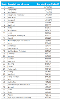
I only had English and Welsh data for this

The numbers for my city look wrong
This may be the case, but it may be a bit more complicated than that. The specific point of arrival I have chosen (the central railway station in each city - or three in London) and the specific time I chose can have an impact on the results. However, I've been through the maps and I think they look right, or at least plausible for sure. In some cases it may very well be possible to get from a location off the map to the central point I chose, but the idea here is it needs to be reliable and without rushing for connections and allowing enough time to get to and from the mode of transport at either end. It's a whole journey commute time rather than a single point-to-point, best case scenario trip. So, you may be able to do better yourself but this is based on a daily journey that most people can realistically make within 45 minutes.


'Why is Warrington so big?', and other FAQs
The population of Warrington isn't 4 million, so let's all calm down. But maybe it is and nobody had noticed. Okay, maybe not. Yet at the same time it is highly accessible, with the M6 and M62 plus the Liverpool-Manchester railway line passing through as well as the West Coast mainline. I'd say Warrington has the Connectivity Double Whammy (CDW) nailed down pretty well. I used to travel through Warrington each day on my day to work and I definitely had the 'if I lived here I'd be home by now' thought more than once. In this sense, then, Warrington may be the Ultimate 45 Minute City.

You might also ask why Leeds has such a high population in this little 45 minute city experiment, when we compare it to the TTWA population above. I suspect it's due to a mix of possibly unique not-very-good internal connectivity and other things Tom Forth knows a lot more about. Also probably has a bit to do with overlapping job markets nearby - e.g. Manchester, Sheffield and the like.

What's the deal with Glasgow vs Edinburgh? Well, if you take the combined populations in the 45 minute city for both of them, you get a good chunk of Scotland - more than half. But why is Glasgow so much bigger than Edinburgh? Again, a mix of things but Glasgow has excellent suburban rail, a subway, motorways and so on, whereas Edinburgh has epic congestion and a good few buses and not too much other stuff, despite the new-ish tram system. Plus the wider Glasgow area just has more people in it.

Why did you choose the central railway station? Just because it is generally very central and close to the jobs. I could have put the arrival point somewhere else in the city centre without it making too much of a difference but I wanted to be consistent and there is no agreed 'this is definitely the city centre' point in each city anyway.

I've spotted something wrong, who do I tell? Feel free to get in touch. You should probably treat this in the spirit it is intended - i.e. an experimental take on functional urbanism - but if you do see something that looks egregiously wrong please let me know. I can also feed back to the people who make the TravelTime platform tool as they're always trying to improve their models and are very keen on feedback.


Nerd notes
I mapped this in QGIS 3.4 using the TravelTime platform plugin. I created a little model (see below) to automate the process than ran a batch process on it for the 26 cities I chose. The 26 include a few that may seem like odd choices but I did try to include places far and wide. For the population counts, this is based on the most recent LSOA (England and Wales) or data zone (Scotland) population estimates from mid-2018. The boundaries here do not align perfectly with the 45 minute isochrone so I suggest you consider the specific numbers in each case as being 'roughly' or 'about' rather than exact. I did use the population-weighted centroids though so having said that I expect the population figures are close to the real numbers. The TravelTime platform api used real-world transit information and if you want more details on it just check out their website.

This is the QGIS model I made

Sunday, 23 February 2020

A few flow maps + data to play with

I've written a fair bit about mapping flows (e.g. migration, commuting) over the past decade or more and here I am again. The point of this post is to a) share some data so that anyone who wants to play with it can have a go; b) talk a little bit about visualising flows; and c) to look at the functional economic geography of England.

First of all, here's the underlying data - it's 2011 MSOA-to-MSOA commute data for England and Wales, which comes from the Census. Yes, it's getting quite old now but it's still a useful dataset. It's a big shapefile, with columns for total commute flow between LSOA and also different modes (train, bus etc) and some other stuff (e.g. distance, area codes and names).

Here are some of the maps I extracted from it. The lines are the commuting connections between places, with an addition blend mode added in QGIS, plus a scaling factor is used to make smaller flows dimmer and larger flows brighter. I've filtered the dataset to show only MSOA-MSOA flows of 10 or greater, otherwise it's a total mess. Here are some of the maps.


Okay, lots of shiny maps to see. With the opacity of the lines set to reflect the volume of the flows you get a slightly better overview of commute patterns. The addition blend mode gives the shiny effect, which is in some ways just a bit fancy but actually it serves a purpose here: making the main economic centres brighter, which fits in well with the underlying economic geography of England and Wales.

Talking of the functional economic geography of England more broadly, there are connections to my previous work with Garrett Nelson on US megaregions (e.g. our interactive map site, with similar shiny maps but driven by an algorithmic partitioning process) and you can get a sense of where the break points are between different areas.

Talking of which, if you're interested in this kind of thing, check out the AMA Garrett and I did on Reddit about the US commute work as part of the PLOS Science Wednesday series. The comments here are pretty interesting, particularly those from commuters about where they draw the line themselves between travelling to city A vs city B.

That's all for today - feel free to download the data and have a play, use the maps as you see fit, or get back to me with any questions or suggestions.

Oh, and if you do download the dataset, you'll also see that I have added origin an destination codes and names for MSOAs and local authorities. This is useful if you want to, for example, only look at all flows into Manchester, or all flows between Leeds and Bradford.


Data notes: MSOAs are small geogaphic areas with between 5,000 and 15,000 people in them, or between 2,000 and 6,000 households. Most have about 8,000 people and 95% of MSOAs had a population of between 5,443 and 11,579 at the time of this dataset is from. Want to know how to do this in QGIS? See my flow map tutorial from a few years ago. Want to know more about the glow effect? See this tutorial on glowing lines in QGIS. And the place labels? I put together a single file of Great Britain place names if you want to use that. I've used a couple of rules on which places to display, plus added some in manually. Thanks to Allan Walker and Richard Mann for making me think a bit more about this again.

Saturday, 15 February 2020

Visualising ecological footprints

A very short post today on something slightly different. I was discussing the issue of how to visualise a city's ecological footprint with Dan Raven-Ellison last year and I made a very simple interactive map of it. The ecological footprint of an area can be expressed in relation to amount of land required to sustain an area's use of natural resources. It's usually expressed in a hectares per capita way, so for London I took the Greater London population (about 8.8 million) and multiplied it by a conservative value of 4.4ha per capita to get an area of about 38,720,000 hectares or 387,200 sq km (about the size of Japan). Since the shape of Greater London is quite well known, I used this to visualise it, as you can see below.

Black = actual boundary | Pink = ecological footprint equivalent

I did put this on an interactive map, although it doesn't actually do much apart from show you the size in relative terms and the wide area it covers. Click the map for a little bit of info on the area, as in the image below. The land area of the UK is about 242,000 sq km. That's about 94,000 sq miles. Or about the size of Oregon, or half the size of Sweden, or just a bit bigger than Uganda, or twice the size of North Korea.

Note that the figure above is in sq km 


Notes: I have seen a number of different figures per hectare for London, the UK and different places online but I used the number I did so that I could be sure I wasn't over-estimating it. This report on London puts the per capita figure for the city at 6.63ha per head (see p. 11). That would give an area of 488,680 sq km for London's ecological footprint - almost exactly twice the land area of the UK (yep, the size of Turkmenistan, 80,000 sq km larger than California, and a little bit smaller than Spain).

Wednesday, 8 January 2020

Land, people and political maps

This is a final map wrap-up following the UK General Election at the end of 2019, but also a follow-on from my last blog post: Land doesn't vote but it does matter. I'll explain more below, but let's start with a little gif, which fades in and out between the new political map of the UK at the start of 2020 and a different version of the same map, but showing only where there are buildings (in an attempt to scale the data to the underlying population more closely). I've included some interesting facts about people and land below, so do keep reading. Teaser: only 4.4% of the UK land area is Labour constituencies, in contrast to the 32.8% of the population who live in Labour constituencies, which is very close to their 32.2% vote share at the election.


Land matters, but it's good to see both

Here are the individual frames from the gif, below, in case you want to look at them a little more closely. It's a bit of a balancing act deciding upon what line width to use for the buildings-only map - too thick and it's just massive blobs of colour. Too thin and everything disappears, so what you see here is a kind of compromise that is supposed to reflect the pattern of the underlying urban fabric that would be visible on a satellite view, for example.

Buildings file available here

The political map of the UK in 2020


How many people live in areas with a Conservative, Labour, SNP or Lib Dem MP?
This is an interesting question, but not one I came up with by myself. I was asked for an answer to this question, and because I'd compiled all the data already it was a relatively quick bit of analysis to arrive at some answers. So, here we go - below - based on the latest UK mid-year population estimates from 2018.


  • 55.3% of the UK population (36.7 million people) live in areas with a Conservative MP. The Conservatives have 56% of the seats (365 out of 650). The Conservatives won 43.6% of the UK vote in the 2019 General Election.
  • 32.8% of the UK population (21.8 million people) live in areas with a Labour MP. Labour have 31% of all UK seats. Labour won 32.2% of the UK vote in the 2019 General Election.
  • 7.4% of the UK population (4.5 million people) live in areas with an SNP MP. But of course that's a bit of a silly statistic because the SNP only stand in Scotland, obviously. So, the relevant figure here is shown below. The SNP won 3.9% of the UK vote in the 2019 General Election. Note: obviously, the % population and % seat shares will be quite similar owing to the sort-of-equal population per constituency. For Scotland, both figures are 7.4% of the UK in terms of seats and population living there.
  • 82.7% of the Scottish population (4.5 million people) live in areas with an SNP MP. The SNP won 45.0% of the Scottish vote in the 2019 General Election and have 81.4% of all Scottish seats.
  • 1.7% of the UK population (1.0 million people) live in areas with a Liberal Democrat MP. They also have 1.7% of all seats. The Liberal Democrats won 11.5% of the UK vote in the 2019 General Election.

You can see the full spreadsheet here if you like - it includes all parties and has separate tabs for England, Scotland, Wales and Northern Ireland and it has a map of the results. It looks like this (below). I've used total population here rather than electors because that was the question I was given and of course MPs are representative for all people.

More interesting than you may imagine, perhaps

None of this is of course particularly profound or surprising but I'm thinking about it in the context of the maps above and in relation to overall vote share, so I find it interesting. 


How much of the UK land area does each party 'hold'?
Describing this correctly is a bit tricky, but what I mean here is what percentage of the UK's land area does each party 'hold' or 'represent'? That is, what proportion of the new political map of the UK is shaded blue, red, yellow, orange, green and so on? I do like the different kinds of political maps we see these days (including the now-ubiquitous hex cartograms) but I also like to see things mapped in a more traditional manner, so long as we also have a different way of looking at it and are aware of the underlying numbers and settlement pattern (hence the gif at the very top of the page).

Okay, prepare to be blown away, or not, by this geographical trivia.

  • 62.4% of the UK land area is covered by Conservative constituencies.
  • 4.4% of the UK land area is covered by Labour constituencies - yes, 4.4% (but of course that's because they are mostly urban and therefore geographically small, but still this low figure surprised me).
  • 19.5% of the UK land area is covered by SNP constituencies.
  • 60.4% of the Scottish land area is covered by SNP constituencies.
  • 5.6% of the UK land area is covered by Liberal Democrat constituencies (with thanks to Caithness, Sutherland & Easter Ross, clearly).
  • The full spreadsheet above has the rest of the data, including the individual UK country breakdowns.

The mid-2018 population estimates from the ONS put the UK population at about 66.5 million, with 56 million in England, 1.8 million in Northern Ireland, 5.4 million in Scotland and 3.1 million in Wales.

For land area, the UK as a whole is about 244,000 sq km (about the same size as Oregon, or almost exactly the same as the total area of the Great Lakes in North America). England covers 130,000 sq km, Northern Ireland 13,600 sq km, Scotland 79,000 sq km and Wales 21,000 sq km. The figures are in square miles as well as sq km in the spreadsheet.

What was that? You want more gifs, but different speeds and different sizes. Okay then, see below. 

More seriously - and there is a rationale here - switching relatively quickly between the two maps in this way helps highlight the ways in which the standard map view can, if we're not careful, give a distorted view of political representation. That's why I think in political mapping a mix of methods and numbers works best. Also, where we can use different kinds of approaches to explain this (like gifs) we probably ought to.

Fast enough for you? 

A mini version

This is a bigger version - click to zoom

Help


Okay, one last stat. 

What percent of the UK population lives in Constituencies where more than 50% of the votes went to the Conservatives? 

By my calculations the answer to that is 28,258,422, so 42.5% of the UK population which, it so happens, is not so far away from the 43.6% share of the vote. But that is definitely not a defence of first past the post!

Bye for now.