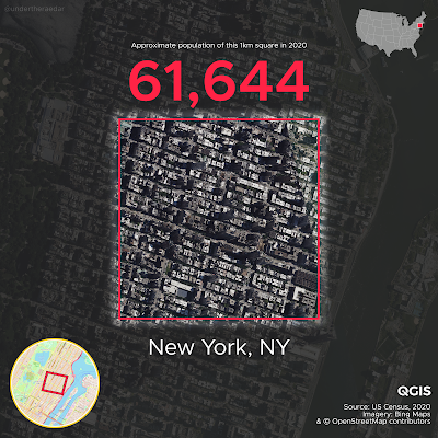
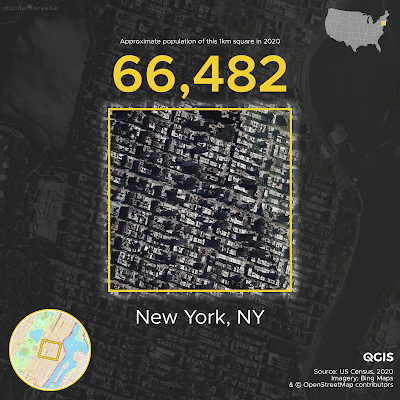
The most densely populated square kilometre in the United States is on the Upper East Side in New York City. This is not a surprise, so in this long and slightly messy post I'll say a bit more about my attempts to calculate exactly where it is and how many people live there, using US Census 2020 data and a similar method to my previous post on the most densely populated square km of the United Kingdom. I also attempt to find the most densely populated square kilometre in each state. If you're looking for more on methodology and data sources, scroll to the bottom of the page. If you want to know whether anywhere in the United States is as densely populated as in Europe then read on, but the answer is: yes, New York City has higher densities than Europe, and a few other spots have European-level densities - but not very many. Time for some maps now. Based on my US-wide 1km x 1km grid, here is the maximum 1km cell population in the US, followed by maps for every state. Bear in mind that the highest value I found in Europe was just under 53,000 in the Barcelona metropolitan area (L'Hospitalet de Llobregat, to be more precise). The highest density in the UK is about 25,000 in a single square km (in east London). You can find high resolution versions of the maps below in this web folder.
How did I get the answer above? Well, first I created a 1km x 1km grid covering the whole US. After some experimentation, I settled on a grid configuration I was happy with. Put simply, I generated a continuous 1km x 1km grid covering the entire lower 48 states, as well as separate grids for Alaska and Hawaii. I also generated an alternative grid, plus some local variations to experiment with, but you'll see a bit more on that below. Then I assigned census block centroids to each grid square to give me an approximate population for each square km. This is never going to be a perfect fit but in my testing it came out pretty close. Again, you can see a bit more on that if you keep reading.
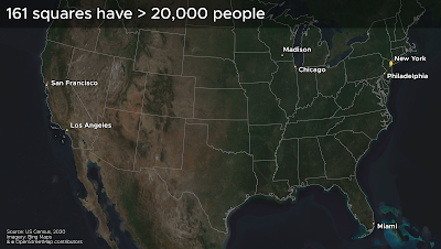
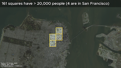
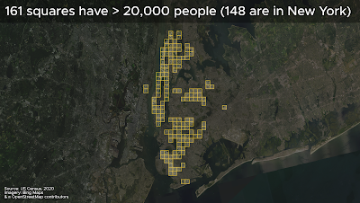
Of the 161 1km grid squares I found in the United States with a population of more than 20,000 here are where they are:
The top 65 most dense 1km squares are all in New York. Then comes San Francisco. This is what it looks like when you put them on a map.
 |
| Yes, there appears to be an 'odd one out' here |
Just remember a few things as you read through this piece: a) moving the grid around will of course get you different results, but this is the same with all gridded population data - though mostly the results only change a bit - even so, grids are still useful; b) the populations are calculated using groups of census blocks, which don't align perfectly with the squares - that's why it says 'approximate population' on the images, and that's also why I used a blurred focal area around the squares, a nod to the fuzziness of things; c) this is US Census data from 2020, so it's about the best and most recent data there is; and d) my numbers are likely an underestimate because I chose to assign only those census blocks to each 1km square where the centroid falls within the square. This is a more conservative approach than if I'd use an intersect approach but I wanted to remain on the cautious side.
The approach of using a continuous grid over a whole country - or indeed the whole world - is pretty common these days and helps us compare areas on a like-for-like basis. Possibly my favourite approach to this is by the WorldPop project, although there are many other sources (see below). If we just want to find a single cell with a higher population then we can of course do this without too much trouble. We'll still end up with the same answers in relation to where is 'most densely populated' but we'll get different numbers. Such an approach is not, of course, a uniformly gridded approach to understanding population density but it is quite good fun!
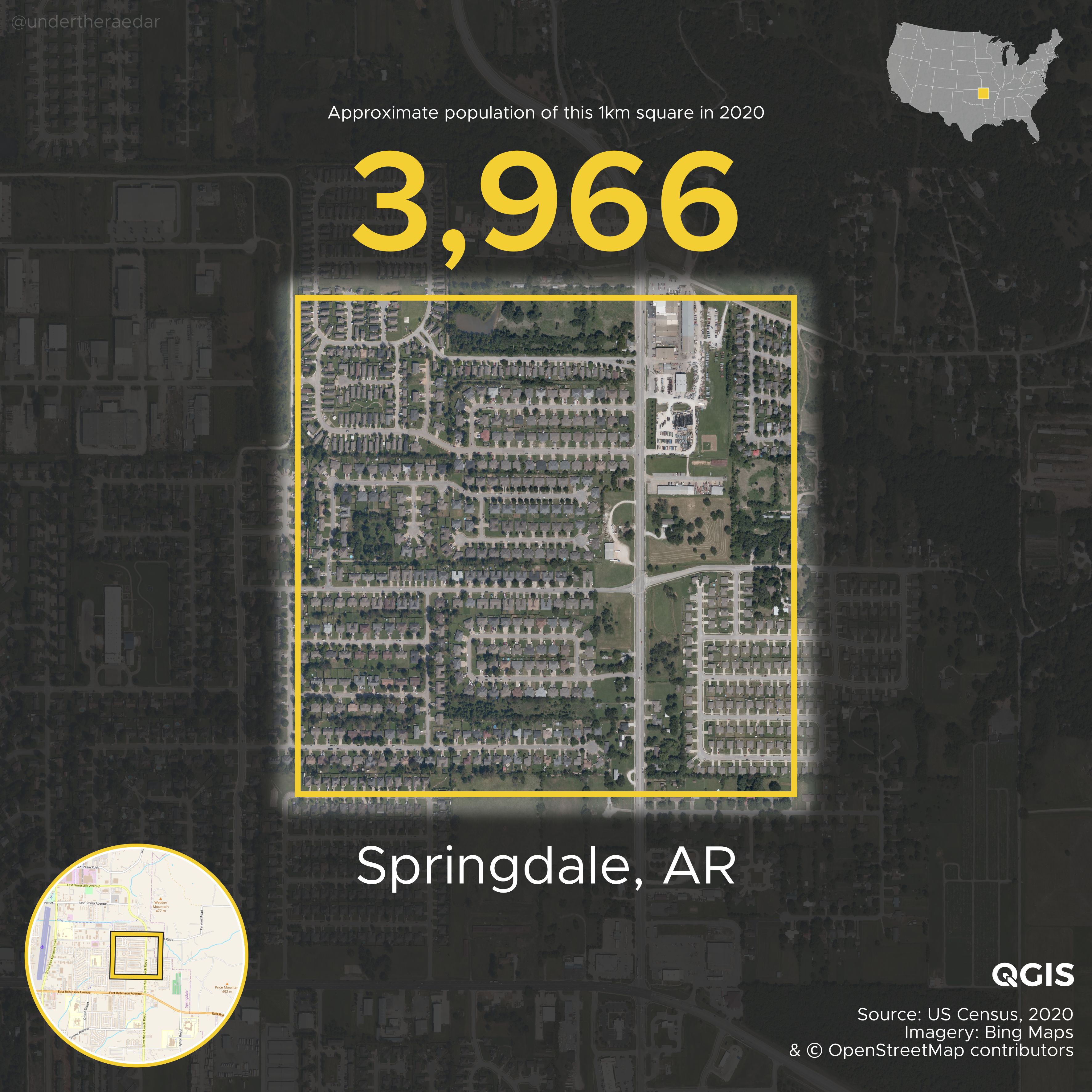
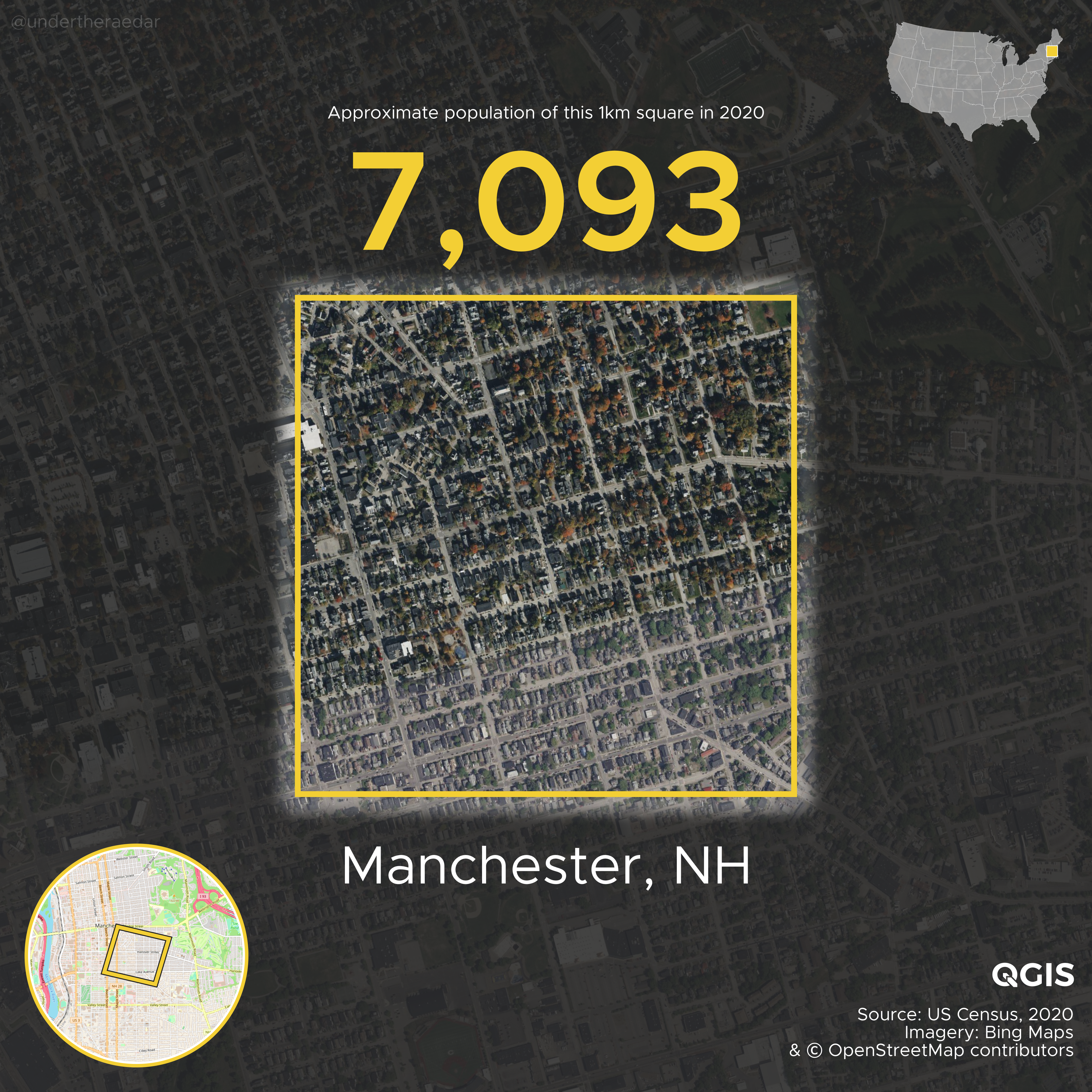
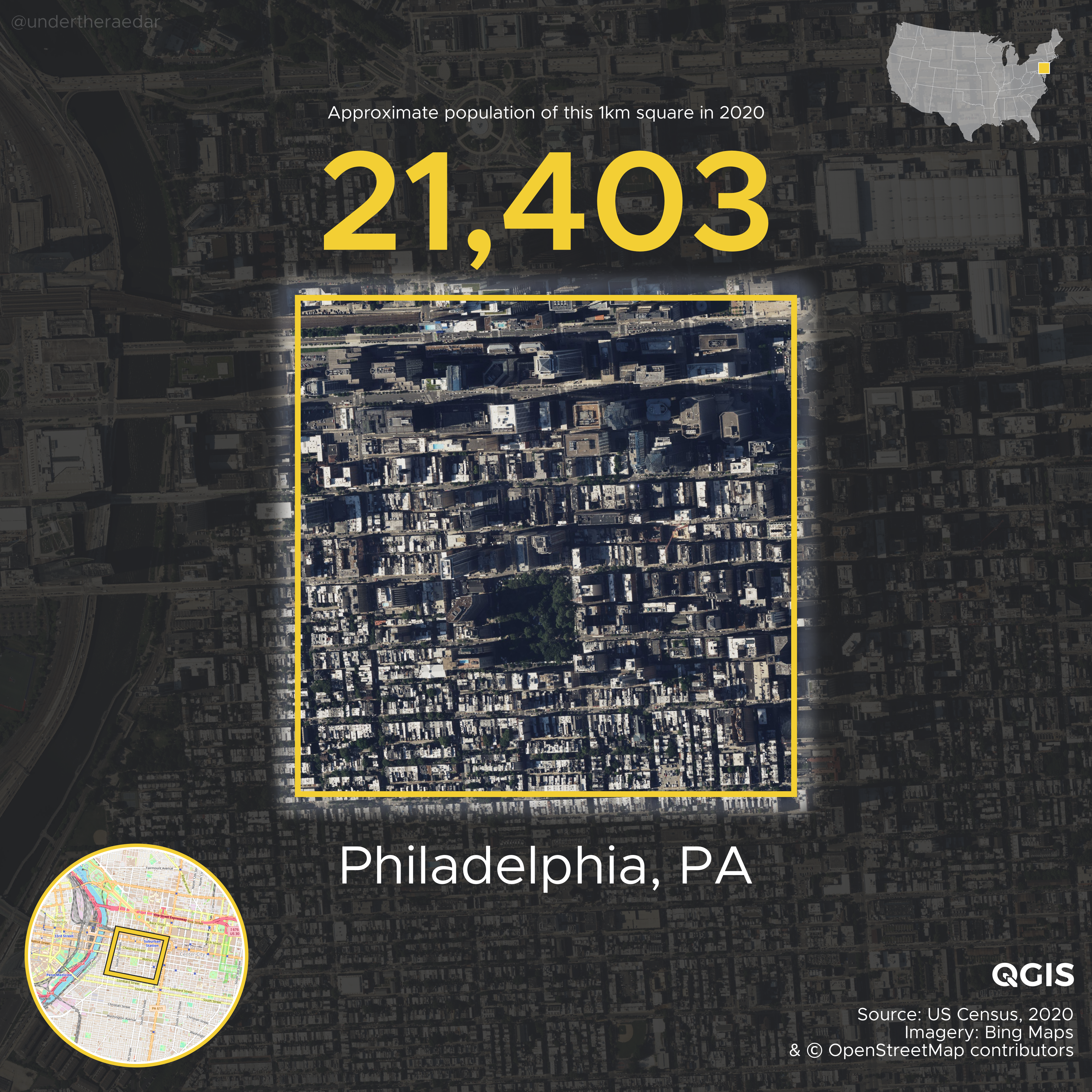
The most densely populated square km in each state (based on my 1km grid)
Here we go, in reverse order, starting with Anchorage, and ending up with New York City. All these files, plus the other ones in this post, can be found in the
web folder I created.
There's a video file of this in the web folder, plus a slower version. Once again, I made all the maps using QGIS and automated the production of the individual files using the QGIS Atlas tool within QGIS.
Alternative grids - higher/lower max values?
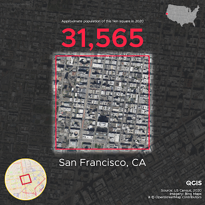
Hmm, but what kind of result do you get if you shift the grid around a bit? This is the question all the methods nerds want to know, and of course I do too so I also did this with another slightly different grid - for the lower 48 states only. Instead of 161 squares with 20,000 or more, I got 160 and basically all in the same locations. But let's look at a few of them here. The maximum in New York comes out lower, San Francisco comes out higher and a few other places are a bit different, as we might expect. But the overall story of density doesn't really change and still goes New York, New York, New York, etc. The top 36 squares are all in New York, but then we have a higher density square in San Francisco, because we moved the grid - now we get over 30,000 and if we keep shifting the grid we could get even higher - but of course that's not the method I'm using here, it's all about comparing things nationally on a like-for-like basis.
 |
| We get a higher value in this San Francisco square |
 |
| But we get a lower figure for max density in New York |
 |
| Gridshift, for the win! |
 |
| Gridshift, for the loss! |
With my favoured grid, San Francisco ends up with 4 grid squares over 20,000 but with the shifted grid we get a higher maximum density value in one grid square but only 3 squares over 20,000. That's just the way grids and numbers work, of course. Here's where the four 20,000+ San Francisco squares are, followed by all the New York ones.
 |
| Density! |
 |
| Density, but projected differently |
 |
| New York (Den)City! |
This all became a bit too interesting for me and I lost a few more hours than I intended to. You could spend days looking at the data but I'll move on now to say a few more things relating to the method.
Compare the 1km grid to a messy census block grouping
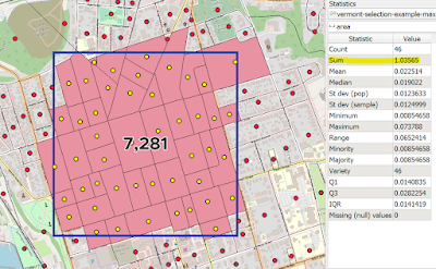
So, does assigning census block centroids to 1km grid squares stand up to scrutiny, given that census blocks don't generally align to perfect squares. Well, in the kinds of places we're interested in here (dense urban areas) the census blocks are very small and generally a reasonable fit. But even when they're not such a neat fit (like the example below from Burlington, Vermont) it's a pretty decent approximation for area and population.
 |
| A bit of give and take round the edges, but not too bad |
You can see from the screenshot above that the census blocks cover an area of just over 1.03 sq km the population of the area is 7,281. In some of the more sparsely populated areas we have less alignment to the grid but overall this is not a big problem for the kinds of dense urban areas we're mostly interested in here.
Rotate/shift the grid to match the street pattern - how high can we go?
Here's an example of an area I created in New York City using a group of census blocks. It comes out at a tiny bit over 1km square but the population is almost 75,000. For the purposes of what I was attempting here (i.e. a consistent 1km gridded approach across the whole US) this is basically cheating but for the purposes of finding a single 'most populous' square km, I think it's okay. I'm not sure you can find a more populated single square km in the United States, but be my guest.
 |
| Just over 1 sq km, and not a square but it's 100% census blocks |
Obviously the approach in the image above finds us a higher density area, but this is not an approach that can be applied consistently and continuously throughout the United States, or indeed the world. The whole point of using a gridded approach to population density is to have some kind of consistent basis for measurement, so that we can compare like-for-like. But I said that already more than once!
Other odds and ends - e.g. college towns and prisons
What you'll see if you scroll through the 'most dense by state' images is lots of big cities, but also lots of college towns. This is quite interesting to me and indeed when I was testing the method with a chunk of data I was qutie surprised to see such high density in Madison, Wisconsin. I didn't realise it was quite so high. So, as you scroll through the maps, you may have noticed this - e.g. Auburn (AL), Bowling Green (KY), Norman (OK), Ann Arbor (MI) and so on. I used to live right next to one of the high density squares in Columbus (OH) when I went to the Ohio State University so I know what these areas often feel like on the ground compared to, say, some of the European high density areas I've been looking at recently. Anyway, this was something that stood out to me.
What also stood out to me? Well, this (below)!
 |
| Ah, an error, surely! No, not an error. |
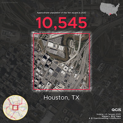
In my alternative grid layout and my original grid, Austin comes out as having the highest density 1km square in all of Texas. But in my alt grid this square (above) comes out as having more than 10,000 people - alongside one more in Houston and one in Austin. When you see this kind of thing you think 'hmm, doesn't look right' so then you have to investigate further. It's all parking lots, water and freeways so how on earth can it be home to more than 10,000 people? Well, the answer to that question is 'the Harris County jail facilities'. They sit on the little chunk of land just above the centre of the square, surrounded on three sides by the water of Buffalo Bayou. Here's a direct quote from the Wikipedia page, as of 12 February 2023:
As of October 2022, over 10,000 inmates are in the jail complex.
You can read more about the facility in this Houston Chronicle piece, but I'm getting off track now (Google Street View link). Anyway, the numbers are correct but it's not the kind of density I was trying to map.
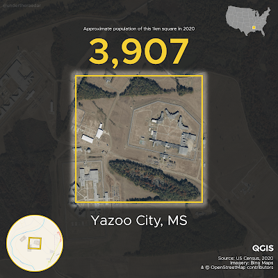
Likewise, it seems that the highest figure in Mississippi is also due to a correctional facility, as you can see below in the 'most dense' map from that state - in Yazoo City.
 |
| I don't think I'd like to live here |
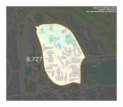
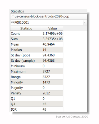
What else? Oh yes, census blocks are usually very small with very low populations - after all there are more than 8 million of them (8,174,955 to be exact). But I did notice the most populous census block in the US had over 8,000 people in it - on UCLA's campus in Los Angeles (another place I just happen to have been to). A total of 17 census blocks have more than 5,000 people, 3 have more than 7,000 people (UCLA, one at Naval Station Norfolk (VA), plus the Houston jail complex), but the vast majority have way less than this.
 |
| UCLA for the win! |
For the US Census geography nerds, here's a little summary of the census blocks population geopackage I was working from in QGIS - it worked pretty smoothly on my machine with no real lag at all despite being a good few gigabytes in size.
 |
| So, that UCLA one is a bit of an outlier! |
"The median population of a US census block in 2020 was 14" is a phrase you can wheel out at parties during a lull in the conversation. After that, you can leave in disgrace or, depending upon the company you keep, move on to discuss the mean and standard deviation.
How many 1km squares from my grid had people in them and how many didn't? Well, I put the figure at about 25% with people, 75% without people, but as you know it all depends upon placement of the grid but I think that's a reasonable estimate.
Welcome to the nerd zone (joke, you are already in the nerd zone)
It can be hard to work with this kind of data, but the source data for this post comes from census.gov. You can get the census block 2020 boundaries from the TIGER/Line Geodatabases page and then import them into your software of choice. I used QGIS for this. The specific file you'll need is the Census Blocks National Geodatabase [5.8 GB] file, and as you can see it's quite big - about 9GB unzipped. You can grab the population data - by state, I couldn't find a whole-US file - on the 01-Redistricting_File--PL_94-171 page. It's terribly unwieldy in my opinion but I couldn't find a simple csv anywhere, or something like it. I eventually ended up with a set of census block centroids, with a 5 fields and just the population data, and it came in at 1.2GB, so not too bad considering there are 8,174,955 records in the dataset.
The folk at ESRI have done a lot of hard work for anyone who wants the ready-made file by putting it on their USA Census 2020 Redistricting Blocks page, but once again it's a whopper of a Geodatabase file! Nonetheless, so long as your computer is up to it, you can fairly easily load this into ArcGIS or QGIS and get up and running. I was working with a geopackage in QGIS that I made and it was very smooth and fast when using either the 1.2GB centroids file or the full 12GB everything-in-it file.
My method was more or less the same as I used for the UK. Here's what I did:
1. Plot area centroids, which in this case are census blocks, the very smallest geography used by the US Census Bureau.
2. I used a centroid definition ('point on surface' in QGIS) that made sure the centroids were within each census block, no matter its shape - to avoid those banana shapes causing the old 'centroid not in shape' problem.
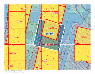
3. Create a 1km grid for the lower 48 states, and again for each of Alaska and Hawaii. I only did this once for AK and HI, but I tried different grids for the lower 48. I also did this manually in a few places, including New York, San Francisco, Burlington (VT), and Madison (WI). The nice thing about the New York and San Francisco examples is that the street grid pattern allows you get things lined up nicely with the grid-shaped blocks in these areas.
4. Aggregate the point data to each 1km cell across the US. Obviously this means the numbers are not exact because only very rarely do blocks align with the edges of 1km squares. But, in the most densely populated areas the blocks are tiny and the numbers in each 1km square are a reasonable approximation of the true numbers. There's a bit of give and take on this - some blocks end up not being counted because their centroid is just outside the 1km grid square and some do get counted for the opposite reason. In very rural areas this kind of falls apart a bit because blocks are much bigger there, but since I am not interested in rural areas here that's not an issue. But, just remember that the numbers reported for single square 1km grid cells are approximations - close to the true figures, no doubt - but not exact.
5. Experiment with different grid configurations. This last part could go on forever! But I think my results are a) defensible and b) a good reflection of the situation on the ground - i.e. I've arrived at the correct answer in relation to where the highest density location is - but we really didn't need GIS to do that.
Will you get different figures if you move the grid?
Yes, of course, but you could do this forever and there is no perfect grid configuration. This is always going to be the case with gridded population data, from GHSL to NASA and everything in between (e.g. Meta's high resolution population density maps). That's why I often experiment with different grid placements and configurations, but I nearly always find the same places come out on top - and this is definitely the case with the United States.
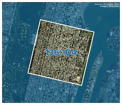
No matter what grid you use and how you rotate it, the Upper East Side in New York City is going to have the highest population density. But it would be interesting to run this programmatically to try to find the max 1km density possible. I suspect that would be a lot of wasted effort to find somewhere that has a couple hundred more than ones you could find manually, particularly given the gridded nature of Manhattan's census blocks.
No matter how you shuffle the square around, the most densely populated area of the United States is to be found on the Upper East Side of Manhattan in New York City. See below for a screenshot of some of my experiments - including using a square mile grid. The red dots are census block centroids, which have the population data attached to them, and then they get assigned to a grid square.
 |
| The big square is a square mile |
Hey, we use square miles in the US, not that km nonsense!
I did this using square kilometres because that's what I did previously for the UK and Europe and I wanted to be able to compare things. I also did it in square miles for the US but the answer to the research question is the same - the Upper East Side of New York City is the most densely populated area. Obviously square miles are fine too but like I said I wanted this to be comparable to what I've already done for the UK and for the whole of Europe so I used square km, and that's why I'm reporting it here using these units.
Having said that, let's have one more map, this time with an estimate for the highest single density square mile in the United States. Where is it? We already know the answer to that - New York City's Upper East Side.
 |
| The Upper East Side wins again |
Is density good? Is it bad? The answer is up to you. I'm not trying to make a case for either position here but I am interested in the question of density in general and that's why I've been writing about it and making maps of it for a long time.