This post explains how to use the Atlas function in QGIS to automate the production of maps from a single layer in order to produce
a map output for each column in an attribute table. The Atlas tool is designed to allow users to iterate through the
rows in an attribute table, but not through
columns so if you want to produce a map for each variable in a single dataset (e.g. annual house prices for small areas) then you may find yourself at a dead end, as I did. Then I saw how
Ed Hampson at Savills very elegantly solved the problem so I'm sharing it here. I know of some other workarounds but this solution is my clear favourite as it allows for the production of as many map outputs as you need in a very efficient manner. I've shared the project file in this
online folder so you can download it and play around with it yourself. This was done in QGIS 3.4. This is written with the assumption that you already know QGIS and how to use the Atlas tool, so I won't cover that here.
 |
| This is the final project, which you can download |
The basic principle of this approach is that for the Atlas coverage layer you use a lookup file, which in my case was a table with one row for each of the column headers I wanted to map in my dataset (as shown below). As you can see, the individual rows follow the pattern
md_1995,
md_1996 and so on. This is because the layer I want to create maps from has one column for each of these fields, from
md_1995 to
md_2016 - this is the median house price for each area from 1995 to 2016. If you're at all confused and want to see how it works, just download the
project folder and take a look yourself by opening the QGIS project I have shared - all the screenshots here come from that.
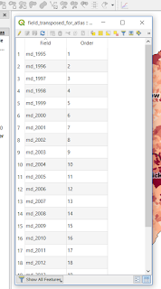 |
| This is the table I used |
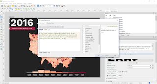
Now here's the bit I really like - when setting up the Atlas in Print Layout, the coverage layer here is the table shown above and the Atlas 'Page name' is the 'Field' column in the table above. The normal way would be to set the coverage layer to be some kind of geographic layer and then QGIS would iterate through it spatially, but this is a kind of non-spatial solution that allows us to map by column instead.
 |
| The 'Field' here is the Field column in the table shown above |
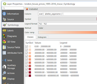
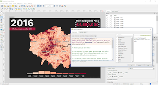
The really important thing you need to do to make this all work is to map the data using
eval ( @atlas_pagename ) as the Column to be mapped. Since we have set our Page name in the Atlas as 'Field', and since the data in the Field column in our Atlas coverage layer has the same names as the attributes we want to map (i.e.
md_2004,
md_2005,
md_2006, etc.) when we iterate through the Atlas it will map a different variable each time. Just remember to use a data range in the symbology that allows you to show the highest and lowest value across your entire dataset, otherwise you might find you have some missing values on some maps. For example, if I had set the symbology data range here using the 1995 house price, then by 2016 loads of areas would be above the max value from 1995 and they wouldn't show up on the map.
 |
| This is the clever bit |
What does 'eval' do, I hear you cry... Well, it's basically this, as described in the QGIS documentation:
- 'eval' - Evaluates an expression which is passed in a string. Useful to expand dynamic parameters passed as context variables or fields.
Once you've got everything looking the way you want, you can then export the Atlas in the usual way and do all sorts of interesting things with the outputs, like creating a gif for example as I have shown below. I did a tutorial for creating these in
an earlier blog post.
 |
| How much!!!! Not inflation-adjusted, obviously. |
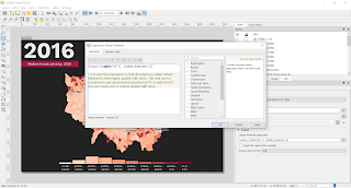
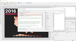
I've added some comments to the expressions in the QGIS project I've shared and these are also shown below to give you a better idea of what's going on here. I know it's a bit tricky to understand without actually seeing it.
 |
| This is just how I set the output file names |
 |
| This is just what I used to automate the year label |
 |
| This is what I used to set the highest value each year |
 |
| This is how I dynamically sized the bars in the chart |
 |
| This just shows you all the different layers - only 4 |
You'll see above that this is a normal Atlas, set up in the normal way. The only difference is the way I've set up the coverage layer and how I have set the column to be mapped using the
eval expression. Everything else works in the same way. I have also used the aggregate function to pull out the highest value for each year (in the top right of the layout) and I used it to set the height of the individual bars in the chart. I have shared all the individual map outputs from this in the
folder, and they look like this.
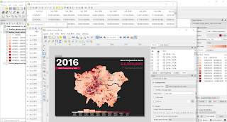
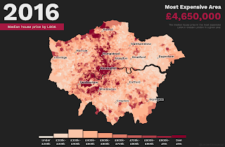 |
| Final map output for 2016 |
Okay, I think we're done here but if you get stuck feel free to get in touch. I'm easy to find online or on
twitter.
Notes: if you try to load the zipped project folder QGIS may throw up a warning saying it can't find the 'field_transposed_for_atlas' layer but don't worry, it's there. You just need to Browse to the folder where it is located (i.e. the layers folder in the download). I should perhaps really thank
Jochen Schwarze here because of his
StackExchange tip to Ed on this. The map colours are ones I borrowed from a very nice looking FT map by Steve Bernard. Note that you can add comments inside QGIS expressions using
/*comment goes here*/ and after an expression using
--comment goes here. In the file names I think it says 'MSOA' but the areas used are actually LSOAs. The
house price data is from HM Land Registry but very helpfully compiled as median values by LSOA by the excellent CDRC team. I added a few place names using OS open data. Easy to remember url for the folder is
bit.ly/qgis-atlas-by-field


