Tuesday 20 December 2022

Population by altitude in Great Britain

This topic of population by latitude has always interested me, and it's something I've written about here before. But I'm also very interested in population by altitude, so that's what this short post is about - population by altitude across Great Britain. This is one of a few pieces I've had sitting on my computer, unfinished, for a while so I'm posting what I have now because I think people might find it interesting.

If you're interested in the topic more generally - and globally - check out this PNAS paper from 1998, it's very interesting. Okay, so here are my results, in the chart below.

Not massively surprising, but quite interesting

So what are we to make of this? Well, hardly anyone lives above 400 metres above sea level. In places like Wanlockhead (467m / 1,531ft) in Dumfries and Galloway or Flash (463m / 1,519ft) in Staffordshire there aren't that many people and actually these numbers are disputed because Flash is said to be the actual highest village in Britain. Either way, they are relatively high up. So, let's summarise those numbers a bit more.

  • About 50% of the population appears to live at 50 metres or lower
  • About 25% live at 100 metres or higher
  • About 3% live at 200 metres or higher
That's about all for today, apart from the map below and then a few words on method.

Uplands and lowlands of Great Britain


The method was basically this: take the Ordnance Survey 50 metre resolution elevation dataset for Great Britain. Take the 2020 WorldPop 1km population dataset. Aggregate elevation to an average value for each 1km cell across Great Britain then use that to sum population by altitude. Yes, this won't be perfect but I think the results are pretty decent given the data we have available. I haven't seen anyone else do these calculations but please let me know if you've done it and got similar/different results.


Saturday 5 November 2022

Two decades of city centre population growth in England

Back in 2013 I published a paper in the journal Cities with the following title: 'English urban policy and the return to the city: A decade of growth, 2001–2011'. I actually wrote it in 2012 and it drew upon some of the urban policy things I'd written about in my PhD a few years earlier. If I had access to the paper now, or if I wanted to spend $27.95, I could even read it again but the gist of it was this: people came back to the city centre, in quite big numbers, between 2001 and 2011. 

You don't need an academic journal paper to tell you that because you couldn't see it just by walking around, obviously. But really it was about a bit more than population and it discussed New Labour urban policy, the Urban White Paper of 2000 and lots of other stuff. I've also just discovered that it has 61 citations on Google Scholar, which means as many as 61 people were at one point potentially aware of its existence and some might even have read it. Okay, too much preamble, time for a map - showing the population of the central Manchester and Salford wards that more than doubled in population between 2001 and 2020 (I don't have the census data for wards yet).

Source data: ONS ward-level population estimates, 2001-2020

Why was I thinking about this? 

It's because of the release this week of a big wodge of local Census 2021 data for England and Wales. I thought I'd go and look at the changes from 2001 to 2021 but then I couldn't find quite what I was looking for (ward population data) so I went and looked at the mid-year population data for wards instead, and how I find myself writing about it here because it's quite interesting.

If you haven't already spotted these things, three observations from the map above:

  1. Salford Quays ward had less than 1,000 people living in it in 2001.
  2. Central Manchester/Salford has the largest collection of contiguous wards (6) in England and Wales that more than doubled in population between 2001 and 2020 - the population now in the six wards above is about 85,000, compared to 24,000 in 2001 and 50,000 in 2011.
  3. Deansgate and Piccadilly wards in Manchester look like a rabbit (Piccadilly) getting a piggyback on a goose (Deansgate - see below). This is the unintended consequence of me looking at map data for too long, but it's a clear fact. 
I'm not wrong, am I?

The numbers are of course not surprising if you've ever stepped foot in an English city centre over the past 20 years but it's quite interesting to be able to put a number on things. So now I'll share more maps of different cities, showing the 2001, 2011 and 2020 population data, like I have for central Manchester above (all areas shown more than doubled in population from 2001 to 2020).

Birmingham

Bristol

Leeds

Leicester

Liverpool

East London (1) - plus a bit non-East London

East London (2)

Newcastle

Nottingham

Sheffield - check out those numbers!

Southampton

Who are all these new people? Well, again it's not that hard to fathom if you have been paying any attention but a mix of students in new private sector accommodation, the so-called 'young professionals' estate agents seem to love and a mix of other folk, including some families and whatnot. Could also say stuff about brownfield sites here, as well as New Labour urban policy (the old 60% target) but that doesn't interest me much these days so I'll leave it at that.

Oh, go on then, a few more.

Cardiff - yes, 100% NOT in England! But interesting

Bournemouth

I can't unsee it

Poundbury

This one was missing a label in the version above


Sunday 9 October 2022

Cometmaps

In one of my many 'playing around with map stuff and then posting it on twitter' adventures, I recently posted a kind of comet map - see below. This started off as something completely different but once I had the basic idea I then wondered what kind of data I could apply it to, and that's why I did it to the UK political map of 2019. Read on below for how I did it, as well as how you can replicate it pretty easily in QGIS. Scroll straight to the bottom if you're just looking for the 'how-to', as well as a bit more on how this kind of thing might work on a US county-level election map.

First of all, this was done in QGIS. I'm sure it could be done lots of ways, but I did it in QGIS using something called 'geometry generator', which is basically just a little bit of code that can be used to style things more fancily than just clicking a button and selecting a colour and shape. 

My starting point was actually just to see if instead of displaying things as polygons I could display them as lines that went from one corner of an area's bounding box to another - in this case from the far south-west to the far north-east corner of a shape's bounding box. That was easy enough - and the result is shown below. I did it with UK local authority areas, then moved on to doing it with constituencies - which you can grab from my Automatic Knowledge resources page.

A basic line, within each area's bounding box

Then I thought about applying a random degree of rotation to each line, just for the sake of it, and that's what you see below. This is probably not that useful unless you want to make a map that looks like a pile of sticks but all the same it's interesting to see that it's possible and perhaps I'll find a use for it one day. 

Big pile of red sticks drifting into space

So then I went back to no rotation and thought about buffering the lines, but using a tapered buffer so that one end was thick and the other wasn't. I applied this to each area and also used a gradient fill so that the colour faded along each shape. The result of this is shown below. This one was also done on local authority boundaries rather than constituencies because I was playing around with both at the time - but then I wondered about applying it to a political map and doing something more interesting, so the cometmap came to life. 

A cometmap emerges from the darkness


The result was that I decided to use geometry generator in QGIS to do the following, based on the results of the 2019 UK General Election - and my goal here was to use the comet trail as the main device in the map to show who came second and how far behind they trailed. I realise some people look at the maps and perhaps see the opposite but for a little map experiment I thought it was a) interesting and b) potentially useful (probably with some further development).

  • Use a circle in the centroid of each constituency, using party colour to indicate who won that seat.
  • Use a tapered buffer behind each coloured circle, with the colour of the party who came second.
  • The length of the comet trail is dictated by the winning margin - so if a party is WAAAAAY behind the winner then it gets a longer trail. So this map draws attention more (deliberately) to the second placed party. But of course any of this can be edited.
  • The size of the circles and buffer is a few thousand metres but of course that can be adjusted too. See the results below.
Dot with no trail? Means it's very close

Loooong blue trails? Conservatives waaaay behind

Mostly short trails = mostly quite close results

THE LIBERAL DEMOCRATS ARE COMING!!!!

Okay, so that's about it. 

Read on if you're a map nerd and you want to replicate the style yourself.


How to replicate this style in QGIS

  1. First of all, you'll need to grab the UK General Election 2019 results file from my Automatic Knowledge resources page. Use the GeoPackage because it's easiest.
  2. Add the file to QGIS. 
  3. Optional step. For exact duplication of my maps, make the QGIS background very dark grey (e.g. #111111) and make duplicate the UK general election layer and make it dark grey, both fill and stroke colour (e.g. #333333) so that when you make the comets they look brighter and have a dark backdrop and you can also get your bearings from the plain dark backdrop. 
  4. Download the cometmap layer style file to your computer. This is just a standard QML file and you'll apply it in the next step.
  5. Go the Layer Properties for the layer you want to apply the cometmap style to and then via the Style button at the bottom of the Layer Properties window, and then it's Load Style... browse to the cometmap-ukge-2019-example.qml file on your computer, then it's Open, Load Style and OK - and that should be it!
  6. Once you've done this you can inspect the properties of the style yourself and edit them if you want to - see screenshot below.
How the trail is generated - rotation set to zero right now


Note that I am using a geometry generator twice in the screenshot above - once to create the circle and once again to create the trail. You'll see that the colours are set using an expression - if you click Simple Fill you can see this when you click the little Expression button (see below). Note that this is done both for the trail and the circle.

The '97' in the html colour values sets the opacity


Could you apply this to, say, a county-level US election map? Yes, but I think it would probably require a good bit more thought otherwise you'd end up with a really wild map. But here are a few examples.

File these under 'hmm' for now.

Done very quickly, just to test the method

You can see where this needs work - but it could work

Just a few tweaks needed here!

That'll do it for now

Needlemaps - the next frontier

I had a bit more of a think about it all and for the US I wanted to see if I could create a kind of needle or dial that showed which way a county leaned. using the 2020 US election results file. Well, turns out that this works reasonably well. Not perfect but it's a good start. See below for the results and then if you want to replicate it yourself and then play with my settings, download the qml needlemap style file for QGIS and then apply it to the election results file and have lots of fun.

Lots of ways this could be edited/improved


Yeah, not surprising

Big 'lean left' energy going on here

Actually quite interesting here I think

Lots of interesting stuff here, for sure


Note that in the needlemap style above, size = scaled to population, roughly, but of course I had to make some a minimum size otherwise they would be invisible, so I also added opacity by population to make them super-faint if they are tiny. Colour = blue for lean Dem, red for lean GOP. Lean angle is set from the Dem/GOP ratio from 2020.

Thomas Gratier on Twitter suggested we could call these pinball maps, and that's also a good fit as the needles look very much like flippers on a pinball machine.


Sunday 2 October 2022

Which GIS software is best?

Let's begin with a story, from some time around the early 1990s in the north of Scotland. I used to go to a church in Inverness with my Mum when I was growing up and although I've forgotten lots of things, one of the things I do remember is the minister asking this question at the start of a sermon:

  • "What's the shortest way to London?"


He didn't say from where, but of course most people thought of the question in relation to where they were at the time. I can't remember exactly what the rest of the sermon was about, but since we were in Inverness, I was thinking maybe either the shortest route to London was the direct train from Inverness to Kings Cross, or maybe the Sleeper from Inverness to Euston or perhaps a flight from Inverness Airport to London Heathrow or Gatwick. 

The answer, of course, was that the shortest way to London was 'good company'. Cliché 101, but of course it's true. Oh, by the way, if you type 'shortest way to [city of your choice]' into Google then you should see a result straight away with a map preview on the results page - like in the example below that appeared when I typed 'shortest way to Amsterdam' into Google just now.


What have we learned so far? That a) Inverness to London is longer than Sheffield to Amsterdam; b) there's always more than one way to get from A to B; and c) sometimes the answer to a question is more abstract than you'd think. But also d) people often remember weird stuff.

If someone asked the "What's the shortest way to London?" question online, today, I imagine the answers would look something like this:

  • "Which London? London, England? London, Ontario? London, Kiribati? You need to be clearer and not make assumptions!"
  • "Where from? What's your starting point? Please clarify!!!"
  • "Why don't you go to Norwich instead of London?"
  • "The UK is finished, don't bother with London."
  • "Why are you so London-centric? Not EVERYTHING'S about London you know."
  • "Actually London is bad."
  • "You're taking the train? Communist!"
  • "Why are you not already IN London?"

[TENUOUS SEGUE JUST LIKE IN THAT SERMON WHERE I FORGOT EVERYTHING APART FROM THE 'SHORTEST WAY TO LONDON' BIT]

Okay, but this piece has a click-bait title so let's get straight to the point. Actually, let's not. Let's talk about things a bit more first, starting with geospatial file formats because we can't do much in GIS without data (apart from argue about file formats). But yeah, the best GIS software is the one that you enjoy being with, probably.

My favourite geospatial file format

The disgraceful truth is that I have quite weak opinions about geospatial file formats, and I don't really dislike any of them. In fact, I'd say I'm still friends with them all. From an abstract point of view, my favourite file format is the one that makes it easiest to get stuff done. Right now, and for the past few years, my favourite file format is definitely the geopackage and it will likely remain this way for a long time. This is because it's a single file, it can be 1KB or 10GB and it just doesn't complain. And also because it just works for me, with no fuss, particularly when I want to share GIS data on the web, as I often do.

All this sounds a bit like a dig at our old and trusted friend, the Shapefile. But it's not really. In fact, I really do agree with the view of the geopackage and Shapefile that I read on the ESRI® blog a while back. This bit of text in particular is about right - the shapefile 'has been spectacularly successful'.

"The GIS format most often compared with GeoPackage is the ESRI-defined shapefile. Shapefile is the most shared GIS format on the planet and its encoding of vector features is published. Note however the publication date — 1998. At the time the shapefile was designed, the components available had limitations that can frustrate today’s advanced workflows. These include file size limit, attribute field count and name width limits, dates not supporting time, complexity in handling character encodings and lack of null value support for most field types. Shapefile has been spectacularly successful for handling simple vector features, but it can be limiting."


But really, I don't use files above 2GB every day, though I do it enough that the geopackage format means I don't have to think about it when I do. So, geopackage? Great. Shapefile? Fine. KML, fine? Let's do a bit of a summary if we're sticking to this 'good company' / 'fastest way to London' thing. This is a bit of a brain dump, and I haven't even been drinking (surprisingly), so please bear with me.

  • GeoPackage - reliable new friend. Unlikely to throw a wobbly, even when you're having a meltdown. You've not known them for that long but they've very quickly worked their way up through the roster and are now the go-to for all your mapping needs. Sharp dresser. Good company. Anagram of go page cake.
  • Shapefile - reliable old friend that doesn't like own company so always brings their friends along for the ride, and sometimes their cousins too. But you don't mind this because they're pretty easy going, very loyal, and you know that they won't throw a wobbly either. You've heard mean people say bad things about them, and you leap to their defence, but silently and internally because you know in your heart that arguing about geospatial file formats on the internet is a bad idea. First entrant to the GIS File Format Hall of Fame. Certified Legends. The Golden Girls of geospatial (Getty as prj?).
  • Geojson - you've not known them that long but they seem okay, even pretty cool. They're always online and are pretty logical. Some of the bigger geojsons move a bit slowly offline, but online they are usually fine. Addicted to the internet though, so don't expect a close relationship.
  • KML - our old Google Maps friend. A friend that lots your our non-geo friends like too, and may even know well. Hard not to like, if you're most people. You're never more than 6 degrees from a kml. The Kevin Bacon of geospatial file formats. Is first cousin of someone known as G (ML), who you also know, a little bit.
  • NetCDF - a friend that you like but can't understand why your other friends don't seem to like them. Unfairly maligned, though you sometimes wonder if you weren't already friends with them if you'd actually like them if you met them again for the first time. A rumour, almost certainly true, is that netCDF was specifically designed to create geospatial beefs online. But you don't care because they are your pal even if, sometimes, they do weird things.
  • GPX - your friend that likes to exercise, post about it online and likes to upload their activity data to social media. But that's fine. It makes them happy and it does no harm. You're not best friends but you know where to find each other if you need to. Wears lots of tight clothes.
  • GeoTIFF - loves detail. Loyal. Doesn't like to leave any gaps in a conversation. But they are pretty solid and they don't let you down, unless you forget to invite their friends (Lempel, Ziv and Welch) to the party too. Make that mistake and you can expect a bit of trouble from time to time.
  • FlatGeobuf  - new friend who you haven't actually spent much time with yet but who you've heard only good things about, from people you trust. It's just that you've got so many other friends and not much free time for another relationship. Has purple hair. You wish you could be this cool, but don't want to admit it. Rides a fixie.
  • MapInfo TAB - ah, such happy memories! They live overseas now and you never see them but you remember the good times. A real powerhouse, but kind of retired now, we think. The Stone Cold Steve Austin of geospatial file formats.
  • All other geospatial file formats - no longer want to be my friend because a) they are not in the list above and b) they have been lumped together here under a single heading alongside CLEARLY INFERIOR formats. SQLite is thinking of taking legal action because of this blog. MIF is super miffed. DXF is thinking about bespoke wooden furniture and didn't want to be on this list anyway and resents any suggestion of equivalence.

Here's an extract from one of my QGIS training workbooks where I talk about this kind of thing in a more sensible manner, followed by two maps which demonstrate that for most of my use cases the file format thing doesn't matter. 


If I don't care too much about file formats then what on earth am I doing writing all this? Well, it's something I deal with pretty much every day and in the course of doing so I see lots of talk about it but in reality I don't find it makes too much difference to me, that's why I tell people who are just learning to use GIS software not to worry too much about it, particularly because QGIS can handle them all very easily. But, having said that, it can all be wildly confusing to people who are new to geospatial and I know this because I do lots of GIS training for people who are very clever and tech-savvy already but who are sometimes baffled by the weird world of geospatial file formats. 

Oh, a tip. If you ever get an error in QGIS while exporting to geopackage - as in when it tries to export but just gives you some kind of error message, try unticking the FID field box on export, so that you're not including that field in the export. This often solves it.

So long as you know that QGIS can export to any geospatial file format anyone would ever need, my view is that a) you don't need to worry about it and b) you should default to geopackage unless you have a really good reason not to (e.g. your org is still a shapefile outfit and not everyone can load geopackages into their software).

So which GIS software is best?

For me, the easy answer is QGIS. It's 20 years old this year and I've been using it for about 9 years. For many others this is also the easy answer. For other people, this is the wrong answer - and that is totally okay. Now that I'm no longer in the higher education world, where I didn't have to think about licences and costs, I don't use ESRI® software any more, but for years I used ArcView and ArcMap and thought they were great, mostly. I even have a soft spot for things like Error 999999 and segmentation violations. 

I probably have more of a soft-spot for ArcView 3.2 than anything else, but then again I'm still quite attached to ArcGIS 10, even if I no longer have it on any of my computers. I never did become friends with ArcGIS Pro but that's fine. I'm probably just not much of a ribbon GIS guy. Same goes for MapInfo - it was the first GIS I ever used, more than 20 years ago, and I really loved getting into it. Good times. I also have a copy of Manifold on my computer, and have done a bit of PostGIS in my time too. 

Is there a definitive answer for everyone on this question, on which GIS software is best? No, I don't think so. The answer is very much like the 'what's the shortest way to London?' question. It depends upon what company you like, where you're starting from and where you want to go. Although I would say that if you're on a Mac or Linux machine then QGIS is almost certainly what you should use for GIS software if you want to be productive. Is this 'there is no single answer' answer a cop out? I don't think so. The best GIS software is the one that meets your needs most closely, even if it's not actually GIS software.

If you're working in a big org with a long history of using ESRI software (and doing great things with it) then someone saying 'just use QGIS' probably isn't the advice you're looking for - and that's totally logical. But at the same time, QGIS is now mature, robust, powerful software to rival any modern desktop GIS and this was not always the case. 

But if I was advising someone who had never used GIS before on which software they should use, I'd 100% for sure say QGIS - I may not have said this ten years ago but in 2022 it's my firm number one and if we look at some basic Google Trends data I think we can see a bit of this in the global data too - although the United States may be a bit different on that front. Again, that's fine, but I do think the landscape is shifting. 

You can see this a bit in the Google Trends charts below - first one is Worldwide data and second one is just the United States. Is Trends data any good? Well, I've been working with the Google data team for years on search data as a proxy for interest - mainly for elections - and my view is that it's certainly useful for getting a grip on what people search for and what matters most, even if it isn't perfect.


Worldwide GIS software search trends


Worldwide GIS software search trends


Here's a little looping gif of searches for QGIS (software) and ArcGIS (software) for different countries, and worldwide, from 2004 to 2022. The blue line is QGIS, the red line is ArcGIS. Note the convergence in some countries, the crossover in others, and the large gap in others. The country name is in small text in each chart, just below where it says QGIS - best viewed on a big screen obviously.

Trends in GIS software search over time, by country


If the software you use is the one you want to use, does what you need it to, you're happy with it - and you even like using it - then I'd say that's the one for you. If this means using more than one piece of software, even better. Spread the love! For millions of people worldwide this all means that the answer to my initial question in the title is 'ArcGIS is the best software' - although I'd be interested to hear from long-term ArcGIS users on how they feel their transition to Pro has gone. 

I must confess that every time I see a new piece of work from the Monet of Maps (John Nelson) I'm even more tempted to get myself a Pro licence. But there is only so much time in the day and GIS software cannot yet make more of it (unless you can afford to purchase the ArcTime® extension, which gives you 36 hours in each day).

Excel does maps now too of course, though not incredibly well as far as I am concerned.

So the best GIS software for many people is ArcGIS and/or ArcGIS Pro. I used to use both and deliberately taught both because I think it's important not to become too locked in to one solution. In fact, for a good while I had ArcGIS, MapInfo and QGIS on my main work machine, but no longer - today it's just QGIS.

Because I think QGIS is the best GIS software for me, here are some of the best things about QGIS for me, followed by something I'd change about QGIS.

The best things about QGIS

There are lots of great things about QGIS, but I can probably highlight a few here for anyone thinking of getting into GIS software but not totally sure about what one to choose.

  • Works on any operating system - Windows, Mac, Linux (and I have it installed on each of these operating systems, and previously had it on my Chromebook too)
  • You can make GREAT maps with it, just like the newsrooms of major global media organisations do (e.g. New York Times, Washington Post, BBC, the FT, and so many more)
  • It can handle any geospatial file format
  • It can export to any geospatial file format
  • I can automate the mapping process with QGIS Atlas and output thousands of different maps at the click of a button
  • I can get all fancy with expressions, filters, queries and little bit of code and combine it all to create lovely maps
  • It's already great but keeps getting better
  • Cartographically it's a powerhouse - so many options and shortcuts mean it's super-efficient
  • The Print Layout (which can seem fiddly at first) is super-powerful and adaptable
  • The Processing Toolbox - an absolute powerhouse of geoprocessing
  • Plugins - because it's open source we have so many great extensions developed by people across the world 
  • Python integration - I'm still terrible at all this but click the Python Console button and you can go far
  • The user community - this is not niche orphan software, QGIS is a huge collective of users and developers 
  • It's super-easy to add web map layers to QGIS (e.g. XYZ or WMTS format or suchlike) - this is so useful
  • Your niche problems are often solved before you even knew you had them - this is because someone else probably had that problem first and then either a) created a Plugin to solve the problem or b) wrote a tutorial to help you and the rest of the world solve the problem - this can happen super-quickly in open source software in a way that it cannot always happen for proprietary tools 
  • Multi-language support - you can use QGIS in so many different languages, thanks to the international nature of the user and developer community (see below)
  • It's free - this is WAY down the list of reasons for me, because I don't mind paying for good software and I donate to the QGIS project anyway (currently at least £500/year but hopefully over £1000/year soon)

Klingon? Not yet 


What might I change about QGIS?

No software is perfect, even if it is (cliché alert) perfect for you. In fact, I believe nearly all software is very far from perfect, but some come close. So, with this in mind, here are all the things about QGIS that I would change, if I could.


  • Fewer updates - I saw a post on Twitter commenting on QGIS that it was software 'by devs, for devs' or something like that and while I don't agree I can at the same time see where this view comes from and have some sympathy for it. And anyway it does no harm to think about these things.


That's it really. There are small things I'd tweak due to my own personal tastes if the software was only being used by me, but from the perspective of a trainer and something of a cheerleader for QGIS I would perhaps like to see a two to three yearly long term release (LTR) schedule and if the regular development versions (release candidates) are still made available (but given much less prominence on the download page) that might be good for new users and even more established users like me. I have had a lot of feedback from users when installing that the LTR vs RC thing can be confusing, as difficult as this may be to believe for those well-versed in the software.

This 'fewer updates' desire is a bit like the job interview question where you're asked if you have any faults and you reply that 'I work too hard and am such a perfectionist' because it's basically a positive disguised as a negative in that I install and enjoy the frequent updates but at the same time the timetable does make my head spin sometimes. 

Overall, though, I mainly want to thank the large and generous QGIS development team for what they have produced since Gary Sherman's initial release in July 2002. It really is remarkable that QGIS has reached the point where we have millions of users, across all types of organisation and national contexts and for many people across the world QGIS is now their desktop GIS of choice, and good company too.

I try to contribute to QGIS myself by being a sustaining member (£$), by offering free tutorials on my blog, helping people via email and DMs, as well as offering training to individuals and companies. The plan is to move up to the next financial category of sustaining membership, and hopefully that will happen soon. 


But what about making maps in R, Python and suchlike?

A good question, but not one I really mean to get into here because I'm talking about software specifically for GIS. But of course R and Python are great tools for map making, as well as lots of other things. And what about tools like Mapbox, CARTO, UrbanSDK, Felt and so on? Again, all great but these are not desktop GIS software, which is what I'm talking about here. I've used them all to varying degrees and had lots of fun doing so, but I remain rubbish at R and Python. But here's my Greggs steak bake spider map anyway (info page).

Where is the nearest Greggs?


Final thoughts 

"Which GIS software is best?" This is actually the second question, or even the third or fourth. The first question is "what do you need to do?", the second is "what do you need to do it on?" and the third might be "in what setting or context?". 

I tried not to go too hard on the 'QGIS is amazing' vibe here, and I probably failed. But I do hope that readers who have come this far will take my point that 'best' is very much context-dependent and that the solution for one person may not be the same as it is for another. And that is totally fine.

Oh, and the shortest way to London on land is 8h 46m on the Inverness to London King's Cross train from 07:55 to 16:41 or a 1h20 flight if you want to mess around in airports for half a day and then find your way into central London. 

Just make sure you don't sit next to someone talking about GIS software or geospatial file formats because that would make it THE LONGEST JOURNEY ON EARTH.


Notes

®Esri, ArcGIS Pro, ArcGIS Online, ArcPad, Web AppBuilder, ModelBuilder, ArcMap and ArcGIS are trademarks, registered trademarks, or service marks of Esri in the United States, the European Community, or certain other jurisdictions.

The Trends data is pretty interesting, but don't take it as hard evidence that x is more popular than y. Having said that, the difference between the red line and the blue line in the US chart is maybe indicative of a situation of actual ESRI market dominance on the ground. Who knows though because it's difficult to get reliable data on the desktop GIS market. 


Thursday 15 September 2022

How big is Tokyo?

How big is Tokyo? What's the population of Tokyo? What even is Tokyo? All excellent questions, so in this long read I'll try to explain my answers to these questions by way of data and maps, including some new analysis I've done. But first, here's a photo of the urban area, plus a map of Tokyo prefecture - I'll say more about it later on - including a bit about the remote Tokyo island shaped like a shark's tooth.


Yodalica, CC BY-SA 4.0, via Wikimedia Commons


The convex hull for Tokyo Prefecture


The short-ish version

If you look at a satellite image of the wider metropolitan region that includes Tokyo, Yokohama and many other places and then calculate a population for that continous urban area, you'll get one big figure. If you calculate the population of Tokyo based on the commuter zone you'll get another big number. If you calculate it at the prefecture level you get another, lower, figure and if you use the '23 Special Wards' definition of Tokyo you get another figure. 

But if you're reading this then you probably already know all that, so let's look at the latest numbers instead. For this, I derived four different 'Tokyo' populations using the most recent (2020) WorldPop data for Japan. There are actually four different versions of this data that you could use and I tried them all but the numbers differed very little between datasets so the figures here use the 2020 1km aggregated WorldPop data for Japan. So, based on this, here are some 'Tokyo' populations for 2020.

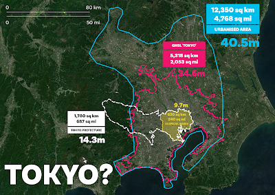
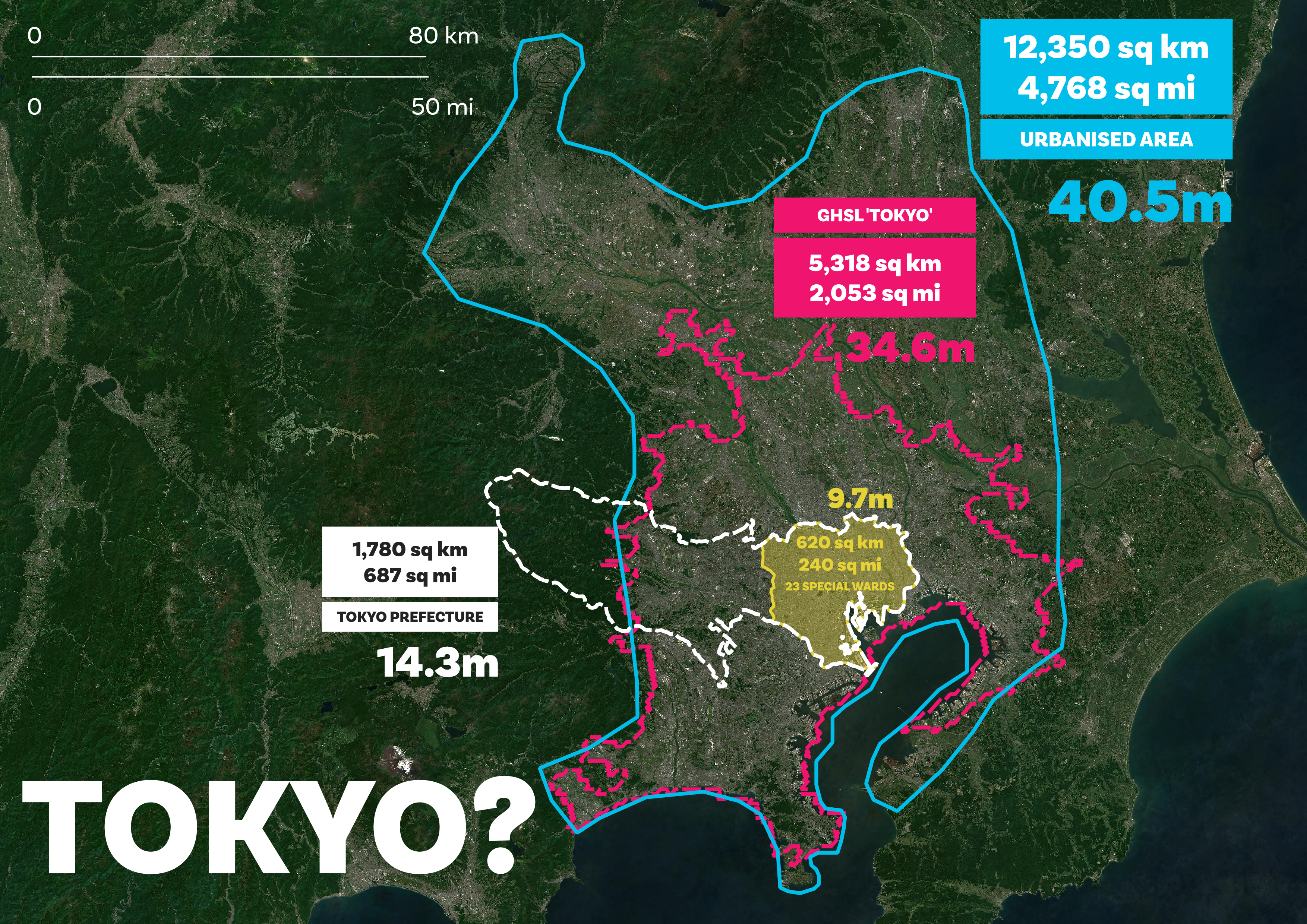
  • 9.7 million people in the 23 Special Wards (this represents the inner-urban core of the Tokyo Metropolitan Area, and is part of Tokyo prefecture - i.e. the Tokyo Metropolitan Government (TMG) area). 
  • 14.3 million people in Tokyo prefecture (i.e. the 'city proper' - this is the official Tokyo Metropolitan Government area but a big chunk of it goes well beyond the urban fabric). The official Tokyo Statistical Yearbook 2020 figure for this area says there are 14.05 million people in Tokyo prefecture, so my calculation isn't far off. Given that my calculations are based on 1km squares, it's not surprising there are some differences, given the unmodifiable chunkiness of 1km chunks of city vs the very detailed prefecture boundary.
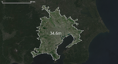
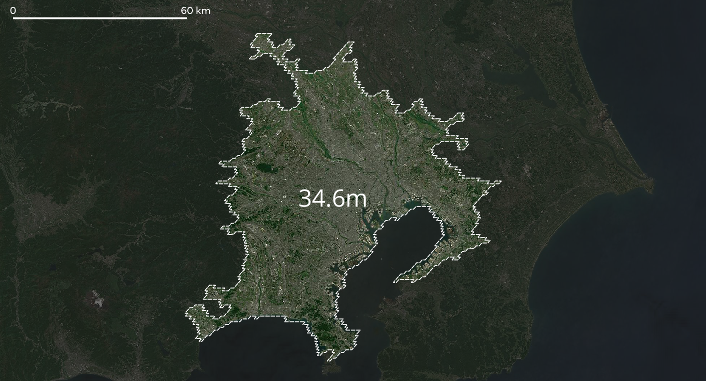
  • 34.6 million people in the wider Tokyo urban area, as defined by the European Commission's Global Human Settlement Layer project - take a look at their web map. This area is highly urbanised and in fact if you look closely (see map below) it appears that there are many continuously urban areas adjacent to it which are not included - so it may not be picking up all of the Kanto continous urban area. In fact, it definitely isn't. That's why I give another figure, below.

The GHSL project's definition of 'Tokyo' urban area

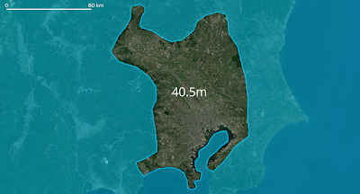
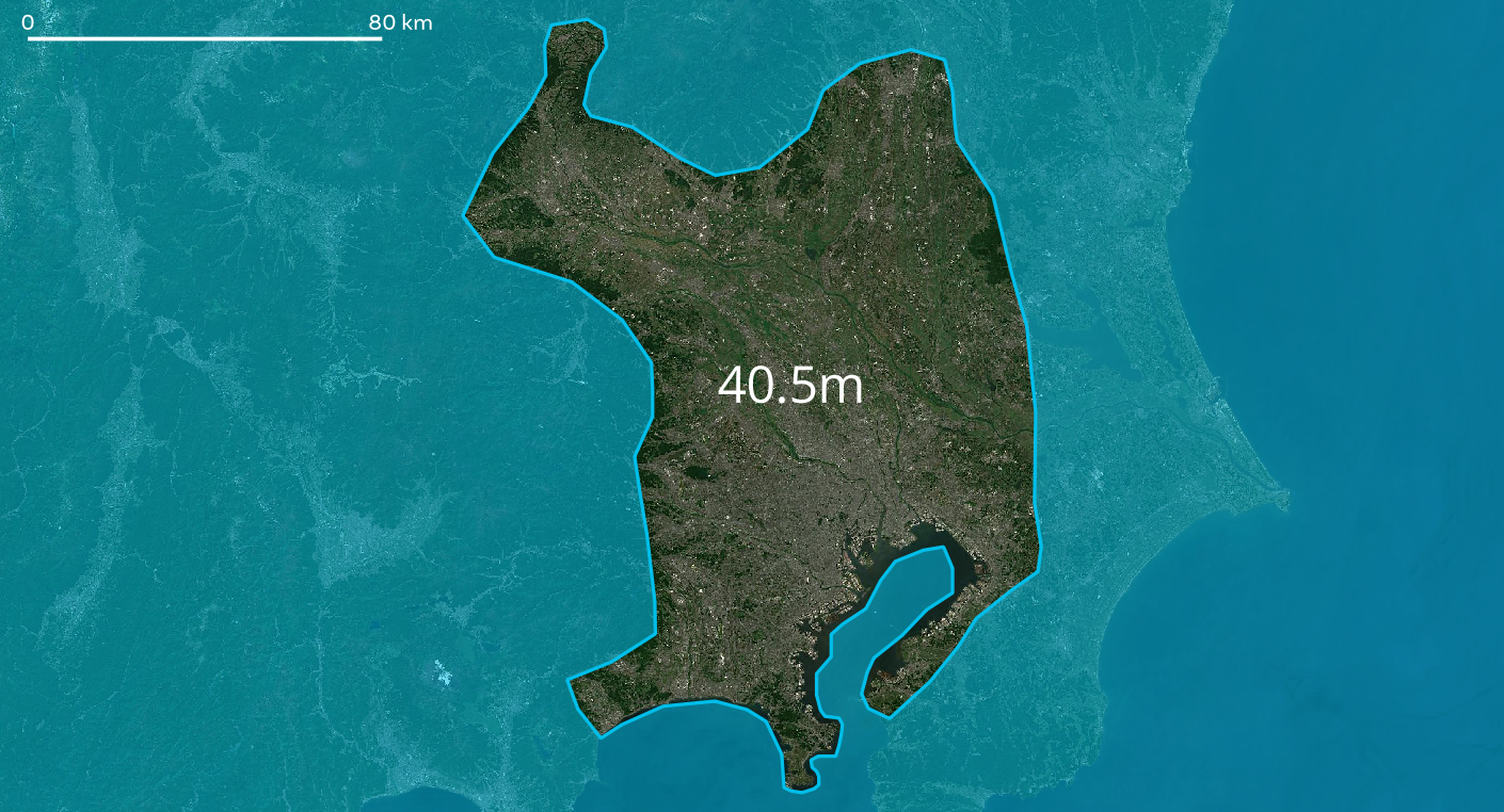
  • 40.5 million people in a fairly continuously urbanised area within the much larger Kanto region. I drew this area very roughly myself based on the underlying satellite imagery but as you can see (below) it does appear to be a reasonable approximation for the wider urban area. Yes, there is a good bit of green in here but it's still very much an urban area.
The wider 'Tokyo' metropolitan area


So is the population of Tokyo 40.5 million, or what? Well, we'll talk about Tokyo definitions a bit more below but here's the answer I'd give.

"The population of the wider metropolitan area in which Tokyo is situated is approximately 40 million people. The continuously urbanised Tokyo commuter zone has about 35 million people. The official Tokyo local government area (i.e. the prefecture, or TMG) has 14 million people and the '23 Special Wards' of Tokyo contain just under 10 million people."

But of course this also raises more questions, such as: how big are these areas in terms of square miles or square km? And, how does this compare to other cities or urban areas? And what about population density?

But for now, I think we've reached the conclusion that Tokyo is a big city. I think we can all agree on that much. Or can we? But what actually is 'Tokyo' anyway?


How big is Tokyo? The many Tokyos

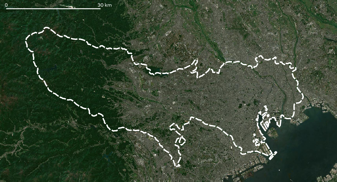
Geography boffins can talk all day about formal regions, functional regions, ontologies, epistemologies, boundedness, agglomeration, conurbations and so on. We can even go on Reddit or elsewhere on the web to read about how big Tokyo is or isn't, including that famous image of the wider Kanto area plonked over the UK. But for most sensible urban watchers, the 'city proper' isn't really a great way of assessing 'cities' because it's often a fairly arbitrary boundary that goes well beyond the urbanised area itself (as in the case of Tokyo) or indeed doesn't actually include all of the urbanised area at all (also true in the case of Tokyo). 

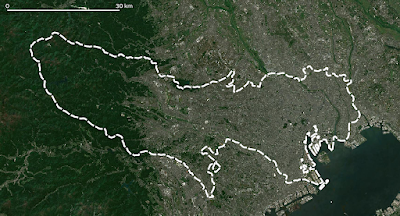
A prime example of this is shown in the map below, of the Tokyo Metropolitan Government area (the TMG, shown in white - this is the prefecture boundary for Tokyo) - I haven't shown the far-flung islands that are actually part of the TMG prefecture but you can see that the area around most of it is very dense. The area within the dashed white line is home to 14 million people, as of 2020. This is one of Japan's 47 prefectures and it is the most populous by far - Kanagawa (containing Yokohama) immediately south of Tokyo has about 9.2 million people. 

Overbounded in the west, underbounded everywhere else

If you Google 'Tokyo prefecture' this (above) is the boundary you should see on Google Maps. It is equivalent, in administrative terms, to the local government area covering Greater London or New York City. But of course it is an administrative, technical, political boundary and not one that makes much sense if we think about human activities. It's a formal boundary rather than a functional one.

Nonetheless, this version of 'Tokyo' does exist and it is a real thing and within this space your local government authority is the Tokyo Metropolitan Government and the Governor is (at the time of writing) is Yuriko Koike. But really this section is more about the size of 'Tokyo' in areal units, so let's get to that. Note in the map below how the only 'Tokyo' that includes a big chunk of countryside is the official Tokyo Metropolitan Government area - i.e. the actual Tokyo prefecture itself).

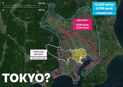
  • The 23 Special Wards cover an area of approximately 620 sq km / 240 sq mi.
  • The Tokyo Metropolitan Government area (TMG, also known as Tokyo prefecture) covers an area of approximately 1,780 sq km / 687 sq mi- note that this refers to the area shown in the map below and does not include the islands that are part of the prefecture.
  • The Tokyo commuter zone (i.e. the European Commission's GHSL boundary for 'Tokyo') covers 5,318 sq km / 2,053 sq mi.
  • The area I defined - very roughly - as being the continous urban fabric surrounding Tokyo covers an area of 12,350 sq km / 4,768 sq mi. Note that my drawn area is not the same as the Kanto region. The Kanto region covers an area of 32,423 sq km / 12,518 sq mi and has a population of 42 million - so if we used the Kanto region as a proxy for 'Greater Tokyo' or 'the wider Tokyo Metropolitan area' then it would be adding in loads of almost empty countryside and that wouldn't make much sense.
Look at the urban fabric vs the boundaries here


But does any of this even help us? Do you know how big or how small 620 sq km or 240 square miles even is? Well done if you do, but I don't, so I need to have some way to compare it to something I know if I'm going to understand it. More on that below in relation to London but here are a few comparisons.

  • New York City (i.e. the five Boroughs) covers 300 square miles (about 780 sq km). So, the 23 Special Wards (population just under 10 million) covers an area about 80% of the size of NYC but has more than a million extra people.
  • Greater London (i.e. the 32 Boroughs plus the City of London) covers an area of about 1,570 sq km (606 sq mi) - that's about 90% of the size of the Tokyo Metropolitan Government prefecture area - and recall that the Tokyo prefecture area contains 14 million compared to about 9 million in Greater London. Add Scotland's population (about 5.4 million) to Greater London and you get roughly the same population as Tokyo prefecture.
  • Delaware is about the same size is the the European Commission's GHSL boundary for 'Tokyo'. Delaware covers 1,982 sq mi or 5,133 sq km and has a population of just over 1 million as of 2021. By comparison, the GHSL 'Tokyo' area has almost 35 million people. Take Delaware, add in the population of Texas (almost 30 million as of 2020) and you're still not at metro Tokyo density levels. To get to that you'd also have to add Arkansas' 3 million residents. This would of course be a fascinating sociological experiment but in practice it may not work very well. 
  • Île-de-France (the the Région Parisienne / the Paris Region) covers an area of 12,012 sq km (4,368 sq mi) and has a population of just under 13 million people - compared to the 40 million in my self-drawn 'Tokyo continous urban area' shape. This is also roughly the same area as Los Angeles County (including the water bits), which is home to just under 10 million people.
So you're saying that Delaware has the same area (roughly) as the urbanised Tokyo commuter zone but 34 million fewer people? Yes, that's about right. and the continous urban fabric of Tokyo's extended metropolitan area has more people than California in an area not much bigger than Los Angeles County? Also yes.

Okay, but what's this in Londons? How many Londons is this? Can we make sense of this by using Londons? Perhaps, so do read on.

Note how the white boundary goes beyond the urban area


Tokyos as Londons

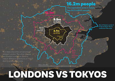
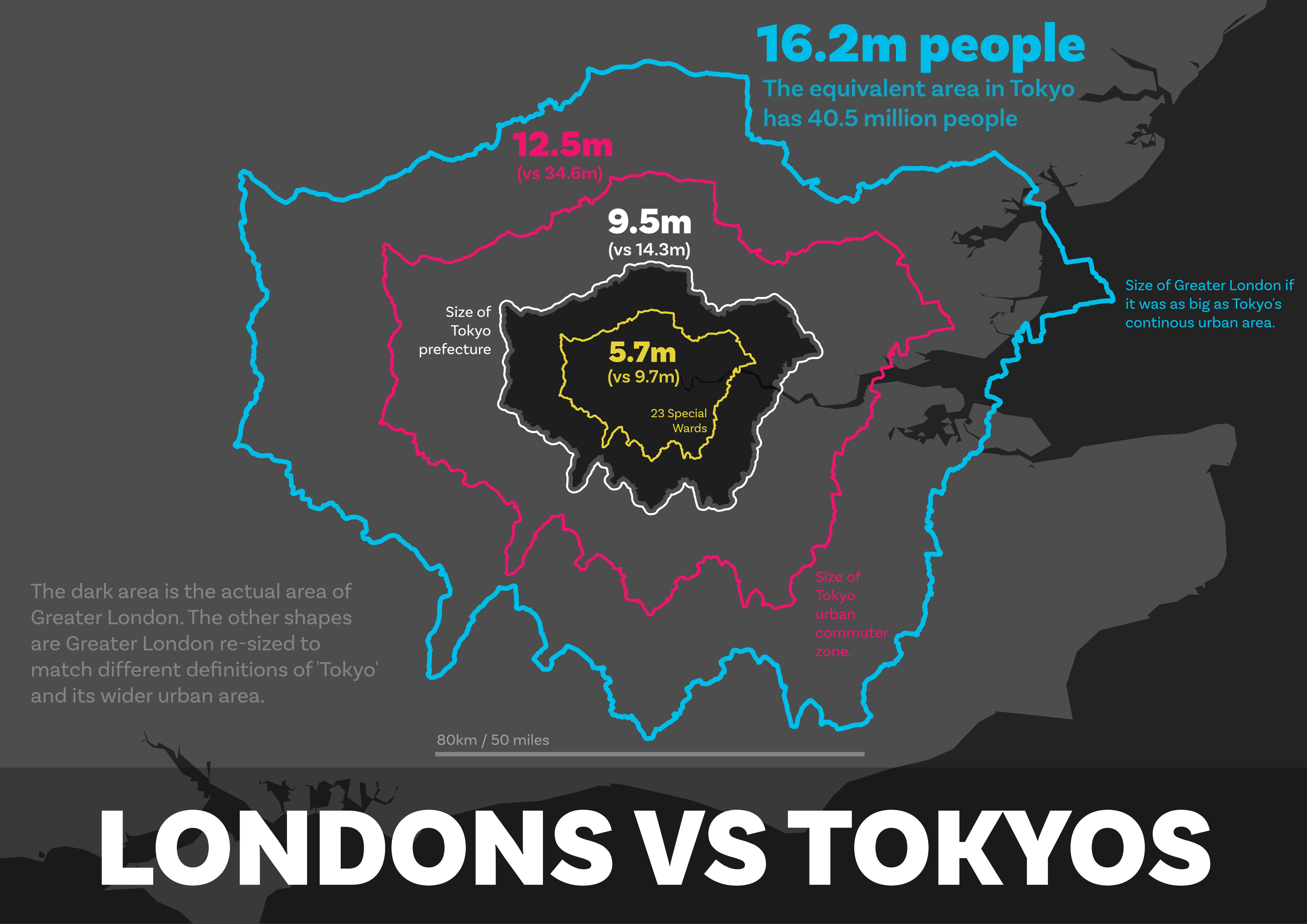
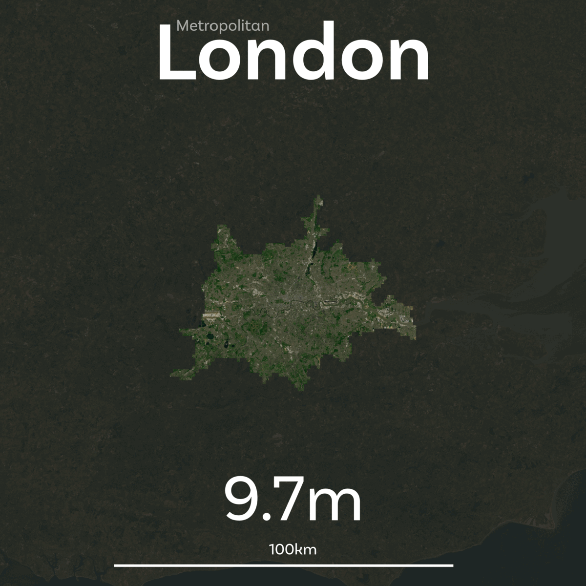
Because I live in the UK, about 175 miles from London, and because London is the only big city I know fairly well, I'm going to use Londons to make more sense of the Tokyos above. What I did was take the shape of Greater London and then resize it to match the four different definitions of 'Tokyo' above. To be clear, though, when I say 'London' I am using it as shorthand for Greater London - that is, the 32 Boroughs plus the City of London that have a combined population of 9 million people. 

Once I had created four new Londons, re-sized to match the four different Tokyos above, I then calculated the population of these new Tokyo-based Londons using the same WorldPop 2020 data as I used for Tokyo. This gave me the following results.

  • The area of London re-sized to match the area covered by Tokyo's 23 Special wards has 5.7 million people (vs 9.7 million in Tokyo's 23 Special Wards).
  • London re-sized to match the Tokyo Metropolitan Government area (i.e. the prefecture) has 9.5 million people in it. It's only just a bit bigger than Greater London itself. The real Tokyo has 14.3 million people in the same area.
  • London re-sized to match Tokyo's GHSL-based wider urban area has 12.5 million people in it, compared to almost 35 million in the real Tokyo urban area.
  • London re-sized to match my wider 'urban fabric' definition of Greater Tokyo has 16.2 million people in it, compared to 40.5 million in the actual 'urban fabric' of the wider Tokyo area.
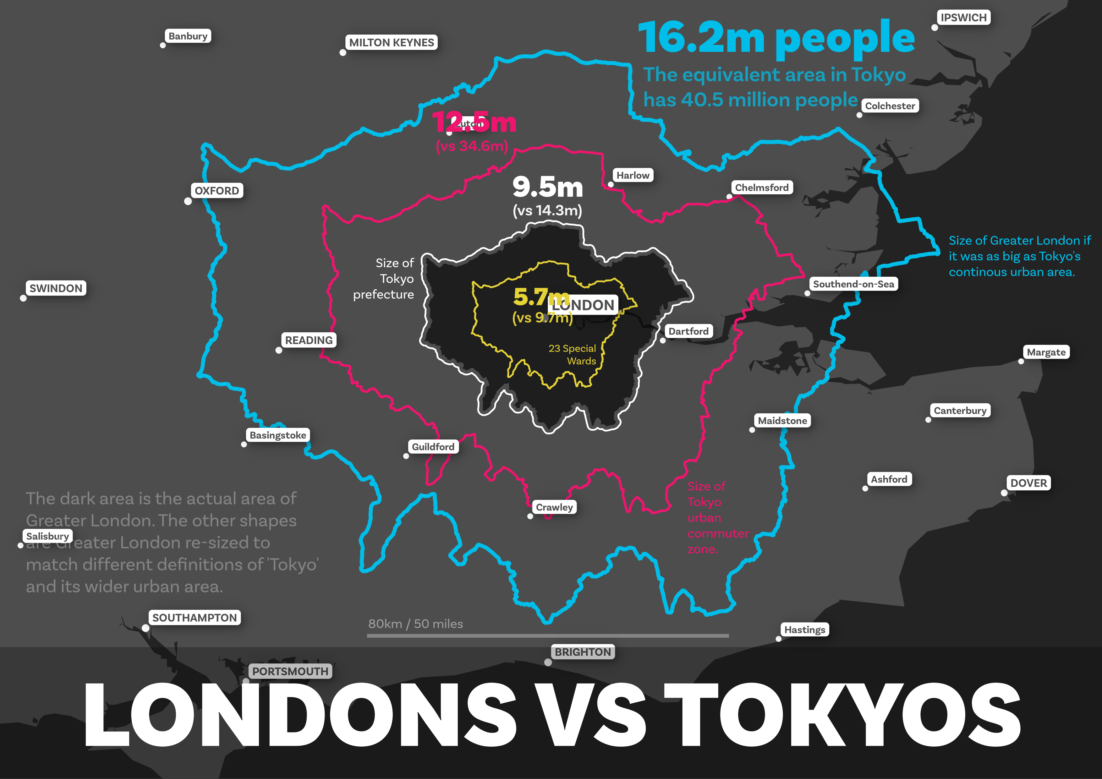
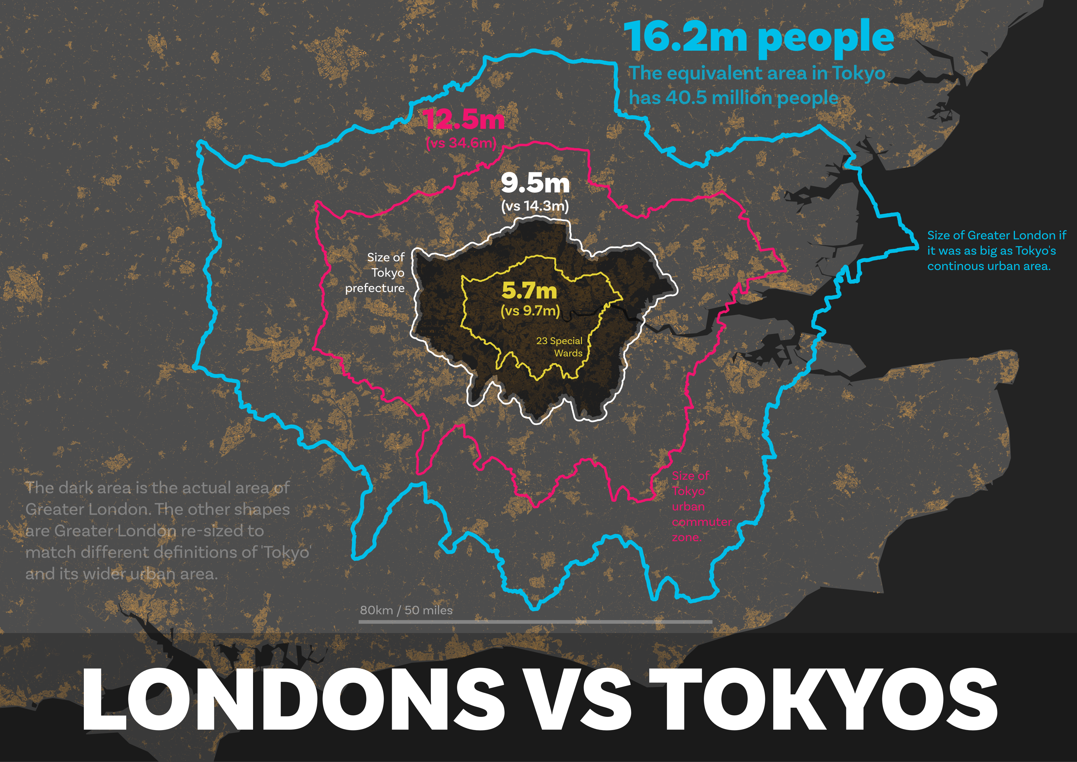
You can see all this on the maps below. The first one is just the re-sized Londons, the next one has labels too and the one after that shows the urban fabric to you can get a sense of the underlying settlement pattern in the south east of England.

Greater London re-sized to match different Tokyos

With labels, for a bit of context (a bit messy, sorry)

Same as the first one, but with building footprints added

I realise this can all get a bit confusing at times but just remember that the coloured 'London' shapes above have been re-sized to match the areas covered by the four different definitions of 'Tokyo' used above. Now, although I'm not thinking about population density here, the last map in particular makes me think of it, not least because I've seen people say that London is more densely populated than Tokyo. Well, as you've seen above, that really depends upon what you mean by Tokyo, so let's talk a little bit about density.


Population density

We've seen above that the Tokyo prefecture boundary goes way into the non-urban part of the administrative area and that the population in this particular Tokyo is packed tightly together. This is just another example of where using an administrative boundary to derive population density data makes no sense, or at least not much sense to me. I have written on this in the past, in relation to what I call 'lived density'. The basic idea in that piece was that population density metrics often make no sense at all if we are thinking about it in relation to what people actually experience in their day-to-day lives.

If we go to the Tokyo prefecture page on Wikipedia, we will find the following information.

  • Area: 2,194 sq km (847 sq mi) 
  • Population: 14.0 million
  • Density: 6,363 people per sq km / 16,480 per sq mi
But of course the population distribution in Tokyo prefecture is very much not a good reflection of this. 

The arithmetic mean here is a bad measure because: 

a) it is not a good representation of the reality on the ground - i.e. the mean as a model is a bad fit here; and 

b) the area figure includes loads of rural areas and offshore islands that are also very much not part of metropolitan Tokyo. 

Yes, the maths are correct but the number is not very useful in my opinion. The density in the 23 Special Wards would be a much closer representation of lived experience for most Tokyo residents.

  • 23 Special Wards area: 620 sq km / 240 sq mi
  • 23 Special Wards population: 9.7 million
  • 23 Special Wards population density: about over 15,000 per sq km / 39,000 per sq mi
Greater London's population density is about 5,666 per sq km or 14,670 per sq mi - so not as dense at all as the 23 Special Wards, or even as dense as the over-bounded Tokyo prefecture. I'm not sure of the original source of the claim that London has twice the population density of Tokyo but I saw it in this twitter thread and it stood out to me. I suppose it's all a matter of getting your Londons and your Tokyos defined in different ways though.

Hmm, how where was I? Oh yes, the actual size of the official 'Tokyo' and by that I mean the prefecture, i.e. the Tokyo Metropolitan Government area. 

The official Tokyo is HUGE!

The version of 'Tokyo' that gets us to 35 million people includes the following places: Tokyo; Yokohama; Kawasaki; Saitama; Chiba; Setagaya; Nerima; Ota; Sagamihara; Edogawa; Adachi; Funabashi; Itabashi; Kawaguchi; Hachiōji; Suginami; Koto; Ichikawa; Katsushika; Machida; Fujisawa; Kashiwa; Shinagawa; Kita; Koshigaya; Tokorozawa; Kawagoe; and Nak. That's a big place, but of course it's not a single place, even if it is basically one huge urbanised area with no major gaps in between.

But there is another Tokyo that is MUCH bigger than that Tokyo (kind of), though on the face of it you'd think it was much smaller. You can read about this on the Tokyo prefecture Wikipedia page in the 'Geography and government' section but the basic facts are as follows.

  • It contains 62 different municipalities: 23 Special Wards, 26 cities, 5 towns, and 8 villages. 
  • The most populous ward is Setagaya Ward (one of the 23), with a population of about 910,000. 
  • It contains three villages with populations under 500
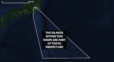
  • It contains islands hundreds of miles away from the Japanese mainland.
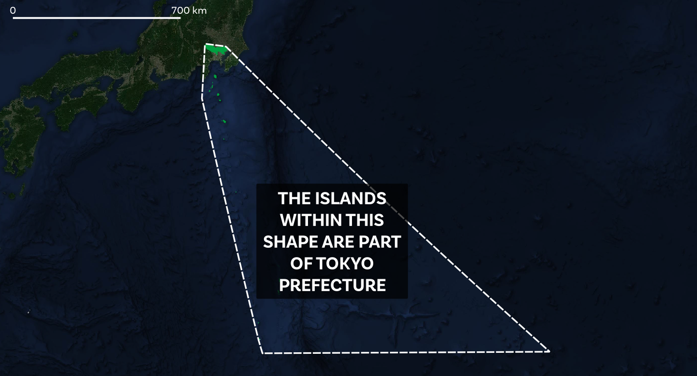
Here's a map showing the convex hull of the Tokyo prefecture area, like the one at the beginning of this piece. The dotted line encloses all mainland and island areas that is officially, from an administrative point of view, 'Tokyo' - i.e. the prefecture version of Tokyo that has just over 14 million people. The sea is of course not part of Tokyo. 

Includes the Izu Islands and the Ogasawara Islands


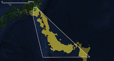
Rotate Japan and put it inside Tokyo's convex hull


What's the island at the far south east corner of the map above? Why, that would be Minamitorishima, the island shaped like a shark's tooth (see below).


Minami-Tori-shima

Here's a photo of Minamitorishima taken in 1987 by a US Air Force Sergeant. Also known as Marcus Island, it is 1,848 km / 1,148 miles southeast of Tokyo and covers an area of about 1 square mile - about the same size as the City of London - and the closest island to it is more than 1,000 km away. It is, as you might expect, the most easterly point of 'Tokyo' and nobody lives there. This makes it easier to calculate the population density. Unsurprisingly, there is no Google Street View imagery here, although the satellite image is quite good. It doesn't look like the best place to be when the weather is bad though.

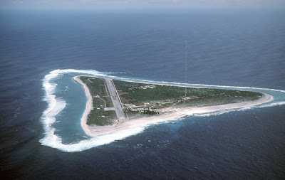
Taken by Chief Master Sergeant Don Sutherland, U.S. Air Force 


Conclusions

1. Tokyo is a big city, however we define it. But to say that Tokyo has 10 million or 14 million people would be a big under-representation of the true size and scale of the continous urban area of which Tokyo is the biggest settlement.

2. Not all Tokyos are the same but only one Tokyo is the 'official' Tokyo - i.e. the prefecture.

3. Some Tokyos are much more than just Tokyo. That is, any sensible definition of the functional scale and size of Tokyo is much bigger than the Tokyo Metropolitan Government area defined by the prefecture boundary.

4. One Tokyo (the 23 Special Wards) is much smaller than the other Tokyos.

5. The urban area of 'Tokyo' or 'Greater Tokyo' or 'Tokyo Megalopolis' is very often considered to be the largest urban area on earth - and as we have seen here the population can be calculated at between 35 and 40 million people - that's about the same population as Canada or California. Note that the Global Human Settlement Layer (which my 34.6m Tokyo population comes from) has Guangzhou and Jakarta urban areas ahead of Tokyo in terms of population, at 40 and 36 million people respectively.

6. Tokyo includes loads of islands far away from what we think of as Tokyo. If we draw a shape around it (i.e. a convex hull) then that area is far bigger than Japan itself. Yes, Japan fits into Tokyo's convex hull (if we chop it up a bit). Tell your friends.

7. The population of Tokyo is 9.7 million, 14 million, 35 million or 40 million depending upon what you mean by 'Tokyo'. But if we're talking about the population of the large, continuous urban area then I'd say that 'Tokyo' has between 35 million people and 40 million people.

8. Has anyone done a list of countries where you can see the nation's highest peak from the capital city? You can see Mount Fuji from Tokyo, about 100km / 62 miles away. This must be my next challenge.


Here's a parting gif for you - the GHSL area of Tokyo compared to the GHSL London area - they are defined the same way so we are comparing like-with-like here.