Saturday 30 January 2021

New QGIS training courses for 2021

A short post today about the new training courses I'm launching as part of my new business (Automatic Knowledge). In late February and early March 2021 we're putting on the first of our public QGIS training courses, as well as one in Aerialod. These are paid events, bookable via Eventbrite and are part of our mission to help improve geospatial software skills across the world. We'll make the training material available for all, plus the data - and we will continue to offer financial support to the QGIS project as a 'sustaining member' - as well as make further donations to the Aerialod project. The permanent url for our training pages is automaticknowledge.eventbrite.com and right now you'll see the first five courses advertised - all of which will be repeated on a fairly regular basis. Note: we offer discounts based on where you are in the world, plus a 50% discount for all students (the 50% student discount is in addition to any country-specific discount). Obviously this isn't a perfect solution but we do want to make our pricing structure as fair and accessible as possible. Feel free to get in touch if you have any questions - you can contact us here.

See our global pricing policy

You'll see full details of each course on the Eventbrite page. For now, we are running them online - see below for a brief look at each of the five courses - three are full day courses and two are half days. When the world opens up again we'll still be doing them online but will also start up our in-person training sessions again.

Our first five training courses


I've previously put on lots of public and corporate QGIS training events, as well as delivering thousands of hours of GIS training in Universities. Now that I've launched Automatic Knowledge I want to continue to do this as much as possible, so this is part of the reason for launching these public sessions. Part of my motivation also has to do with the fact that - in the UK at least - there is something of a skills gap in relation to geospatial skills - e.g. see p.8 from the 2019/20 Geospatial Commission Annual Plan.

I agree that there's a need for better skills


However, I'm not trying to turn everyone into a geospatial nerd, honestly. I just think that whilst many of us have access to great open data, and fantastic free and open source software like QGIS, there aren't always enough people with enough knowledge and skills to do the kinds of things they might want to. I've seen this need grow over the past few years as I've put on training courses for a variety of organisations - including the BBC, the FT, Savills, Regeneris, as well as teaching people who work for large global organisations such as Google. In addition, I always try to help people who come to me with queries and questions about tutorials I've posted previously on my blog - this happens on a fairly regular basis from people in different parts of the world (e.g. recently I helped people from Colombia, Bhutan and Nigeria with GIS-related queries).

With all of the above in mind, I can probably summarise my general training principles now, with a few bullet points.

  • Not for nerds: what I mean by this is that the Automatic Knowledge QGIS (and other) training sessions are not aimed at the uber-nerd but at competent IT users who want to get more into geospatial tools but are not really sure where to start or how to move beyond the basics. Even so, if you do self-identify as a nerd already you are still very welcome!
  • Fun - I really do think it's important to try to have fun, or at least enjoy things as you learn them, so this is an important part of my approach.
  • Fairness - it's difficult to offer an approach to timing (e.g. the first courses are on UK time) and price (I realise not everyone can afford full price) that helps everyone, so I have adopted a varied pricing structure so that it can at least be a little bit fairer than a flat global pricing structure. I also plan to put on sessions in other time zones - and in person when this is allowed again.
  • Inclusive - I welcome anyone and everyone, no matter who you are or where you come from or what you know or don't know. My view is that the geospatial world - particularly in education - should be about encouragement, positivity, mutual support and openness. 
  • I don't know everything - this is obvious, but important. Sometimes during a training session someone will ask 'what does this tool do?' and the answer I have to give is 'I don't know'. Sometimes this happens, but you may also be glad to hear that I do know quite a lot about the software I teach - but I realise this is all relative and I continue to look on in awe at so many people in the geospatial world. I'm always learning, and in cases where I do have to say 'I don't know', I always end up learning more in the end.
  • Flexibility - my training sessions are based on a very carefully prepared, tried-and-tested workbook format. This works really well but there is always a risk that it can turn us into robots - so I always make sure we can go off at tangents, explore new ideas and tools and generally get to grips with the software in a way that makes most sense for the user. 
  • Giving back - a cliché, I know. When people do my training sessions, they pay for my time and expertise developed over many years, but I will continue to share my knowledge more widely on my blog, on Twitter and elsewhere. I am often found in Twitter DMs sharing my knowledge or tips with users from across the world. Right now, Automatic Knowledge is in the 500+ Euros per year category of QGIS donors, but we always want to give more - our last donation to Aerialod was $200USD and we plan to continue to donate to the project. 

The courses currently listed on Eventbrite

Right now we're working on finalising our new training material (see below for a peek) and we're really looking forward to getting started. You can see who 'we' are on our website. The idea is to start small and then grow slowly over time as things develop. The training side of the business is only part of what we do but it is a very important part of our overall mission.

This is our intro-level QGIS course

We're currently using QGIS 3.10

Part of the intro section

A few introductory words

Finally, I've recently been re-writing my 'QGIS tips and tricks' sheet and thinking about a) what I know, b) what I think is important for users in different contexts, and c) how amazing QGIS is. Here are my notes on that so far - only some of this is going in; the rest will be part of different levels of the courses.

Messy handwriting, sorry

So, if you're looking to get into making maps from data, or want to get better at it, or just want to talk about it, feel free to get in touch with me.


Sunday 24 January 2021

How to work with Facebook population density data

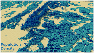
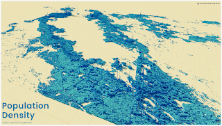
This is a brief introduction on how to work with Facebook's high resolution population density data in QGIS, for anyone who needs a bit of help getting started. It's one of the datasets I'm using in my upcoming QGIS and Aerialod training sessions so I've been working with it recently. I won't do analysis here but the basic workflow is simple - download it, load it, explore it, visualise it, analyse it. Here's a couple of examples of the data for the New York City area and the San Francisco Bay Area - these show the general density patterns in 3D. When I said 'high resolution' above, I mean one arc-second. At the equator, this is just under 31 metres square so that's very small areas. As you go further from the equator the cell size is of course smaller, but you can read more about the methodology here if you want to. To save you a click: 'These maps aren’t built using Facebook data and instead rely on combining the power of machine vision AI with satellite imagery'.

An example for the wider NYC area

Same as above but for the SF Bay Area

Download it

Yes, this step is obvious but it's not always easy to remember where to find stuff on the internet so I'm putting this here for my benefit as much as anyone else. Also, the data are available in more than one place but here's where I go to get it.

  • Go to the Humanitarian Data Exchange (HDX) home page and search 'high resolution population density' and you'll get see lots of results - the data are available by country.
  • To get data for use in QGIS, I normally filter my search by looking for only Facebook data and in GeoTIFF format - here's an example search result, which returns 194 country datasets.
  • And then I go to the results page for the United States - this is a good example to look at because there is so much data. It's hard to know which data to download and how to work with it. 
  • You can also get the data via the AWS open data registry, but I'm aware this is too technical for some people so I'll concentrate on the click-to-download approach.
  • The US data - unlike many other countries - is split into chunks, so the best way to get it into QGIS is to download the virtual raster file (population_usa_2019-07-01.vrt (16.1K)) and then download all the the files for the US that begin with 'population_usa18_' - there should be 32 of them if I've counted correctly.
  • For the US, put the .vrt file in a folder and then unzip all the tif files into the same folder that the .vrt file is in. For countries where you just have one tif file for the whole country you don't have to do this.
No matter what, this Facebook page takes you straight to what you need to know to download the data and start working with it in QGIS. Note that as well as data on total population, you can also get a population breakdown by age.

Load it

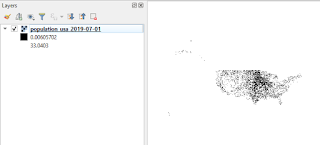
I then open QGIS (I'm using version 3.10 right now) and then load the data. I do this by dragging and dropping the .vrt file directly into QGIS but you can also do it via the data source manager. If you don't see anything when you do this, it's probably because your tif files aren't in the same folder. When you add it to QGIS (it's about 1.2GB of tif files) you will see something decidedly unimpressive - but don't worry, that's easy to fix. Notice that the upper value shown in the legend in the Layers panel will probably be way lower than the actual highest value in the dataset. There are also some instructions from Facebook on how to load the data in QGIS.

Don't be fooled - this is great data

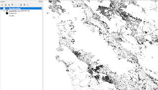
Now zoomed in to the SF Bay Area

Explore it

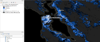
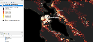
Actually, I did explore this data after adding it to QGIS, but because it's just a black and white mess by default, I actually made it a bit nicer so that I could explore it properly. I added a couple of other layers, turned the background black and did a bit of styling - otherwise it would be a bit difficult to explore meaningfully. Here's what that looks like, including a screenshot of how I styled the population density .vrt layer. 

I've just styled the layer quickly here

This is how it was done in QGIS

Same idea, different colour scheme

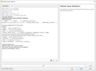
After I did this, I spent quite a while panning, zooming, clicking and just getting to grips with the data. The highest cell value I could find in the entire dataset was over 3000, which seems like quite a lot for a 30m x 30m cell. This may of course be an anomaly so it's always worth doing a bit of a deep dive on any new dataset like this to check for values that don't seem right - e.g. like I did previously when the GHSL global population density dataset came out. Here's a screenshot of the results when I ran some raster stats on it in QGIS - you can see the max and min values and also the sum of the population, which looks about right based on the time period the data relate to.

Is this max value possible? Well, theoretically

Visualise it

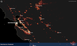
I'm not really going to say much here other than that I did a series of maps in QGIS (see below) and also some quite quick and rough 3D visuals in Aerialod. The 3D ones are more schematic and abstract than anything else but with a bit more time they can be quite useful and also very accurate.

The wider SF Bay Area

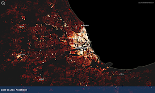
Chicago and beyond

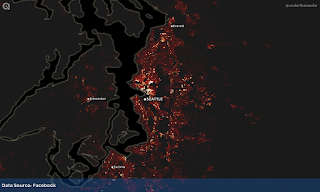
Seattle and the Puget Sound area

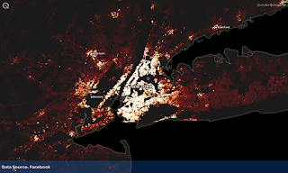
The NYC metro area - and beyond

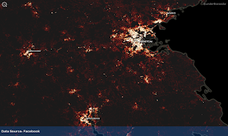
Boston and a chunk more

A bit of ye olde megalopolis

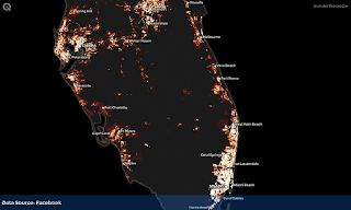
South Florida (mostly)

The Texas Triangle

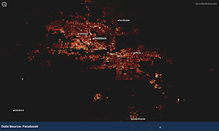
Phoenix metro area

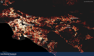
Los Angeles

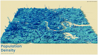
I also (of course) did a few visuals in Aerialod, which you can see at the top of the page. I did one for London as well (below) but this didn't work out quite right but I'm posting it here anyway because it looks like some kind of Minecraft output and I think it's quite interesting to look at.

I think I need to stretch the values a bit more

Analyse it

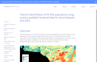
You can do all sorts of analysis with this data, but half the battle with anything like this can be knowing how to get the data and how to work with it. I'm not going to cover any analysis here but thankfully the Facebook data team have an excellent example of using the data to identify at-risk populations. There's a full tutorial based on using the data in QGIS. If you want to look more at movement data, particularly during the period associated with Covid-19, Facebook has some great movement range data as well. Regardless of what you do in terms of analysis, this is certainly a very useful dataset for the visualisation of urban spatial structure.

This is a very useful tutorial

And that's about it for today - I'll finishing by adding in a few more maps of population density for the United States, for areas not included above.


Related

I've written about this kind of thing quite a bit in the past, and also shared similar data, so these links might be of interest.


Citation

Facebook Connectivity Lab and Center for International Earth Science Information Network - CIESIN - Columbia University. 2016. High Resolution Settlement Layer (HRSL). Source imagery for HRSL © 2016 DigitalGlobe. Accessed 20 January 2021."

The Facebook data I've used here is open data (CC BY).


Friday 15 January 2021

Which football team is nearest me?

Today's post combines points, pointlessness, science, football, maths and maps - the perfect combination. It's based on the perennial 'which thing is nearest me?' question and does it in relation to teams in the English men's football pyramid that were scheduled to compete in the 2020-21 season (this includes a small number of Welsh teams that play in the English football league system). The main things we made are two interactive maps showing which teams are nearest anywhere in England and Wales (top flight version and tiers 1 to 8 version - oh go on then, here's another one for the top four leagues). This was a little Automatic Knowledge side project that came out of a conversation between Philip Brown and me last September. It's really just a bit of map fun with a dataset Philip put together that we thought was quite interesting - we have no secret agenda. Or maybe we do. We don't. Or do we?

This is how the polygons work and what they mean: all areas within a polygon are closest to the team (shown as a point) within the same polygon. In the examples below we've added an indication of the underlying settlement pattern as well, just to show where people live. In the first map below, everywhere in the bigger yellow shape is closest to Everton and everywhere in the smaller yellow shape is closest to Brighton & Hove Albion. Note that in season 2020-21 Everton is the only top flight team that has parts of England, Scotland, Wales and Northern Ireland closest to it. Already knew that? Keep reading, we have more.

For each team, you can see the area closest to it

Same map as above, but minus the yellow explainer areas

Now, if you're a bit of a boffin you will at this point have several questions, including 'does anyone play in purple?' or 'how many teams begin with the letter b?' (54, presently more than for any other letter of the alphabet amongst clubs in the top eight tiers of English men’s football). However, top of the list might be 'I wonder how many people live in each area?'. Well, we did some calculations for this using the most recent Office for National Statistics mid-year population estimates (for June 2019) and got some answers. We used population-weighted LSOA centroids (covering small areas) so this gives us final estimates that will be reasonably accurate. 

As you can see in the tables below, we calculated that for 12.6% of England's population, Southampton are the nearest top flight team this season - that's over 7 million people. We didn't expect Tottenham Hotspur to be second, at 9.4% (over 5.3 million people), but that's what we get, because the Tottenham wedge takes in much of the East of England. In the second table below you can see the same data but with the entire population of England and Wales included, just because there are a small number of Welsh teams who play in the English football league system. 

Incredibly important data

Even more important data

Here's what the areas look like zoomed-in a bit on the top flight interactive map (below). You can see from the table above that in the blue wodge (Chelsea) the population adds up to almost a million, because of the high density in west London. Almost 1.4 million live in the Arsenal wodge on the top flight map. But we're not writing about population density today so let's look at some other stuff.

Almost a million people live in the Chelsea wodge

The nearest English top flight team this season if you live anywhere in Scotland? Well, let's just say that nobody can call you an Everton glory hunter if you're a Toffees fan from Stranraer. Burnley comes close, but doesn't quite touch Little Ross island. For everyone else in Scotland, Newcastle United are the closest team, which is not surprising.

Dumfries and Galloway - Everton territory?

We extended the polygons beyond the boundaries of England, but of course everywhere has their own leagues and teams - this was just to make sure all of England was covered, but it overlaps other countries too. We're not suggesting everyone in Brugge/Bruges should be a West Ham United fan (although, feel free). See the nerd notes at the bottom of the page if you want to know more about the method, but the shapes are called Voronoi polygons (also known as Thiessen polygons and for maths boffins more commonly Voronoi diagrams). You put a line half way between each set of two points and then construct a whole set of polygons based on this simple geometric principle. See below for how this looks in Merseyside, where Liverpool's Anfield and Everton's Goodison Park are only about 1km apart and the dividing line is half way between the two grounds.

The red and blue 'halves' of Merseyside

And below, here's a little more zoomed in detail of London so you can see how the polygons are constructed. Again, half way between each point pair a line gets drawn and then all the lines are joined up until they intersect and make polygons. 

Half way between each pair of dots, you see a line

Okay, you get the point, but there's more to football than the Premier League, right? Yes, so we decided to do lots of leagues, but which to include and which to leave out? In the end, we decided - after some discussion - to include tiers 1 to 8 of the English football pyramid. Once you go below the 8th level the number of football clubs really skyrockets, plus we've just had an 8th tier team (Marine AFC, of the Northern Premier League Division One North West) play a top flight team (Tottenham Hotspur of the Premier League) in the FA Cup for the first time ever in the competition’s 140 seasons, so it seemed like good timing. Here's a screenshot of the interactive map that includes the top eight tiers of English men's football.

This is not pointless

We've also shared a spreadsheet that tells you how many (and what %) of the population of England and Wales live within each polygon.

Everything you ever wanted to know

Of all the English teams in tiers 1 to 8, the team with the highest population in its Voronoi polygon area is Arsenal, with approximately 1.3% of the English population. Leicester City and Tranmere Rovers are the only other English clubs with a figure of more than 1%. In Wales, about 28.6% of the national population fall within the Swansea City polygon and about 27.1% fall within the Cardiff City polygon - however, caution should be exercised when interpreting this data for Welsh teams as most Welsh football clubs do not play in the English football league system but instead play in the Welsh football league system. But, returning to England, spare a thought for Swindon Supermarine of the Southern League Premier Division South, wedged between Highworth Town and Swindon Town, with a polygon population of just under 21,000. That’s the smallest local population for any team in the top eight tiers of the English football league system.

Swindon Supermarine FC

This all leads us off-topic to the seemingly weird and wonderful names of some of the teams. Or at least they can sound weird and wonderful if you've never heard of them. Talking of which, I'd like some AI/machine learning guru to go full-on Bobson Dugnutt on English football team names, if it hasn't been done already.

Here's a selection of some of my favourites, staring with Swindon Supermarine:

  • Swindon Supermarine - a full tier above Marine FC 
  • Corinthian Casuals - they are of course pretty famous though
  • Whitehawk - from a suburb of Brighton
  • Prescot Cables - again, pretty famous and they've been around for a long time
  • Loughborough Dynamo - I just love their name (I believe named after Moscow Dynamo)
  • Three Bridges - but just one football team, based in Sussex
  • Folkestone Invicta - am really hoping they get to play Blyth Spartans some day
  • Dorking Wanderers - in the sixth tier, the National League South
  • F.C. Romania - in the eighth tier, founded in 2006 by Ionuţ Vintilă

Whitehawk FC

This turned out a bit longer than intended and we have loads more stuff but I think I'll leave it there for now - possibly forever. It will go out of date soon enough once the 2020-21 season ends and teams move up and down the various tiers of the English football league system, and in and out of the Premier League.

As for me, I'm a season ticket holder at Thrumpington Olympians, who may or may not be a real team but hopefully someone like Dan Hon can train an AI to generate football team names as a next step in this important scientific quest. 

To end, I should add that I have no strong opinions about what teams people do or don't support - however near, far, successful or futile they may be. This piece is just what happens when I end up discussing random 'I wonder what that would look like' ideas with similarly-inclined colleagues and have a bit of spare time to find out the answers.

Nerd notes: this is my favourite video about Voronoi diagrams. Note that Georgy Voronoy (spelling is different for the polygons but it's the same dude) was Ukrainian and, as it happens, a student of Andrey Markov - part of a chain, you might say. I also like this little Voronoi software demo with Theo Gray. Philip Brown located all the football team grounds from the Premier League all the way to the eighth tier, and beyond, but we just used the top 8 tiers here as you can see. We made the Voronois in QGIS (it's really easy) and the web maps were made with Tom Chadwin's qgis2web. Colin Angus did a nice version of the top flight map in November, and thankfully our shapes match his. Guus Hoekman also has some code for doing similar things, if you want to have a go.

The colours on the top flight map are from individual teams - if not the first colour, then a different one from their badge. The tier 1 to 8 map uses the red and navy blue shades from the FA website. As noted above, I'm informed that no team in tiers 1 to 7 plays in purple as their first choice kit (thanks to Philip, once again) but we didn't want to have a purple map. [Side note - City of Liverpool FC, of the 8th tier Northern Premier League Division One North West, chose to play in purple due to the fact that the city's two Premier League clubs (Everton and Liverpool) play in blue and red respectively and when blue and red are mixed, they make purple!]

Loads of people have done this kind of thing before, with football in England, major league teams in the US, and many more. Ours is just for fun, using the most recent data for the top 8 tiers of the men's football league system. What about tiers 9 and 10!? If we'd included tiers 9 and 10 we'd have had to add more than 650 teams - when our current dataset for tiers 1 to 8 only has 382 teams in it. Did you think about doing a travel time one? Yes, we've done this too and may share that in future, we'll see. This post is long enough already. Note that 'nearest' here relates to straight line, as-the-crow-flies distance, or what is also known as Euclidean distance, after Euclid, the famous Greek centre forward (possibly) and geometry genius (definitely).

Finally, for English data boffins, the mean population of an English LSOA from the 2019 mid-year estimates is now just under 1,714 people. The lowest population of an LSOA is in Hull, with 679. But the highest - and this is EXCITING - is 16,004 in Newham in East London.

The base map on the web map is © OpenStreetMap contributors, used under the CC-BY-SA licence.


Monday 11 January 2021

Daytime and nighttime population density in Europe

This is a short post about a relatively new data series from the European Commission's Joint Research Centre. It comes from their 'Spatiotemporal activity and population mapping in Europe (ENACT)' project and - in simple terms - it provides gridded population data for the daytime and nighttime, so that we can compare population patterns at different points in the day. It's very similar to the GHSL data that I've written about before but the key difference is that we can compare the population of 1km cells in the daytime vs the nighttime. The data are from 2011 and it is available for each month of the year, and in two different projections, for the EU28 (as it was when the project began). But what does it look like? See below for a snapshot of nighttime population for January.

This is basically a 'where people live' map

The data were released in mid to late 2020 so many people might have missed it but I think it's a great new addition to the European data infrastructure. You can read more about the specifics of the project and the data fusion approach in this open access Nature Communications paper written by the research team. It's a nice piece, and it also sets out why - if you weren't aware - it is important to understand both the spatial and the temporal distribution of population. These issues have of course come into focus more during 2020 and beyond with the rise of Covid-19.

As for the data, I'll let you explore that yourself if you're interested but I'd certainly recommend spending some time on the website and also reading the notes and information about it. For now, here's another map of the January data, but this time for during the day (so I've turned the lights up). You can see how the settlement patterns thin out as the population is concentrated in towns and cities. Greater London's daytime population normally swells to over 10 million, for example - although this has all changed since the advent of Covid-19. Will it ever rise so high again?

Daytime population - notice the higher spikes

You can find the actual values for each 1km cell by importing the data into QGIS (or any other software that will read a tif) and then querying it. I've done this below for the January data for a small area of central London so you can see how the day and night populations differ. I've added the raster cell values to the images - these are the populations for each 1km cell either at night or during the day, so you can really see how the population changes with commuting in this example. You may have to click on the image and zoom in so you can read the numbers.

Day vs night population

Right, that's all for now. This is a great new dataset and even though the time point is 2011 it provides a really useful resource for spatiotemporal analysis. It will be very interesting to see what things look like in future in relation to daytime vs nighttime populations with the impact of Covid-19 on the nature and location of employment.


Download the data (each tif file is about 14.5MB)

ENACT seasonal nighttime and daytime population grids for 2011. Values are expressed as decimals (Float). The data is published at 1 km resolution in Lambert Azimuthal Equal Area (EPSG:3035), 12 monthly nightime grids and 12 daytime grids, and at 30 arc-seconds in WGS-84 (EPSG:4326), 12 monthly nightime grids and 12 daytime grids. The compressed ZIP file contain TIF files and short documentation.

https://data.jrc.ec.europa.eu/dataset/be02937c-5a08-4732-a24a-03e0a48bdcda


Citation

Schiavina, Marcello; Freire, Sergio; Rosina, Konstantin; Ziemba, Lukasz; Marin Herrera, Mario; Craglia, Massimo; Lavalle, Carlo; Kemper, Thomas; Batista, Filipe (2020):  ENACT-POP R2020A - ENACT 2011 Population Grid. European Commission, Joint Research Centre (JRC) [Dataset] doi:10.2905/BE02937C-5A08-4732-A24A-03E0A48BDCDA PID: http://data.europa.eu/89h/be02937c-5a08-4732-a24a-03e0a48bdcda