It's been a while since I've posted a QGIS tutorial so with the release of QGIS 3.4 I thought I should do another one. This post is about how to create an interactive 3D model in
QGIS 3.4 which you can then export and view in a web browser, like the one you see below. You can see the interactive web version
here - it's great fun to play around with, particularly when you press R and watch it rotate. This kind of thing was possible in previous versions of QGIS but I think there are some great improvements with the new version of the Qgis2threejs plugin that you create this with (thanks to Minoru Akagi).
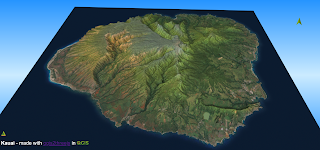 |
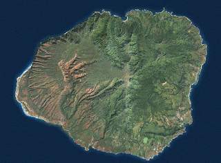
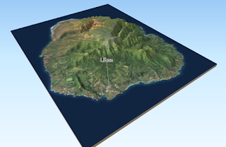
| This is Kauai, an island in Hawaii |
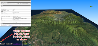 |
| Make sure you read the instructions - very useful |
The basics
All you need to make this work in the way that I have is
a) QGIS 3.4,
b) a DEM layer (that is, a raster layer with elevation data in it),
c) some kind of satellite or aerial imagery,
d) the
Qgis2threejs plugin which you install via the Plugins menu in QGIS and
e) a bit of time.
There are many sources of digital elevation model data but for this I used NASA's 30-meter resolution elevation data from the Shuttle Radar Topography Mission, which is very easy to download thanks to Derek Watkins'
tile grabber. You need to register (for free, takes only a few minutes) to get the 30 metre resolution data but if you can't be bothered doing that you can get the coarser
90m SRTM data without registration. As is normally the case with this kind of thing, the area I was interested in was split between two tiles so I patched them together in QGIS (Raster > Miscellaneous > Build Virtual Raster). I chose Kauai in Hawaii because of its size and varied terrain.
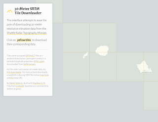 |
| Derek Watkins, I salute you |
For satellite or aerial imagery, the usual approach would be to add a layer in QGIS using the QuickMapServices plugin (e.g. Google Satellite layer) but in this instance I used a Landsat 15m image from the State of Hawaii's Office of Planning
GIS pages. This is a bit better quality than those available via QuickMapServices so I used this.
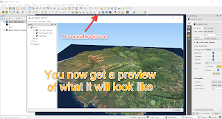
When you have the DEM data and the Landsat imagery in QGIS 3.4 it will look something like this:
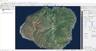 |
| Make sure your image fills the whole map view in QGIS |
 |
| The preview window is a great addition |
The process
You then activate the plugin by clicking the icon (see above) and it's a case of playing around with the options until you are happy with what you see. Since qgis2threejs has excellent
documentation, I won't go over all the steps and options here but I would just add the following points - and see point 5 in particular.
- Set the level of vertical exaggeration via Scene > Scene Settings... In my case the vertical exaggeration is 3.0.
- In Scene Settings under Material you may be baffled by the options - Lambert, Phong, and Toon. I've exported three versions of Kauai, one for each - you can see the difference by opening them in a web browser but basically the lighting will look different depending upon which one you choose.
- Right click individual layers to set the Properties. On the DEM settings you'll get a much crisper visual with the resolution set to 400% but the file size will be bigger and it will most likely load slower in the browser.
- If your preview looks wrong, with weird, impossibly high extrusion, change the projection in the bottom right of the QGIS window, as below.
- In previous versions of qgis2threejs, when you exported the view from QGIS it would automatically open the visualisation in a web browser. When you try this from QGIS 3.4 it will attempt this but if your default browser is Chrome or Internet explorer then you'll get an error message. This is a known issue so you'll have to view in Firefox or Edge (I haven't tried other browsers) to overcome it. This is only a local problem - it's fine viewed over the web in any browser.
- If you look at the style panel in the image below, you'll see that I've colorized the raster layer. I did this to give the image a kind of 'morning glow' look to it. See below for a comparison between a colorized and non-colorized image.
- Via Scene > Decorations you can now add in a north arrow (very cool, since it is dynamic) and a footer label to add text (which can be html, like I used to style the font and add the QGIS image).
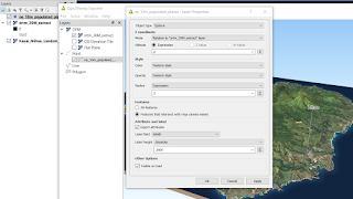
- If you want to add labels to a point layer, you can still do this by right clicking the layer in the preview and setting the options. It's no longer Times New Roman font either, so that's an improvement too. You can see an example with labels in a previous map I did of Madeira. I've added another screenshot below to show you how to set this up.
- You can also now set the view to be in Perspective (the default) or Orthographic, which is another nice advance.
- There are many things you might want to tweak manually that you can't do from within the plugin options but they can be done by editing the html and the js and css files (see below for more).
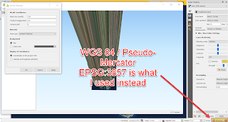 |
| Don't worry, just change the CRS |
 |
| Subtle difference, but I like the effect (this is a looping gif) |
 |
| Setting labels relative to the DEM surface will usually look good |
When you export the scene, qgis2threejs will create a number of files and folders which you can then put on a web server so that the world can see how amazing you are. Or, you can just view them locally on your own computer (but not in Chrome or Internet Explorer, like I said above).
Making it look even nicer
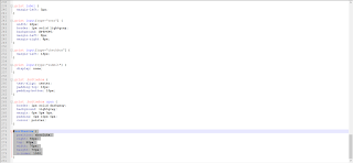
You may now want to change the background colour, font size and other bits and bobs. To do this you need to edit different bits of the .html file, the .css file and the .js file created by qgis2threejs. These files will be named as below.
- index.html (this is the default name, you may have changed it to something else) but it is here you can change the page name and footer text, for example.
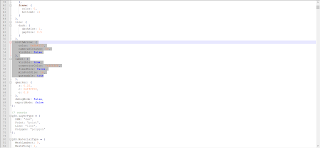
- Qgis2threejs.css - you can edit this to change the north arrow position (I put it in the top right, but it's not there by default) and the colour of the sky.
- Qgis2threejs.js - you can edit this to change the font size (edit the value of the MinFontSize under label, where you can also edit the leader line colour) and the colour of the base sides and the overall lighting colours.
 |
| This is how you edit the north arrow size and position (css file) |
 |
| This is how you edit the sky colour (css file) |
 |
| This is how you edit the footer text (html file) |
 |
| This is how you edit the side colour and lighting (js file) |
 |
| This is how you edit the font size for labels (js file) |
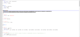
If you want to edit the font, search for "font-family: arial, sans-serif;" in the css file and change it to something else. You can see some different options for that on
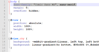
this page. In the example below I just changed the font size to 24 and added font-family: "Comic Sans MS", sans-serif; to the css, as below.
 |
| You can use lots of different fonts here |
 |
| This is the bit you want to edit |
Last words
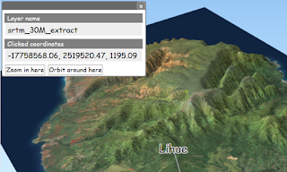
The last thing to say is that you should take some time to figure out how to control the visualisation. On mobile, it works really nicely too and upon export there is now a mobile option. It's worth playing around with the different export options to get a sense of what can be done. My favourite thing is to click on a point and you'll see the lat and long plus elevation and then you have two options - Zoom in here or Orbit around here - self explanatory but the orbit option is really cool. You can of course make it rotate just by pressing R.
 |
| Comic Sans has its uses, but this isn't one of them |


