This is a short post about map-based animated gifs (i.e. the humble geogif). It's not about general elections in the UK because that would not be a sensible topic. It's a bit about design choices, just in case anyone is interested, and it's also a bit about the method and data. Here's the final gif, below, which I posted on twitter recently. I wanted to make something that told the story of the 2017 General Election in a short time frame - in this case 30 seconds.
 |
| This is about 4.7MB |
In the original version of this, the large font was too thin so in this version it's bold and easier to read. You could probably tell what it shows and how long it takes to show it, but with this text there is no doubt. This stems from the redundancy principle that you'll hear John Burn-Murdoch talk about in relation to his work with the FT. I've used Raleway as the font, though I think perhaps I should have chosen something slightly cleaner. I'm not that keen on the numbers with Raleway, though it is a lovely font. By the way, this was all done with QGIS Atlas and only one map layer. See bottom of page for the sources.
The constituency names are displayed incredibly quickly below the main text (for 46 milliseconds each). Not because I want them to be read; more for effect so that people can pick out names they know as it runs through. Of course, it's also so that when you pause it you can see which constituency we're up to (more relevant in other formats). Then when the name of a constituency appears, the corresponding hexagon to the right has a black border to it. Not thick enough here probably, but you should be able to see it.
Since the results file from the House of Commons Library is so detailed, I was able to add the time each result was declared, which I did as a digital clock. Again, adding a bit of redundancy in making the times work like a clock, just in an attempt to speed up cognition. Below the clock the number shows the order of the result (from 1 to 650) and whether the result was a hold or a gain from another party. I added a green banner to the top left to say when the General Election was. I did use the numeric format for this in an earlier version, but there are two problems with this: i) I think it's more difficult to process compared to seeing the word 'June' in there; and ii) we can't have our US friends thinking the election was on August 6th. I like to avoid doubt in such situations. That's why I moved house on the 8th of August 😉.
I also wanted to add a chart because you can't tell just by looking who actually wins the most seats. That's why in the final version I added the animated bar chart in the top right (previously it was a boring, non-animated one). This was also done using QGIS Atlas. I think this helps tell the story of the night as it's often the case that in more urban, tightly-packed constituencies (where Labour do well) the counts are quicker and they race off to an early lead. It also gives it a bit of jostling for position/race feel to it, which I like.
 |
| At 03:12 Labour are in the lead |
According to the data, it wasn't until Daventry, the 498th declared result, that the Conservatives gained the lead from Labour. This happened at 04:09 in the morning.
 |
| Celebration or desolation, depending upon your allegiance (possibly) |
"Hey, why did you lump my favourite political party into the 'other' category"?
Fair comment. You're right, it's not very nice, but I didn't want to add ten bars so this is what we have. Plus, I thought it wouldn't be too much of a stretch since the lower numbers of the individual groups within the 'Other' category mean they can easily be counted.
I added the numbers to the bars for completeness, and because it wasn't that difficult, and of course the party labels below the bars.
All I wanted to do here was tell the story of the 2017 General Election in a 30 second gif, deliver a lot of information in doing it and have a bit of fun. The idea is that you watch it multiple times to get the story of the evening. Each frame is on for about 0.046 seconds, so the whole thing lasts about 30 seconds. Well, it would have lasted 29.9 seconds but I kept the last frame on for 5 seconds to give viewers a breather and some time to process things before it re-loops.
Now for a few words on the method.
Method
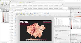
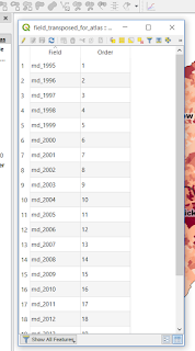
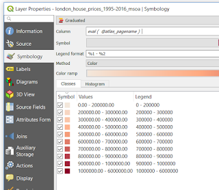
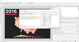
The basic method is to create a set of individual images which are then used as single frames displayed for a short duration in a gif. I do this using QGIS Atlas. You can create gifs from a set of images in a number of different ways, but I use GIMP because it works really well, is open source, not that difficult and you can optimise the animation so the file size is low. The method is described in an earlier blog post I did, from about half way down the page.
When exporting the gif you can choose the duration of each frame, but I like to have the final frame on for longer, at least a few seconds, so that people have time to take in what they are seeing after the rapid fire sequence of frames before it. There's a nice script you can use to set the frame duration of all frames automatically and then you can change the final one manually.
What I normally do is export individual images from QGIS Atlas at 300dpi and then I batch re-size them in IrfanView, normally to max width/height of 1000 pixels. IrfanView is simple but surprisingly powerful and I've used it for about 15 years now. It can do just about anything, apart from solve Brexit (though I suspect it could do that too). I have found that I get a higher image quality doing it this way, rather than exporting images at 1000 pixels from QGIS.
If I need to convert images to mp4 instead of gif, then I'll use ffmpeg, which is a command line tool. If that scares you, then you'll probably find ezgif very useful - and I believe it uses FFmpeg behind the scenes anyway. The advantage of mp4 is of course that you can more easily pause/rewind and add music and suchlike. But if you upload a gif to twitter it will actually convert it to a slightly different gif format that can be paused.
When I follow this method, gifs on twitter always look nice and crisp.
In a QGIS Atlas of this kind, it's normally the case that only one feature would be showing at a time, but thanks to a tip from GIS guru Ian Turton I've done it cumulatively so that previous features remain on the map and it builds up until the map is fully coloured in.
Software
The basic method is to create a set of individual images which are then used as single frames displayed for a short duration in a gif. I do this using QGIS Atlas. You can create gifs from a set of images in a number of different ways, but I use GIMP because it works really well, is open source, not that difficult and you can optimise the animation so the file size is low. The method is described in an earlier blog post I did, from about half way down the page.
When exporting the gif you can choose the duration of each frame, but I like to have the final frame on for longer, at least a few seconds, so that people have time to take in what they are seeing after the rapid fire sequence of frames before it. There's a nice script you can use to set the frame duration of all frames automatically and then you can change the final one manually.
 |
| Export options for gifs in GIMP |
What I normally do is export individual images from QGIS Atlas at 300dpi and then I batch re-size them in IrfanView, normally to max width/height of 1000 pixels. IrfanView is simple but surprisingly powerful and I've used it for about 15 years now. It can do just about anything, apart from solve Brexit (though I suspect it could do that too). I have found that I get a higher image quality doing it this way, rather than exporting images at 1000 pixels from QGIS.
If I need to convert images to mp4 instead of gif, then I'll use ffmpeg, which is a command line tool. If that scares you, then you'll probably find ezgif very useful - and I believe it uses FFmpeg behind the scenes anyway. The advantage of mp4 is of course that you can more easily pause/rewind and add music and suchlike. But if you upload a gif to twitter it will actually convert it to a slightly different gif format that can be paused.
When I follow this method, gifs on twitter always look nice and crisp.
In a QGIS Atlas of this kind, it's normally the case that only one feature would be showing at a time, but thanks to a tip from GIS guru Ian Turton I've done it cumulatively so that previous features remain on the map and it builds up until the map is fully coloured in.
Software
As above, it's a mix of QGIS, GIMP, IrfanView, FFmpeg, and hardly ever anything else for geogifs. If you've not used FFmpeg for creating/editing/converting video files then you might want to check it out. It can be confusing but it's really, really powerful. I also used it recently to create an mp4 file from a series of Google Earth Studio images, as below (though I cheated and added in the text and audio using Filmora).
Data sources
 |
| Check this out for the method |
Data sources
For the hex grid of the 650 UK Parliamentary Constituencies, I used Ben Flanagan's file, which you can download from ArcGIS online. This file is licensed under a Creative Commons Attribution 4.0 International License, which in simple terms means you can use it, adapt it, share it and so on. For the colours, I used those from the BBC website because a) I like them, b) people are familiar with them and c) they know what works. I also used the 'detailed results by constituency' file (see bottom of this page) from the brilliant team at the House of Commons Library.

