Back in 2014 I did a
tutorial on how to automate map production in QGIS, followed by
another on my idea to turn the map legend into a 'bargend' (aka a frequency histogram legend). I promised a follow-up on how to do this, so here it is, complete with QGIS project file and
data. I used the Indices of Deprivation 2015 data for London as a sample dataset here but you could use just about anything. Before I share more of the method, here are some results. If you have trouble following any of this, I suggest you go back to the
first tutorial, which explains the QGIS Atlas functionality in more detail.
[Update 13 February 2020: this all still works in QGIS 3 but you'll have to change the Atlas syntax to @atlas_featureid rather than $atlasfeatureid as it was in the version of QGIS I used to create this back in 2016.]
[Update 9 November 2016: I have zipped all files into a single download so when you get to the Google Drive link further down you should be able to download a single file package called Download_this_all_files_in_a_single_folder.zip and then just unzip it and open the london_example.qgs file in that folder. If it has a ~ after the file name, you may need to delete it to get it to work.]
 |
| This was done using the QGIS Atlas tool and open datasets |
 |
| Much of the text and numbers are based on the underlying data table |
 |
| Note that the small lower case labels only appear in one area - see below for how |
So, this is all done using the QGIS Atlas tool, plus a few little tricks. There are only four different data layers. I have one layer with the deprivation dataset (the red to blue one), another for London Boroughs, one more for place names, plus I've also added in London buildings in a light colour to give some sense of the underlying urban fabric.
The map legend shows the % and total number of areas within each London Borough that fall into each of the ten national deprivation deciles from the 2015 Indices of Deprivation. There are many ways to achieve what I did here (no doubt it's about five lines of code in R), but this is my method...
1. I took the deprivation data for London LSOAs (which I extracted from the national dataset - available on
my IMD15 page) and then dissolved it so that the Borough boundaries would be a perfect fit on top of my LSOAs. I just like to do this to make sure the boundaries are a perfect match in the final map series, but if you already have matching boundaries then it's not necessary.
2. Separately, I used a Pivot Table in Excel to summarise the number of LSOAs in each decile using the district codes as labels - I also calculated percentages as shown below and then saved this as a dbf (xlsx is also fine). The deciles are already calculated in the IMD15 dataset so this made it simple.
 |
| This was done in Excel, but could be done easily other ways too |
3. I then imported the Borough summary file above into QGIS and joined it to my dissolved Borough shapefile (using the common label code field) to create a new layer I could use as the coverage layer in Atlas. Since I now have summary stats for each decile I can then use this information to size features dynamically in Atlas based upon the values in the attribute table. More on that later.
4. I then added in building and place name files using
Ordnance Survey open data.
5. I then set up my layers in QGIS using a variety of different styling techniques. I used version 2.10 for this. Here's what it looks like in the main QGIS view:
 |
| Note that some layers are copies, styled differently |
6. I used $id = $atlasfeatureid and NOT $id = $atlasfeatureid in some of the duplicated London Borough layers. This means that when you have Atlas turned on in Print Composer only the active Atlas coverage feature will be displayed (or everything
but the active feature - that's what the NOT does).
7. To make the place names appear only on the active Atlas feature, I used a trick I learned from colleague Ruth Hamilton - intersects($atlasgeometry ,$geometry) - this tells QGIS to only draw the features which geographically intersect with the active Atlas feature. I find this useful as otherwise the map is completely swamped with place names. Note that in newer versions of QGIS you can use slightly different syntax to achieve the same result: intersects( @atlas_geometry, $geometry). Also, if you use this but no place names show, it's probably because your point layer is in a different projection to your polygon layer. The solution is to save a new version of your point layer with the same projection as the underlying polygon layer. This has caused me to tear my hair out once or twice before figuring it out!
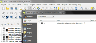 |
| This is just a rule applied in the Style dialogue |
8. In my Print Composer, I then get everything set up as I want it. I use the London Borough shapefile as the Coverage layer, I use the field name variable to call in the Borough name and some other text, and I use the percent and total decile fields to position and size the features in the bargend. With the Atlas tool turned off, it looks like this (below) where you can see the field names instead of the final map text.
 |
| Atlas > Preview Atlas (or the Atlas button) makes this go live |
9. The histogram legend? That is just manually drawn rectangles, duplicated and coloured to match the map data and then sized dynamically using the % figures from fields in the underlying Coverage layer. Since the percentages are a good match for millimeters here I didn't need to apply a multiplication factor to scale them - as you can see below.
 |
| This is really very simple, but can take a bit of thought to get right |
10. What about the position of the % and total labels for each bar? Again, this was done dynamically using the decile % fields in the London Borough shapefile I used as the Coverage layer. You can see this in the screenshot below.
 |
| You need to do this to make the labels appear in the right place |
That's about it really. I'm sure there are other ways of achieving similar results, but right now this works for me and I like the additional information provided by the histogram style bargend. If you want to get your head round what I've done the best way is to download the QGIS project file and data layers that I've made available below. You can then explore the properties in the different layers and examine the way I've set up the Print Composer. Once you've done this then you can go wild with your own data. Here are a few more maps before I finish.
 |
| Brent, home of Wembley (among other things) |
 |
| Kensington and Chelsea - actually quite a mixed Borough |
 |
| Westminster - also a very mixed Borough |
Want to try this yourself using the project and data shown here? If so, here's what to do:
- Go to the Google Drive folder I created with the QGIS project file (the .qgs file) and data layers and then download the qgs and the zipped shapefiles (and then unzip them).
- Open the .qgs project file in QGIS (I'd use version 2.10 or above if I were you). When you do this QGIS will ask you where your layers are located (this is the rather worrying-sounding Handle Bad Layers dialogue), but you'll only have to do this once - just click 'Browse' and point to where the relevant data layer is located.
- Once you've done this, you should have a QGIS project on screen that allows you to replicate (and modify) what I've done here. If you then go to Project > Print Composers you'll then be able to go to the London SUMMARY one I created and start exploring the properties (remember, by default Atlas will be turned off so just go to Atlas > Preview Atlas to turn it on). Then you can use the arrows to go through the individual Atlas pages.
One final map, just for fun.
Hopefully some people find this useful. Or maybe you have some questions - in which case, feel free to get in touch on twitter or by e-mail.
 |
| Richmond upon Thames - home to Twickenham (and other Hams) |
Notes: as I said at the beginning, you might need to have a go at the
first tutorial for any of this to make sense. If you're already proficient with QGIS and the Atlas tool then it should all be pretty easy. One thing you may not immediately notice is that one of the layers is filtered (the place names layer has "FONTTYPE" <= 2 AND "FONTHEIGHT" >= 6 AND "FONTHEIGHT" <= 10 so that not all places and all place types are shown - the Ordnance Survey dataset is
very detailed and I didn't want to show them all).


