Earlier this year
I wrote about kepler.gl and how I visualised some Bay Area commute flow data with it. It's an amazing tool from the fantastic Uber Visualization team. Take a look at their
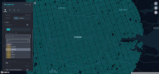
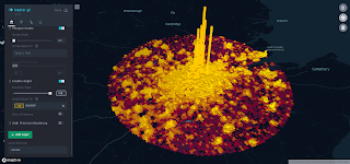
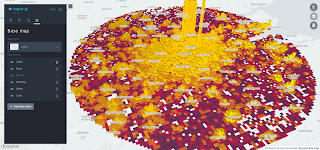
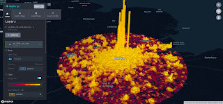
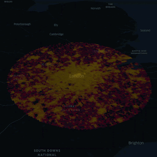
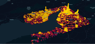
website for more info, plus nice group photos. But this is about Kepler so to give you an idea of what it can do, see below for the first example, which shows daytime population density in the London area for 1km grid cells. We'll get to how you do this in the rest of the post, which includes the data I used. I've also shared the config file and data in a
single json file that you can upload to replicate the image below.
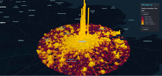 |
| This shows daytime population for 1km x 1km cells |
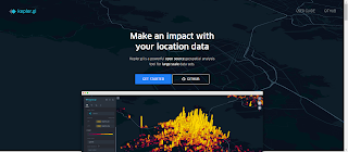
Before going any further, I should say a few things. First of all, you should scroll down all the way and see all the examples on the
Kepler home page, or you're missing out because Kepler can help you make all kinds of maps. Obvious, but easy to miss. Second, it seems your data should be in WGS84 format otherwise it won't display. At least that is what I found. Third, when you try to export images using the export tool in a web browser you might not see any output until you clear your cache. I had this problem but it was solved by clearing my cache. Finally, just be aware that you can put labels on top of your map content in the layer options - which I've also screenshotted below. All data and images are shared
here. Have fun!
 |
| This is the home page - but scroll down too |
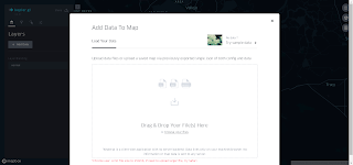 |
| Clicking Get Started takes you here - I uploaded geojson |
 |
| The data appears on the map - you can see the tooltip popup |
 |
| On the left, I'm choosing which column to map |
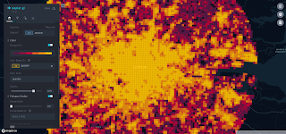 |
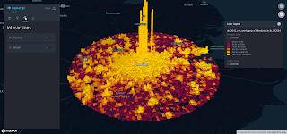
| Now we can see daytime population density |
 |
| Now I'm making it 3D, by clicking the button, top right |
 |
| Now I set the column to be used for the 3D effect |
 |
| In this case I've used the maximum value of 100 |
 |
| I've clicked 'Show wireframe' to make it look a bit clearer |
 |
| Here's where you can change the contents of the tooltip popup |
 |
| And now how you put the place labels on top |
 |
| Some place labels appear - different for each basemap type |
 |
| See, you get more labels with this lighter basemap |
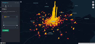 |
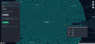
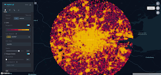
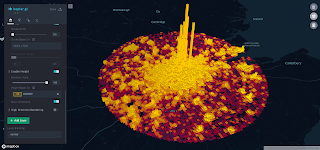
| Now I've used some filtering options to show the high values |
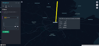 |
| Only the highest value shown now, with tooltip data |
 |
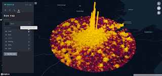
| I've added a legend using the button on the right |
 |
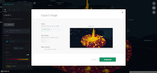
| Now you can share/export your viz |
 |
| If you see nothing here, clear your browser cache |
 |
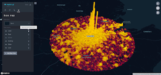
| This has the legend too - best to change the layer name first usually |
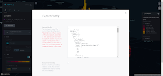 |
| How to export the whole lot - or just the config |
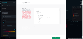 |
| Doing this will export everything, including the data |
Okay, so that's about it really. I've just added some more images below that I extracted previously. There is sample data for quite a few different parts of the UK, as you can see.
 |
| This was me just playing with the 3D extrusion slider |
 |
| Central Scotland |
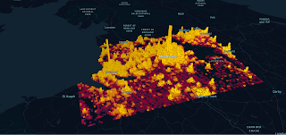 |
| Liverpool and Manchester |
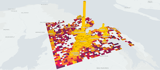 |
| Belfast |
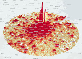 |
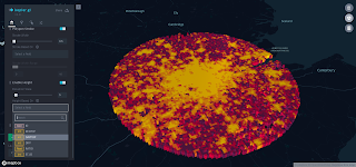
| The Greater London Pizza Region |
 |
| Cardiff and Bristol area |
Data source: I've used the
CEH's UK Gridded population data for this. It's available under an Open Government Licence, with the requirement to add the following statements:
Contains data supplied by Natural Environment Research Council and
© NERC (Centre for Ecology & Hydrology). Contains National Statistics data © Crown copyright and database right 2011.
Data note: if you download the data (registration required, but open and free) you will get a residential daytime grid for the UK and a daytime population grid for the UK. I combined these into one file. The only problem was that the original data has the population data stored as text so I converted it to integer and added a column showing the difference between daytime and residential population, plus a ratio field too. I then extracted data for some areas of the UK, exported them as geojsons from QGIS (using WGS84 projection) and put them in a
shared folder.


