Showing posts with label color. Show all posts

Sunday, 9 October 2022

Cometmaps

In one of my many 'playing around with map stuff and then posting it on twitter' adventures, I recently posted a kind of comet map - see below. This started off as something completely different but once I had the basic idea I then wondered what kind of data I could apply it to, and that's why I did it to the UK political map of 2019. Read on below for how I did it, as well as how you can replicate it pretty easily in QGIS. Scroll straight to the bottom if you're just looking for the 'how-to', as well as a bit more on how this kind of thing might work on a US county-level election map.

First of all, this was done in QGIS. I'm sure it could be done lots of ways, but I did it in QGIS using something called 'geometry generator', which is basically just a little bit of code that can be used to style things more fancily than just clicking a button and selecting a colour and shape. 

My starting point was actually just to see if instead of displaying things as polygons I could display them as lines that went from one corner of an area's bounding box to another - in this case from the far south-west to the far north-east corner of a shape's bounding box. That was easy enough - and the result is shown below. I did it with UK local authority areas, then moved on to doing it with constituencies - which you can grab from my Automatic Knowledge resources page.

A basic line, within each area's bounding box

Then I thought about applying a random degree of rotation to each line, just for the sake of it, and that's what you see below. This is probably not that useful unless you want to make a map that looks like a pile of sticks but all the same it's interesting to see that it's possible and perhaps I'll find a use for it one day. 

Big pile of red sticks drifting into space

So then I went back to no rotation and thought about buffering the lines, but using a tapered buffer so that one end was thick and the other wasn't. I applied this to each area and also used a gradient fill so that the colour faded along each shape. The result of this is shown below. This one was also done on local authority boundaries rather than constituencies because I was playing around with both at the time - but then I wondered about applying it to a political map and doing something more interesting, so the cometmap came to life. 

A cometmap emerges from the darkness


The result was that I decided to use geometry generator in QGIS to do the following, based on the results of the 2019 UK General Election - and my goal here was to use the comet trail as the main device in the map to show who came second and how far behind they trailed. I realise some people look at the maps and perhaps see the opposite but for a little map experiment I thought it was a) interesting and b) potentially useful (probably with some further development).

  • Use a circle in the centroid of each constituency, using party colour to indicate who won that seat.
  • Use a tapered buffer behind each coloured circle, with the colour of the party who came second.
  • The length of the comet trail is dictated by the winning margin - so if a party is WAAAAAY behind the winner then it gets a longer trail. So this map draws attention more (deliberately) to the second placed party. But of course any of this can be edited.
  • The size of the circles and buffer is a few thousand metres but of course that can be adjusted too. See the results below.
Dot with no trail? Means it's very close

Loooong blue trails? Conservatives waaaay behind

Mostly short trails = mostly quite close results

THE LIBERAL DEMOCRATS ARE COMING!!!!

Okay, so that's about it. 

Read on if you're a map nerd and you want to replicate the style yourself.


How to replicate this style in QGIS

  1. First of all, you'll need to grab the UK General Election 2019 results file from my Automatic Knowledge resources page. Use the GeoPackage because it's easiest.
  2. Add the file to QGIS. 
  3. Optional step. For exact duplication of my maps, make the QGIS background very dark grey (e.g. #111111) and make duplicate the UK general election layer and make it dark grey, both fill and stroke colour (e.g. #333333) so that when you make the comets they look brighter and have a dark backdrop and you can also get your bearings from the plain dark backdrop. 
  4. Download the cometmap layer style file to your computer. This is just a standard QML file and you'll apply it in the next step.
  5. Go the Layer Properties for the layer you want to apply the cometmap style to and then via the Style button at the bottom of the Layer Properties window, and then it's Load Style... browse to the cometmap-ukge-2019-example.qml file on your computer, then it's Open, Load Style and OK - and that should be it!
  6. Once you've done this you can inspect the properties of the style yourself and edit them if you want to - see screenshot below.
How the trail is generated - rotation set to zero right now


Note that I am using a geometry generator twice in the screenshot above - once to create the circle and once again to create the trail. You'll see that the colours are set using an expression - if you click Simple Fill you can see this when you click the little Expression button (see below). Note that this is done both for the trail and the circle.

The '97' in the html colour values sets the opacity


Could you apply this to, say, a county-level US election map? Yes, but I think it would probably require a good bit more thought otherwise you'd end up with a really wild map. But here are a few examples.

File these under 'hmm' for now.

Done very quickly, just to test the method

You can see where this needs work - but it could work

Just a few tweaks needed here!

That'll do it for now

Needlemaps - the next frontier

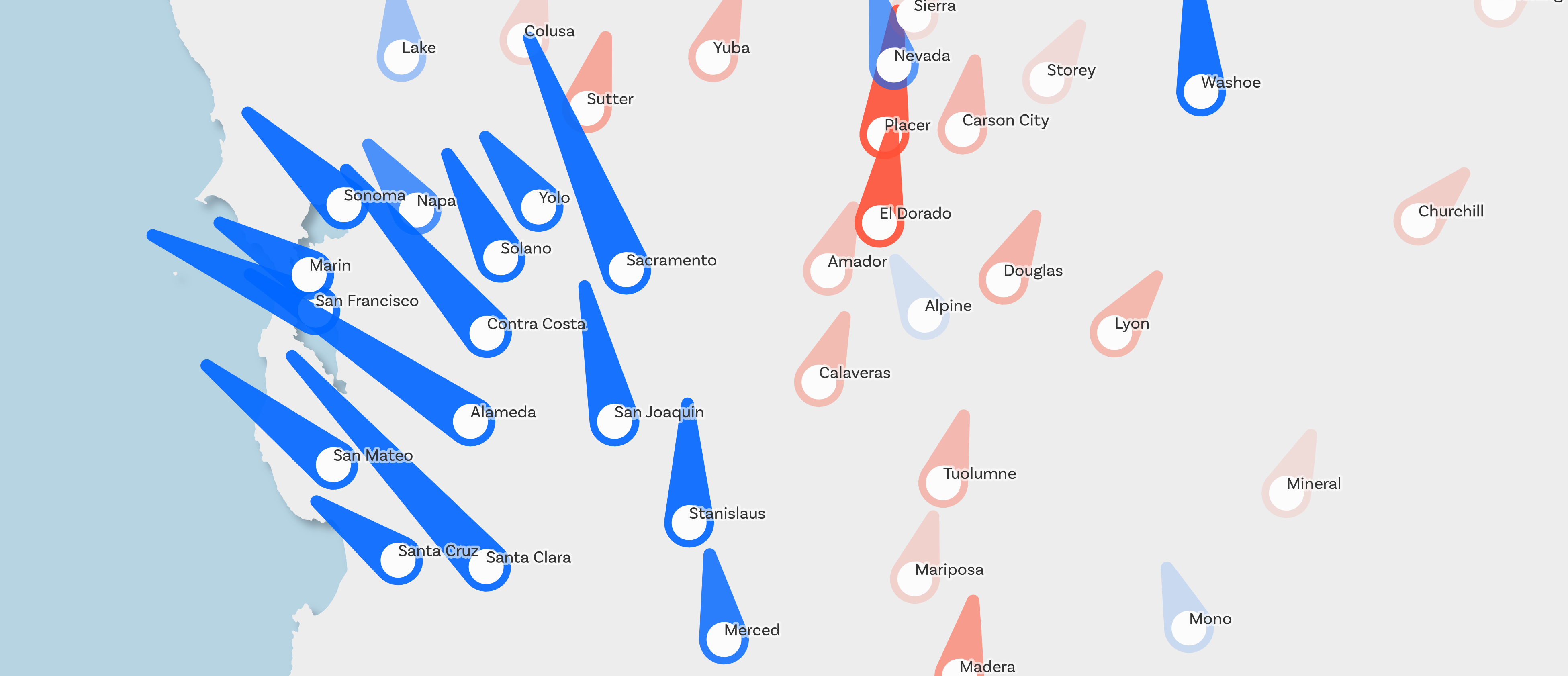
I had a bit more of a think about it all and for the US I wanted to see if I could create a kind of needle or dial that showed which way a county leaned. using the 2020 US election results file. Well, turns out that this works reasonably well. Not perfect but it's a good start. See below for the results and then if you want to replicate it yourself and then play with my settings, download the qml needlemap style file for QGIS and then apply it to the election results file and have lots of fun.

Lots of ways this could be edited/improved


Yeah, not surprising

Big 'lean left' energy going on here

Actually quite interesting here I think

Lots of interesting stuff here, for sure


Note that in the needlemap style above, size = scaled to population, roughly, but of course I had to make some a minimum size otherwise they would be invisible, so I also added opacity by population to make them super-faint if they are tiny. Colour = blue for lean Dem, red for lean GOP. Lean angle is set from the Dem/GOP ratio from 2020.

Thomas Gratier on Twitter suggested we could call these pinball maps, and that's also a good fit as the needles look very much like flippers on a pinball machine.


Thursday, 30 June 2022

Labelling tips and tricks for QGIS

It has been said that making a map is 80% labelling, and 20% everything else. Okay, I just made that up, but if you've spent any time at all using GIS software you'll see the truth in this. Sometimes I end up spending far too much time on labelling, but then again it's usually time well spent because it makes things clearer. Too many labels and we're overwhelmed, too few and we're left guessing. I put this post together for anyone who uses QGIS and wants to know a bit more about labelling - just some tips and tricks for general use, regardless of what QGIS version you're on. I'm going to do this on a Pacific-centric world map, because there aren't enough of them and it's nice to look at things from a non-Greenwich perspective. Here's a little example map below, and then everything is explained after that. I'm working on this kind of thing for my next Map Academy course on Udemy.

A little example, using data from simplemaps.com

The data

As you can see, I'm using a Pacific-centric world map layer. This is based on the Natural Earth land layer and I just clipped it at 30 degrees west so that when I projected it using the Sphere Equal Earth Asia Pacific CRS in QGIS it didn't go all weird with Greenland and Antarctica split across the meridian. But of course you don't need to do this if you want to follow along - you can just add any world map layer, or none at all, because this is about labelling places.

For the cities layer, you can get it at simplemaps.com as a csv and then load it into QGIS, but I already converted it to a world cities GeoPackage so you can just download that directly and add it to QGIS if you want to follow along here. There are over 26,000 places in the file though, so when you add it you'll see too many places to make sense of - but we'll filter the layer to sort that out in a moment. For now, here's what the whole lot looks like.
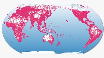
Lots and lots of dots

Okay, so this is fairly typical when we add a cities or places layer to QGIS - or indeed any GIS software. We're overwhelmed with dots so we need to think about how to filter it somehow. That's next.


Filtering the data

Before we label, let's filter the data. You can use the columns (also known as Fields) in the Attribute Table to filter the data - and you can see below that I've done this using "capital" = 'primary' so that only capital cities are showing on the map.
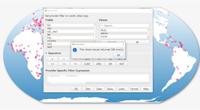
Okay, this is looking a bit better

But let's say we only want larger capital cities to appear - e.g. those with more people. We can use the population field in the dataset to filter further, like I've done below to show only capital cities with 1 million people or more.
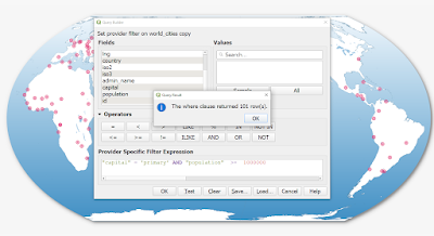
You can see how to use the AND operator here

We also have a latitude and longitude column in this dataset, so we can use that to filter the data too. This time I'm going to filter it to show only those cities within 10 degrees of the equator that have more than 1 million people (according to the population column in our dataset).
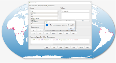
You can filter using any of the columns in your dataset


One more filter now - this time we're looking at cities in Brazil, Australia, Canada and Japan with more than 700000 people - according to the simplemaps dataset.
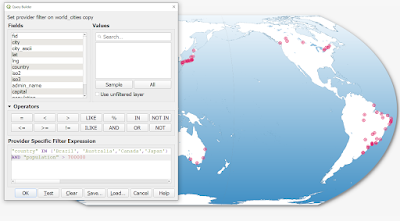
Using IN as well as AND this time

What about labelling? 

This post is supposed to be about labelling, so let's talk about that in a moment. I just want to emphasise that BEFORE doing any labelling it really is worth thinking about what you want to label - and how many features there are as well as where exactly they are - e.g. are they overlapping?

I wrote a filter expression so that I'm only showing the cities you saw at the top of the post - a selection of cities on or close to the Pacific Ocean. 
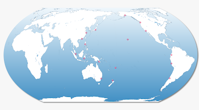
I filtered the dataset to focus on only a few cities


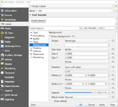
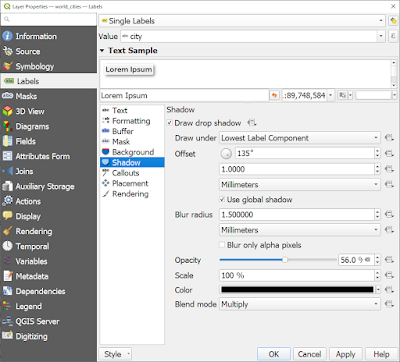
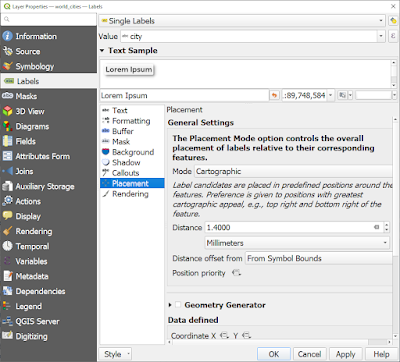
The next few images show you what label settings I've used here - a variety of different methods, including a slightly transparent white background to the labels.
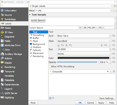
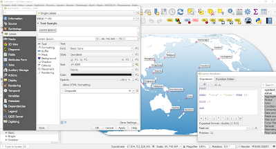
I'm using the city field to label the cities, size 14 font

Note the Size X and Y variables, and the Radius X, Y too

Drop shadow on the labels, with Opacity turned down

I've moved the labels away from the symbols a bit here


Visual hierarchy

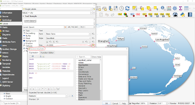
There are so many things you can do with labels in QGIS, but one really useful thing is the ability to set the size of labels based on a variable. So let's do this with the cities above so that larger cities have bigger labels. There are many ways to achieve this but I'll do it a fairly simple way. I'm using the Data defined override button beside the Text size option, as you can see below. Look at the expression I've used and you'll see how I modified the size of the labels this way, starting off initially with just Tokyo being in large font.
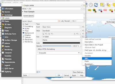
The Edit button (via the Size section) is how I change things

Note the format of this - e.g. CASE, WHEN, ELSE, END

Now I'm starting to get a more useful visual label hierarchy

Now in the map below I've made the largest cities a different colour, using the same kind of approach - as you can see.
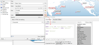
I'd normally use just a single colour, but you don't have to

In the example below, I'm only using a label background on cities with more than 5 million people, using the same kind of approach.
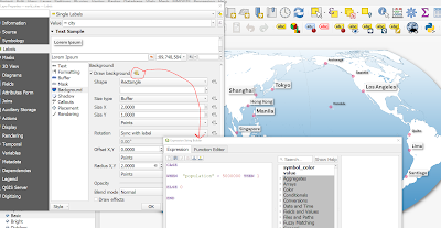
Note the 1 and 0 values here, where 1 = true

And then in the final image below I've added a thin line around the label backgrounds, just to make it a little bit crisper on the screen.
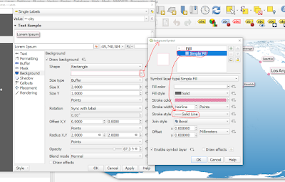
This require a few clicks, as well as editing the Stroke style

Here's the final version of this simple label map experiment, in high resolution. What I'd normally do beyond the labelling is also apply some kind of size hierarchy to the city symbols, and this can be done using exactly the same approach - i.e. edit the symbol size using the Data defined override and then setting it based on city populations or city names - or whatever variable you want.
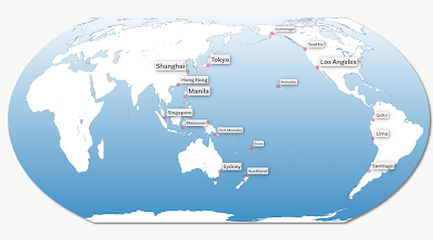
Hopefully this has been useful for you


That's all for today, but if you're new to it and need some help, feel free to get in touch.