Showing posts with label newcastle. Show all posts

Saturday, 5 November 2022

Two decades of city centre population growth in England

Back in 2013 I published a paper in the journal Cities with the following title: 'English urban policy and the return to the city: A decade of growth, 2001–2011'. I actually wrote it in 2012 and it drew upon some of the urban policy things I'd written about in my PhD a few years earlier. If I had access to the paper now, or if I wanted to spend $27.95, I could even read it again but the gist of it was this: people came back to the city centre, in quite big numbers, between 2001 and 2011. 

You don't need an academic journal paper to tell you that because you couldn't see it just by walking around, obviously. But really it was about a bit more than population and it discussed New Labour urban policy, the Urban White Paper of 2000 and lots of other stuff. I've also just discovered that it has 61 citations on Google Scholar, which means as many as 61 people were at one point potentially aware of its existence and some might even have read it. Okay, too much preamble, time for a map - showing the population of the central Manchester and Salford wards that more than doubled in population between 2001 and 2020 (I don't have the census data for wards yet).

Source data: ONS ward-level population estimates, 2001-2020

Why was I thinking about this? 

It's because of the release this week of a big wodge of local Census 2021 data for England and Wales. I thought I'd go and look at the changes from 2001 to 2021 but then I couldn't find quite what I was looking for (ward population data) so I went and looked at the mid-year population data for wards instead, and how I find myself writing about it here because it's quite interesting.

If you haven't already spotted these things, three observations from the map above:

  1. Salford Quays ward had less than 1,000 people living in it in 2001.
  2. Central Manchester/Salford has the largest collection of contiguous wards (6) in England and Wales that more than doubled in population between 2001 and 2020 - the population now in the six wards above is about 85,000, compared to 24,000 in 2001 and 50,000 in 2011.
  3. Deansgate and Piccadilly wards in Manchester look like a rabbit (Piccadilly) getting a piggyback on a goose (Deansgate - see below). This is the unintended consequence of me looking at map data for too long, but it's a clear fact. 
I'm not wrong, am I?

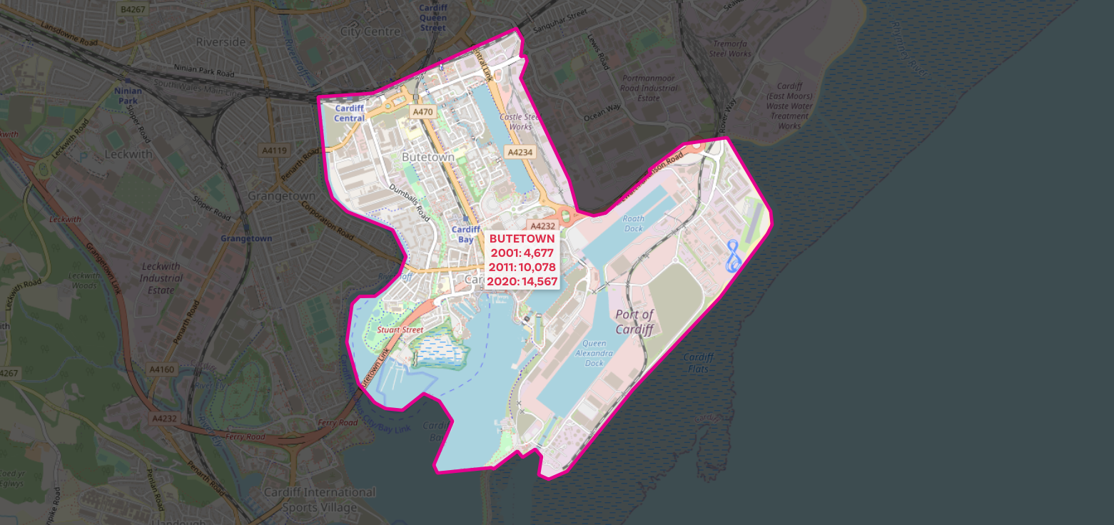
The numbers are of course not surprising if you've ever stepped foot in an English city centre over the past 20 years but it's quite interesting to be able to put a number on things. So now I'll share more maps of different cities, showing the 2001, 2011 and 2020 population data, like I have for central Manchester above (all areas shown more than doubled in population from 2001 to 2020).

Birmingham

Bristol

Leeds

Leicester

Liverpool

East London (1) - plus a bit non-East London

East London (2)

Newcastle

Nottingham

Sheffield - check out those numbers!

Southampton

Who are all these new people? Well, again it's not that hard to fathom if you have been paying any attention but a mix of students in new private sector accommodation, the so-called 'young professionals' estate agents seem to love and a mix of other folk, including some families and whatnot. Could also say stuff about brownfield sites here, as well as New Labour urban policy (the old 60% target) but that doesn't interest me much these days so I'll leave it at that.

Oh, go on then, a few more.

Cardiff - yes, 100% NOT in England! But interesting

Bournemouth

I can't unsee it

Poundbury

This one was missing a label in the version above


Wednesday, 11 March 2020

45 Minute Cities

Have you ever wondered what a city would look like if it only included areas within 45 minutes of the centre? Of course you have, otherwise you wouldn't be here. Well, even if you haven't, please read on and be sure to check the nerd notes at the bottom of the page. The idea here was to produce a set of maps, based on a central point in 26 different British cities, and a 45 minute time cut off. More specifically, from everywhere shown on the maps below you should be able to reach the centre (in this case I chose a main railway station) within 45 minutes of leaving home (note, not from when you get on a train or in your car). I included travel by public transport, driving, or driving plus train in my model and an arrival time of 08:45 on a Monday morning. I then calculated the population within each area and the maps you see below are the result. These '45 minute cities' are of course not actual cities from an administrative point of view, although they are a kind of functional entity that makes more sense from an economic point of view. But really this is just a first-stage experiment and I thought the results were interesting so I'm sharing them here.


What's this all about, then?
Partly it's about me using a new tool more regularly - TravelTime platform's QGIS plugin - and partly it's about some other work I've been doing over the past few years relating to functional urban areas, polycentricity, functional regionalisation, and whatnot. You can read a bit more about one of the off-shoots of this work here, which is all about a little graphic I tweeted in February 2020. It also relates to some of my previous research, including this work on transport-related barriers to employment for the Joseph Rowntree Foundation.

But for now, in this case, it's mostly about curiosity and me wondering 'how big are these cities if we see them as 45 minute commuter-sheds based on arriving at some central point with enough time to get to work for 9am on a Monday morning?'.


What about Marchetti's constant?
The idea that on average we travel 30 minutes each way to work each day is of course well known, but I thought a 45 minute time frame, from leaving the house to arriving at the workplace (and including interchanges, walking, and the actual realities of the daily commute) would be more interesting and also realistic. My door-to-desk journey these days takes about 20 to 25 minutes but in the past it used to take anything from 50 minutes to an hour and a half when I commuted between Liverpool and Manchester each day.


How does this compare to travel-to-work-areas?
I'm glad you asked, because I had the same question early this year so I added up the 2018 population data for most TTWAs and the results are shown below, as well as on this Twitter thread. This is particularly interesting when we look at, say, Leeds and compare it to the Leeds map above. Or even the Warrington one above. But of course TTWAs are based on a commuting self-containment threshold and my maps here are just experimental outputs created as part of a little curiosity project (for now at least).
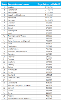
I only had English and Welsh data for this

The numbers for my city look wrong
This may be the case, but it may be a bit more complicated than that. The specific point of arrival I have chosen (the central railway station in each city - or three in London) and the specific time I chose can have an impact on the results. However, I've been through the maps and I think they look right, or at least plausible for sure. In some cases it may very well be possible to get from a location off the map to the central point I chose, but the idea here is it needs to be reliable and without rushing for connections and allowing enough time to get to and from the mode of transport at either end. It's a whole journey commute time rather than a single point-to-point, best case scenario trip. So, you may be able to do better yourself but this is based on a daily journey that most people can realistically make within 45 minutes.


'Why is Warrington so big?', and other FAQs
The population of Warrington isn't 4 million, so let's all calm down. But maybe it is and nobody had noticed. Okay, maybe not. Yet at the same time it is highly accessible, with the M6 and M62 plus the Liverpool-Manchester railway line passing through as well as the West Coast mainline. I'd say Warrington has the Connectivity Double Whammy (CDW) nailed down pretty well. I used to travel through Warrington each day on my day to work and I definitely had the 'if I lived here I'd be home by now' thought more than once. In this sense, then, Warrington may be the Ultimate 45 Minute City.

You might also ask why Leeds has such a high population in this little 45 minute city experiment, when we compare it to the TTWA population above. I suspect it's due to a mix of possibly unique not-very-good internal connectivity and other things Tom Forth knows a lot more about. Also probably has a bit to do with overlapping job markets nearby - e.g. Manchester, Sheffield and the like.

What's the deal with Glasgow vs Edinburgh? Well, if you take the combined populations in the 45 minute city for both of them, you get a good chunk of Scotland - more than half. But why is Glasgow so much bigger than Edinburgh? Again, a mix of things but Glasgow has excellent suburban rail, a subway, motorways and so on, whereas Edinburgh has epic congestion and a good few buses and not too much other stuff, despite the new-ish tram system. Plus the wider Glasgow area just has more people in it.

Why did you choose the central railway station? Just because it is generally very central and close to the jobs. I could have put the arrival point somewhere else in the city centre without it making too much of a difference but I wanted to be consistent and there is no agreed 'this is definitely the city centre' point in each city anyway.

I've spotted something wrong, who do I tell? Feel free to get in touch. You should probably treat this in the spirit it is intended - i.e. an experimental take on functional urbanism - but if you do see something that looks egregiously wrong please let me know. I can also feed back to the people who make the TravelTime platform tool as they're always trying to improve their models and are very keen on feedback.


Nerd notes
I mapped this in QGIS 3.4 using the TravelTime platform plugin. I created a little model (see below) to automate the process than ran a batch process on it for the 26 cities I chose. The 26 include a few that may seem like odd choices but I did try to include places far and wide. For the population counts, this is based on the most recent LSOA (England and Wales) or data zone (Scotland) population estimates from mid-2018. The boundaries here do not align perfectly with the 45 minute isochrone so I suggest you consider the specific numbers in each case as being 'roughly' or 'about' rather than exact. I did use the population-weighted centroids though so having said that I expect the population figures are close to the real numbers. The TravelTime platform api used real-world transit information and if you want more details on it just check out their website.

This is the QGIS model I made

Friday, 27 May 2016

City Footprints

Earlier in the week I posted a map of London's 'economic hinterland' on Twitter because I've been working with commuting data and wanted to see what the economic footprint of London looks like. But, some people have been telling me that other cities exist - which is a fair point. Since I have the data and I'm just revising a paper on the topic I thought I'd look at a few others, but this time using lower level data - MSOAs instead of districts for the origins. The maps below show the proportion of people from an MSOA who commute to a given area. Only MSOAs with 1% or more going to a particular place are shown and the darker the colour the higher the percentage. These aren't exactly the same as travel to work areas but they do give a reasonable approximation of each city's economic footprint. As you can see, I did quite a few maps - click to enlarge, as ever.

Birmingham has quite a pleasing concentric pattern

Bradford has quite a wide footprint

Bristol - quite a neat footprint

Cambridge is a little wider than I expected

Camden - one of a few London Boroughs I looked at

Cardiff - clearly the major focus in South Wales

Cheshire West - I wanted to see how far into Wales it goes

Derby seems relatively tightly packed

Leeds - the second largest local authority by population

Leicester - another quite tight East Midlands labour market area

Liverpool - extends into Wales and south to Cheshire, as you'd expect 
Greater London - the light areas are only 1% of commuters, but still!

Greater London - same as above, but with some city labels

Manchester - only the 'underbounded' district here, but still dominant

Middlesbrough - an important northern labour market area

Milton Keynes - I think it has quite a wide footprint

Newcastle - clearly dominant in the North East

Norwich - a good example of a large regional labour market area

Nottingham is relatively symmetrical in labour market terms

Oxford - a relatively large footprint here

Plymouth is a major South West economic zone

Reading - I had expected this to be a little bigger

Sheffield is another major northern labour market area

Southampton - somewhat overlaps with London's fringe

Southwark - I wanted to see how this London Borough looked

Swansea - quite a wide footprint here

Tower Hamlets - interesting to see the dominance of eastern origins

Warrington - a strategic hub in the North West

City and Westminster - the ONS group these two together

York - quite a wide Yorkshire footprint


Should I patch all these together in one big animated gif? Of course I should.

Why isn't my city included? Good question. Sincere apologies.

Birmingham doesn't get enough love, and is so often overlooked, so I did a zoomed in version of MSOA flows into Birmingham, with a few place labels.

Click here to see the full size version


Notes: the maps give the impression that they are unclassified choropleths, but that is just for effect and because this is a quick map batch. The colour classification is the same in each (see below) and no areas with less than 1% commuting to a given place are shown. I used the UK Data Service Flow Data website to extract the data and QGIS 2.14 for the maps. Bear in mind that they are a bit rough and ready and only really for comparison. Also, each 'city' here refers to the local authority area, not the wider city-region. But I think it's interesting to compare places. You just need to bear in mind the spatial scale and relative size of the destination places. Birmingham and Leeds ought to have much larger footprints that (e.g.) Nottingham and Sheffield because they contain more jobs. Where are Scotland and Northern Ireland? These datasets come separately and are not part of the English and Welsh MSOA geography so are not mapped here.

I used the same classification scheme for all maps