Saturday, 30 April 2016

A bit about image formats

This may be the most boring blog post you ever read, but I think some people might find it useful. Also, given the title of my blog, it's about time I did something on image formats. Let's imagine you are making some images (maps, maybe, but it could be any kind of graphic) and you come to the end of the project and want to export the final images for use elsewhere for sharing and so on. Do you default to JPEG? Hopefully not. Do you use BMP? I really hope not. Do you default to PNG? (I do most of the time), or are you required to use EPS or TIF? These choices matter and that's what this is about. Take a look at the JPEG image below - click to enlarge it and you'll see that around the edge of the lettering it looks slighly fuzzy or shadowy. That's because the image has been compressed but also because during the compression some of the original image quality has been lost (that's why they say a JPEG is 'lossy').

The jpg format is not very good with big areas of the same colour

Now compare the following maps, all in JPEG format, which I've exported at 75dpi, 150dpi, 300dpi and 600 dpi. To see these and the other images below in their native form, take a look in the Google Drive folder I put them in. 

This is 0.145MB 
This is 0.423MB (2.92 times bigger than the one before)

This is 1.166MB (2.76 times bigger)

This is 3.003MB (2.58 times bigger)

If there were no compression, each doubling in dpi would lead to a file size four times bigger. As you can see, the rate of increase in file size actually declines with each doubling of dpi. But you shouldn't use JPEG for maps like this anyway. So let's look at PNG instead. PNG is also a compressed file format but unlike JPEG it is lossless. It's kind of a non-proprietary version of the GIF file format (which is patented). There are lots of good things about it, including the fact that you can have a transparent background. Here is the PNG equivalent of the above set, with file sizes shown again - as you'll see the file size is bigger than JPEG (without being massive) but if you look at them in their native resolution in the Google Drive folder you'll see that there is no image quality loss around the edge of block colour shapes, particularly the writing in the top left.

This is 0.463MB

This is 1.025MB (2.21 times bigger than the one before)

This is 2.238MB (2.18 times bigger than the one before)

This is 5.353MB (2.39 times bigger than the one before)

So, with PNG you get a bigger file size but the quality is better because it's lossless - and that's why it's normally the most appropriate format for images of this kind on the web. If you need higher quality - for publishing for example - then EPS is often required. Sometimes, it's TIF. TIF is, like JPEG and PNG, a raster graphic format and when you export from QGIS as I have done here there is no compression (that's another story). This means that doubling the dpi leads to a quadrupling in file size - you can see this in the Google Drive where I've taken the image above and exported it again but in TIF formats. 

Uncompressed 75dpi TIF - 2.122MB

150dpi this time - 8.492MB (4 times bigger)

I haven't uploaded the other two TIFs here as they get pretty big quite quickly. The 600dpi file is nearly 136MB. But that's where TIF compression can come in handy. The two images below are 300dpi and 600dpi TIFs, but I've saved them using LZW compression (one of the options in IrfanView - my free tool of choice but there are other ways, like GIMP) and they are much smaller. You can see the full versions of these in the Google Drive folder.

This is only 3.908MB (the original was 33.975MB)

This is only 10.314MB - 13x smaller than the uncompressed TIF

Okay, so where were we? Oh yes, don't make a lovely map and then ruin it by exporting to BMP. Also, don't make loads of maps for a book or other project without thinking about the image format the end user will need. I keep making this mistake, somehow! I haven't even mentioned Abraham Lempel, Jacob Ziv and Terry Welch, but I think I ran out of goodwill quite some time ago so I'll just end by saying that their LZW algorithm is what makes the last two images much smaller than they were originally.

With this post I've reached a new low. I promise something more exciting next time. But if this saves just one person from having to re-produce a map because they got the image format right first time then it's been worth it. Last of all, here is one more extract from a 600dpi JPEG where you can really see the fuzzy effect you get.

The fuzzy effect is more noticeable in blocks of red colour


Other stuff JPG or JPEG? TIF or TIFF? It doesn't matter. If you manually change the .jpg file extension to .jpeg you'll see that it still opens and looks the same. Also with .tif vs .tiff. JPEGs are good for where the colour values change a lot in a short space - like in photographs of people or places. Following tweets from Rob Pattay, I thought I'd add here that you can also reduce PNG size with a bit more post-export compression. I used IrfanView to reduce the 600dpi PNG from 5.23MB to 4.85MB (about 12% less). Also, you might notice that when you click on the TIF images here in blogger they end up displaying as JPEGs.

Sunday, 17 April 2016

Where is the Northern Powerhouse?

Depending upon how you look at it or who you've been listening to, the 'Northern Powerhouse' is a 'programme', a 'proposal', an 'idea', an 'area', a 'thing' or - for some - a bit of a dog's breakfast. It's definitely something, but where is it? That's what I set to find out and this is my attempt to understand it. First things first though. The government officially don't define its area, as you can see from the Hansard extract below that says 'The exact extent of the North in the context of the Northern Powerhouse is not prescribed by the Government'.

This seems pretty clear-cut - original source

So, obviously it's just the north of England, right? Wrong. Look at the gif below and see if you spot anywhere that isn't in England. Okay, so North Wales is in and that makes sense. The cross-border economic connections between Cheshire and Flintshire/Wrexham and beyond are very important and long-standing so shouldn't be ignored. Now it's time to look at some maps.

It comes from this lovely video

I attempted to turn the list of areas above into a map, which you can see below. It's a pretty wide definition but of course there is value in not being too specific about what is in or out as you can then be a bit flexible about things round the edges. One example of this would be the parts of Sheffield City Region that are actually in Derbyshire so not in the areas listed in the gif above. But of course this looks pretty big and the Northern Powerhouse is often put into an English, urban context. So the next map adds urban areas into the mix. A third map adds in the parts of Sheffield City Region I just mentioned. As you can see, this then leaves High Peak encircled by the Northern Powerhouse but I don't think that is deliberate.

This is one way of looking at it

This helps highlight the core urban areas (in England)

Now with added Sheffield City Region areas - High Peak left out?

What about connections? An important part of all this agglomeration and city productivity talk is how places connect together to help produce stronger economic growth. That's a big part of why much of the Northern Powerhouse work so far has centred on transport, and why they used my original flow lines map on the front of one of the reports. So I've also attempted to map those here again, in a more colourful way. The final map shows this. I've coloured some of the major urban areas differently and used darker shading for 36 local authorities that seem to me to be at the heart of the Northern Powerhouse idea.

This gives you an idea of how everything connects

One other thing to say is that it's quite interesting if you look at the first mentions of the Northern Powerhouse in parliament. This is what the Chancellor said on 24th June 2014:

  • "Today we have the very welcome news that Abu Dhabi will be investing £1 billion in building new houses in Manchester. That is a step towards it becoming the northern powerhouse I want to see, and it is a £1 billion vote of confidence in our long-term economic plan."

Note the use of 'it' shortly after 'Manchester'. To sum up, then, where is the Northern Powerhouse? My view is that the Northern Powerhouse is:

  • In the North of England
  • A bit in North Wales
  • Has the biggest cities at the heart of it
  • Inherently fuzzy (on purpose)

Not exactly lightning bolt stuff then. But I feel like I now know a bit more, which is always a good thing. Anyway, it seems that we might already have hit Peak Powerhouse.

I wonder what the little bumps were in 2008

Notes: Neil Lee at the LSE has written a good policy paper on the Northern Powerhouse that's well worth a read. Anyone with a decent memory will remember the previous incarnation of this, in Northern Way form, still available in small part online as archived content. I tweeted a version of the last map earlier in the week so I'm wrapping it up here, after a bit of further thinking and to and fro with Buzzfeed star Peter Matthews and expat Westphalian/north west near-native and spatial planning guru Andreas SchulzeBäing. If  you're really keen, go back and read the original Northern Way stuff from 2004. It's still available via the waybackmachine internet archive.

Tuesday, 5 April 2016

Deprivation and affluence, cheek-by-jowl

As part of some work I'm doing for a 'fracturing societies' seminar this summer, I've been thinking about the spatial manifestation of inequality in England. Some places will always be rich and some always poor - if we're defining it relatively - but the location of these places, their characteristics and their wider neighbourhoods may all differ significantly. That's one of the reasons I made a 10% most/least deprived interactive map last week and shared it online.

You can explore the map online here

This then raised the question in my mind of how many of the 10% most deprived areas in England neighbour areas among the 10% least deprived. In part, this was inspired by the famous image of São Paulo rich and poor taken by Tuca Vieira in 2007 and widely circulated since then (see below). The photo shows the favela of Paraisópolis on the left, right next to the upscale Morumbi neighbourhood over the wall. You can't really imagine a more stark divide. For more on this, see Teresa Caldeira's article from LSE Cities.

Credit: Tuca Vieira, 2007 - original here

In England, things are not quite as extreme as this example, but there is quite significant socio-spatial inequality nonetheless, as documented over the past few years by many observers, including the SASI research group here in Sheffield. It matters for many reasons, but life chances, health, opportunity and education are just a few of the major advantages/disadvantages experienced by people on either side of the rich/poor divide. 

The answer to my original question of how many of the 10% most deprived areas in England have a neighbouring area in the 10% least deprived is, I found, 75. I set about investigating further and here's what I found. You can see all the maps here but below I've provided a few examples to illustrate my points.

The most deprived area in England with a 10% least deprived neighbour is in Birmingham. On each map I've added in the LSOA name at the top, in addition to the LSOA ranks of the areas in question - as you can see here the one in Birmingham is ranked 38 out of 32,844 so it's right at the very most deprived end of the spectrum. But you can also see that the relationship with the neighouring area isn't like the example from São Paulo above. It's just more a feature of the way the boundaries are drawn. This is the case in quite a lot of the areas, but not all.

Just Google the LSOA name to see an interactive map

One area that's a bit different and where the most and least deprived are almost literally next door is in Gateshead. On one side of the road we have one of the most deprived areas in England right next to one of the least deprived over the other side. Mind you, the location of people within these is still not exactly of the 'cheek-by-jowl' category we see in São Paulo. Most local authorities don't have any areas with 10% most/least neighbours, but Kettering has three, one of which you can see below.


Not many most/least deprived are like this
This is partly an artefact of how the boundaries are drawn

More striking examples of areas where people live next door but in opposite ends of the deprivation spectrum can be found in Leicester, Norwich, Nottingham and Swindon - see below.

You can see this contrast on Google Maps


The Indices of Deprivation 2015 which I used to map the 10% most and least deprived areas do not measure affluence but the areas in the least deprived 10% are significantly wealthier, healthier and have lower crime rates - among many other differences - so it's a pretty reasonable proxy for affluence in many respects. 

All of this raises the vexed 'so what' question once more. Is spatial inequality worse when you can see it? Is it worse, or somehow more grotesque, when rich and poor live side-by-side? Wasn't that what the 'mixed communities' policies of the 2000s were all about? Well, sort of but not really. 

There is a mix of things going on here to create these patterns - sometimes it's housebuilding on brownfield land, sometimes there are physical or artificial features dividing neighbouring areas such as rivers, roads or railway lines, sometimes it's a boundary effect and the people in households aren't really neighbours. Either way, I find it very interesting and troubling at the same time. The plan is to keep working on this. I know it's not exactly São Paulo levels of contrast, but the big gaps between places - and particularly the life chances of young people - are really important.

Click on the image below to see all the maps.

Here are all 75 '10% most' areas with a '10% least' neighbour 


Wednesday, 30 March 2016

How Urban is Deprivation in England?

The answer to the question above is 'very'. However, it's not all about the big cities, and there are significant pockets of deprivation in rural areas that don't often get the attention they deserve. In this post I take a little look at the distribution of England's most deprived areas (the 20%) in relation to the 2011 Rural-Urban Classification - developed for the government by Paul Brindley and Peter Bibby here at Sheffield. The ideas is to try to shed more light on the kinds of places that we find among England's 'most deprived'. Let's take a look at this in overview first of all.

This maps shows the 20% most deprived, with rural-urban area types

Sometimes it's a bit difficult to tell from a map like this how it all breaks down by category, so I also did two sets of charts - one each for the % and total in each deprivation decile in England (where decile 1 is most deprived, 10 least deprived). In the % charts below (click to enlarge) you can see the nature of the distribution by rural-urban classification type, followed by the total number in each decile in the second set of charts.

Green for rural types, red for urban types here

By absolute numbers, the urban areas dominate

Given the nature of what is being measured, and the distribution of the population by socio-economic status, this is not particularly surprising. What I do find interesting is the extent of deprivation among non-'conurbation' areas (one of the types in the rural-urban classification). You can see these in the map below, coloured blue, followed by a zoomed-in map for Blackpool.

These areas seem to get less press than the more famous examples

All these areas in Blackpool are among England's 20% most deprived

In some areas there is more of a mix of area types on the rural-urban classification, with rural, town and conurbation areas all featuring. Two examples here are County Durham and Barnsley, as you can see in the maps below (green for rural, blue for town, red for conurbation). This reflects the industrial heritage of these places but it also raises the issue that the policy solutions (or responses) may need to be tailored to meet the needs of very different local contexts. Well, that's for another day but at least this typology helps us identify the different character of areas that are often lumped together.

It's easy to spot the coalfield areas here

Barnsley also has a mix of areas

One area of the country that often seems to be overlooked - at least from a national perspective - is Cornwall. It's a very large local authority and the patterns of deprivation here are much more dispersed and not in conurbations. So, I've extracted a couple of maps here too - one with place names and one without.

Significant areas of deprivation here, but less obvious on a map


This time with labels, for anyone not from Cornwall...

To highlight one further kind of deprivation in England I have also produced a map of East Lindsey, which helps identify some areas of deprivation on the east coast. As you can see, they are a mix of rural (green) and town in the rural-urban classification.

East Lindsey is the 5th largest local authority in England

So, the answer to the question is of course that deprivation in England is 'very urban' but also that we find pockets of deprivation all across the country and often not in the kinds of inner-city locations we hear most about in the news, in government reports and in my maps. So, I'm trying to draw a bit more attention to it with this post.

Finally, here's all the areas together in a single animated gif, just to highlight the variable geography of the most deprived 20% by area type.


If you're looking for a map of deprivation in your area, see my IMD 2015 resources page.


Saturday, 26 March 2016

The Road to Applecross

The road to Applecross, known as Bealach na Bà in Gaelic (the Pass of the Cattle), is a narrow, winding, single-track road in the west Highlands of Scotland. It's quite famous among cyclists, bikers and drivers - and notoriously snowy in winter. It's also not for the faint-hearted. It even has its own Tripadvisor page. As a Highlander in exile, I dream of remote, snowy places but don't get to go there much so of course I turned to Google Streetview to refresh my memory. As it happens, the Streetview car went on this route on a remarkably nice day. So I made a little time-lapse video, which you can see below, in addition to a map of the route.


Here's the warning sign before you hit the road...

Source: Neil G Hamilton, Flickr (CC BY 2.0)

This is the exact same route I used in the video.


This road is also part of the route of the north of Scotland's 'North Coast 500' which has recently become really popular among cyclists and other people who love driving rain and extreme pain. But, the scenery is amazing and there are plenty of good places to stop off on the route. Billed as 'Scotland's answer to Route 66' it also has an incredibly positive Tripadvisor page. This has inadvertently turned into a marketing piece for the Highland Tourist Board when all it was supposed to be was a bit of holiday blogging on a great Highland road, so I'll end here.


Further information: I used Brian Folts' brilliant Streetview Player to generate the frames and then just made an mp4 file on my own.

Sunday, 20 March 2016

Ben Nevis 'gains a metre'

The news that the UK's highest mountain has 'gained a metre' was relatively big news here this week. It just so happens that this coincided with me teaching a bit of 3D GIS last Friday. So, since I'm a) Scottish, b) interested in mountains and c) have a hard drive with all the data on it, this means that I did of course have to produce a 3D animation of Ben Nevis using Ordnance Survey Open Data. So, here's what I've done, just for fun. Unlike some other mountains, and as some news outlets suggested, Ben Nevis didn't grow, it has just been measured with more accurate equipment by the national mapping agency. In global terms it's still a bit of a midget (now 1,345 metres compared to 1,344 on the old maps) but at nearly 57 degrees north and with nothing to shelter you from a few thousand miles of North Atlantic weather, it's not to be underestimated!


I also did an interactive version if you want to explore it yourself. For this, I used the excellent Qgis2threejs plugin created by Minoru Akagi. It might load a little slowly in your browser but it should work okay and allow you to explore the terrain. It works pretty well for me, even on my phone.

Try it yourself here


I also extracted a few static images from ArcScene, as you can see below. If you do happen to visit, you'll be lucky if you actually see Ben Nevis as it's normally shrouded in cloud but on a good day you can see it towering over Fort William in all its glory. If you want to see some really great Scottish mountain imagery, check out Iain Cameron on twitter.

Fort William, a few miles away, is just about at sea level

You can get a sense of the scale of the Nevis massif here

The view from 'over the back', looking down towards Fort William


For a much more beautiful video take a look at this view of the Càrn Mòr Dearg arête in winter. Absolutely stunning. 

The video from this point is really fantastic

Technical details: I did this in ArcScene using the following OS layers: Terrain 50, tile NN17 and OS VectorMap District (Raster), also tile NN17. There is no vertical exaggeration on the elevation. I just enabled animated rotation and then set it spinning quite slowly and then used the Animation toolbar in ArcScene to record the view. I then exported this (to the default avi) and then uploaded to YouTube and added some titles.

Wednesday, 16 March 2016

Airbnb in London: 'micro-entrepreneurs'?

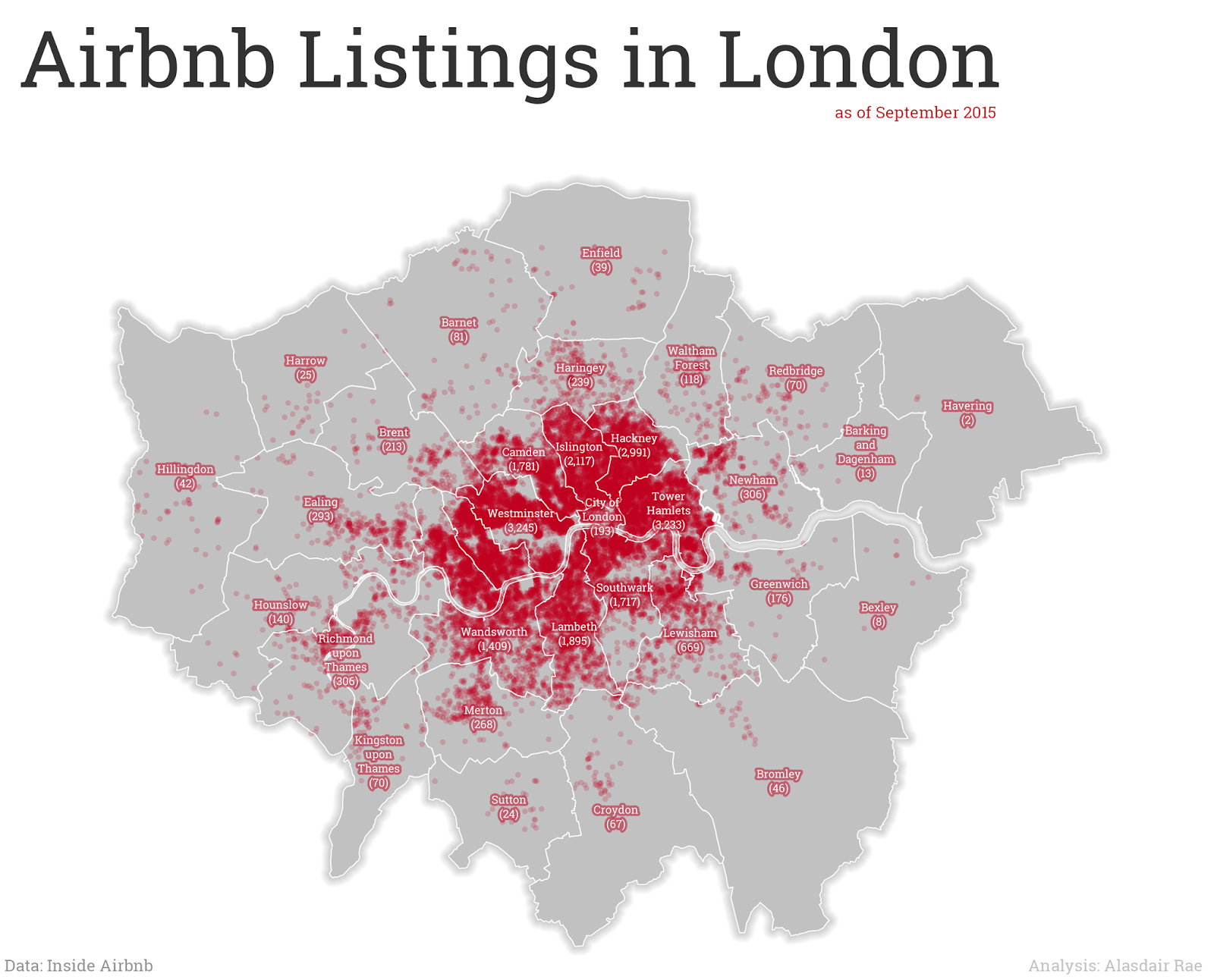
In today's Budget, the Chancellor outlined some new tax allowances for 'micro-entrepreneurs', such as those doing business on Airbnb or eBay. Basically, there's a new £1,000 tax-free allowance on income from these kinds of activities. However, this 'sharing economy allowance' may also serve to benefit big landlords, if data from Airbnb are to be believed. Using figures from Inside Airbnb I did a little analysis to see how much of the room sharing in London is of the 'micro' scale. It turns out it's a bit more complicated than the 'sharing economy' label would suggest. But first, here's a map with the 25,000 or so London rentals listed on Airbnb, just to make the point that it's 'a lot'.

As of September 2015, there were 25,361 London listings

Alex Hern in the Guardian picked up on this almost instantly, and has already written a good piece on the issue. I'm just trying to add a little more in the way of a geographical breakdown, since I'm thinking about things like lack of affordable housing, loss of housing stock to the 'sharing economy', the impact on rents and issues related to displacement and gentrification. When you break it down by Borough, as I've done in the map below, it's clear that there is a big inner/outer London divide and that Tower Hamlets (3,233 listings), Hackney (2,991) and Westminster (3,245) are real 'sharing economy' hotspots. But bear in mind they also face intense housing market pressure and suffer from a severe lack of affordable housing.

Not much 'sharing economy' demand in Havering, it seems

If this is really aimed at the kind of 'micro-entrepreneur' that the Budget talked about, that sounds reasonable enough. But what do the data show? Well, by my calculations based on the latest Inside Airbnb data (September 2015), 14,923 of 25,361 London hosts only listed one property. But 599 hosts had three or more, and 139 had 10 or more (just over 11% of all listings). At this end of the spectrum it looks a lot less like 'micro-entrepreneurs' and more like nice tax breaks for buy-to-let landlords with multiple properties. Well, that's the obvious conclusion you'd draw from looking at the data. Whether this is the reality or not requires further investigation. Just to see whether these patterns looked anything like clustered property portfolios on the ground, I mapped all those hosts who had 50 or more listings against their name. The data are publicly available so I have just mapped this using the host name obtained from Inside Airbnb. I don't know exactly what's going on here but it doesn't seem very 'micro' to me.

Don't read into this too much - check the data yourself

I thought about whether this is really about the 'sharing economy'. I think a large proportion is, but it's also reasonable to assume that a good chunk is not. One way to look at this is to consider how many hosts allow stays of more than 90 nights, as per Section 44 of the Deregulation Act 2015. According to the publicly available data scraped by Inside Airbnb, 78% of listings allow maximum stays of more than 90 nights. Whether this actually happens or not is unknown, but if this was the case then landlords would need to apply for planning permission. Of the 590 properties in the map above, only 4 are not available for more than 90 nights. 

I also took a little look at the patterns at the micro-level and broke it down by LSOA. In the image below, I've shown the top 5 LSOAs in London by Airbnb listings. These were the only five small areas with more than 100 listings, which does seem like quite a lot.

The five LSOAs with more than 100 Airbnb listings

What's the point of all this? It's not a rant against Airbnb (I like the idea), individual hosts (the big ones often get great feedback) or even the Chancellor. The point is that giving tax breaks to 'micro-entrepreneurs' in the 'sharing economy' may not be as straightforward as it first seems. This is the case with just about any policy and perfect targeting of policy is impossible but it seems that by using data from fantastic sources like Inside Airbnb we can get a better understanding of what's actually happening and - perhaps - local authorities might be able to take enforcement action if people are breaking the rules. The point is to demonstrate that the headline announcement of tax breaks for micro-entrepreneurs will, it seems, be very beneficial to 'macro-entrepreneurs' as well, particularly in areas of acute housing shortage.

...also, as a little bonus feature, I also decided to look at the distribution of Airbnb listings by area type, using the Indices of Deprivation 2015 data. In the bar chart below you can see the distribution of listings by deprivation decile, where 1 is most deprived and 10 is least deprived. It's skewed towards the most deprived end of the spectrum. This raises further questions in my mind about the impact of the sharing economy in these areas. But more work is needed to figure all this out.

Not many listings in the very least deprived areas!

Data source: Inside Airbnb - see the data pages for London data and other cities across the world. go to the London interactive page for a great breakdown of the issues and impacts. The author, Murray Cox, has done a great job of explaining things.