Showing posts with label Northern Ireland. Show all posts

Sunday, 26 May 2019

Did you realise wards were actually very interesting?

More map and data fun today. I know there's a massive market for blog posts about administrative geographies, so here I am. It's partly inspired by the fact that I look at this kind of data all the time and get to know it quite well, and partly because of this Twitter exchange some time ago with Mags Hall and Allan Faulds, who truly do know too much about this kind of thing.

Did you know that the UK's biggest ward accounts for 2% of the total area of the UK? You did? Ok then, did you know that only one UK ward out of more than 9,000 begins with 'z'? Perhaps you did. But did you know that 'Plumpton, Streat, East Chiltington and St John (Without)' is the longest ward name in the UK, and also perhaps the best? How about the fact that there are 11 UK wards bigger than Greater London and the smallest ward in the country (in the City of London) is not very big at all - 0.044 square km (about 6 football pitches). The ward that you'd most like to drink? Why, that's the ward of 'Speyside Glenlivet' (in Moray), surely.

Time for some maps now. They all have the name of the local authority they're in in the top left, with the ward name along the bottom.


Not quite as big as Trinidad and Tobago, but close enough

It's small, ancient and has about 320 people

Zetland ward, in Redcar and Cleveland

If you're a local Councillor in the UK's biggest ward you have an awful lot of ground to cover, as you can see below for the journey between Achiltibuie and Kinloch Hourn, which are both in the same ward. Extra points if you can pronounce Achiltibuie (I can but I have a bit of an advantage on the Highland-place-names-as-Shibboleth thing).

The route between Achiltibuie and Kinloch Hourn (in same ward)

There are two really, really big wards in the UK. One is shown above and it's Wester Ross, Strathpeffer and Lochalsh, and the other is North, West and Central Sutherland. Both are in the north west Highlands, and are more than 4,800 sq km in size (that's over 1,800 sq miles, which is close to 3x Greater London or 18 City of Edinburghs). The biggest ones in other parts of the UK are a good bit smaller, and here they are below. Overall, the 10 biggest UK wards account for more than 10% of the land area of the UK, and the 100 biggest account for just over 30% of the UK's land area. You could fit almost 3,000 of the smallest UK wards in Wester Ross, Strathpeffer and Lochalsh but I don't think it's a very sensible idea so I'd advise against it.


By far the biggest ward in England

Just a smidgen bigger than Torr Head and Rathlin

The biggest ward in Wales is also a donut ward

The other humongous ward 

All this isn't supposed to be profound or anything like that, just a bit of map trivia, so read on for a bit more about the little wards. The smallest wards in the UK are all in the City of London, and we've seen the smallest of those above (Queenhithe) so let's look at smallest ones in different parts of the UK instead.

Northern Ireland's smallest ward

Scotland's smallest ward

The smallest ward in Wales

Not the street of Charles Booth fame, but it is small

Wards are actually very important though, and they represent a very important part of local democracy in the UK, so there are some practical implications to this kind of thing, particularly when you consider the different areas people represent and how widely they can vary, even within a single local authority. For example, in Northumberland the biggest ward is more than 1,100 times the size of the smallest. In the Highland Council area in Scotland the biggest ward is over 1,300 times the size of the smallest.

But did you know that wards can also be mapped with a basemap in greyscale? You didn't? Okay, here's proof, with a selection of wards covering more than 100 sq km.

Lots of big wards in this neck of the woods

Not anywhere near Bolton

Another donut ward - I'm not sure how many there actually are

10th biggest ward in Northern Ireland

Yes, the Isle of Skye is a single ward (pop about 10,500)

I like the name of this ward


Notes: I used ward boundaries for 2018 from the ONS Open Geography Portal. This file contains 9,114 wards for the UK, with 7,446 in England, 462 in Northern Ireland, 354 in Scotland and 852 in Wales. Scotland has relatively few wards compared to Northern Ireland and England but I won't go into that here. My favourite ward? Not sure, but Aird and Loch Ness is definitely a contender - see below. It contains all of Loch Ness, is pleasingly-shaped and is only a little bit smaller than Luxembourg. Then there is 'Highland' ward which is not in 'Highland' (the council area) but is in the Highlands but in the Perth and Kinross council area. I have loads more of these maps but that's enough for today.


The midgie capital of the world (at least in my experience)

Hmm


Saturday, 16 December 2017

Population Density in Europe

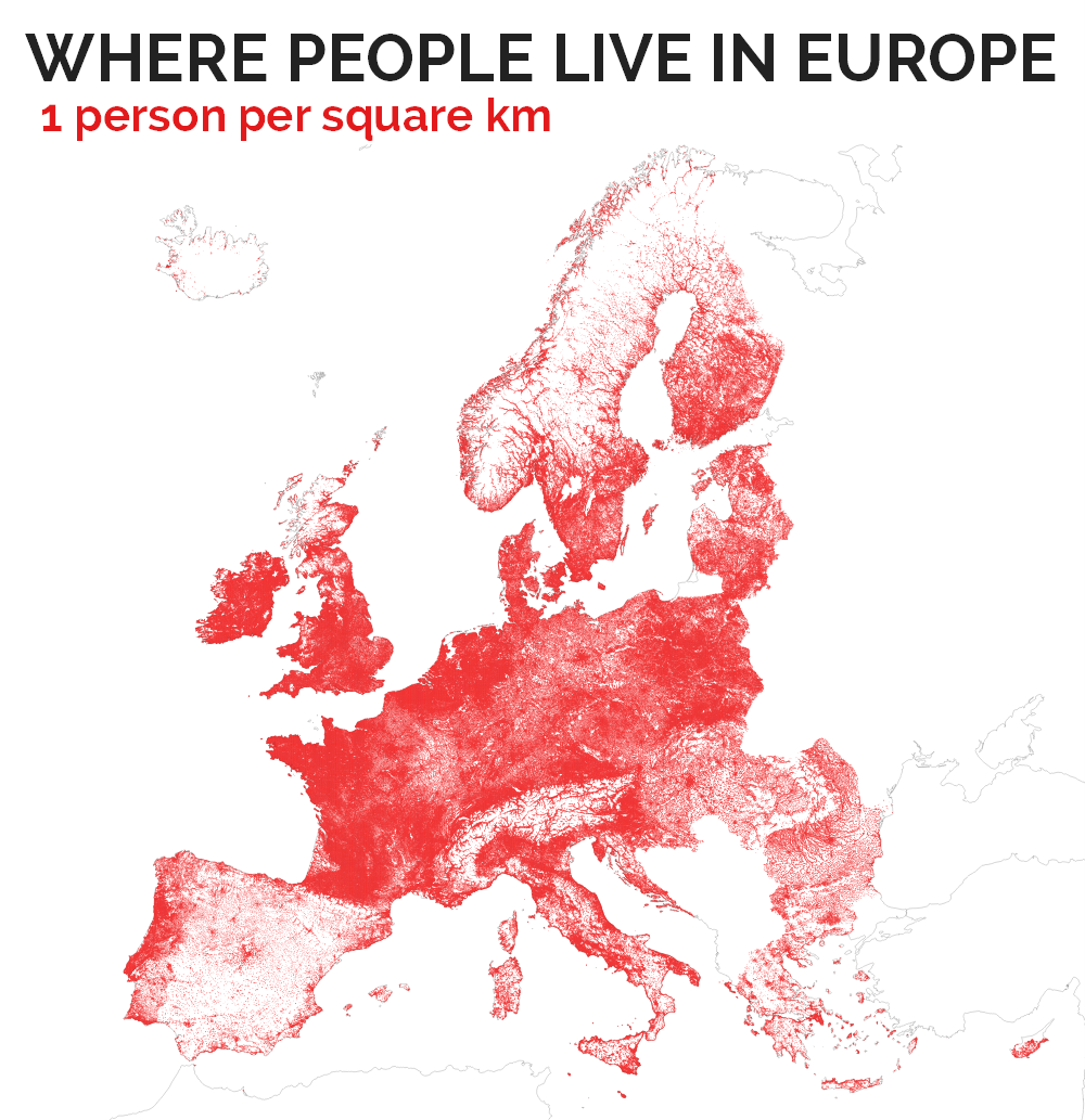
I've recently been looking closely at population density data for Great Britain, Europe and the World. There are a number of good sources of data for this, which typically comes as a 1km resolution grid, including GHSL, the EU, and Datadaptive for Great Britain (based on ONS data). I'm working on some more technical stuff with this data - with varying degrees of success - but I have also outputted a few maps, including stuff I posted on twitter. I just thought I'd share a few of the raw maps here, plus a few observations, because the gifs are a little too quick and small to see the detail. Let's start with the Europe data.

I'm still not 100% convinced that Spain is correct - hmm

Pretty similar to the above, but Scandinavia looks most different

You can start to pick out settlement patterns more clearly now

Now we're getting up to reasonable urban density levels

This basically shows the most dense inner cities - Madrid and Paris highest here

I also did a similar thing for Great Britain, as you can see below. Nothing earth-shattering of course but I find it interesting and I know others do too.

You can see that lots of 1km cells have no people in them

This is isn't much different to the map above, just a little less red

Now this is just the wider urban fabric of Great Britain

This level of density is major towns and cities

Click to enlarge this and you'll see there's more to this than London

Some observations...

1. For the European data, it seems that Spain stands out as being different and - to the naked eye at least - potentially incorrect. I'm not sure about this though, because the data are collated, quality checked and published by the EU and have been circulated widely. Spain also has some very high urban densities and a notably different settlement pattern to other European nations.

2. Some countries are missing. Yes, this is because the EU data does not include some Balkan states, and other non-EU or non-EAA countries. But the coverage is pretty good and, if we want to do this on a global level then we could use GHSL data. 

3. The availability of different data sources measuring the same thing now allows us to compare them and attempt some kind of validation and cross-checking. This is also important because where the 1km grid cells fall can of course affect the numbers reported at the local level. 

4. Interestingly, for EU data, the UK is split into its four constituent nations here with separate country codes for EN, NI, SC and WA. The data, from 2011, shows that England is one of the most densely populated nations in Europe on this measure - and with recent growth since 2011 it may be the most densely populated, overall. 

5. Using the most recent data I could find (2016 for England and 2017 for the Netherlands), England's population density is 424 persons per square km and in the Netherlands it is 502 (if you see lower figures for NL elsewhere it's probably because it includes non-land area, a common mistake). But raw arithmetic density figures are not that useful in my opinion because many areas have much higher densities and many much lower - in this case the mean is not a good model. A good example of this - at the extreme - is looking at population density in Russia. The fact that it has lots of empty land far from the main population centres could give the impression of a very empty country when in fact this would be a good case for using built-up density. This is something Duncan Smith has done in his excellent World Population Density map (see the Analysis link at the bottom of it).

6. The figures for Great Britain suggest some slightly higher maximum densities at the 1km cell level than the EU data but they are reasonably close. But nowhere in the UK is close to the maximum urban density figures in France and Spain. Both countries have a maximum density figure of above 50,000 per square kilometre. In the UK the maximum is just over 20,000 (in London). Poland, Belgium, Greece, Sweden - among others - all have higher absolute maximum densities than the UK. 

7. I think population density is best measured and explored locally, so that's why I'm working with this data. More on that to follow in future hopefully.


Saturday, 11 November 2017

Land Cover Atlas - Notes, FAQs and Data

The last post had some background information on my Land Cover Atlas of the UK. In this post I'll say a bit more about it, answer some of the questions I received, and share some of the data from the project. As I said in my previous post, this was really about me trying to understand the data better and seeing if I could produce a localised atlas of land cover for the whole UK in a way that was accessible and comparable between areas.

Corine Land Cover data for Liverpool and Manchester area

As above, but for Northern Ireland and a bit of Scotland

Notes
If you really want to know more about what I did, and the results of my analysis, I strongly recommend you see my more detailed Land Cover Atlas of the UK, including the Appendices. The piece on the BBC was a simplified version of this work, because it had to be. You just can't have giant, detailed maps on the BBC website in the same way you can on Figshare, where the full set of maps are hosted. That's why, after some discussion, we created a simplified four-class Corine map set, with one set of maps optimised for desktop (640 pixels wide) and another set optimised for mobiles (350 pixels wide). My heart did sink when I found out I'd have to do this but then again it was a good way to learn a few more tricks and the BBC graphics and data team are brilliant to work with.

On the underlying classification itself, I decided to use Corine because I had always wanted to understand it better, but it's also open data and comparable across Europe, and over time - it goes back to 1990. This means that, in theory, you could repeat this kind of analysis for the whole of Europe over 20+ years. But don't hold your breath; I'm done with Corine for now. As I note in the Atlas, the categories themselves do require a little bit more investigation if you really want to make sense of things, as you can see in the extract below.

An extract from my Atlas

On the four-fold simplified classification used on the BBC website, there was quite a bit of debate about this. We moved from using 'Artificial' (as Corine uses) to 'Built on' after some testing at the BBC suggested there was confusion about what 'artificial' actually meant. For 'natural', I think Mark Easton's blog piece did a good job of explaining that this must be interpreted with care. 

'Natural' must be interpreted with care

Ultimately, I thought that producing a localised land cover Atlas would be a good way of showing that when it comes to national averages, they don't always make sense locally. That is, the UK might be mostly farmland and semi-natural, but doesn't mean much if you are surrounded by a concrete jungle and are always stuck in traffic jams. Having said that, I did discover that Midlothian was the local authority which most closely matched the overall UK land cover figures, almost exactly. Thus, 'the Midlothian question' is born.

The UK in miniature?

Just beside Edinburgh, in case your geography is rusty

FAQs
Doing something like this, if it will only be seen by a few interested boffins, is normally fine. But when it is on the BBC website millions of people might see it (and this was the case). That means you get a wide range of responses, from the 'oh cool, maps!' to the 'this is EU propaganda gone mad, the UK is basically a car park and I don't care what the numbers say'. But that's okay because most people are in the middle ground, though much closer to the first and, anyway, people are perfectly entitled to their opinions. What I thought I'd add here are some answers to common questions that were either asked directly or posted elsewhere online.


Why did you do this?
I wanted to know more about land cover across the UK. This was motivated by my desire to understand the country better in terms of land cover but also to see how much of it was actually artificial or 'concreted over' as some put it. The answer was about what I expected it to be but there is great variation locally and that's partly what I hoped to find - and to put some more precise figures on it. 

You really want to concrete over the whole of our beautiful countryside, don't you?
No.

But you're a secret housebuilding cheerleader, right?
I do think we need to built more houses, and we do have space to build them if we want to, but the housing question was not part of this project. If it was, I would have tried somehow to look at 'developable' land or something like that. A key question in this is that for housebuilding there needs to be enough infrastructure and it needs to be in the right place. This kind of analysis could potentially help with that, but it wasn't my goal here.

Was this funded by the EU?
The data I used are created through an EU programme but neither the BBC nor I received any funding for this. I started this in my spare time (evenings and weekends) and although I used the Corine data provided by the EU (it's free and open data) this project definitely wasn't funded by the EU.

How much did the BBC pay you?
Nothing. We decided to use what I'd already done and then create a bespoke map and data set for their news website but I'd done the vast majority of the work already - Mark Easton and colleagues just thought it would be interesting and I see this as a useful kind of public engagement activity that adds to knowledge. If it gets more people interested in land and maps, then great.

What do I think it tells us?
Lots of things, but three come to mind - 1. there is more space in the UK than some of us might imagine. 2. We can find space for more housing if we want to. 3. We should probably get out and about more and enjoy the space that's out there. On 1, this is a question of where we live (i.e. 83% in urban areas) vs lots of land that can't really be lived on (e.g. the 9.5% or so that is peat bog) but I wasn't thinking it being about space for any one particular use. On 2, I didn't begin with a housing question but inevitably it comes up and when you look at it objectively you can easily find space, if you are willing. On 3, that's mainly just a message to myself but it also serves as a useful reminder that the UK is full of amazing landscapes. Maybe, just maybe, it also tells us that the way the population is distributed is something that needs to be looked at.

But England has the highest population density in Europe so this data is meaningless, isn't it?
Overall, in global terms, the UK is quite densely populated and within Europe the UK is now said to be the most densely populated. This data does not challenge that. It is about land cover, not people cover. The goal here is to show land cover, and it does show that some areas are very built up in percentage terms. Some areas may feel very crowded, but this is not just down to population numbers - it's also got to do with infrastructure, services and housing. And density is best thought of locally in my view, not at the national level. A simple national arithmetic average where you divide population by land area isn't very helpful. But I'm working on a more nuanced, meaningful metric for this that is based on a local density measure based on 1km squares. London is the most densely populated area in the UK - with an average of about 5,500 per sq km - and a high of about 25,000 - but it is much less dense than Manhattan or central Paris, for example.

If I complain that the country is full, am I wrong?
No. Yes. Maybe. Take your pick. The answer to this question depends upon people's perceptions, experience, and sometimes biases. I prefer to think about this question in relation to infrastructure, services, housing and international comparisons. But if you were born in 1930, when the population of the UK was around 20 million lower than it is now, I can understand the point of view that the country is 'full', though I don't agree with it. However, my aim was to look at land cover, not population. It's inevitable that the population question comes up but I think some data on land cover is helpful in helping people understand the UK better.

What does it all mean?
It means that someone looked at the EU's Corine data, turned it into localised maps for the UK's 391 local authorities and collaborated with the BBC to produce a simplified set of maps for the same areas. It is an attempt to take raw data and turn it into more meaningful information. The 'knowledge' bit will largely come from what people think to begin with or, in some cases, perhaps change people's perspectives. But for me it's about understanding how local areas compare to the national picture.

Can I have the data?
Yes, see below.


Data
Last of all, if you're looking for the underlying data, I've made it available in an open Google Drive folder. Here's what it looks like if you open it up in QGIS - and there are a few more screenshots in the folder. I have also put a 'Shapefiles etc' folder in there, which contains a QGIS project file you can open and see it styled as below (there's a qml style sheet in there too). If you're an ArcGIS user, you can use the layer file included in the same folder. There is also a UK local authorities file that I made, which should come in handy in providing a bit of context.

Take a look yourself if you're a GIS user

The other thing I've added to the folder is a spreadsheet with a summary of how much of each local authority is 'built on', etc. This just provides an opportunity to see the all map data in a single place. If you want to know how the land cover categories in this table translate to the original Corine classes, well it's relatively simple. Although Corine has a 44 class nomenclature, at the most basic level it covers 5 classes - 'Artificial surfaces', 'Agricultural areas', 'Forest and semi-natural areas', 'Wetlands' and 'Water bodies'. In the simplified classification, 'Artificial' became (1) 'Built on', but without 1.4.1 and 1.4.2 ('green urban areas' and 'sport and leisure facilities'), which became their own class of (2) 'Green urban'. 'Agricultural' became (3) 'Farmland', and the rest were put into (4) 'Natural', though of course some of it is certainly not 'natural'. 

A single file with all the data from the BBC maps


Final words
I hope some of this is useful and that it makes people think. But really, of course, I'd rather you look at my more detailed Atlas because that's where all this started. I'll end with a small sample of comments from Mark Easton's blog because I think they are a reasonable representation of the kinds of reactions there have been, and they also highlight the fact that land, population and statistics can sometimes be an intoxicating combination. 

Beware positive internet comments

Nick Faldo, is that you?

There were lots of these

The lowest rated comments - a mixed bag overall

A good few people worried about how this data will be used

Right, enough on land cover for now.

Sunday, 25 September 2016

Population Density Comparisons

I grew up in the Highlands of Scotland - well kind of. Perhaps the New York of the Highlands is more accurate (Inverness, obviously). But I am also partly of crofting stock so spent a lot of time in very sparsely populated areas. I lived in Liverpool for 5 years and now live in Sheffield and visit London a lot, and I also like looking at maps and making maps. That's why I was particuarly interested in Steven Kay's population comparison map which compared circular areas centred on London to the populations of Scotland, and also Scotland plus Wales and Northern Ireland.

You can see the original map here

Steven has lots of really interesting, clever maps on his website, many of which do this kind of thing. I also really like his Edinburgh comparison with less populated European nations, as you can see below.

Edinburgh - population about 495,000

Obviously, at one level, such graphics don't really tell us that much beyond the fact that some places are really densely populated, and some aren't - and we all know that. But their power lies in the cognitive trick of the simple spatial overlay. By putting them in the same place and simplifying the shapes to roughly circular ones it makes the comparison more powerful and immediate. And this is why it's both easy to understand and quick to digest. It's also what makes me like it as a simple comparison. There are lots of other examples of this kind of thing online, including one I did in the past looking at the Highland local authority area vs Greater London (which is 32+1 authorities, but also a single political space).

Most definitely not a town planning policy suggestion for Nicola Sturgeon

Talking of the Highlands, the other Steven Kay piece I really liked was his analysis of which parts of Britain and Ireland are closer to Westminster, Dublin, Stavanger, and Oslo respectively. My part of the Highlands is, of course, closer to Stavanger than Westminster. But again, this is just a geographical curiosity and not a reason to suggest we be governed from there! Mind you, their sovereign wealth fund would be nice (current value and nice video - click here).

So, where were we - ah yes... These maps are interesting geographical artifacts but they often have a kind of power that connects with people at different levels - including the emotional. But that's a whole other topic.

For the time being, it's interesting to note the different responses to my tweet of Steven's map. I only noticed it because I went back into the Flickr QGIS feed the other day to change my password after the Yahoo! hack. I liked his map because it made an interesting comparison and even though I know London has 'lots of people' and a good few million more than Scotland, seeing it in this way was quite shocking. For some, that might feel threatening (see notes below) but for others - including me - it's just a comparison which captured my attention as a data/map buff.


Notes: for map nerds, Alan MacEachren's 1995 'How Maps Work' has some good stuff on how maps are imbued with meaning - Part II from p. 213. The section on map connotation (p. 336 onwards) is quite relevant here. For some, the London/Scotland comparison is immediately annoying because of the nation/city comparison (I have a little sympathy here) and for others there is something of an 'incitive connotation' because of the current state of UK politics and particularly the push for Scottish indepdenence vs continued Westminster governance. While I'm on a roll, I'll add that Norway has about £56bn invested in the UK, including ownership of 50% of Meadowhall in Sheffield and 25% of Regent Street in London. So, if you are ever at a loss for words, impress your friends with this knowledge. Tenous links here are that I live in Sheffield and Scotland and Norway have similar populations.


Sunday, 7 February 2016

Spotlight on Higher Education participation and deprivation

There has been quite a lot in the news recently about participation rates in higher education in the UK, with universities defending their access records after criticism from the Prime Minister. Part of this is about gender and ethnicity but it's also about socio-economic class, so I thought I'd take a little look at higher education participation rates in relation to deprivation, as a kind of proxy for socio-economic class. I took the the participation of local areas data from HEFCE (the dataset known as POLAR3) and data on deprivation using the official indices from across the UK (IMD, NIMDM, SIMD, WIMD). I looked at how participation in higher education varies in the most deprived fifth of the country - bearing in mind that the deprivation data is unique to each country of the UK and that there are differences between the data in Scotland and elsewhere. So, it's best to compare within rather than between nations in the maps below. Having said all this, it's time for some maps, first for England.

Only 20% most deprived are in the spotlight here

We can see from the first map, of London, that across the 20% most deprived areas participation in HE is quite variable and actually in the highest quintile in places. But this is something of an anomaly and London is a bit different in this respect, as noted by scholars such as Sol Gamsu. The situation is a little different in Bristol, below, where areas amongst the 20% most deprived nearly all have the lowest HE participation rates. A couple of points to note here, though. This says nothing about cause and effect (i.e. this isn't a finger-pointing exercise, even if the HE sector in general can do more). Also, the geographical scales are different - POLAR3 is available at ward level and deprivation data at lower scales (LSOA in England and Wales, SOA in Northern Ireland and Data Zone in Scotland). So, let's call this 'indicative' and move on.


HE participation and 20% most deprived - Bristol

Moving from the South West to the North East of England, there is slightly more variation in HE participation among the most deprived 20% of areas, but not much. There are many good reasons why we shouldn't be surprised about it (some historic, some socio-economic) but the patterns below do indicate that there is a need (or opportunity) to widen access.


HE participation and 20% most deprived - North East

Now it's time to run through a few more maps from the rest of England - West Yorkshire, South Yorkshire, Merseyside, Greater Manchester, East Midlands and the West Midlands.

HE participation and 20% most deprived - West Yorkshire

HE participation and 20% most deprived - South Yorkshire

HE participation and 20% most deprived - Merseyside

HE participation and 20% most deprived - Greater Manchester

HE participation and 20% most deprived - East Midlands

HE participation and 20% most deprived - West Midlands

As you can see from the maps above (remember, only the 20% most deprived of areas are highlighted - the rest have the 'lights off' effect), there is a good bit of variation in HE participation rates in some urban areas. I've shown the LSOA boundaries in white and it's a bit frustrating/tantalising with the POLAR3 data being at the larger ward scale, but I think these patterns merit further investigation. Maybe this has already been done, in which case do let me know. To complete the UK picture, here are some more maps, starting with Glasgow and Edinburgh. Just remember that in some cities (such as Glasgow) there are more areas in the most deprived 20% than others - and Glasgow and Edinburgh provide an obvious contrast in this regard. 

HE participation and 20% most deprived - Glasgow
HE participation and 20% most deprived - Edinburgh

To Northern Ireland now with a map of Belfast, followed by Cardiff. In both cases there is a little variation but most of the areas shown - all within the 20% most deprived -  overlap with wards with the lowest HE participation rates. 

HE participation and 20% most deprived - Belfast

HE participation and 20% most deprived - Cardiff

What does this all mean? Well, at first glance, it appears that in some cities - and in particular in London - there are higher levels of HE participation in some of the most deprived areas. In others, the opposite appears to be the case. Overall, it appears HE participation is low in the 20% most deprived areas. But, there are many caveats here. Even in areas where the participation is higher, we don't know where that participation is taking place - or why. These are things I'd like to know more about. In the first instance, I was most interested in the patterns. Also, some areas have a lot more deprived areas so this affects how we might interpret the maps - a point reinforced if I include maps for Oxford and Cambridge, which have very few areas in the 20% most deprived in England. 

HE participation and 20% most deprived - Oxford
HE participation and 20% most deprived - Cambridge

Notes: as I said above, the datasets used here are at different geographical scales, so this makes it all a bit frustrating. The within-ward variation in HE participation we might be interested in cannot be discerned from these maps, but these patterns appear consistent with results reported elsewhere. The best way to interpret these maps would be to say that the areas shown are within wards with a specific HE participation quintile, rather than to read anything more into it from a statistical point of view. I think this is a useful initial exercise but ideally we'd have more fine-grained POLAR3 data to do this with - maybe it already exists, but I couldn't find it. If you want to look at the POLAR3 data yourself - including in an interactive map - go to the POLAR web pages.