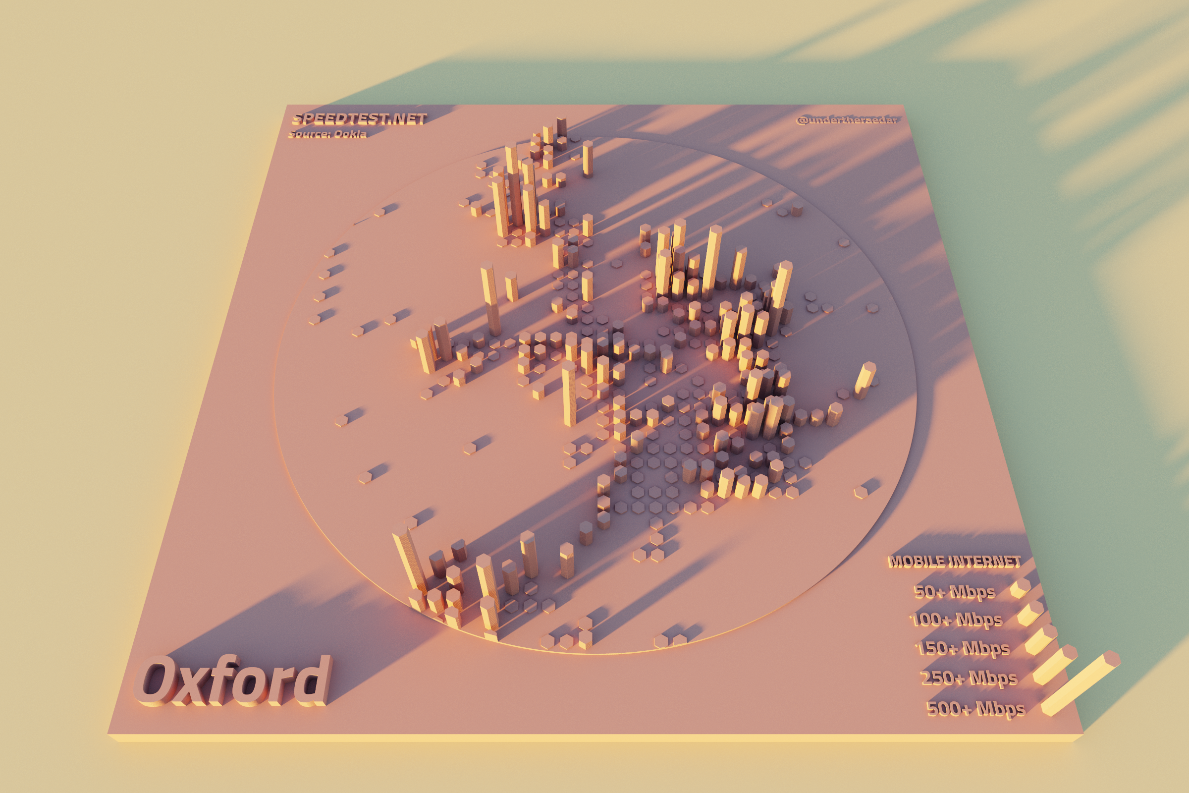
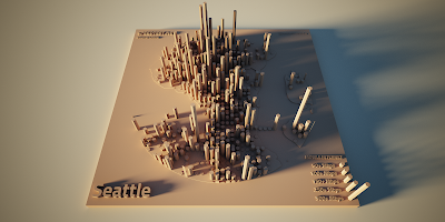
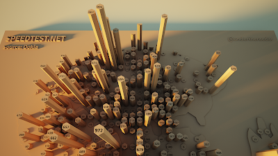
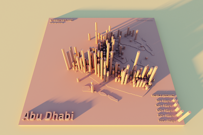
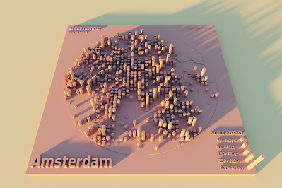
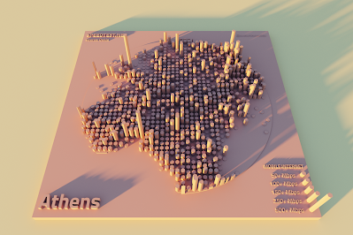
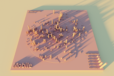
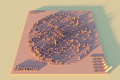
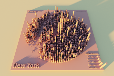
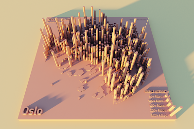
Since 2006, more than 40 billion internet speed tests have been carried out by users of speedtest.net and it's used by over 10 million people every day. Actually, their about page has a live ticker telling you how many Speedtest tests have been undertaken to date, if you want to have a look. The company behind Speedtest is Ookla, and they have their headquarters in Seattle, with another office in Dublin. Most of the world's ISPs and mobile carriers use Ookla data to help analyse their services. One of the great things Ookla do, beyond offering Speedtest, is share their data as open data. To cut a long story short, I took the most recent global data on mobile internet speeds for a number of different cities (staring with Seattle, below) and produced a series of 3D maps of mobile internet speeds. I also did a map of Mobile, Alabama - it seemed like it had to be done. There are lots of maps below - and below that I added a few notes on the data and so on. Remember that these are for mobile internet speed.
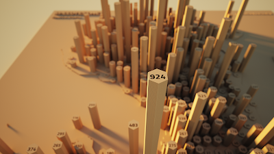 |
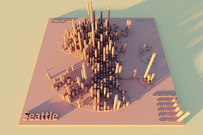
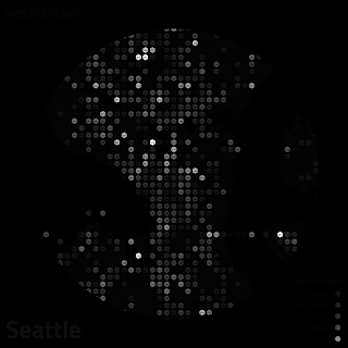
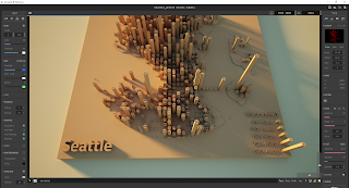
| Some seriously fast mobile internet in Seattle |
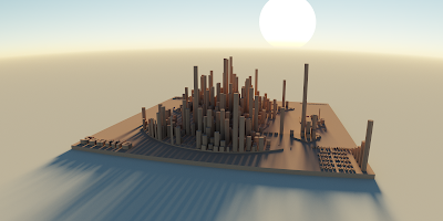 |
| Big internet energy here |
 |
| Throwing some different shade |
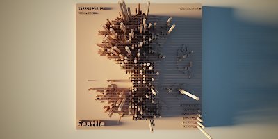 |
| The mobile internet - from above! |
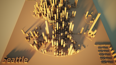 |
| I added labels to some of these |
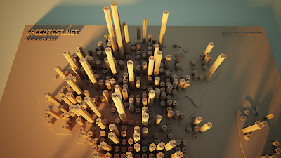 |
| This is fast mobile internet |
 |
| Don't settle for slow mobile internet in Seattle |
 |
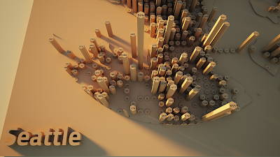
| Highest speed I found - that's a big spike! |
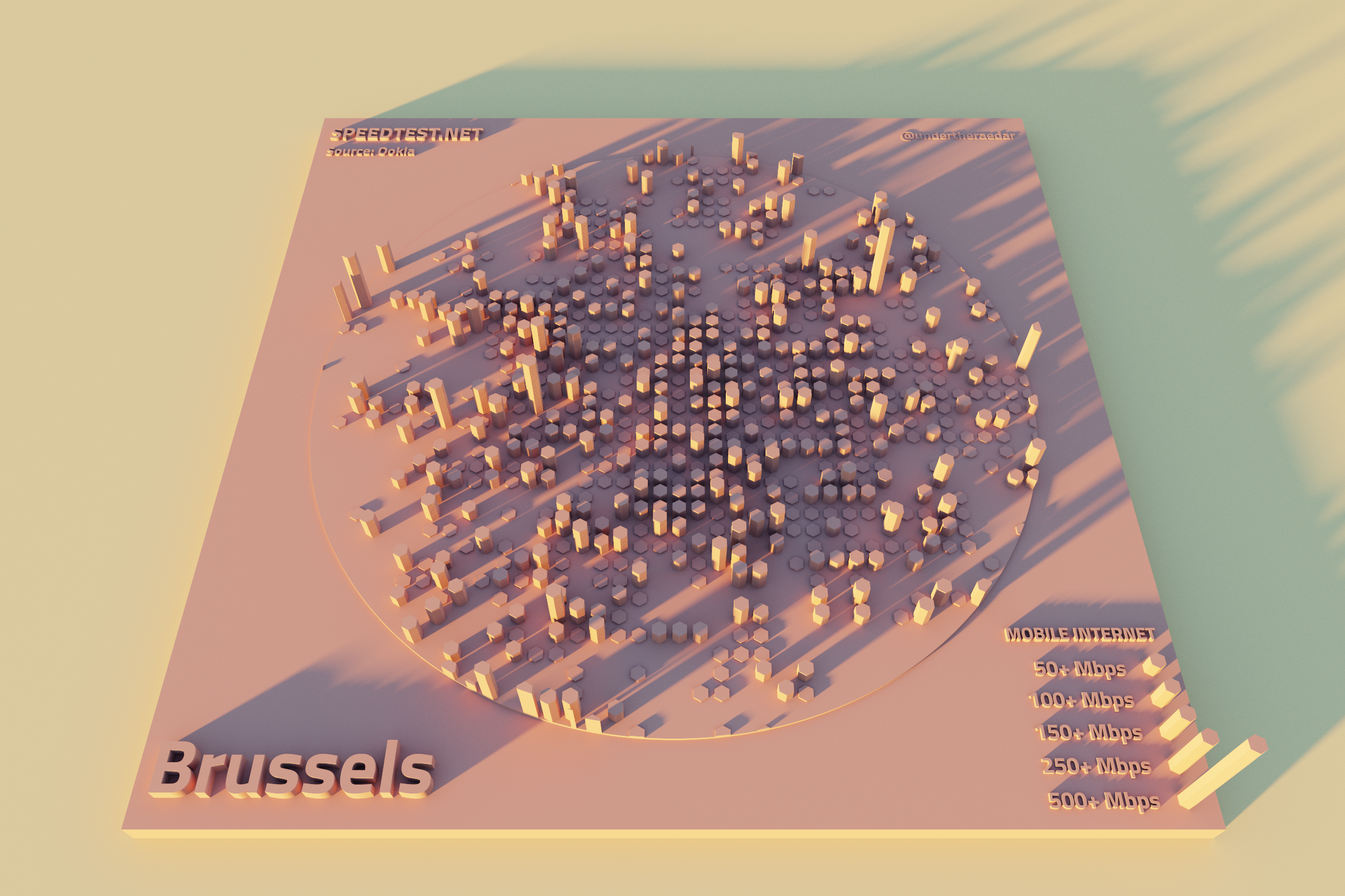
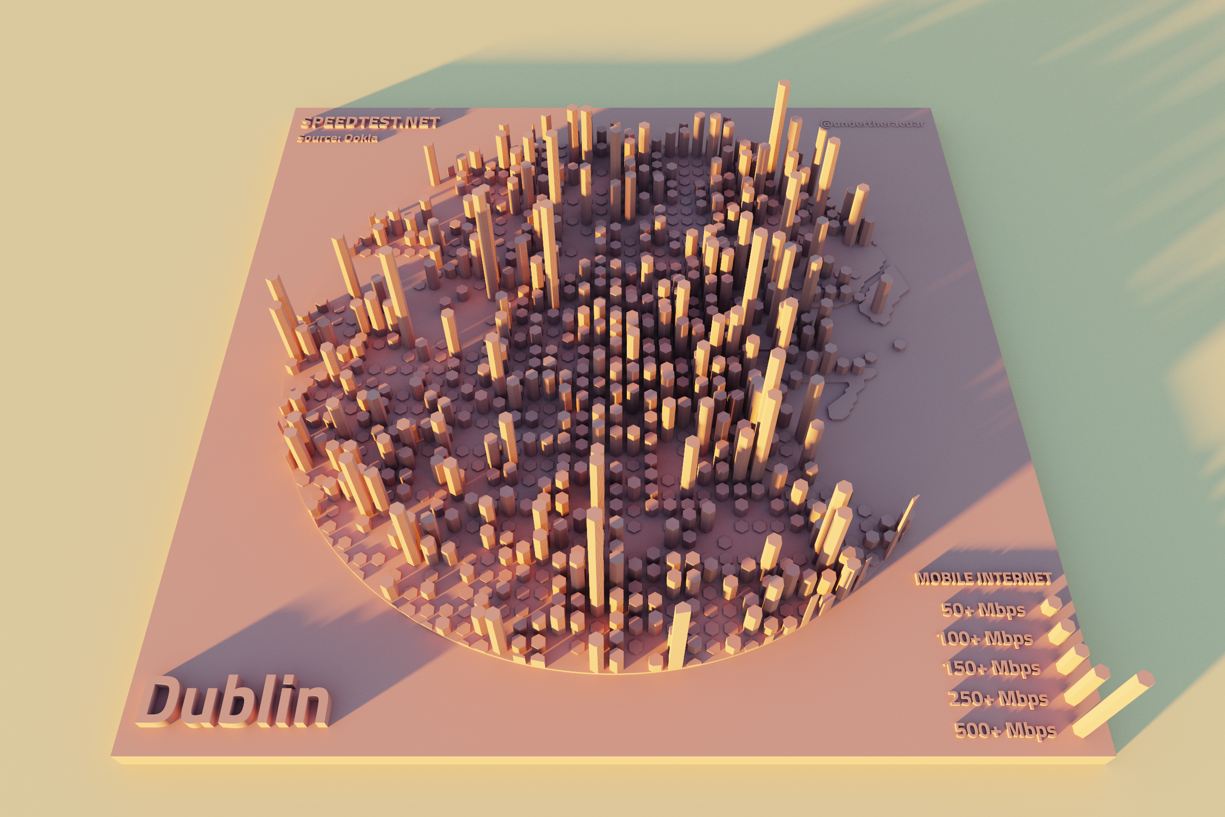
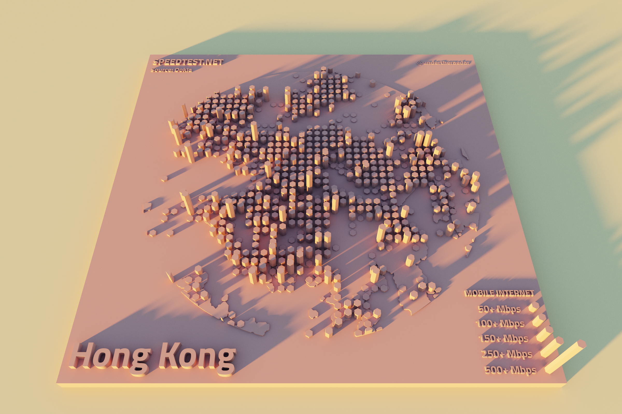
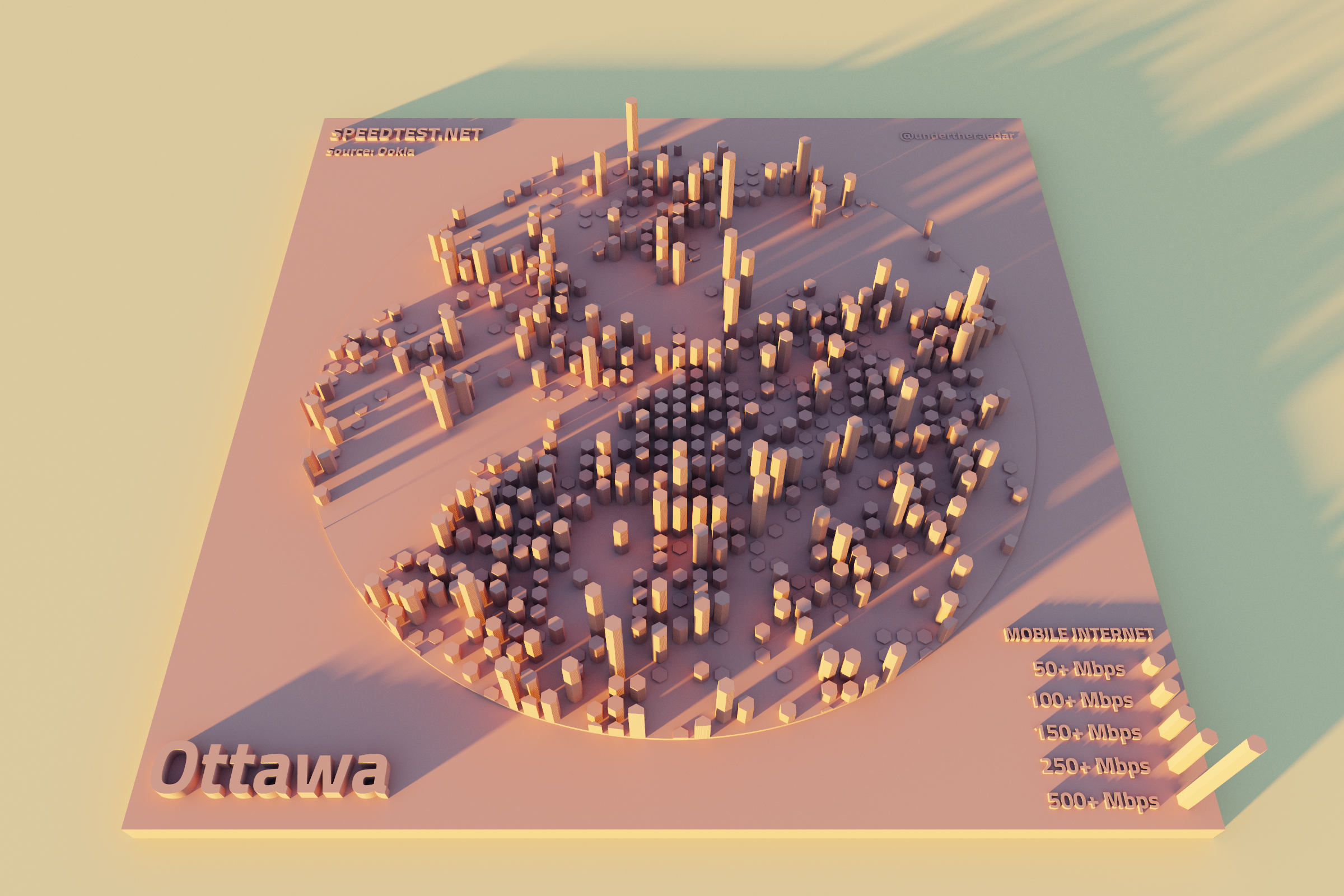
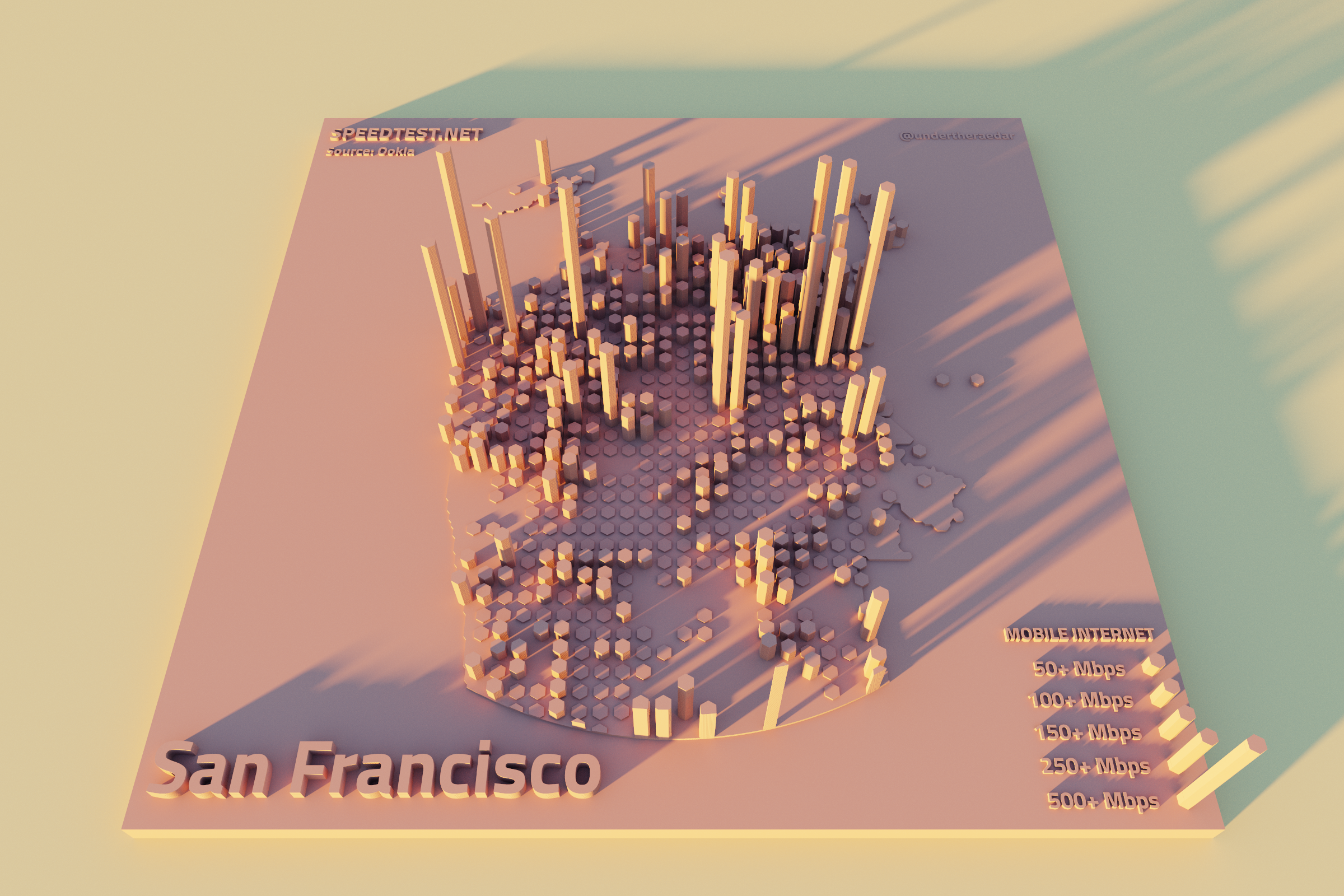
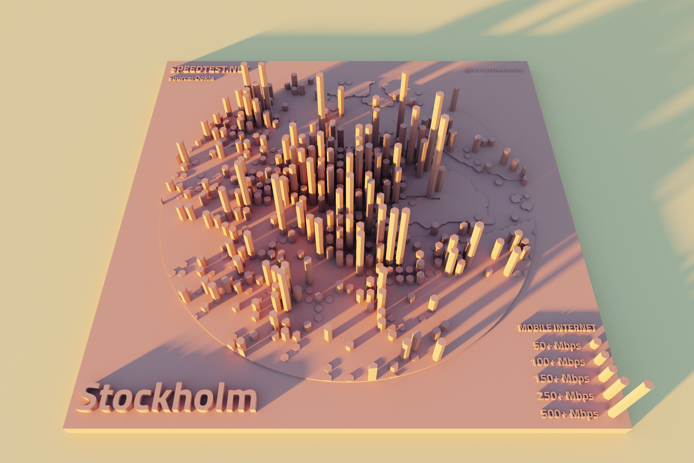
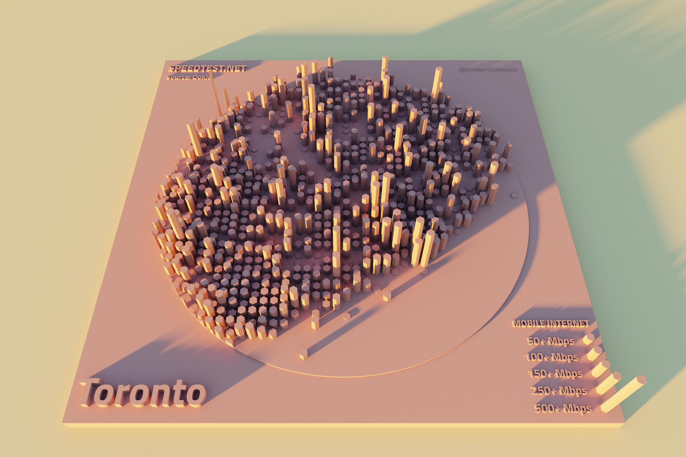
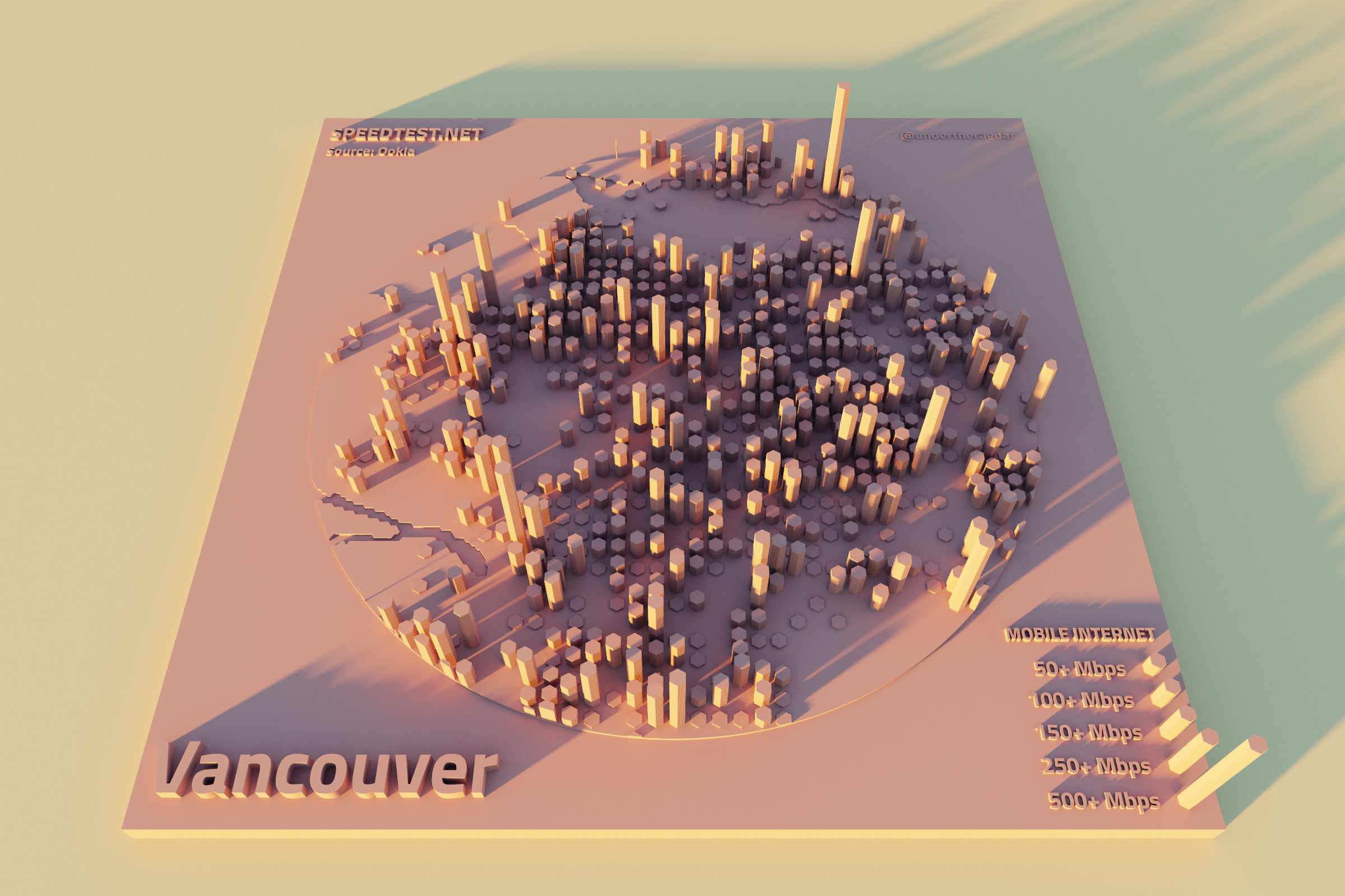
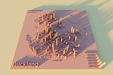
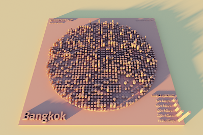
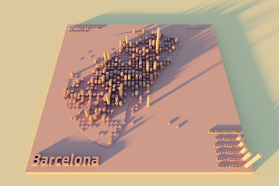
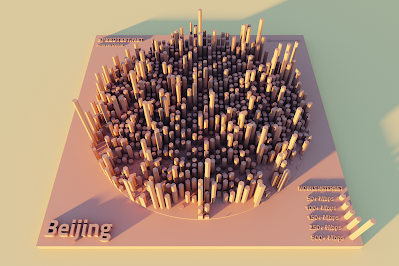
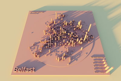
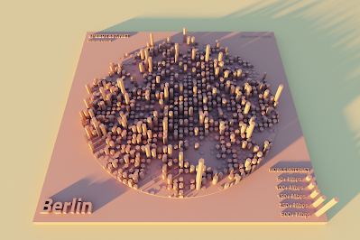
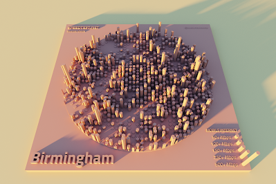
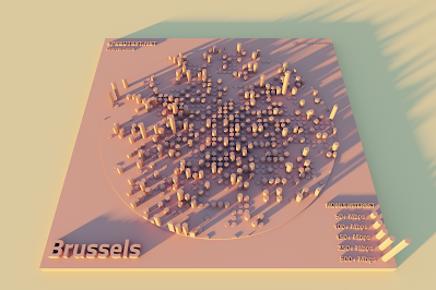
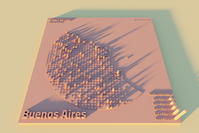
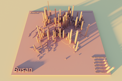
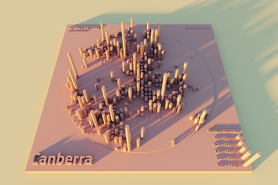
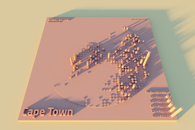
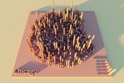
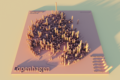
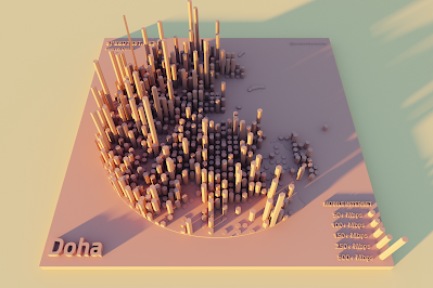
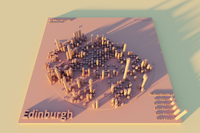
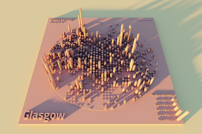
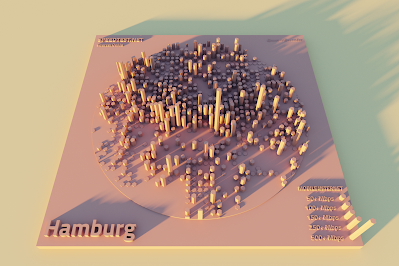
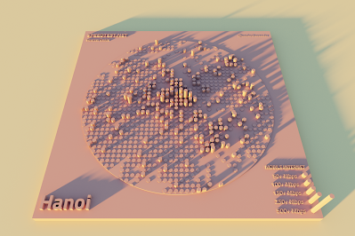
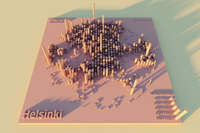
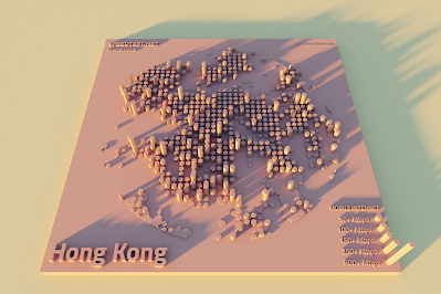
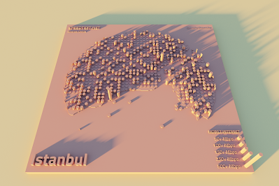
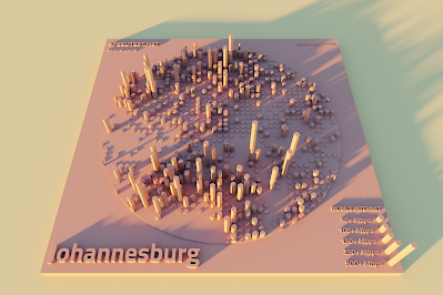
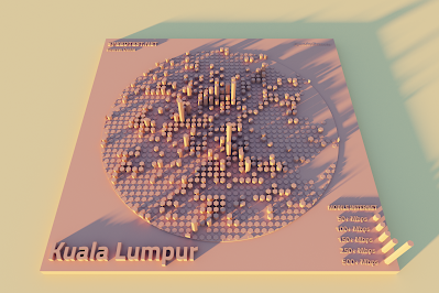
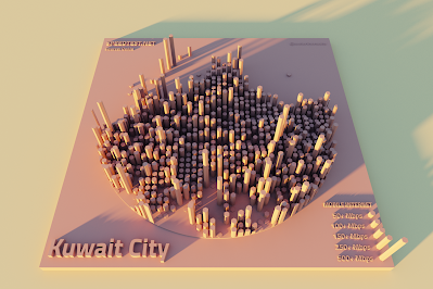
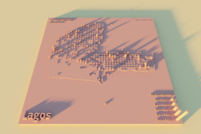
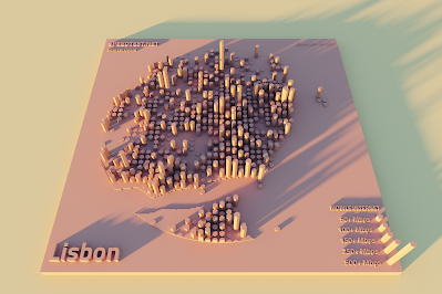
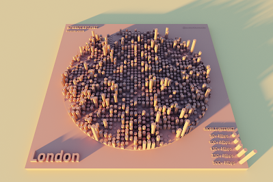
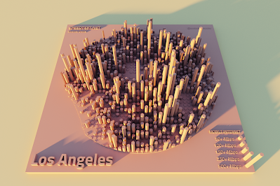
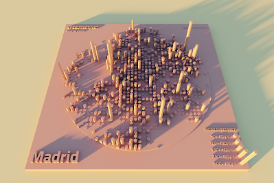
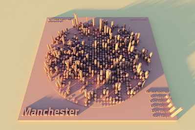
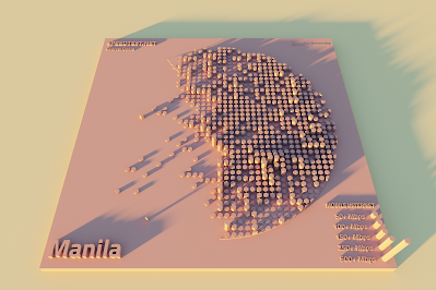
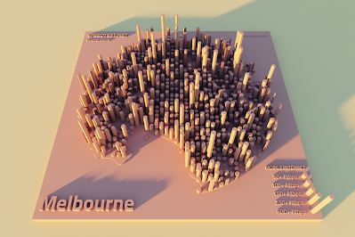
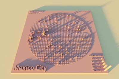
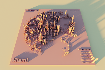
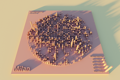
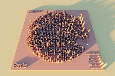
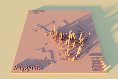
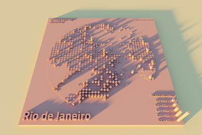
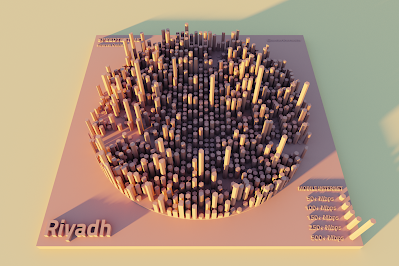
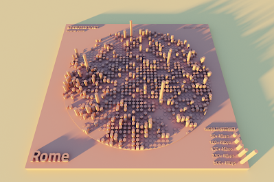
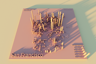
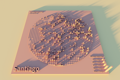
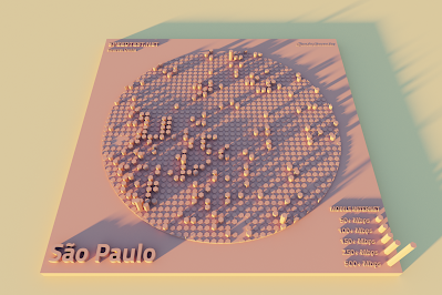
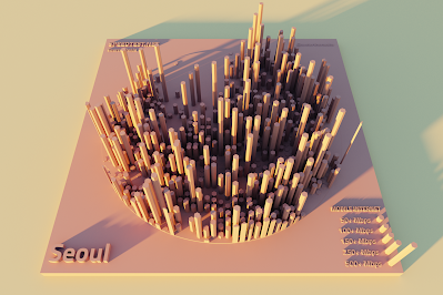
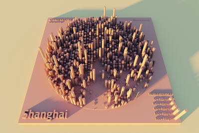
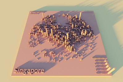
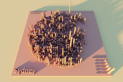
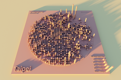
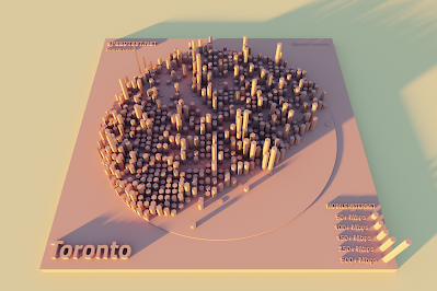
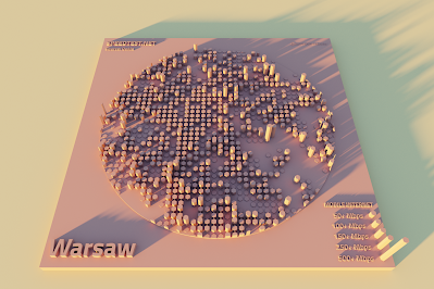
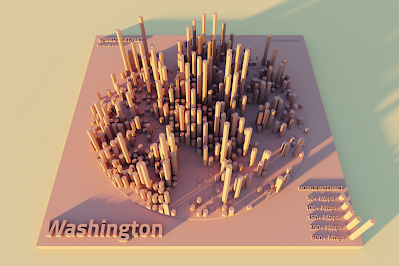
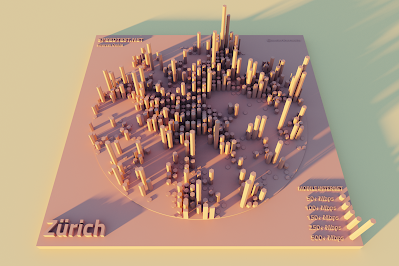
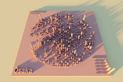
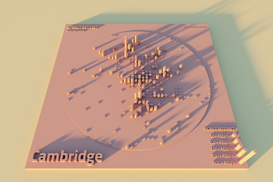
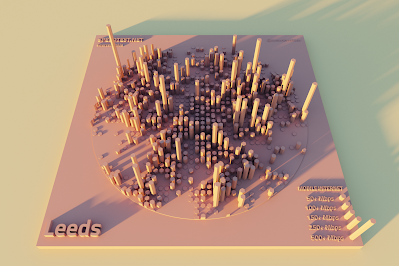
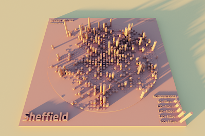
And then cities across the world, below. For these I used a different colour scheme and no labels, just because you can only really read them when zoomed in. What's the width of the circles in the images below? Well, this varies depending upon the latitude each city is at, but it's typically close to 20km / 12 miles in diameter. The individual sample points are roughly 0.5km by 0.5km, but again this varies depending upon latitude. If you want to look at it on an interactive map then check out the
Ookla Mapbox interactive. I've included a mix of cities below, including most that rank among the top
cities worldwide for 5G. It takes a while to render each image, so I couldn't do them all. The vertical scale is the same for each city, so if you want to grab multiple images and put them side-by-side for comparison then feel free.


This was really just another experimental mapping piece with a dataset I've been
playing around with for a while. I haven't used it in any real-world projects to date, but I think it's likely to come in very useful in the future as I can think of loads of potential applications.
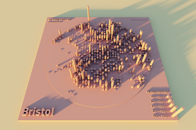
I decided to run off a few more cities in England, including where I live (Sheffield), so see below for that.

Notes: if you're looking for the raw data, you can find it on the
Ookla Github open data page. The data is based on people testing their internet speed using
speedtest.net. How big are the sample points? Here's what Ookla say on the open data page I linked to above: "This equates to a tile that is approximately 610.8 meters by 610.8 meters at the equator (18 arcsecond blocks)". Is there an R package for this data?
Yes. Is this really open data? Yes, Ookla have made it available under a CC BY-NC-SA 4.0 license). Can you just grab a shapefile if you want to? Yes, they provide download files in shp format for both mobile and fixed internet on a quarterly basis - just go to the Github page and scroll down to the
Download via URL section. How did I make these images? I used
QGIS to create the basic layouts and then
Aerialod to render them in 3D. See below for an example that you can just drop straight into Aerialod to render - it doesn't look like much below but once you load it into Aerialod it should look nice once you tweak some settings, but you'll need a Windows machine and a decent graphics card to make it work quickly. What about the fact that some areas have not much data? This is sometimes true for individual points, but even with a single test we have an indication of local achievable speed. But, in the case of these cities there is in most cases a lot of data to go on. Finally, the Seattle images at the top with the labels - I think the scale on the legend here doesn't quite match the main map area but since there are labels on it that doesn't matter too much.
 |
| Add this file to Aerialod |
 |
| Apply the settings you see here |
Postscript: I went out for a walk around my neighbourhood today to see how the speeds from the data compared to the speeds I got on my Samsung S21 Ultra phone. Basically, I got highest speeds in areas that the data suggested I would, although my top speed was 354Mbps, just outside the local ASDA, and I also got over 300Mbps in the local park. I don't get 5G signal on the street where I live though. All this in the name of dataviz, maps and science, of course.