I really have no idea whether Brexit will turn out to be a bad thing in the long run, but in the short term I'm kind of sick of hearing about it. So, naturally, I thought I'd do another blog post on it. The reason is that I had a few charts tucked away that I think are interesting. Here's what I did... I took the ward-level Brexit results put together by Martin Rosenbaum at the BBC and tried to establish if there was a correlation between % voting leave and level of deprivation. Yes, I know everyone has done this kind of thing using education to best effect but I'm interested in this link because i) I kind of wanted to test the 'left behind' narrative in a different way and ii) nobody had done this kind of localised analysis, to my knowledge. Here's the overall scatterplot comparing deprivation and % leave. Not great in terms of correlation. But perhaps you can use the data to produce something more interesting - I've put it here (it's a bit messy, but includes population-weighted ward-level IMD).
 |
| The BBC weren't able to get all wards - this is just a sub-set |
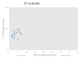
But what I really wanted to do is pick out individual local authority areas and see if they fit the narrative of 'poor vote leave, rich vote remain'. The results for me were actually pretty interesting, particularly the contrast between some very non-deprived areas as you can see below with South Staffordshire and St Albans.
 |
| Not very deprived at all, all wards voted leave (record turnout too) |
 |
| Big remain vote here in another non-deprived local authority |
Now let's take a look at Birmingham, which I also think is an interesting case study in Brexit voting patterns at the local level. Plenty of poorer areas voted remain and at least two of the less deprived areas voted leave.
 |
| Different scales can sometimes be more revealing |
My enthusiasm for Brexit analysis is on the wane as I type but I do want to share these scatterplots so here are the rest of the ones I did. I found them interesting so that's why I'm sharing them all here. In case anyone is wondering, I created a ward-level deprivation dataset by aggregating up from LSOAs to Wards, based on the technique described in the English Indices of Deprivation Technical Report. As such, these plots cover England only.
Now just the small matter of finishing this whole leaving the EU business and everything will be fine. Maybe. Who knows. Either way, I promise not to do any more Brexit data stuff here.


