Many people who read this blog will be familiar with Karim Douïeb's fantastic 'transition between surface area of US counties and their associated population' map, shown below.
I wanted to see if I could create something a bit like this in QGIS, using a geometry generator approach, so that's what this post is about. My end result is shown below, and read on for more information about my method. See the notes at the bottom of the page for a bit more detail. The version embedded below will be a bit small, so
here's the full size, high-resolution mp4 if you want to take a closer look at it.
What's a geometry generator in QGIS?
In QGIS you can style layers in the normal way, as in any GIS software - e.g. by using a blue fill on a polygon and a white outline - or you can use the geometry generator option to style a layer in a different way. For example, if you had a set of points representing populations, you could turn them into spikes with the height based on their populations.
You could display lines as a series of points, and all kinds of
other options, all without having to create any new files. Or you could convert areas into proportional symbols, as I've done above.
Okay, so you may have read this and still be like 'what the what? what the heck does this mean?' and that's pretty normal actually because it's not necessarily an easy concept to grasp without seeing examples. That's why I created
a sample file where you can drop it straight into QGIS and play with different geometry generator styles, as in the tweet/ thread below.
You can get really pretty fancy with geometry generators in QGIS and do all sorts of interesting things, some of which you can easily find if you search for
geometry generator qgis on Twitter.
The thread below is another example of what I'm talking about here - it ends up with me making a tartan t-shirt based on a geometry generator style and some point data in QGIS!
Okay, fine, but could we create something like Karim's animated map in QGIS? Well, I tried and I think I got reasonably close, so read on for more about it.
Polygons to proportional symbols with QGIS geometry generator + Atlas
Okay, first things first - if you want to replicate this style, you can find the QGIS project file plus the individual map layers in
my training data folder - directs links to each file are provided below. Whereas Karim did this for the entire US, my example only includes the lower 48 states. If you already know what you're doing with QGIS this will be fairly straightforward but anyone with a bit of experience should be able to download the files and replicate my steps. Here are the files you'd need to replicate my work.
If you want to replicate my project
exactly, you'll also need to have the Comfortaa font installed because that's what I used for the labels and in the Print Layout. You'll also need to open the Print Layout in the project and make sure you activate the QGIS Atlas (via the
Atlas menu then
Preview Atlas). I did this in QGIS version 3.24 so if you're having any issues try using the same version, or a later one. Last of all, if you want to add the QGIS logo like I have, you will need to change the file path for the Picture in the print layout. I put the QGIS
svg logo file in the same folder as the files above.
As you move through the Atlas page by page, each of the counties changes from a polygon to a proportional symbol, from west to east, with the size of the symbol based on the number of votes in each county. This is not perfect, but it's a more proportional representation and it's all about testing the concept here. This is what it looks like half way through the set of QGIS atlas frames.
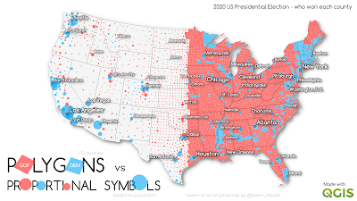 |
| Half way through the animation |
Once I got everything set up, I exported each page of the Atlas as a single png and then combined it into an mp4 as an animation, using ffmpeg. I've written about that process
in a previous post. For the final version I added a pause at the end, then reversed it so it loops back and forth.
So what about the QGIS project file itself? Well, if you download it you'll see it contains:
- A US states layer, to show the state outlines - simple black colour outline
- A US cities layer, filtered to show a selection of cities across the US, and also labelled
- A grey US county backdrop layer so that when the polygons turn to proportional symbols we still have some background behind it
- And on top of the grey US county layer we have the red/blue county layer showing which party won in each county at the 2020 US election. This is the layer that has the geometry generator style in it.
- Plus the QGIS logo svg in the bottom right of the print layout.
If you want to look at the all-important geometry generator style, just go to the Layer Properties for the red/blue us-election-2020-lower-48 layer and then double-click on the blue colour patch symbol then Geometry Generator to see the geometry generator style for the blue areas and then do the same for the red areas, as shown below.
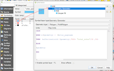 |
| You can also access this via the Symbol dropdown in Layer Properties |
This is the geometry generator style I used - it's pretty basic, but works well:
CASE
WHEN x($geometry) < @atlas_pagename
THEN buffer(centroid( $geometry),7000+ "total_votes"/30 ,50)
ELSE
$geometry
END
What does it do, and how does it work? Well, the first bit after the WHEN uses the x coordinate of county centroids to change the shapes from west to east - this is because I used the longitude of each county as the Atlas page name. That's why @atlas_pagename appears in the expression. You'll need to think about this for a while if you're not used to how the Atlas tool works in QGIS but if you look at the Print Layout you'll see each page is named using x($geometry).
The next bit draws a buffer around the centroid of each county, to 7000 metres, then scales it using the total vote count, divided by 30 (otherwise the circles are HUGE, but I did experiment with this and scaled it loads of different ways). The 50 value just makes the circle smoother. Why 7000 metres for the buffer? Well, if it's much smaller then you can't actually see it at the scale I'm mapping at.
The ELSE $geometry bit just says to QGIS to draw the polygon as usual until the Atlas page name (which contains the longitude) meets the WHEN condition above.
Confusing? Yes, probably if you've not used this before but feel free to download the project and have a go.
You'll also notice that in the Atlas tab I've done some other things, like set the page name using the format 0001, 0002, 0003, 0004 and so on.
This is what the Atlas layout looks like at frame 2000, below.
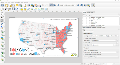 |
| What it looks like in the QGIS Print Layout |
Okay, so can we create an animated proportional symbol map in QGIS? Yes, we can.
Is it as cool as Karim's? No, but it does demonstrate the power of QGIS geometry generator styles and shows the kinds of things that can be done - and that's what this post is all about.
This is example is fairly simple really but if you've not used QGIS in this way before it can be quite confusing - that's why I shared
the simple geometry generator file plus the more complex project file shown here.
Want to replicate this but can't quite get it all to work? Feel free to get in touch.
Notes
If you want to actually create new geomtries (e.g. a new shapefile or geopackage) using a geometry generator expression, you can do it via 'Geometry by expression' in the Processing Toolbox.
Are the proportional symbols sized exactly to match the population? No, because the size is based on the buffer radius, but if you use a bit more clever maths in the expression you can get it spot-on. But if you do this, the smallest symbols will likely disappear.
What's the point of all this? The point is to test what kind of things are possible with geometry generator styles in QGIS and to share this with people who might be interested.
That's all for now. I may add further notes if there are any questions but I'm putting this post here as a more permanent resource for anyone interested in how to do this kind of stuff.


