Monday, 10 April 2023

The longest line (part 2)

In my last blog piece I wrote about my attempt to find a longer straight line in Great Britain that doesn't cross a public road than the one identified by Ordnance Survey in their 2019 blog. I did this using their OS Open Roads dataset, and I excluded public roads because that's what I think makes most sense. I found a longer line in a different area, though I definitely wouldn't recommend trying to walk it but I would recommend watching this video. I wasn't quite satisfied that my previous line was the definitive single longest line possible so I spent a bit more time on it and now I'm back to report my results. All of this was done in QGIS, using open data from Ordnance Survey - and just a bit of curiosity. The original OS piece was in response to a question on Twitter but I also found it very interesting from a methods point of view. And now here's a map of the single longest straight line I think you can possibly find between roads in Great Britain. I'll say a bit more about the method below, for the nerds. Here's the web map of the new longest line. And here's the Scottish Outdoor Access Code.

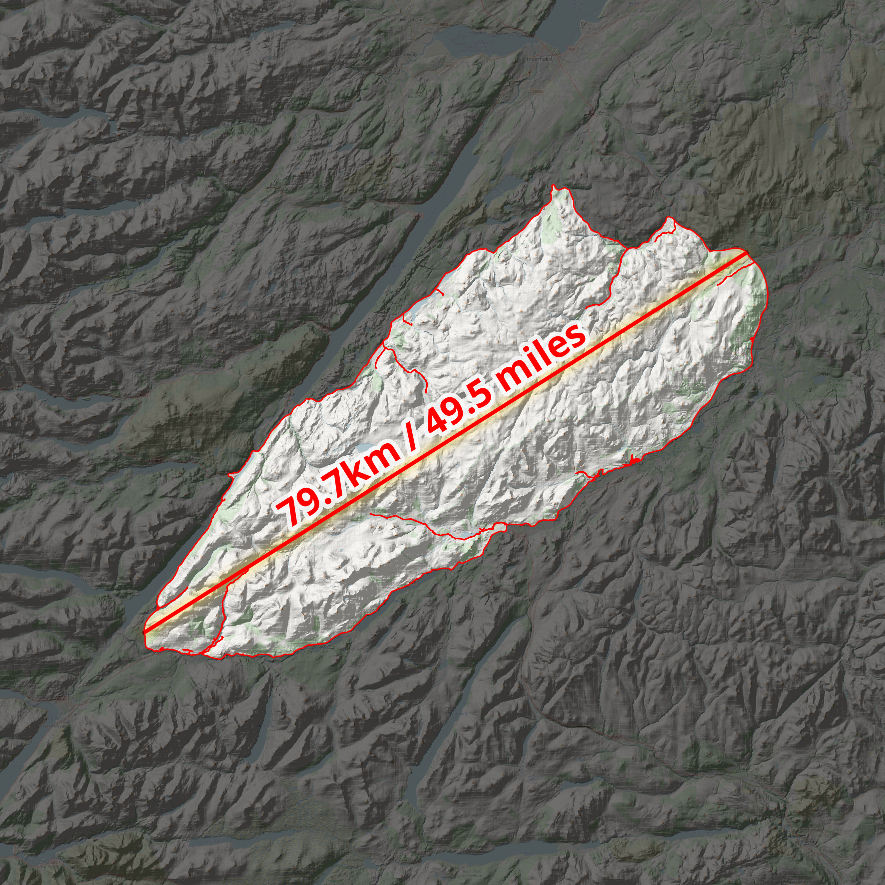
What I now believe is the definitive 'longest line'

Was I wrong at first? Well, no, in the sense that I was still correct in stating that I'd found a longer line - in a different area - than the original OS line, but I didn't quite find the single longest line possible. The line I have found is roughly in the same location though and this is all just a mix of curiosity, mathematical geometry and fun so there's no big issue here. Look for longest-line-new in this folder (gpkg, shp and geojson formats) if you want to load up the line in your GIS software.

But I would strongly suggest that if anyone wants to walk this route they should be extremely careful and only attempt in good weather, and if they are very experienced in Highland terrain (e.g. thigh-deep heather, nasty, tussocky, holey land, murderous midgies, etc). I know myself how hard it can be to walk over this terrain and how much pain it can cause. Many difficult walks over the years have proven this, including a particularly bad decision in Knoydart a few years ago where it took us about an hour to walk 500 metres over what looked like flat ground!

In doing all this I also found a much longer line in England than the one identified in the original OS piece - over 35km vs 29km. This was the case even if I used the file that has the restricted roads in it. I also found a longer one for Wales too but in both these cases there is no right to roam so I don't want to encourage trespassing.

You can read about the method below, but here are a few images from my map adventures.

All areas > 100 sq km between roads

Generating sets of 'longest line' candidates

I got to about 35km straight line in England

Yes, I got carried away with myself again

What about the distance over terrain? Well, that's important so I did the same as last time. I took the longest line, plonked it on top of the OS Terrain 50 digital elevation model and then generated a distance for the line. Obviously if I had even more accurate terrain data (Terrain 5 for example) then the distance would be a bit more.

So, a nice wee 50 mile stroll

This was an interesting methodological challenge and I think I've found the definitive longest line you can travel along a straight line without crossing any public roads in the UK. See my original blog post on this for more on the background.

A revised web map - I think this is the final answer


The method - let me know if you have a better, super-quick method :)

In theory the task is easy. Just draw a straight line inside the biggest gap in the road network, defined using the OS Open Roads dataset. It's quite easy just to eyeball the biggest gaps in the road network and come to a pretty good answer but this is not sufficient if you want to be systematic and definitive. I didn't just eyeball it the first time, there was more to it than that, but also I wasn't completely exhaustive either. So, here's what I did this time, in brief. Note that the data is just for Great Britain but the longest line is the longest in the UK because there are no gaps in the road network in Northern Ireland anywhere near this big.

I'm reporting my method for non-restricted roads, but I also did it with the entire OS Open Roads dataset, including restricted roads - just for fun.

  1. Download the latest OS Open Roads dataset and add it to QGIS.
  2. I decided to polygonize the entire OS Open Roads dataset because of a suggestion by John Murray, and this was pretty useful. This was also pretty quick and simple on my computer.
  3. Then I decided to deal with the roads a bit differently, because they needed to be cut out of the 'between roads' polygons I made so that I could fit my lines entirely within the polygon geometry. But also because the OS Open Roads data is just centre lines and they have no thickness. So I approximated here and buffered the roads to 10 metre width, and dissolved the result. Then I ran a Difference on them to end up with a final set of polygons - lots of big 'no roads here' polygons. I only did this for areas of 100 sq km or more - for all road types this gave me 116 areas and when I removed restricted roads I ended up with 141 areas. 87 out of 141 are in Scotland.
  4. Then I needed a simple way to identify the longest line within polygons. This is in theory very easy but also you could waste a lot of time computing vertex-vertex distances here that you don't need to - you're only really interested in the furthest vertices from each other that can be connected with a line entirely within the polygon. So for this I used the Python console in QGIS and a little snippet I found on StackExchange (of course). I've copied this below in case it ever disappears from there. With thousands of vertices this can take a long time so try it one shape at a time if you are doing it yourself. You could just draw a set of lines to/from selected vertices but this is also a bit of a pain, particularly because it won't avoid the roads.
  5. How could I be sure which intra-road area contains the longest line? Well it's pretty easy to see visually but to be sure I created some minimum bounding circles and computed the radius and then the longest line was still clearly in my original Monadhliath Mountains area, so that was good. You can see a bit of this in one of the screenshots above.
  6. Then it was a case of doing some checks, double checks and then writing this short note.

import itertools

layer = iface.activeLayer() #Click layer in tree

#Create empty line layer
vl = QgsVectorLayer("LineString?crs={}&index=yes".format(layer.crs().authid()), "Longest_line", "memory")
provider = vl.dataProvider()

#For each polygon find the longest line that is within the polygon
for feat in layer.getFeatures():
    verts = [v for v in feat.geometry().vertices()] #List all vertices
    all_lines = []
    for p1,p2 in itertools.combinations(verts, 2): #For every combination of two vertices
        all_lines.append(QgsGeometry.fromPolyline([p1,p2])) #Create a line
    all_lines = [line for line in all_lines if line.within(feat.geometry())] #Check if line is within polygon
    if len(all_lines)>0:
        longest_line = max(all_lines, key=lambda x: x.length()) #Find longest line
        #Create a line feature from the longest line within polygon
        f = QgsFeature()
        f.setGeometry(longest_line)
        provider.addFeature(f)

QgsProject.instance().addMapLayer(vl)

Thursday, 6 April 2023

The longest straight line in Great Britain (without crossing a public road)

In short, I believe I've found a longer straight line without crossing a public road than the line identified by Ordnance Survey in 2019. Important stuff, clearly. Let me explain.

**Update, 8 April 2023: I've added a Part 2 to this now, where I find an even longer line in the same area. Also, be very careful if you try this route because it won't be at all easy and you may also be eaten alive by midgies, as well as all the other hazards like bogs, hills, snow, cloud and so on.**

This is a longer straight line than the one below

Back in 2018 someone asked Ordnance Survey a question on Twitter, as follows:

"what (and where) is the longest distance you can walk in a straight line in England/Wales/Scotland without crossing a road (defined as a paved surface for vehicular use)??"

Note 'a paved surface for vehicular use'. This is the most important bit for me and the reason I'm coming back to it again after years of working with this data and never quite finding time to investigate, until now.

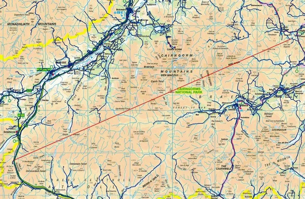
It's an excellent question. The answer the OS team provided was then turned into a blog post on the OS website in early 2019, and you can read that here but see below for their map. There's also a fantastic short film of Calum Maclean and Jenny Graham walking the route. 

71.5km or 44.43 miles

Now, let me say a little bit more. I'm from the Highlands, know lots of this area pretty well from my days cycling around it on my mountain bike when I was a teenager, as well as loads of other trips over the years for all sorts of reasons. I also spend my days looking at map data because that's a big part of my job and because of that one thing troubled me a bit about this answer from Ordnance Survey. 

To be more precise, once again, it's the 'paved surface for vehicular use' part of the answer. I'll explain all below and my maps are very rough and quick but you'll hopefully see what I mean. 


The roads data

Ordnance Survey provide loads of great open data these days, and one of those products is their OS Open Roads product. Load it into your GIS software and it looks like the image below. You can see from just eyeballing it where the biggest gaps in the road network are - unsurprisingly, all in the north of Scotland. There are some gaps in England and Wales too but here I'm trying to find the longest straight line between roads in Great Britain so I'm focusing on the north of Scotland. The longest line in Great Britain is also the longest in the whole UK, because the density of roads in Northern Ireland is such that there's nowhere even remotely as long as the line above there.

All roads in Great Britain


This OS roads file is about 2GB in size and is really useful. However, when I've run different kinds of network analyses on it I sometimes run into problems because it also includes roads that are not public. These are typically flagged as 'Restricted Local Access Roads', and I've shown some of these in the zoomed-in map below in purple. You may think by looking that these are 'roads' but in reality they are usually unpaved private tracks but more on that further down the page. 

Restricted 'roads' in purple here

What do these restricted roads look like on the ground? Well, you can take a look via Google street view a lot of the time, and you can also get a sense for what public roads are just by hovering the street view icon over the map, like I've done below.

A much better representation of public roads

For example, if you travel down the road along the River Findhorn, you'll eventually get to the end of the public road. You can of course keep going on foot or on your bike because of the laws on access in Scotland but you can't drive down these routes (unless you have permission). 


The end of the public road


Another 'Restricted Local Access Road' - see what I mean?

If you download the roads file and then make public roads one colour (blue) and then the restricted roads a different colour and then make a head-splitting gif of the result, this is what you get. Study this for a while and then you start to wonder if you can find a longer line than the OS one from 2019. Sometimes restricted access roads are in places like caravan parks, cemeteries, and the like - but in the Highlands they are often in the hills too.

Loads of restricted access roads (purple) on the map

Using what I would consider to be the 'correct' OS roads file - i.e. the one in keeping with the original question and in keeping with the concept of public roads - I can get a longer line in the original Cairngorms route too, see below. Let's worry about distance over undulating ground later on.

I can get a distance over 74km (straight line) this way

But with my glasses on I could see a potentially longer route, that just missed a couple of public roads, this time to the west of the A9 instead of the east. That's the map I posted at the start, and again below.

From the A9 to near Fort William, a nice walk

I've added terrain to this one, to show how tough this would be

Here's a height profile for anyone mad enough to be thinking about doing this route. It looks horrendously tiring and almost certainly quite dangerous unless you're a bit of an expert. Units are in metres below and the max is just about 3,000 feet, with lots of ups and downs. How much distance does this actually add to the straight line? 

Well, it's never as much as I'd think and it depends upon the accuracy of your terrain model but using the publicly available OS Terrain 50 dataset I get a distance of 77.0 km / 47.8 miles for this so a bit longer than straight line distance. I calculated this in QGIS using the Saga 'Profiles from lines' tool. 

A nice wee stroll

Anyway, that's what I get when I look at the data. A bit longer than the OS answer, but that's because I've tried to stick to the spirit of the original question. Get a different result? Found a mistake? Feel free to let me know.

Not easy

All these options are over 75km, and none are easy!

Data source: © Crown copyright and database rights 2023. © OpenStreetMap and contributors

Want the line file to play around with? It's in this folder, in geojson, gpkg, gpx and shp formats. File name is longest-straight-line-candidate followed by the various file extensions for each type.

Interactive map version of my original line 

How could you systematically, definitively find the longest possible route? With some difficulty but it could be done. My map above involved converting OS open roads to polygons, then vertices then connecting vertices then measuring the longest lines and so on. It's not a trivial problem to solve with 100% accuracy, at least not for me.

Sunday, 5 March 2023

Geometry generators in QGIS

So, you've heard about the mysterious 🌏 geometry generator 🌍in QGIS and you want to know more? You're in the right place. No idea what I'm talking about but you do use QGIS? Well you're still probably in the right place because I'm going to explain things here, with examples you can try yourself. I've put this post together for anyone who really wants to know what a geometry generator in QGIS can do. So before going any further here's a map of US states where I have used a geometry generator style to move Alaska and Hawaii below the lower 48 states as they often appear on US maps. Read all the way down to the bottom of the post if you also want to know how to use a geometry generator expression to create an entirely new layer where AK and HI are in the location shown below permanently!

The expression moves Alaska and Hawaii

Geometry generator? Generators?

Let me say a little about terminology here, because it can be a bit confusing hearing people talk about 'geometry generator', 'the geometry generator', 'geometry generators' and various other terms. Don't worry about the precise term, it's all the same. Regardless of precise terminology The Geometry Generator in QGIS allows you to use expressions to create new points, lines or polygons on the fly during the rendering process. 

Hmm, okay. What does this actually mean? It means that if you have, say, a shapefile of US states and you want to move Alaska and Hawaii to a position below the continental states you can do this using a geometry generator expression - no new shapefile is created and you aren't editing the original file, it's all done 'on the fly' - i.e. you make changes to the appearance of the layer without actually having to modify it's original properties or edit any features. That's why geometry generator appears within the Symbology option in map layers in QGIS.

So using a geometry generator is simply about changing the symbology of a layer in QGIS by using an expression, but without having to a) create any new files or b) edit the existing layer in any way? Yes, that's basically it.

I've found that the best way to understand what the geometry generator can do in QGIS is to have a go yourself, so with that in mind see if you can download the file below and add it to a new QGIS project. Once you've done that, go into the layer's Symbology and then once you're there click on Geometry Generator to look at the expression I've used to move Alaska and Hawaii. You can then edit the settings to see what happens.

Just note that in the example layer above the layer itself is in a coordinate reference system that uses metres, so the large numbers in the geometry generator expression (see below) refer to metres. If you are doing this kind of thing with a layer that has degrees as the map unit you will need to be aware of it. So, for example, you may want to move Alaska just a few degrees south, and not 1200000 as in the example I've given you!

Hopefully this makes things a bit clearer


Some more geometry generator examples

If you search 'geometry generator' in the blog search box here you'll find some examples, but they are quite complex if you're new to it, so let me share some simpler ones now, starting by saying a little more about the US example I've provided above. In the first image below you can see where Alaska and Hawaii actually are (in yellow) and where I've moved them to using a geometry generator expression - and note that I've also scaled Alaska down 50% and rotated them so they look like other maps where AK and HI have been moved.


Original position vs new geometry generator position

Once again, this explains the expression used to move AK and HI

Loads of examples that have AK and HI below the lower 48

So what about other examples? Well I actually created a US lower 48 states file with loads of different geometry generator expressions in it that you can have a play around with, as well as a video that shows you how to do it. Here's the file - just download it and add it to a fresh, blank QGIS project:


Look out for the dancers at the end of the video above, by the way.

So, watch the video, download the file and then you'll see in much more detail than I can say here how things work. But, if you did want to make Texas much bigger - and only Texas - this is how you'd do it.

BIG TEXAS!

If you wanted to take things a lot further and do strange stuff, see below - the point here is that once you know how it works you can use your imagination to do all sorts of things. Note that for all the expressions I've used you will be able to replicate them if you are on the latest version of QGIS (currently 3.22 or above).

An up to date version of QGIS is required

Okay, here's a version where I've got a plain US states layer in the background and then one on top that uses a geometry generator expression to create little needle shapes that relate to population change between the 2010 and 2020 US Census. I have a much more detailed post on this kind of thing here.

See, you can do all sorts of cool stuff

Since I'm in the UK, and since people sometimes move Shetland, you may find it useful to know how to do that if you were working with a UK local authorities file. If you want to replicate this, then here's the UK districts layer

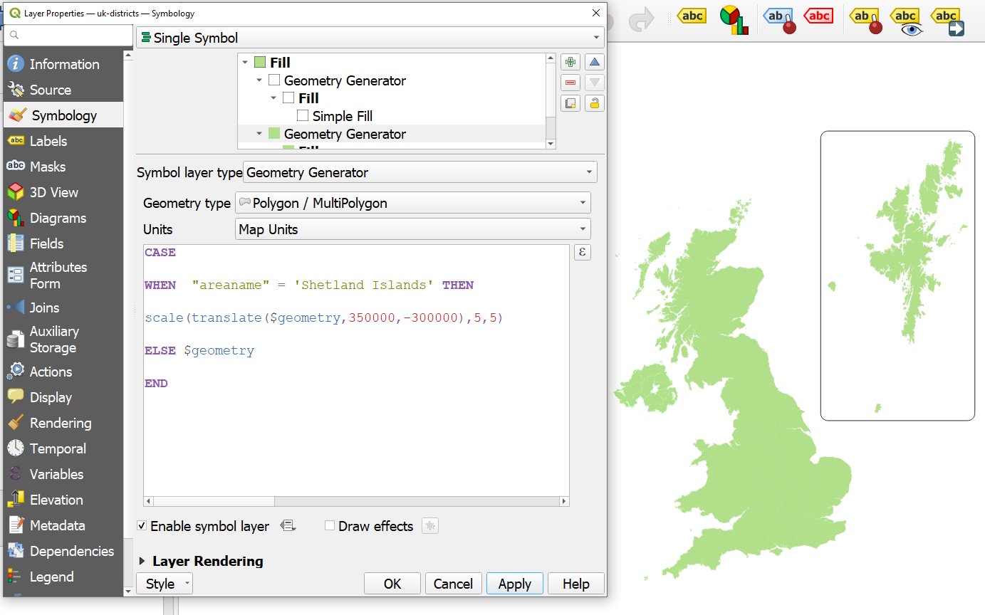
I made Shetland 5 times bigger, just because

Note that in the example above I also added a box round Shetland - a rounded box - if you look closely you'll see that I have two separate geometry generator symbols in the one layer here. See below for the expression I used to add the box - it's basically the same as the one I used to move Shetland but then I added a bounding box and a buffer distance too.

Shetland is indeed in a box, but it's also 5x bigger here

For loads more examples, take a look at the video I posted above, which relates to the US lower 48 states layer I created with TONS of example expression in it that you can play with. This is a great way to learn more about the possibilities of geometry generator in QGIS. Here are a couple of screenshots showing you what's in that file. All you need to do is delete the -- in front of any of the expressions so that only one expression is active at a time and then you'll see what it does. 


I put together loads of different expressions in this file

Tons of different potential uses for this


Wait, I can actually create new layers using geometry generator?!?! Yes!

This is a very important section. Yes, you can use geometry generator to style a layer to make it appear totally different from its original shape but if you want to create an entirely new layer that permanently looks different, based on a geometry generator expression then you can do this. Let's say you wanted to create a new US states layer where Alaska and Hawaii are always located below the lower 48 states. You can do this easily in QGIS by opening the Processing toolbox and then searching for 'Geometry by expression' and then you enter your geometry generator expression, choose where to save your new layer to and then that's that! It's amazingly easy and also very useful.

Create a new, modified layer using Geometry by expression

If you wanted to create a new shapefile, say - or any other type of geo file - with Alaska and Hawaii permanently moved below the lower 48 states, you could just take the original US file I shared at the start of this post, then copy/paste the expression into the Geometry by expression tool as shown above and then run it. See below for a screenshot of where I've done this in QGIS myself.

A layer with AK and HI permanently moved

Help! My shapes are disappearing

You may find that when using geometry generator expression in symbology that things disappear. This can be confusing and worrying and confusing. It happens when you zoom in too far, basically. What do I mean? Well, in the case of the US example above, if you zoom in to the lower 48 states then you will find that Alaska and Hawaii disappear because you have zoomed in to a map extent beyond their actual  position. To get round this, in the Print Layout in QGIS, you can just set the map frame much wider so that it includes the original positions of AK and HI, for example - as shown below. In the main map canvas in QGIS, in this case, just don't zoom in too far or at least move the lower 48 states to the lower right of the map canvas. Once you know what causes this it's easy to deal with and then if it's really causing problems you can just use Geometry by expression to create a layer with the shapes actually moved and then this won't be an issue anyway!

Stop AK and HI disappearing


You may also find that your shapes (points, lines, polygons) disappear when you use a geometry generator expression even if you do it correctly and not for the zoom-in-too-far reason above. In this case it will be because you have used an expression such as centroid($geometry) on a polygon layer to display the polygon centroids but you have forgotten to change the geometry type - as shown in the screenshot below. So, if you are using a geometry generator expression to change the geometry type (e.g. polygons to points) you need to let QGIS know but all it involves is clicking on the Geometry type drop-down and then picking the right one. 

Sometimes you also need to change the Geometry type


Where can I find out more?

There aren't a huge number of resources out there on using geometry generators in QGIS. Well, maybe there are but they are kind of scattered across the internet and they vary in quality. But if you do want to know a bit more and see examples of all sorts of interesting use cases then here are a few resources I recommend.


And of course you will also find lots of great geometry generator stuff if you search twitter. I have particularly enjoyed the examples from Keith Jenkins.


Sunday, 12 February 2023

The most densely populated square km in the United States

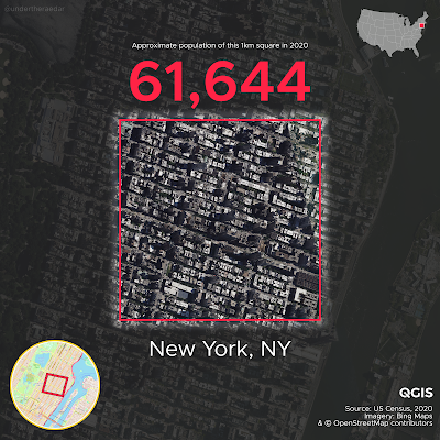
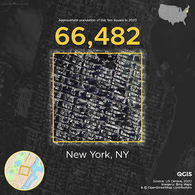
The most densely populated square kilometre in the United States is on the Upper East Side in New York City. This is not a surprise, so in this long and slightly messy post I'll say a bit more about my attempts to calculate exactly where it is and how many people live there, using US Census 2020 data and a similar method to my previous post on the most densely populated square km of the United Kingdom. I also attempt to find the most densely populated square kilometre in each state. If you're looking for more on methodology and data sources, scroll to the bottom of the page. If you want to know whether anywhere in the United States is as densely populated as in Europe then read on, but the answer is: yes, New York City has higher densities than Europe, and a few other spots have European-level densities - but not very many. Time for some maps now. Based on my US-wide 1km x 1km grid, here is the maximum 1km cell population in the US, followed by maps for every state.  Bear in mind that the highest value I found in Europe was just under 53,000 in the Barcelona metropolitan area (L'Hospitalet de Llobregat, to be more precise). The highest density in the UK is about 25,000 in a single square km (in east London). You can find high resolution versions of the maps below in this web folder.

The most densely populated area in the United States

This is basically population density central for the US

How did I get the answer above? Well, first I created a 1km x 1km grid covering the whole US. After some experimentation, I settled on a grid configuration I was happy with. Put simply, I generated a continuous 1km x 1km grid covering the entire lower 48 states, as well as separate grids for Alaska and Hawaii. I also generated an alternative grid, plus some local variations to experiment with, but you'll see a bit more on that below. Then I assigned census block centroids to each grid square to give me an approximate population for each square km. This is never going to be a perfect fit but in my testing it came out pretty close. Again, you can see a bit more on that if you keep reading.

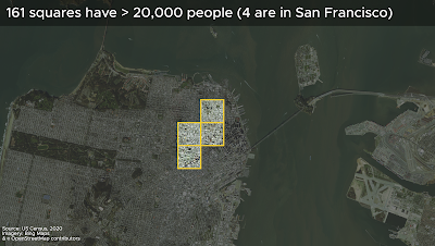
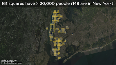
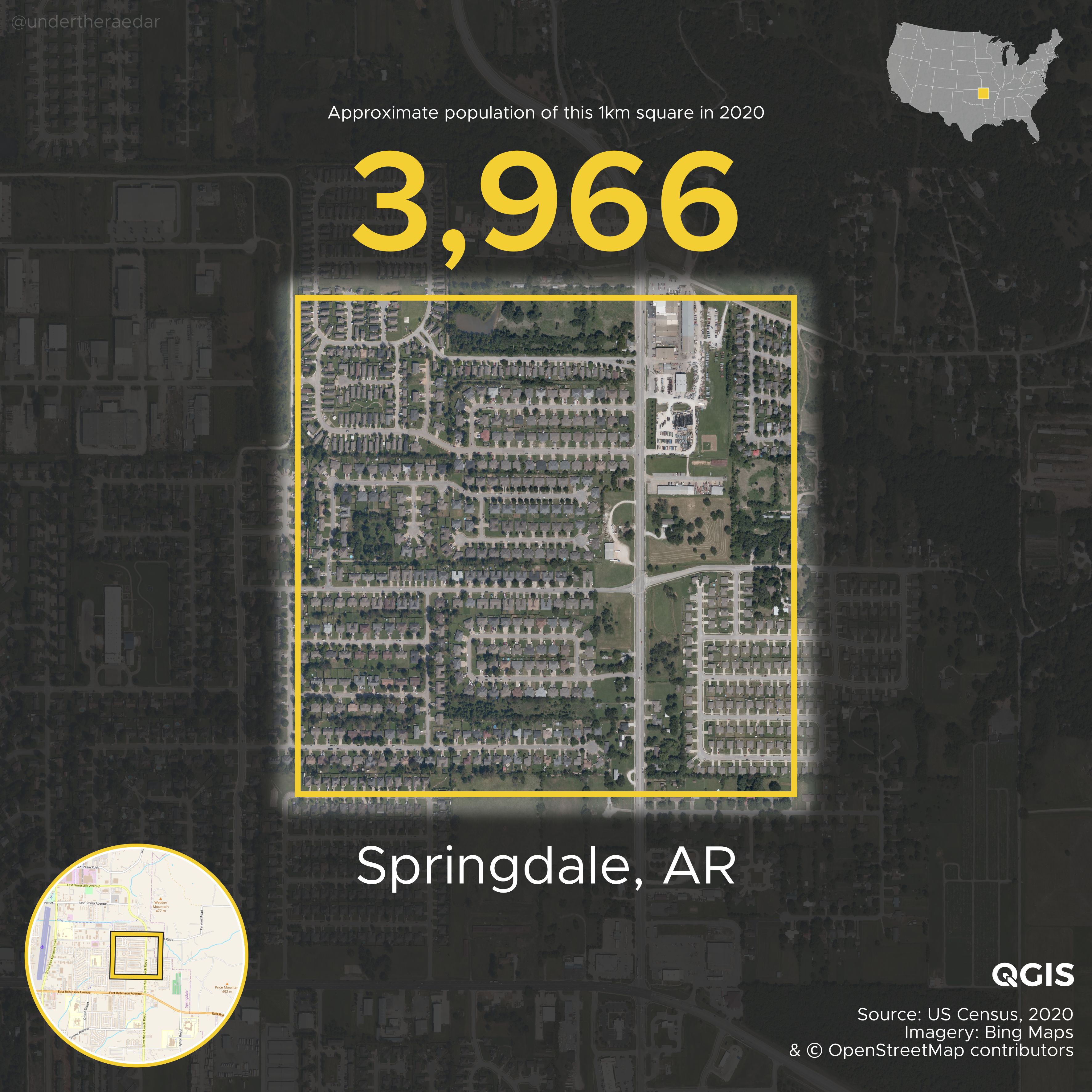
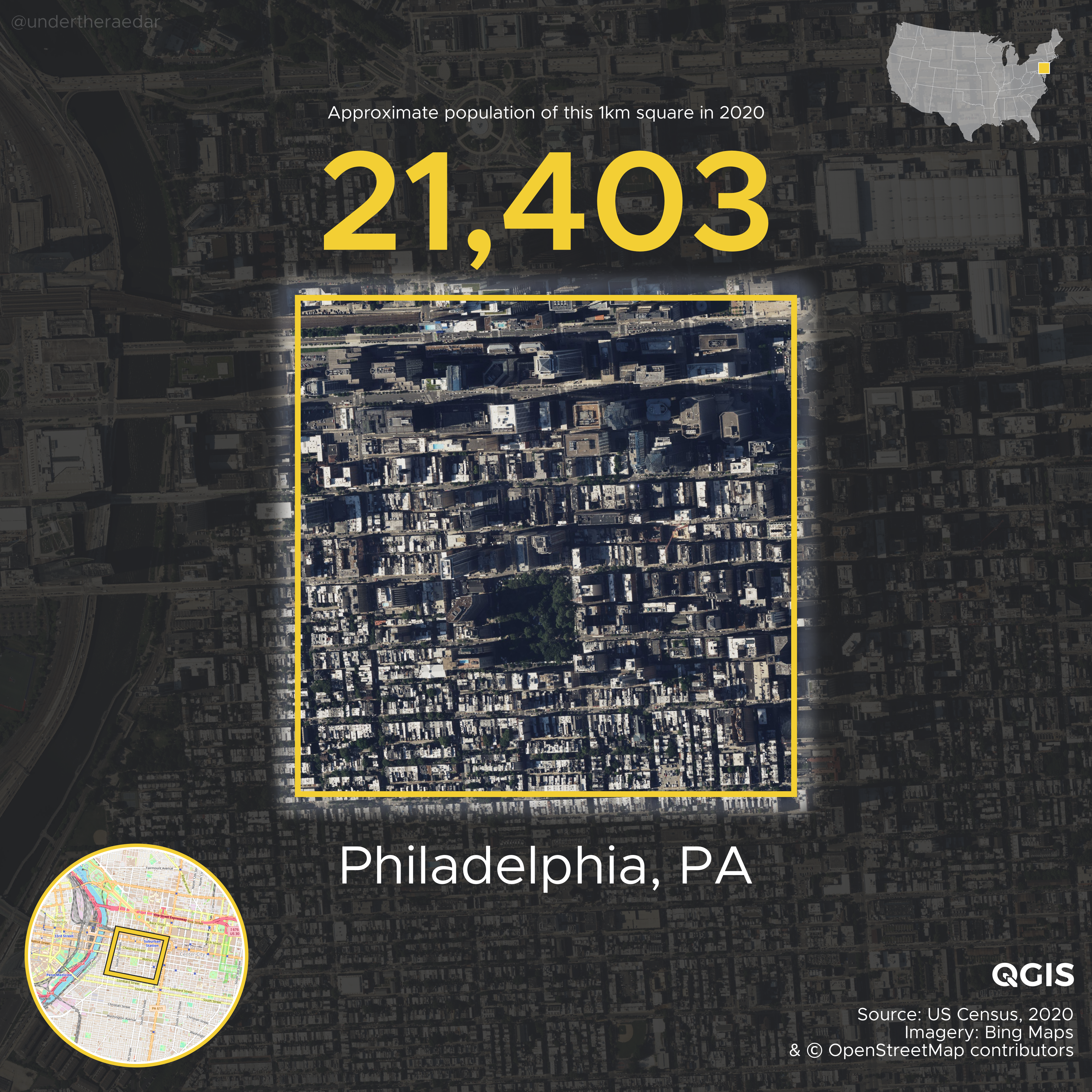
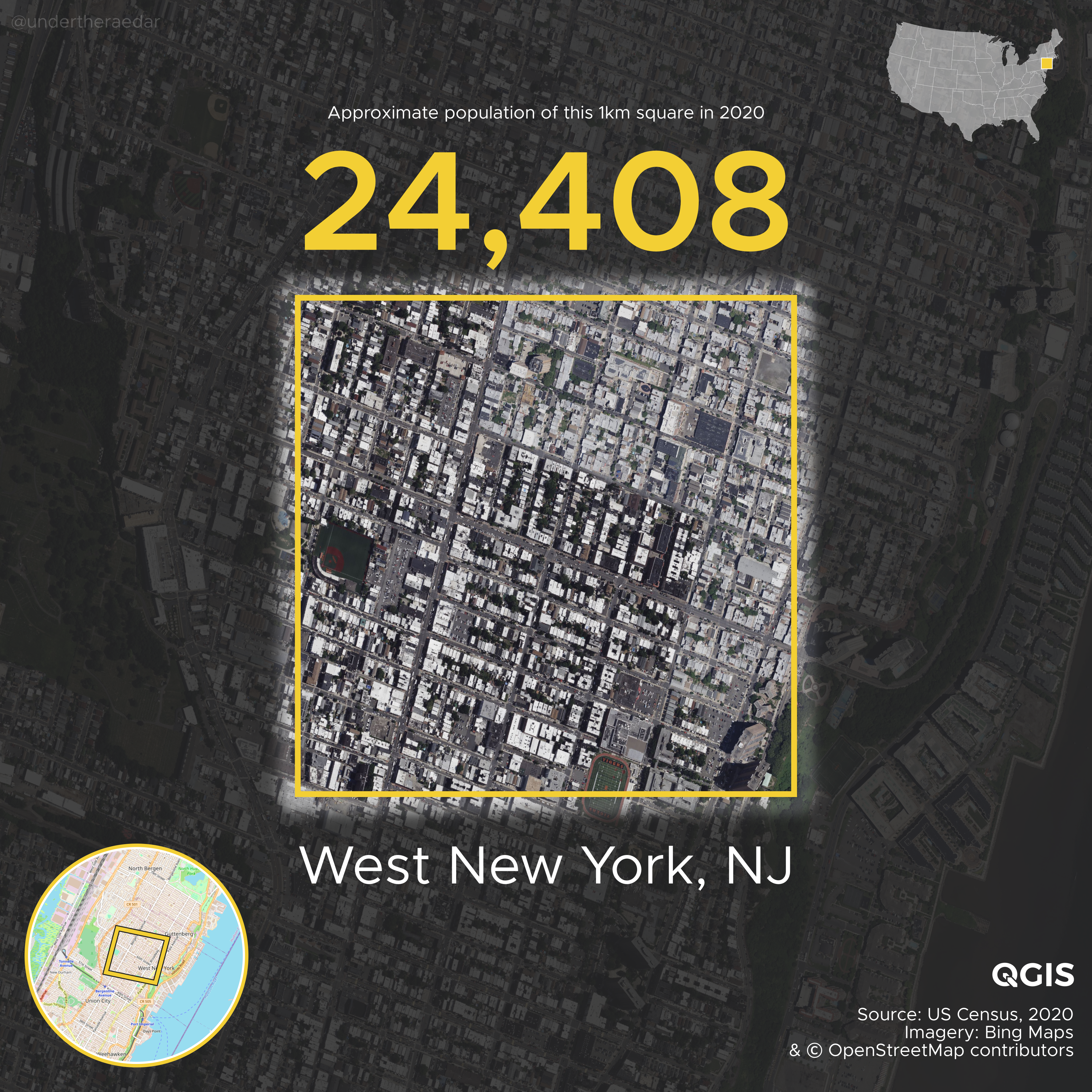
Of the 161 1km grid squares I found in the United States with a population of more than 20,000 here are where they are:

  • 148 in New York City
  • 4 in San Francisco
  • 2 in Chicago
  • 2 in Los Angeles
  • 1 in Madison
  • 1 in Miami
  • 1 in Philadelphia
  • 1 in Union City (NJ)
  • 1 in West New York (NJ)

The top 65 most dense 1km squares are all in New York. Then comes San Francisco. This is what it looks like when you put them on a map.
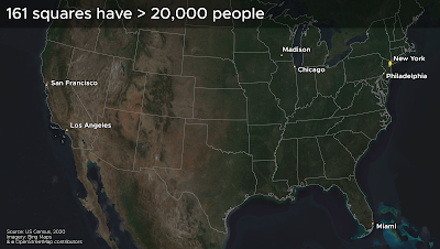
Yes, there appears to be an 'odd one out' here

Just remember a few things as you read through this piece: a) moving the grid around will of course get you different results, but this is the same with all gridded population data - though mostly the results only change a bit - even so, grids are still useful; b) the populations are calculated using groups of census blocks, which don't align perfectly with the squares - that's why it says 'approximate population' on the images, and that's also why I used a blurred focal area around the squares, a nod to the fuzziness of things; c) this is US Census data from 2020, so it's about the best and most recent data there is; and d) my numbers are likely an underestimate because I chose to assign only those census blocks to each 1km square where the centroid falls within the square. This is a more conservative approach than if I'd use an intersect approach but I wanted to remain on the cautious side. 

The approach of using a continuous grid over a whole country - or indeed the whole world - is pretty common these days and helps us compare areas on a like-for-like basis. Possibly my favourite approach to this is by the WorldPop project, although there are many other sources (see below). If we just want to find a single cell with a higher population then we can of course do this without too much trouble. We'll still end up with the same answers in relation to where is 'most densely populated' but we'll get different numbers. Such an approach is not, of course, a uniformly gridded approach to understanding population density but it is quite good fun!


The most densely populated square km in each state (based on my 1km grid)

Here we go, in reverse order, starting with Anchorage, and ending up with New York City. All these files, plus the other ones in this post, can be found in the web folder I created.


There's a video file of this in the web folder, plus a slower version. Once again, I made all the maps using QGIS and automated the production of the individual files using the QGIS Atlas tool within QGIS.


Alternative grids - higher/lower max values?

Hmm, but what kind of result do you get if you shift the grid around a bit? This is the question all the methods nerds want to know, and of course I do too so I also did this with another slightly different grid - for the lower 48 states only. Instead of 161 squares with 20,000 or more, I got 160 and basically all in the same locations. But let's look at a few of them here. The maximum in New York comes out lower, San Francisco comes out higher and a few other places are a bit different, as we might expect. But the overall story of density doesn't really change and still goes New York, New York, New York, etc. The top 36 squares are all in New York, but then we have a higher density square in San Francisco, because we moved the grid - now we get over 30,000 and if we keep shifting the grid we could get even higher - but of course that's not the method I'm using here, it's all about comparing things nationally on a like-for-like basis.
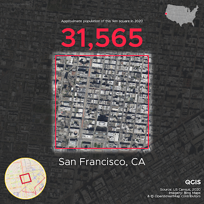
We get a higher value in this San Francisco square

But we get a lower figure for max density in New York

Gridshift, for the win!

Gridshift, for the loss!

With my favoured grid, San Francisco ends up with 4 grid squares over 20,000 but with the shifted grid we get a higher maximum density value in one grid square but only 3 squares over 20,000. That's just the way grids and numbers work, of course. Here's where the four 20,000+ San Francisco squares are, followed by all the New York ones.

Density!

Density, but projected differently

New York (Den)City!

This all became a bit too interesting for me and I lost a few more hours than I intended to. You could spend days looking at the data but I'll move on now to say a few more things relating to the method.


Compare the 1km grid to a messy census block grouping

So, does assigning census block centroids to 1km grid squares stand up to scrutiny, given that census blocks don't generally align to perfect squares. Well, in the kinds of places we're interested in here (dense urban areas) the census blocks are very small and generally a reasonable fit. But even when they're not such a neat fit (like the example below from Burlington, Vermont) it's a pretty decent approximation for area and population.
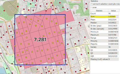
A bit of give and take round the edges, but not too bad

You can see from the screenshot above that the census blocks cover an area of just over 1.03 sq km the population of the area is 7,281. In some of the more sparsely populated areas we have less alignment to the grid but overall this is not a big problem for the kinds of dense urban areas we're mostly interested in here.


Rotate/shift the grid to match the street pattern - how high can we go?

Here's an example of an area I created in New York City using a group of census blocks. It comes out at a tiny bit over 1km square but the population is almost 75,000. For the purposes of what I was attempting here (i.e. a consistent 1km gridded approach across the whole US) this is basically cheating but for the purposes of finding a single 'most populous' square km, I think it's okay. I'm not sure you can find a more populated single square km in the United States, but be my guest. 
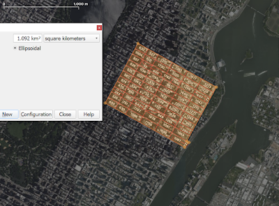
Just over 1 sq km, and not a square but it's 100% census blocks

Obviously the approach in the image above finds us a higher density area, but this is not an approach that can be applied consistently and continuously throughout the United States, or indeed the world. The whole point of using a gridded approach to population density is to have some kind of consistent basis for measurement, so that we can compare like-for-like. But I said that already more than once!

Other odds and ends - e.g. college towns and prisons

What you'll see if you scroll through the 'most dense by state' images is lots of big cities, but also lots of college towns. This is quite interesting to me and indeed when I was testing the method with a chunk of data I was qutie surprised to see such high density in Madison, Wisconsin. I didn't realise it was quite so high. So, as you scroll through the maps, you may have noticed this - e.g. Auburn (AL), Bowling Green (KY), Norman (OK), Ann Arbor (MI) and so on. I used to live right next to one of the high density squares in Columbus (OH) when I went to the Ohio State University so I know what these areas often feel like on the ground compared to, say, some of the European high density areas I've been looking at recently. Anyway, this was something that stood out to me.

What also stood out to me? Well, this (below)!
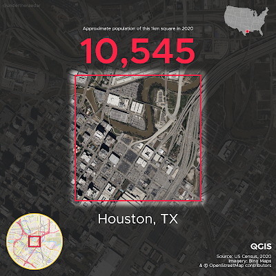
Ah, an error, surely! No, not an error.

In my alternative grid layout and my original grid, Austin comes out as having the highest density 1km square in all of Texas. But in my alt grid this square (above) comes out as having more than 10,000 people - alongside one more in Houston and one in Austin. When you see this kind of thing you think 'hmm, doesn't look right' so then you have to investigate further. It's all parking lots, water and freeways so how on earth can it be home to more than 10,000 people? Well, the answer to that question is 'the Harris County jail facilities'. They sit on the little chunk of land just above the centre of the square, surrounded on three sides by the water of Buffalo Bayou. Here's a direct quote from the Wikipedia page, as of 12 February 2023:

As of October 2022, over 10,000 inmates are in the jail complex.

You can read more about the facility in this Houston Chronicle piece, but I'm getting off track now (Google Street View link). Anyway, the numbers are correct but it's not the kind of density I was trying to map. 

Likewise, it seems that the highest figure in Mississippi is also due to a correctional facility, as you can see below in the 'most dense' map from that state - in Yazoo City.
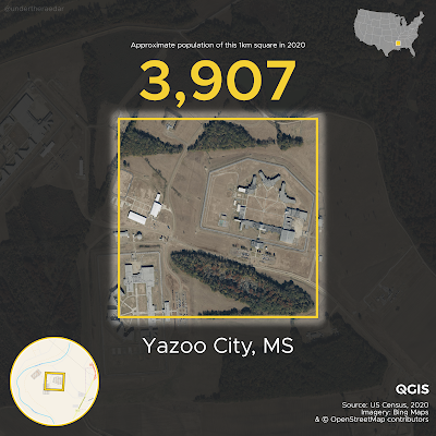

I don't think I'd like to live here

What else? Oh yes, census blocks are usually very small with very low populations - after all there are more than 8 million of them (8,174,955 to be exact). But I did notice the most populous census block in the US had over 8,000 people in it - on UCLA's campus in Los Angeles (another place I just happen to have been to). A total of 17 census blocks have more than 5,000 people, 3 have more than 7,000 people (UCLA, one at Naval Station Norfolk (VA), plus the Houston jail complex), but the vast majority have way less than this.
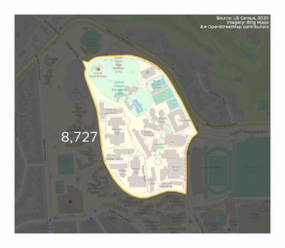
UCLA for the win!

For the US Census geography nerds, here's a little summary of the census blocks population geopackage I was working from in QGIS - it worked pretty smoothly on my machine with no real lag at all despite being a good few gigabytes in size.
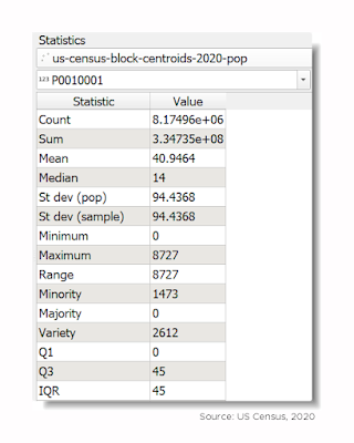
So, that UCLA one is a bit of an outlier!

"The median population of a US census block in 2020 was 14" is a phrase you can wheel out at parties during a lull in the conversation. After that, you can leave in disgrace or, depending upon the company you keep, move on to discuss the mean and standard deviation.

How many 1km squares from my grid had people in them and how many didn't? Well, I put the figure at about 25% with people, 75% without people, but as you know it all depends upon placement of the grid but I think that's a reasonable estimate.


Welcome to the nerd zone (joke, you are already in the nerd zone)

It can be hard to work with this kind of data, but the source data for this post comes from census.gov. You can get the census block 2020 boundaries from the TIGER/Line Geodatabases page and then import them into your software of choice. I used QGIS for this. The specific file you'll need is the Census Blocks National Geodatabase [5.8 GB] file, and as you can see it's quite big - about 9GB unzipped. You can grab the population data - by state, I couldn't find a whole-US file - on the 01-Redistricting_File--PL_94-171 page. It's terribly unwieldy in my opinion but I couldn't find a simple csv anywhere, or something like it. I eventually ended up with a set of census block centroids, with a 5 fields and just the population data, and it came in at 1.2GB, so not too bad considering there are 8,174,955 records in the dataset.

The folk at ESRI have done a lot of hard work for anyone who wants the ready-made file by putting it on their USA Census 2020 Redistricting Blocks page, but once again it's a whopper of a Geodatabase file! Nonetheless, so long as your computer is up to it, you can fairly easily load this into ArcGIS or QGIS and get up and running. I was working with a geopackage in QGIS that I made and it was very smooth and fast when using either the 1.2GB centroids file or the full 12GB everything-in-it file.

My method was more or less the same as I used for the UK. Here's what I did:

1. Plot area centroids, which in this case are census blocks, the very smallest geography used by the US Census Bureau. 

2. I used a centroid definition ('point on surface' in QGIS) that made sure the centroids were within each census block, no matter its shape - to avoid those banana shapes causing the old 'centroid not in shape' problem.

3. Create a 1km grid for the lower 48 states, and again for each of Alaska and Hawaii. I only did this once for AK and HI, but I tried different grids for the lower 48. I also did this manually in a few places, including New York, San Francisco, Burlington (VT), and Madison (WI). The nice thing about the New York and San Francisco examples is that the street grid pattern allows you get things lined up nicely with the grid-shaped blocks in these areas.

4. Aggregate the point data to each 1km cell across the US. Obviously this means the numbers are not exact because only very rarely do blocks align with the edges of 1km squares. But, in the most densely populated areas the blocks are tiny and the numbers in each 1km square are a reasonable approximation of the true numbers. There's a bit of give and take on this - some blocks end up not being counted because their centroid is just outside the 1km grid square and some do get counted for the opposite reason. In very rural areas this kind of falls apart a bit because blocks are much bigger there, but since I am not interested in rural areas here that's not an issue. But, just remember that the numbers reported for single square 1km grid cells are approximations - close to the true figures, no doubt - but not exact.

5. Experiment with different grid configurations. This last part could go on forever! But I think my results are a) defensible and b) a good reflection of the situation on the ground - i.e. I've arrived at the correct answer in relation to where the highest density location is - but we really didn't need GIS to do that.


Will you get different figures if you move the grid? 

Yes, of course, but you could do this forever and there is no perfect grid configuration. This is always going to be the case with gridded population data, from GHSL to NASA and everything in between (e.g. Meta's high resolution population density maps). That's why I often experiment with different grid placements and configurations, but I nearly always find the same places come out on top - and this is definitely the case with the United States. 

No matter what grid you use and how you rotate it, the Upper East Side in New York City is going to have the highest population density. But it would be interesting to run this programmatically to try to find the max 1km density possible. I suspect that would be a lot of wasted effort to find somewhere that has a couple hundred more than ones you could find manually, particularly given the gridded nature of Manhattan's census blocks. 

No matter how you shuffle the square around, the most densely populated area of the United States is to be found on the Upper East Side of Manhattan in New York City. See below for a screenshot of some of my experiments - including using a square mile grid. The red dots are census block centroids, which have the population data attached to them, and then they get assigned to a grid square. 
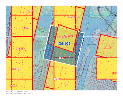
The big square is a square mile


Hey, we use square miles in the US, not that km nonsense! 

I did this using square kilometres because that's what I did previously for the UK and Europe and I wanted to be able to compare things. I also did it in square miles for the US but the answer to the research question is the same - the Upper East Side of New York City is the most densely populated area. Obviously square miles are fine too but like I said I wanted this to be comparable to what I've already done for the UK and for the whole of Europe so I used square km, and that's why I'm reporting it here using these units.

Having said that, let's have one more map, this time with an estimate for the highest single density square mile in the United States. Where is it? We already know the answer to that - New York City's Upper East Side.
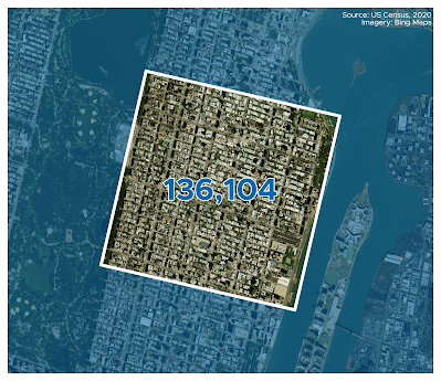
The Upper East Side wins again

Is density good? Is it bad? The answer is up to you. I'm not trying to make a case for either position here but I am interested in the question of density in general and that's why I've been writing about it and making maps of it for a long time.