Friday, 11 June 2021

Arterial Cities

I was recently experimenting with some circular city layouts in QGIS in preparation for my Automatic Knowledge QGIS training sessions. After a bit of playing around, I ended up creating a set of city models in Aerialod. I'm calling them 'arterial cities' because they show cities criss-crossed by major arterial road and rail routes but also because they're kind of art as well. I've now done this for 50 towns and cities across Great Britain - using a 5 mile diameter circle on top of a 10x10km plinth. Here's a close-up of one of the London ones (below). I've posted a selection of the others further down, but if you want the original high resolution images for 50 towns and cities you can find them all in this folder. As one of my earlier tweets said, this might be a useful way to show how cities are divided by road and rail infrastructure and highlight things like urban permeability. If you want to learn about the method, scroll to the bottom of the page.

London in a new light

Some examples

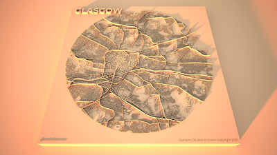
The final set of 50 arterial city models include the major cities plus a selection of other places, chosen for a variety of reasons such as location, urban form, size, and a bit of personal preference. For London, Cardiff, Birmingham, Leeds, Manchester, Glasgow and Edinburgh I also created some large, re-coloured, and also zoomed-in renders and you can find them in the shared folder as well. Ok, so let's take a look at some of them, starting with Leeds, because it's really quite fascinating. I'll say a bit more about specifics below, but in all the graphics the rail lines are the highest features, followed by major roads and then minor roads, with buildings being slightly higher than the minor roads. This 'major' / 'minor' thing isn't perfect of course but that can always be tweaked.

Lots of big roads and rail lines (I've recoloured this one)

Glasgow has lots of roads and rails

Spot those motorways

Quite a pleasing ring road here

A real cross-cross of routes

No hills are shown in any of these

Lots of barriers

A very interesting one I think

Interesting compartments here

A real mix of old and new patterns


Hopefully there is something here that you find interesting. Let me also post a few of the zoomed in versions I did, focusing on the lettering in the top left of the plinths. I've changed the sun direction on these ones so it's coming from the north.


Little details that I find interesting
I've done quite a lot of visualisation with Aerialod before and written up a few tutorials but this is the first time I've made this kind of graphic and it wasn't planned. Even so I think the approach can be quite useful at highlighting city structures and there are a number of elements in the design that interest me. The first is when the text of the city name overlaps the city fabric, like in the Newcastle & Gateshead example below.

I just like the way it looks

I also like the way the railway lines in some cities appear to fray at the end, as the lines diverge to different platforms - like in the example below showing Euston, St Pancras and King's Cross in London. 

I just like the way these look

Then of course we have other features like roundabouts and grid patterns, for which we can use Milton Keynes as the pre-eminent example. I think the light and shadow does a good job here.

There are more roundabouts than you can see


In quite a few of the coastal cities it looks like there is only half a city, just because when I extracted the images from QGIS I did so using a distance of 2.5 miles from the city centres. So for places like Hull, Brighton and Bournemouth you'll see half a circle. But in other places it shows how they are connected to places across the water, as in Liverpool or in Dundee (below) and I quite like this tethering effect.


Tethered across the Tay

Also quite interesting, given that Euro 2020 is now in progress, is the way you can see many football stadiums and this can often help us get our bearings when we see them. So, for example, in the snapshot below we can see Celtic Park to the east of the image and Hampden to the south of it. This one below has also been recoloured, like the Leeds example above, but they are both available in the original gold tones in the shared folder.

Hampden: home of the Euro 2020 champions

There are loads more interesting details, so I'll leave you to look for yourself. For now, I'll leave you with Oxford because I think the urban structure here is both unusual and fascinating. 

Take a look at the real place on Google maps


Okay, so that's the graphics and what I think about some of the details. The rest of the post is about how I made these so read on if you want more information on that.

If you want to make your own prints out of any of the graphics on the shared folder, be my guest.


Stage 1: prepare your images in QGIS
For these graphics I used OS Open Zoomstack data and specifically the five layers below - they are layered in this order in the QGIS Layers Panel and the greyscale colour I used for each of them is shown in brackets. The greyscale colour values determine how much or how little Aerialod extrudes features because that's just how it works - white (#ffffff) will be the highest and black (#000000) shows up as a hole, just like the little Ordnance Survey credit in the bottom left of my images above. I quite like using black to give a kind of cut-out effect with text.

  • roads_national (0.35 line thickness, #4d4d4d - this is 30% greyscale)
  • rail (0.25, #595959 - this is 35%)
  • roads_regional (0.25, #404040 - 25%)
  • roads_local (0.1, #262626 - 15%)
  • local_buildings (#2b2b2b - 17% and with a 0.05 mm stroke width on the building polygons)
I prepared these in the QGIS Print Layout using the Atlas tool so I could automate it (see my previous tutorial on that) and I added text labels for the city, my twitter handle (bottom left) and the OS credit (bottom right). The background page colour in the Print Layout is #1f1f1f (12% greyscale) rather than black because if it's black it won't show up in Aerialod - although this is good if you want to make these without a square plinth. 

What they look like before adding them to Aerialod


Then I just exported the images at 1200dpi as png files straight out of the QGIS Print Layout. I have put all the images in this shared folder for anyone who wants to try making the graphics in Aerialod but doesn't want to do the QGIS bit.


Step 2: load the images into Aerialod and go wild with the settings
Aerialod is an interactive path tracing renderer for height maps in Windows and that's what I used to create the graphics on this page. It is pretty easy to get started but it can also be a bit baffling and there are so many options - many of which may not be obvious to the casual user. So, rather than mess about telling you what I did and making all kinds of suggestions I'll just show you the settings I used to create these images, in the screenshot below.

I exported these at 3840x2160 pixels

The only thing you need to be aware of is that it could take hours to render just a single image at this size - it all depends upon your computer. I have quite a powerful machine with 64GB of RAM, an i7-10700KF CPU running at 3.80GHz and a NVIDIA GeForce RTX3070 graphics card. Without the latter piece of equipment in your machine - if you just have a basic graphics card - the rendering could take hours, or maybe never.

You can spend hours, days, months messing about with the settings in Aerialod and there are an almost infinite range of possibilities in terms of light, shade, colour, tone, extrusion and so on. You can of course achieve similar things using tools like Rayshader or Blender but Aerialod is deceptively simple, yet impressively powerful in my opinion (once you get past the initial steps of what does what).

One thing that is not immediately obvious, or indeed obvious at all, is how to achieve the blurred/focal point tilt-shift effect you see in the example below for London. This is done by clicking on the area of the map you want to be in focus. When you do that, the Focus setting on the right of Aerialod changes and you see the blur effect everywhere you didn't click.

You can go round in circles with this kind of thing


Note the Focus value on the right

Want to achieve a totally different, less glowy kind of aesthetic? Well here are some other settings you might like.

The key difference here is the 'SKY' setting on the left

And one more, like above but slightly tweaked.

Intensity (left) and Exposure (right) adjusted in this one

And if you want to remove the plinth completely, you just need to reduce the Offset value on the right in Aerialod, as shown below.

I also quite like the plinth-less approach

This is the big plinth-less version, rendered as above


This is my way of doing it although if you see the original twitter thread mentioned above you'll see loads of different kinds of examples. 

Hey, could you do it with buildings extruded more realistically in 3D? Yes, but that's for another day.

In this example I've used building height data from Emu Analytics


Friday, 14 May 2021

Far too many words about a chart

This is a bit of a long read, because I wanted to put down my thoughts on a chart I made that has been quite popular and quite widely shared. See below for one version of this chart - it ranks all 650 UK Westminster parliamentary constituencies by deprivation and colours them by which party won the seat at the 2019 General Election. You can skip straight to the data and charts folder now if you want, but if you do, it's probably best if you also read the notes at the bottom of the page. Because this is a chart made of blocks, or bricks, and because of recent 'red wall'/'blue wall' media talk I'm going to call this a wallchart, but you can call it whatever you like. If you do like reading about charts and dataviz and the thinking behind them, read on. I cover all the small things.

Click to see it full size

Background

I will not go on too much about the backstory, but I'm here to tell you that there have been quite a few votes on things across the UK in recent years. This is something you may have noticed, particularly if you were up all night watching, waiting, or commiserating at any recent election. Because of all the votes there have been lots of maps, lots of data and lots of news. Some good stuff, some confusing stuff and probably just too much stuff. But anyway, after the 2017 UK General Election in June 2017 I wrote a piece on here with some maps and charts. Almost as an afterthought, I said to myself 'I wonder what it would look like if you took all 533 English constituencies, turned them into blocks, ranked them by deprivation, and then coloured them by the party that won the seat'. Then I thought, 'how quickly can I do this?' So, I did it very quickly and messily in Excel - see below for what the first one looked like and a screenshot from the original Excel file.

What's 533 divided by 10?


Some immediate observations about this chart that came to mind at the time: i) it's annoying that there are 533 rather than 530 constituencies in England - neat charts > representative democracy; ii) this chart tells us something that is blindingly obvious but even so it's also strangely striking; iii) 'hey, what's that blue block doing on the left hand side'? (it's Walsall North); iv) I didn't realise the orange blocks would nearly all be on the right half of the chart; v) I need to figure out how to deal with the fact that 533 doesn't divide by 10 neatly and maybe make the top of the chart nice and flat.

Excel?! #$@&%*! Excel!!?? Say it ain't so


Next versions

I really didn't think much of it at all after I hit Publish and never planned to come back to it, but at some point in the year or two that followed, Danny Dorling got in touch with me about it using it and then I did new versions for different years, including ones for the UK that were much neater because of the fact that there are currently 650 constituencies and this divides neatly into 10 columns of 65. I also changed the colours, added more labels and some versions had constituency names as well. The initial one used deprivation data for English constituencies produced by the always-excellent team at the House of Commons Library. For the earlier UK versions I used UK-wide deprivation data produced by Abel et al. (2016) to calculate the ranks. 

For most versions of the chart, including the UK ones, I've had to calculate constituency-level deprivation myself using a population-weighted method, aggregating up from small areas (LSOAs in England and Wales, data zones in Scotland and SOAs in Northern Ireland). A big hat-tip here must go to my collaborator and all-round political data boffin Philip Brown for prompting me to come back to this and do new versions. When the 2019 General Election came round I decided to dust off the old files and make a version that looked much nicer. The reason I've come back to this again now is because Alex Parsons recently published a new set of UK-wide deprivation data, based on the earlier work by Abel et al. 

The left hand column is turning blue


This was the 2017 General Election edition

It took a while to put the data together for the different years and although I would have loved to put together one for earlier years - particularly 1992 and 1997 - it would have taken me too long to do it.

Read on below for more on the design stuff


Since I did the first one of these in 2017, other people and organisations have done their own versions using the same concept. I am not sure if it was done before that, but I haven't seen one like it. All I do know is that I got the original idea from a chart Owen Boswarva made in relation to age and party colour. 

Here's a version that the Economist created (below) - horizontal rather than vertical and much more elegantly executed. It was in their 'Who are the Conservatives’ new voters in the north?' piece from December 2019 - which I took a picture of in the print edition just because it's nice to see things in print. I had to travel a further from home than I expected to actually find a print copy of the Economist because none of the local newsagents near me in Sheffield Brightside and Hillsborough (left-most column) stock it, but that's another story. 

This is a good place to mention the ecological fallacy, because I am certainly not claiming I am poor, or deprived - this is just a nod to the fact that internal variation obviously exists in all areas, even if the overall ranking is a good representation of the overall pattern across the UK in terms of relative deprivation by area.

Lovely!

Call me old fashioned but I do like print

There are also other versions out there, including a remain/leave by deprivation one that Helen De Cruz did - copied below. I thought this one was really interesting, particularly column 10.

Column 10 is clearly the most remainy

There was also a version of the chart looking at age and deprivation - this was done by the Resolution Foundation in December 2019 and can be found in this twitter thread (I've pasted the chart below as well). I decided to do an age one in my most recent iteration - see below for that.

Very nicely done

I have also created a dark mode version of the latest chart from 2019 and a chart ranked by median age as well, so I'll put these ones below too. You can see this in my more recent twitter thread about it.

Turn the lights off!

Age rank gives us a similar pattern

Design

The legendary Andy Kirk very kindly noticed one of the things I did in earlier versions of the chart so click that link for a bit of independent insight on one of the details. Here I will set out a few reasons why I think this chart connects with people - and why it also makes sense to me. One of the main reasons is that it builds upon some things that are hard-wired into our brains already.

  • Rank: ranking things is not always a sensible idea and it's always somewhat fuzzy. Things get collapsed into categories made by people and this can mask internal variation. However, even if ranks can be quite a coarse measure, the constituency ranks by deprivation are more or less what we might expect for England or the UK as a whole. The places with the most 'poor' or 'deprived' neighbourhoods are on the left of the chart, with the wealthiest areas on the right. Also, and fundamentally, ranks are easy to understand, so this is not much cognitive work for the reader, once they know how the chart is laid out with the most deprived areas at the top left and least deprived at the top right - and this requires only minimal labelling. 
  • Colour: this one is of course more context dependent in that UK readers (or those who follow UK politics) don't need more than a split second to interpret the colours, without a key. We see red, we see Labour, we see blue we see Conservative, we see yellow, we see SNP, and so on. There aren't many occasions when we can do this with colours but political charts and maps are one example where we can. The cognitive load here is again quite low, I would argue. I will just add that I've tweaked the original colours because the red/blue combo was blinding in the first chart. My colours are a mix of commonly used ones (e.g. on BBC election coverage) plus a bit of artistic licence. 
  • Position: The general idea is for this chart to be more about the forest than the individual trees. Having said that, being able to position individual areas on the spectrum from more deprived (left) to less deprived (right) is very important. It also matters symbolically that the red areas are on the left, and blue on the right because this is a visual match for the traditional left/right political divide. Again, we can argue with definitions and concepts here but having Labour on the left and the Conservatives on the right matches what is already hard-coded in our brains if we follow politics even just a bit.
  • All the small things: there are lots of little things I've tried to do with the different versions of this chart to make it easier to digest, but without overwhelming the reader. One example is the faded axis labels on the left and right of the chart (below). I did this because I only really wanted people to be able to understand how the ranking worked, but without introducing any cognitive overload. I also don't want to put too much stock in individual rankings - I'd rather people saw the groups of 10 (labelled across the top) as more indicative of relative socio-economic status. That's also why the label colour is lighter for the individual blocks. The number fade thing was something I got from John Burn-Murdoch on twitter but I can't find the original post on that. So, the faded axis numbers are very much there so readers can get what's going on, but without it being too much of a focal point or distraction. 
  • Notes, etc: with this being the internet, there are small dangers associated with doing this kind of thing. Quite often people take things without attribution or context and share them with friends and followers as their own (even academics who ought to know better). People also see what they want to see - particularly with politics and causal links on a chart like this. The idea behind the chart was simply to see what the pattern looked like. I'm not trying to identify causal links here, but clearly people will do this anyway. Looking for causal links is a different kind of statistical activity, but this chart raises such questions with people and that's to be expected. Anyway, in order to avoid some of the problems with no-context sharing, I try to put enough text on the chart to explain a) what it is; b) how it was made and c) data sources. I usually add my name as well so that if someone wants to find out who did it they can get in touch - this would be more complex if my name was John Smith - but thankfully there aren't that many Alasdair Raes doing weird colour charts these days. Still, people will crop your name off because this is the internet.


There are plenty of things I could improve about the chart- and I've tried to keep doing that - but at the same time this wasn't part of my day job (work sucks, I know) and it wasn't for any particular project so I can't invest too much time in it (he writes, whilst writing War and Peace instead of finishing the presentation for next Tuesday). Having said that, there are a few final points I'd make on all the design-related stuff.

  1. Doing this in Excel might be okay for a quick-and-dirty experiment but it's clunky and messy and every time I go back to the original I am confused. It also takes me ages to find the original files. Having said that, I'm not bothered about what tool I use to do a job so long as it works - and there is nothing wrong with Excel, used properly. I like to think I follow 'the law of the job' rather than 'the law of the instrument' but even so this was a messy mess first go round. It started off as a bit of Excel formula, pivot chart, conditional formatting and a few hacks and it worked, and that's okay.
  2. After Excel I normally used GIMP to add some text and other bits. Again, fine but not optimal. I think in previous quick versions I even drew some arrows in PowerPoint and I'm not even sorry because it worked fine and served a purpose.
  3. I don't really like to label the individual blocks because the chart idea wasn't about that, plus some constituency names are very long and the font size has to be small. But I do like to think about user needs so some versions have them because people always ask. There's also a searchable html version so you're only a quick browser search away from finding your area.
  4. Most importantly, the way I have done this to date is pretty sub-optimal to say the least but then sometimes sub-optimal things happen and you get locked in to them. 

So, I thought to myself... why don't you try to make this less bad and also sharable? Good idea. But how? Read on to find out and grab the data for yourself.


Wallcharts for everyone
I normally work with spatial data but the chart I'm talking about here is non-spatial - it's just a series of ordered blocks and where they sit in the chart bears no relationship to their geographic location in the real world. Nonetheless, what I decided to do was keep it simple and create a 10x65 GeoPackage that covered roughly the same areas as the UK and with the constituency deprivation rank number assigned to each block - see below for what this looks like with the standard UK election map on top of it. Once I'd created the 10x65 grid I prepared a separate spreadsheet with all my other data in it - including age, ethnicity and so on. I then joined this to the 10x65 grid to make the final GeoPackage.

The 10x65 GeoPackage can be found in this web folder - I've also shared it in different formats as in the hope that it can be more widely used (shp & geojson). When you add it to QGIS it will be coloured according to the party that won each seat in 2019. I do realise that for non-GIS users this might not be ideal, but you can easily take one of the existing versions and convert to a more suitable format for your own needs. There's also a qml file in the folder that you can use to style the layer, as well as one svg that I extracted as a test.

This is simple, but works well


Just in case you download the UK 650 block file and are confused by the column headings, here they are:

  • fid - just a numeric identifier, which can be ignored
  • DEPRANK - the rank of each constituency based on Parsons' 2021 UK small area deprivation data, aggregated up to constituency level (by me)
  • CODE - ONS constituency code
  • CONSTIT - constituency name, upper case
  • NAME2019 - constituency name
  • COUNTY - the county a constituency is in
  • CTRY_REG - the UK country or English region a constituency is in
  • COUNTRY - the UK country a constituency is in
  • GE2010, GE2015, GE2017, GE2019 - the part that won in each of these years
  • AGE2019 - the median age of each constituency in 2019
  • AGERANK the age rank of each constituency in 2019 (1 is youngest)
  • POP2019 - the population of each constituency
  • MINDECILE - the minimum UK-wide decile any single LSOA/DZ/SOA within a constituency is in (1 being the most deprived)
  • MAXDECILE - the maximum UK-wide decile any single LSOA/DZ/SOA is in (10 being the least deprived)
  • AVRANK - the average rank of all LSOA/DZ/SOAs in a constituency - where 1 is most deprived and 42,619 is least deprived (so, e.g. an average rank of 4262 would mean that the average area was among the 10% most deprived nationally)
  • POP2011 - the population in 2011 (relates to the indicators below)
  • WHITE2011, MIXED2011, ASIAN2011, BLACK2011, OTHER2011 - the number of people in each ethnicity group from the 2011 Census (data published by the House of Commons Library)
  • WHITEPCT, MIXEDPCT, ASIANPCT, BLACKPCT, OTHERPCT - same as above, but % rather than total number
  • WHITERANK, MIXEDRANK, ASIANRANK, BLACKRANK, OTHERRANK - this ranks all 650 constituencies according to ethnicity, so that an area with a WHITERANK of 1 has the highest % of white population (as of 2011, we don't yet have 2021 Census data, so keep that in mind) and a WHITERANK of 650 has the lowest % of white population - and so on for the other groups.


I'm almost done here, but before I wrap up here are some different versions of the chart - now much easier to create having done the hard work of putting it together in a more suitable format. All I need to do is apply a simple filter and I can get all sorts of interesting charts out of it.

The overall 2019 chart

2019, just for England

2019, just for Scotland

Coloured using 2010 results

Constits that are 25% + non-white

The 100 oldest constituencies

Lab in 2017 but Con in 2019

What colour the 2010 Lib Dem seats are now

I've put the high resolution (300dpi) versions of these charts in the new wallchart folder I created for this project, so feel free to use them as you wish. 

Well, this was quite a long post so if you read all of it then please accept my thanks and congratulations.

This was mainly about all the small things, so if you noticed the Blink 182 song references, well done - carry me home! 


Notes

The deprivation ranking is somewhat England-centric. You can read more about the new UK deprivation data I used for the new charts on Alex Parsons' repo for the project. This new iteration is all possible because of the great work Alex did. If you want to follow the method then you should definitely read his notes on this - as well as the bit on mapping (which I provided some of the text for). There are four different files you could use to create a UK-wide constituency ranking. I used the UK_IMD_E.csv file, but the overall pattern is not likely to change much when you use the others. I also used the most recent mid-year population estimates (2019) for weighting.

The individual ranks of constituencies are likely to move slightly up and down if you use a different method but, on the whole, I am confident they are in the right place. 

Feel free to use, re-use, improve or otherwise adapt this - I know there are many, many people with better skills and ideas than me so this is very much a starting point.

If I spot any typos or other errors I'll back later to clean them up.


Thursday, 22 April 2021

Gridded GDP maps for a spiky world

It's a bit of a cliché to say that the world is 'spiky', but since I've done a few spiky-type maps in recent years I thought I would take it a step further and look at the world in relation to GDP rather than population. Why? Well, take a look at this part of Hans Rosling's '200 Countries, 200 Years' piece and you'll see that there is much to be gained by separating out different regions from their national contexts if we want to learn more about the economic position of sub-national units. So, using the 'Gridded global datasets for Gross Domestic Product and Human Development Index over 1990–2015' data provided by Matti Kummu, Maija Taka and Joseph H. A. Guillaume in their scientific data paper, I decided to see what it would look like if I mapped GDP in 3D for small grid areas. See below for the world map, and read on for more details about the data.

This is one way of looking at global GDP

As a reminder, or something new for those who didn't see my earlier population density graphic in the same style, see below - and you can compare the two to see how different they are - most of Africa and also India are particularly different. Yet we can also see that, below the national level, it's easier to see where statements like 'Europe is rich' or 'Africa is poor' look like false or not-quite-true statements, at least for some grid cells. This kind of insight is not exactly earth-shattering but it's also one of the reasons you'd want to have this kind of data in the first place - to look beneath the surface of country-level stats to see what's going on at a more fine-grained level.

Global population density

I've also produced a series of zoomed-in maps of different parts of the world, which you can see below, starting with sub-Saharan Africa. I haven't labelled any of them, on purpose, because I like exploring them visually and trying to figure out what's what based on the obvious spikes - e.g. like Lagos or Cape Town. Call me a nerd, but I like the simplicity of the unlabelled maps and I enjoy trying to figure out which city a particular spike represents.

This one differs greatly from the population map above

Australia and New Zealand + a bit more

Southeast Asia

The Arabian Peninsula has some big spikes here

I tried to capture the whole US in this one

Most of South America in this one

A zoomed-in version showing the lower 48 US states

With this kind of map it can at times - actually quite a lot of the time - seem a bit gimmicky, but I think the use of 3D in this case adds a useful extra dimension of information that is not possible with standard choropleth maps. Yet with 3D maps like this some of the spikes can easily obscure others so here are a couple more views of the US - one of which is focused on Chicago and blurred everywhere else, just for effect.

With apologies to Hawaii this time

This angle provides a better view, I think

And one final view, zoomed in to Europe this time.

A (mostly) European zoomed-in version

Okay, go on then - two more, but that's it. The first is focused on India and the second is a more zoomed-in version showing East Asia. 

This looks quite different to the population map

Manila is in the middle foreground

That's all for now. 


FAQs

Where can I find the data? You can find it here.

Should I trust this data? That's up to you and of course different methods would produce different outputs, but if you read the Scientific Data paper and the methodology you'll see that it is defensible and robust (well, I think it is). My view is that even if the specific method can be argued with, a different approach would likely produce very similar results and therefore similar maps. There may be some anomalies in the data but that's one reason why a 3D approach like this can be useful - it helps us identify unusual spikes that may or may not make sense, although they usually do after further investigation - e.g. read this and the bit about San Quentin State Prison.

How did you make the maps? I used a Windows tool called Aerialod. Read my previous posts if you want to know how to use it. You can be up and running with it in a very short space of time, but if you want to create large images quickly you'll need a top-end graphics card.

This data looks all wrong, who should I tell? If you spot anything that doesn't look right, feel free to contact the authors of the paper and dataset - see link below, in the Acknowledgements section.

Is this available as a print? No, but I may add this to my existing print store.

Can I use this image? Yes, it's on the internet, which means you can steal it, crop off the author's name and pretend you made it. Just kidding, sort of. Everything on my blog can be used and shared in a non-commercial setting, but it's always nice if people link back and/or give attribution. I post stuff here that I think is interesting, so feel free to share it if you also find it interesting. If you want to use any of this commercially, get in touch with me via my company, Automatic Knowledge, where I do paid consultancy.

What's the resolution of the grid cells? You can see on the first image above that it says '5-arc minutes', which is about 10km at the equator, but less than that as you go further north or south. That's one of the sub-optimal things about this kind of data, unfortunately, but I can't do anything about that.

Hey, there are loads of blank spots with no GDP, what's going on? These maps can't show everything and sometimes the level of economic activity doesn't register as a spike in the maps above. Like all maps and visuals, these are simplifications and abstractions of another reality. Or, to put it another way, this kind of map is intended to provide the general pattern in the data rather than show every individual grain of sand. If you want a specific raw GDP value for anywhere in earth you can download the data and explore it as you wish.

Okay, I know it's an abstraction blah de blah de blah but what numerical value do the very highest spikes actually represent? The very highest spikes represent a value of 100x10⁶ USD and above. How much is that? If my maths is correct that is $100 million USD. And remember that this is total GDP (PPP) in constant 2011 international US dollars, as it says in the paper.

Isn't GDP a load of nonsense though? Yes. No. Spend 5 minutes searching for 'gdp flawed' or 'gdp nonsense' and you'll see lots of great critiques, many of which I agree with. Yet it is still a yardstick and it is still used. 

What does FAQ stand for? Frequently asked questions. 

What spatial unit does the grid spacing on the ground represent? These are spaced at 100 map units. That means that it's 5-arc minutes x 100, which is equivalent to about 1,000km at the equator. I just put these in to provide a bit of scale, but also because I think they are quite effective for context and drawing our eyes to the main canvas, which I put on a little elevated plinth.


Acknowledgements: I had looked at this before without getting very far, but I decided to look at it again after Michael Gustavson got in touch with me recently to ask about it. I couldn't have mapped GDP like this without the data - obviously - so of course I must acknowledge Kummu et al. (2018) for generating this fascinating dataset - see citation below. Thanks also to ephtracy for making Aerialod free and easy to use.

Kummu, M., Taka, M., & Guillaume, J. H. (2018). Gridded global datasets for gross domestic product and Human Development Index over 1990–2015. Scientific data, 5(1), 1-15.


Monday, 5 April 2021

House prices in 2021 (in England and Wales)

A few maps and notes today as I try to catch up with the latest release of the HPSSA house price data from ONS. HPSSA? It stands for 'house price statistics for small areas', and it covers England and Wales. There are loads of different datasets and sometimes finding what you're looking for can be a bit fiddly so I put together a very basic, single page with links to them all. The good news? You can get small area house prices going back a full quarter century now, to the final quarter of 1995. Yes, way back in the mists of time. This is what the house price map of England and Wales looked like then - this is for the four quarters from the final quarter of 1995. Get yourself a time machine and snap up a bargain in central London - treat yourself!

Snap up a bargain while you can!

Fast forward 25 years and, you will be shocked to learn, the pattern is much the same and unless you have access to giant wads of cash, you are not going to be buying a big house in London any time soon. You really did need a map to tell you that, right?

Amazingly surprising patterns

But of course these maps don't change very much over time, save for a few little pockets here and there, or a bit of spread outwards from London or a few other high price areas - which I've tried to label. 

What I find most interesting - apart from this consistency over time, and the eye-wateringly expensive areas in inner London - is the extremes and the spatial patterns. So here are a few maps on that, below. 

By the way, I've chosen a £250k cut-off for the middle category as it's close to the average house price at the end of 2020. Or at least one version of the average. The London average is a bit over £500k now but my last category starts just a little bit below that. If you look at the maps below it's easier to pick out the 'southern bits in the north' (e.g. Wilmslow) or the 'northern bits in the south' (e.g. Portsmouth?) - at least as far as prices and perceptions of them sometimes go. I don't want to start one of those north-south wars that seem very popular on Twitter these days, particularly since all these places are incredibly far south anyway 😉.

The high and low categories together

Just the most expensive areas

Just the least expensive areas

Want the data? Here's my web page list with all the data - take your pick. The data I've used here is from dataset 46 and was last updated at the end of March 2021. How will the Covid-19 situation pan out in relation to house prices over the short, medium and long-term. No idea, but I'll keep following Neal Hudson's latest updates to keep on top of all that.

It's a bit ugly, but it still works

1996, eh? Now that seems like a loooooong time ago. Mind you, so does 2019. Is there any kind of north-south divide in house prices though? Hmm, hard to say.

Again, not exactly surprising

And one of those 'how it started, how it's going' things to end, since the data series goes back so far.

Quite interesting if you look really closely