After the recent release of England and Wales Census data for 2021 I decided to take a quick look at which areas have the highest population density. I've done this kind of thing before, for the whole of Europe and also in relation to thinking about measures of population density more generally - in short, my view is that using the arithmetic mean approach to density makes very little sense at the country level because it doesn't reflect how we actually experience density (unless we live somewhere like Monaco). That's why I came up with the very simple idea of using 'lived density' instead. But this piece is about my attempt to find the area of the UK with the highest population density in a single square km. And note that I say 'in the UK' in the title because the highest density area of the UK is within London - the highest densities in (e.g.) Glasgow, Edinburgh, Cardiff or Belfast are about half that of London's densest areas. Here's where I think the most densely populated square kilometre in the UK is, based on 2021 Census data.
 |
| This is the answer to my question - read on to see how I got here |
Here's a map of the southeast of England (mostly) showing 1km density - brighter colours = higher density. There are a few very high density areas outside London, but not necessarily exactly where you might expect.
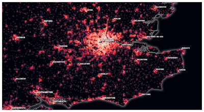 |
| No big shock to find London has the highest densities |
That London has the highest population density areas of the whole UK is not a surprise. Previously my calculations on the highest population densities in London led to figures in the range of 20,000 to 25,000 people in a single square km. But of course this refers to residential density, and my previous calculations arrived at a figure of about 120,000 people in a single square km for daytime population density (see below, where the top figure is daytime population and the bottom figure is residential).
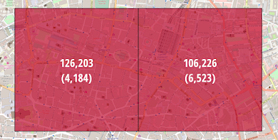 |
| Daytime density in parts of Central London is over 100,000 per sq km |
The centres of cities such as Manchester and Birmingham in particular have some pretty high densities - over 10,000 per sq km - but London has by far the highest density and the largest number of areas above 15,000 per square km in relation to residential population density. If you're interested in daytime (i.e. workday) population density then I wrote about that in a previous post.
Okay, so where was I? Yes, trying to find the single square km in the UK with the highest population density. I can say UK with some confidence even though I'm only using data for England and Wales, like I've already said, because my previous analysis shows that the answer is definitely in London.
How do we estimate where the highest density is?
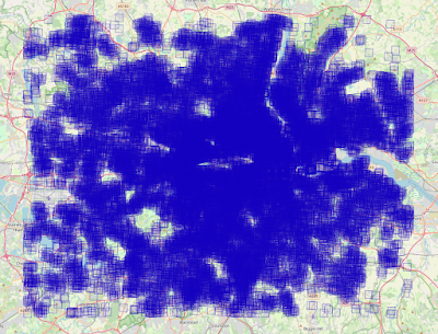
First of all, we attach the output area population data from the 2021 census to the 2021 output area boundaries and we get something pretty uninspiring, like the basic map below. There are over 180,000 output areas and they are quite small. This was all done in QGIS, but I've not really bothered trying to make it look pretty here because I just wanted to find the answer.
 |
| All output areas, with 2021 population data |
Then we create a 1km grid that covers all of England and Wales. At this point I should point out that the answers you get when doing any kind of 'per sq km' calculation do of course depend upon where you draw your grid Shift it a little up or down, or left or right and you will obviously get slightly different results. But not radically different numbers (as we'll see later on). Also, if you're using output areas to do population density calculations - instead of a 1km grid - then your numbers won't make a lot of sense because the vast majority of them (90%) are under 1km in size.
In fact, most output areas are tiny, as in the example from the Isle of Dogs in London (below), where we see one output area with a density figure of over 142,000 people per square km - but of course it's WAY smaller than a square km, which are illustrated with the big black lines and the big numbers. Using a population density figure like this would make no sense. This stuff is pretty obvious but sometimes people quote these kinds of figures without realising how small output areas actually are.
 |
| Dense? Yes. 140,000 per sq km? No. |
Once I had the 1km grid overlaid on England and Wales I think used population-weighted centroids for the output areas and assigned them each to a single 1km grid square and then added up the total population in each. This is of course not perfect because output areas don't align perfectly with the grid but it's close enough in the areas of interest to take us closer to a plausible answer. Here's what that looks like in part of Manchester and Birmingham - messy maps but you get the point. The big numbers are the 1km cell populations and the small numbers are the output area populations.
 |
| Central Manchester wasn't like this 20 years ago |
 |
| This rivals parts of London for density |
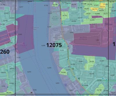
Okay, so what next? Well, next was to filter for all those square km with more than 15,000 people. Bear in mind that at this stage we are still talking in rough figures because of the mismatch between output area boundaries and the grid - an example of this is shown below but you can see it's not a terrible fit - only those output areas with their population-weighted centroid within the 1km square are added to that square's total. So the overlapping ones with most population outside are assigned to a neighbouring square. Again, not perfect, but logical. The big numbers here are the population in each square - with only squares with more than 15,000 shown and labelled.
 |
| This is just of City Road in London |
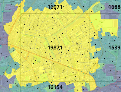
Surprised by the grid squares I found (below) that have more than 15,000 people? I did think Manchester would crack this list but not based on the 1km grid I used. Apart from that it's mostly what I'd expect. There's one square in each of Leeds, Birmingham, Leicester and Brighton and 63 in London. You might get some others in other places if you were to shuffle the grid around a bit. For example, I tried this in Portsmouth (a relatively very dense city) where the highest values on my 1km grid were approaching 14,000 per sq km. I managed to get a figure of 15,509 in a single square km by manually placing the square somewhere else (see below). But in these cases no matter what you do you're not going to reach London densities.
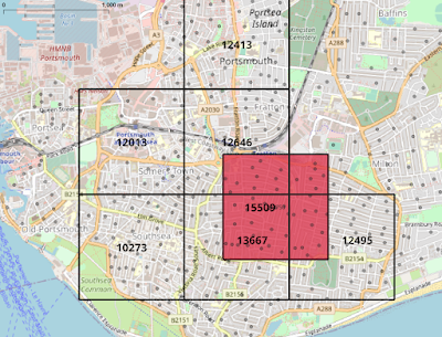 |
| Portsmouth is a very dense city for the UK |
 |
| The 67 1km squares with more than 15,000 people |
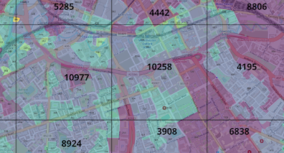
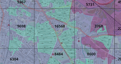
Here are some zoomed-in versions showing the location of the highest density 1km squares across England (it's likely that these are also the highest in the whole UK, given that when I last did this Glasgow and Edinburgh had max densities of about 12,000 in any single square).
 |
| This is the Birmingham one |
 |
| This is the Brighton one |
 |
| This is the Leeds one |
 |
| This is the Leicester one, to the east of the train station |
 |
| The 63 London 1km squares, with population labels |
Okay, get to the point mate
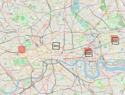
Run another filter and this time do it for over 20,000 in any single square km and what do you get? You get the map below, with three possible candidates for 'most densely populated square km in the UK'.
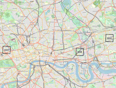 |
| These areas all seem like plausible answers to my question |
See below for the zoomed in versions showing more detail. The reason they are tilted slightly in this one and the maps above is because I changed the map projection so that the OpenStreetMap layer (© OpenStreetMap contributors) is nice and crisp because if you show it using the British National Grid projection it comes out a bit fuzzy, that's all.
 |
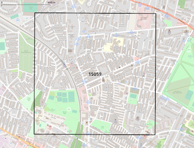
| Notice London Marylebone in the square here |
 |
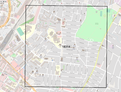
| Bow Common Gas Works in the centre here |
 |
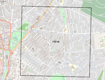
| This area is around Upton Park |
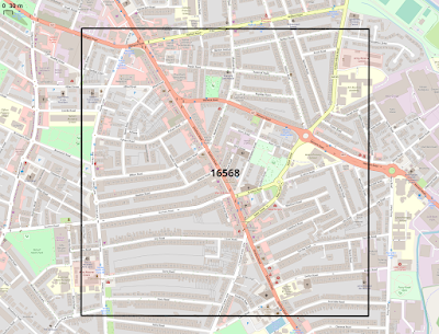
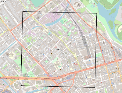
Okay, so which square should we choose as 'most densely populated'? Is it a case of just taking the one with the highest population figure? Maybe, but I wanted to investigate more first. In each case there are overlaps around the edges of the 1km squares due to the irregular shapes of output areas. But overall I believe it's the case that the numbers reflect pretty close to the true population so I think, based on my initial 1km grid, that the area in Bow (East London) is the most densely populated 1km square in the UK, with a total of approximately 21,000 people in the 1000 x 1000 metre square.
Ah, but hold on now. What were we saying about moving the grid around and the impact it might have? Well, I also generated three extra grids and ran the calculations on those, so read on for my final answer!
The answer to the question is finally here
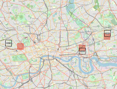
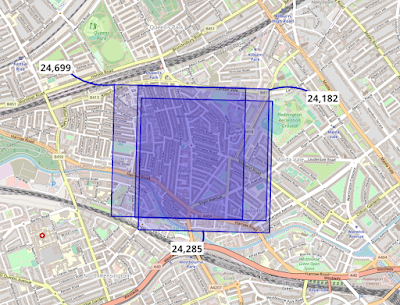
With my first alternative 1km grid I once again got figures of just over 21,000 in any given square km, but I got seven of these. With my next one I got three squares, two of which had more than 22,000 people in them. With my third I got three as well,, one of which had more than 24,000 people in it, and one of which had 23,000. See below for maps of these. The three top squares from my original grid are shown in red on these maps, for comparison.
 |
| Shuffle the grid, get more answers, but similar areas |
 |
| Three alternative candidates |
 |
| I think we have a winner |
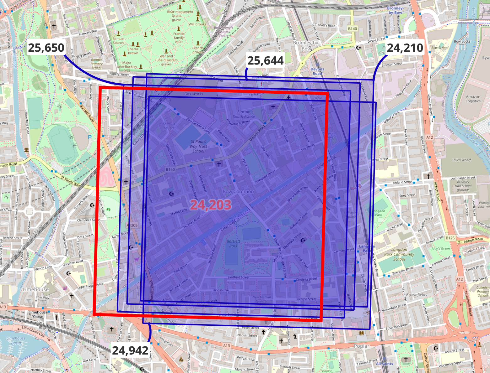
So, my initial grid seems to have not been very far off the mark in helping find the most densely populated square km in the UK. Yes, we could go on and on with grid placement, and do it programmatically but I think we're always going to end up in the same place, around Bow Common in East London. It's also encouraging that the 20,000 to 25,000 per sq km figures I previously calculated come out here too. By way of comparison, the most densely populated areas of Paris or London (or New York or Seoul) have more than 40,000 people in them, and some over 50,000.
 |
| The overlap here is the initial winning candidate from my search |
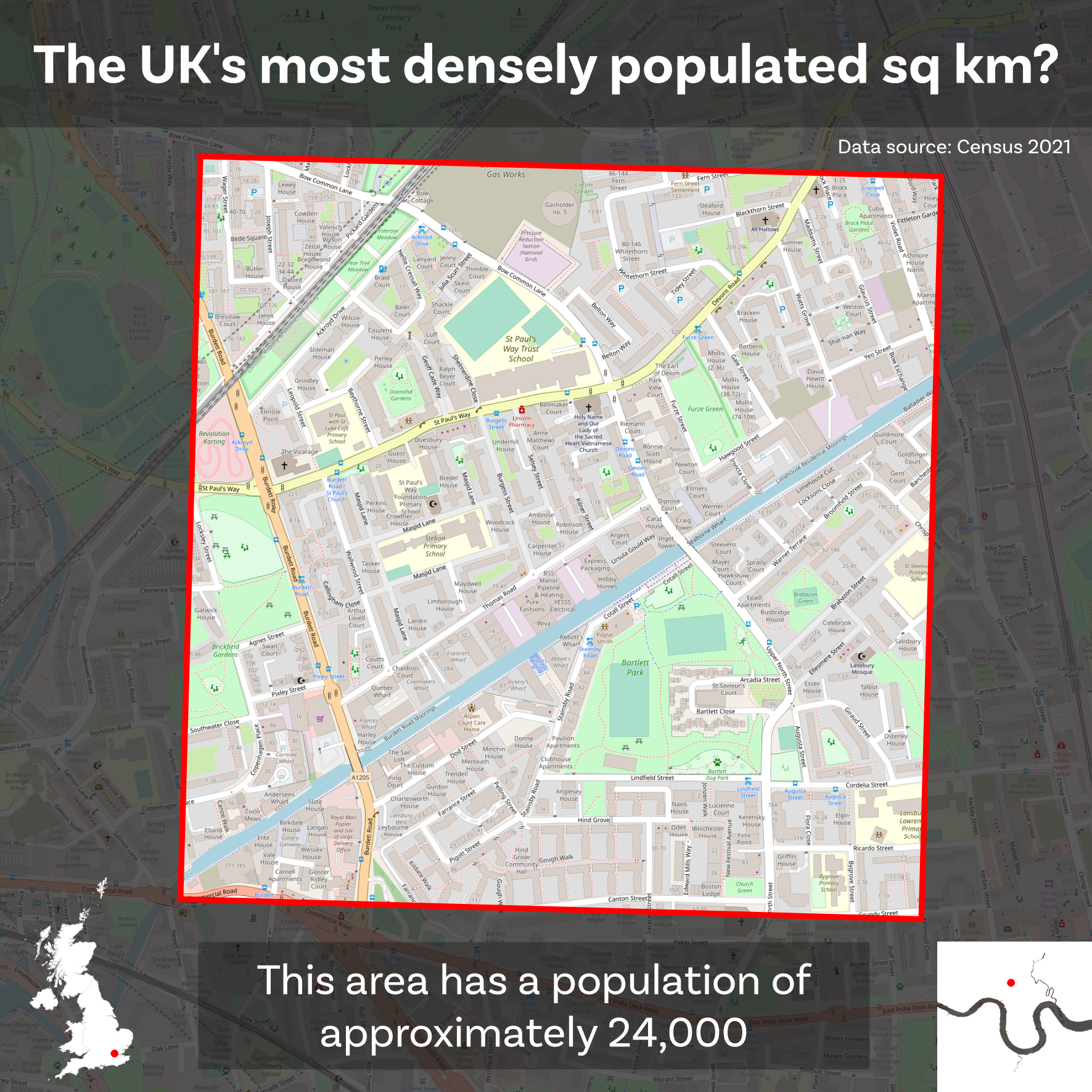
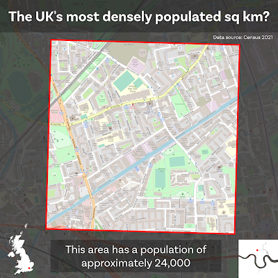
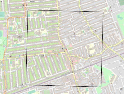
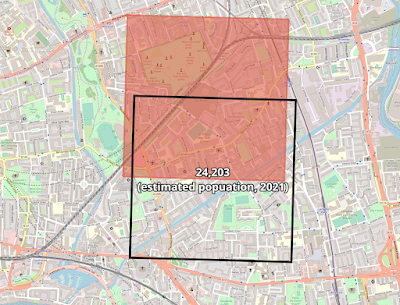
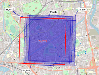
So, based on all of the above, my answer to the question of where the UK's most densely populated square km is, is Bow in East London with a population of approximately 24,000 in a single square kilometre, as shown below. Yes, there is a bit of fuzziness in these numbers due to not being able to perfectly align grid squares to output areas but I'm fairly happy with the answer I arrived at here.
 |
| I think this is a plausible answer to the question I posed |
Hey, hold on a sec! What, not more density numberwang? Yes indeed.
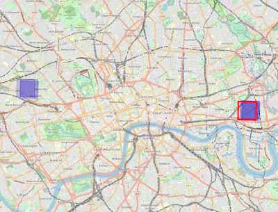
I'm happy with my answer, but just to prove beyond any reasonable doubt that in these kinds of things the answers you get depend upon your method I decided to cheat a little and see if I could use a random 1km grid approach to find any area with more than the population in the square above. This is not really in the spirit of the method because it's not applying a regular grid across England and Wales so I don't consider this the 'proper' answer. Instead, consider it an approach to find an even higher value, for research purposes. The location of the 'most densely populated square km' in the United Kingdom doesn't really change and that's the main thing.
Here's what my 1km 'grid' looked line when I was on the hunt to find a higher figure than the square above. This is almost 28,000 separate 1km squares but they do not form a grid, so I consider this method a bit of a cheat so I don't use it as my final answer above, but I wanted to see what happened when you did it.
 |
| Lots of squares, but not a grid approach |
Then we can filter for areas with above 24,000 people and see what we get. That's what's shown below, and the square from the answer above is highlighted in red here for comparison.
 |
| Ruh-Roh, spanner in the works? |
Is this now a showdown between West and East London for the title of 'most densely populated square km in the UK'? Well, maybe, but only if you're using this cheat method of single squares. So who wins on this approach? See below for the zoomed in maps with the numbers.
 |
| All over 24,000 here (remember this is approximate) |
 |
| East London wins again (original winner in red) |
So, as we can see, the answer to the 'where is the most densely populated square kilometre in the UK?' question doesn't seem to change, even if we cheat and allow ourselves to place our 1km squares randomly in order to maximise the single square total. The area in the map above has four new squares with 25,000 or more - though of course these numbers are an approximation of course, as I've explained above. This kind of cheating approach does however have the benefit of showing how areas of West London come close to being the highest density if we play a bit of gridshift.
What does this actually look like on the ground though?
Here's a Google Maps link to more or less the centre of the red square above, which is also pretty much in the middle of the blue squares. Here are some images from Street View - and recall that this is what about 25,000 people per sq km density looks like in London. This is half the density of the highest density places in Paris, Barcelona or New York, and about a quarter of the highest densities globally (found in cities like Manila, Cairo and Dhaka).
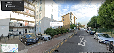 |
| Burgess Street, E14 |
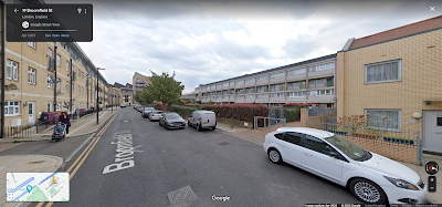 |
| Broomfield Street, E14 |
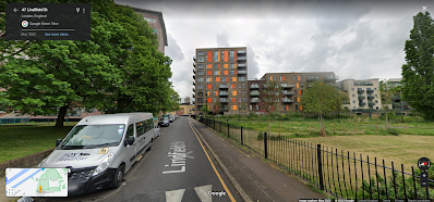 |
| Lindfield Street, E14 (still space for parks) |
Are we done now?
Yes (for now).