This blog post explains how to make a 3D population density render for any country in the world, using open data and free software. The main tool I'll use (Aerialod) is Windows-only at the moment, but it is amazing. I say 'render' rather than 'map' here because the images you'll generate are rendered by Aerialod, which is, technically, a 'path tracing renderer' rather than a piece of mapping software. But feel free to call them 3D maps - either way, this is an example of what they look like.
 |
| Global population density print |
But why do this? Well, partly because it's an interesting and often informative way at looking at population and settlement patterns, but also partly because this particular method produces nice-looking graphics. Perhaps the best answer I could give here is that's it's a combination of aesthetics, insight, and interest. In the image below, for example, we can see a lot of what we might already know, but it's often in the comparisons within and between places that we learn new things and that's also part of the point here - it can give us a new perspective on the world.
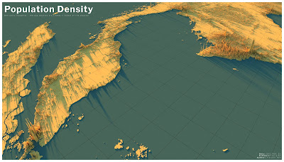 |
| Singapore, KL, Medan, Ho Chi Minh City, etc |
The ingredients
What do we need to make a population density map like this of a single country? Well, it can be done in different ways, and you may have your own method, but the basic ingredients are outlined below. I'm going to use the example of the United Kingdom as a single country, but the data source I use has data for all countries in the world, so you can pick whatever you like and replicate the method. So, here's what we need:
- Some population data, preferably in raster format
- A tool to render it in 3D
For the data, there are a few different sources, including the European Commission's
GHSL data and NASA's
GPWv4 but here we're going to use
WorldPop population density data. These datasets are all free and open (CC BY 4.0), and all have 1km resolution versions, but WorldPop allows you to download individual countries, for each of the years from 2000 to 2020, so I'll use that here. Just a note of caution now to say that '1km' means '1km at the equator', or 30-arc-seconds - so if you're at 50 degrees north then the cell will still be 1km in height but it will only be about 80% of that width. Also, you should read the
WorldPop - Mapping Populations page about the data, so that you understand what it is, and how it was created.
For rendering the world as a 3D population surface, there are again lots of options, the best of which is probably
Blender. This is free, open source and extremely powerful but it's not what I'm using here. Instead, I'm using
Aerialod by
@ephtracy. I've
previously written tutorials on how to use this for different kinds of data, but here' I'll focus on population density renders.
About the vertical dimension of population density datasets
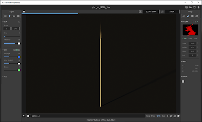
You can just download some data from WorldPop for a single country, in tif or asc format, and then just dump it in Aerialod, but when you do that with population data, something like this will probably be the result (below). This is the 2020 UK population density file from
WorldPop, opened in Aerialod. I'm showing you this here as a way of explaining what Aerialod does and what you need to understand before you try to map population density in this way.
 |
What the tif?
|
The gbr_pd_2020_1km.tif file from WorldPop (2,372KB) is a simple black and white raster image, measuring 1,250 by 1,321 pixels (you can see this in the image properties when you download it). But the individual pixel values have population counts in them. So, when I open the file and inspect it in QGIS (below) I can see that the highest pixel value is 27,500 - and since Aerialod extrudes the vertical dimension according to individual pixel values, what we see in the image above when we open it in Aerialod is a kind of population density tower 27,500 high and only 1,250 wide by 1,321 high. Not exactly very useful. So, we have a 1km area of London with 27,000 people in it and this then gets extruded 27,500 units on the z dimension in Aerialod, while our x and y units max out at 1,250 and 1,321 respectively. Next step is to fix this.
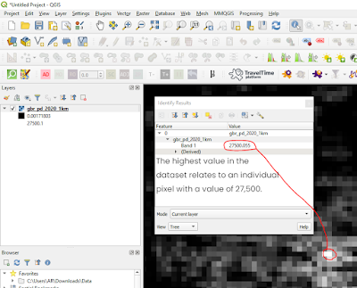 |
| We need to re-scale this file in order to use it |
Scaling population density data in QGIS
This is probably the most important bit. I will say now that there are lots of different ways to do this next bit, but ultimately what we are trying to do is arrive at a situation where we can show population density patterns in 3D that provide a useful overview of the settlement patterns in different countries, or the world as a whole. I used a different approach in the image at the top of this blog post, plus different data (GHSL), but it is based on the same principle. The following is a simple workflow to take a tif file from WorldPop and then rescale it so you can use it in Aerialod. If you were mapping something with much lower actual values (e.g. elevation) then you don't need to do this re-scaling.
- Open the population density tif in QGIS. It should just display as a black-to-white image, with low population counts in darker colours and lighter shades for the highest values. You can see this in the screenshot from QGIS above.
- Right-click the layer > Export > Save As... and then you want to change the Output mode to Rendered image, select a folder to save it to, plus a file name, and then click OK. This will add another raster layer to QGIS. You can see a screenshot of this below.
- You'll see that the new raster layer in QGIS looks exactly the same, but it's not. Instead of the actual population values in each pixel, the values go from 0 to 198. This is what the Rendered image save option does - it scales the image using pixel values in the range from 0 to 255, where 0 is black and 255 is white.
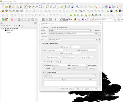 |
| Saving as a rendered image |
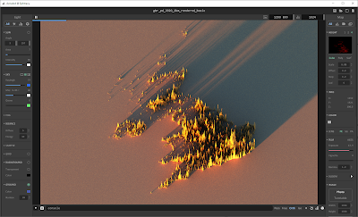
- When we add this new rendered image to Aerialod, and then change some of the settings (as in the screenshot below), we do get quite a good visual representation of population density.
- But, there's no land and the old 0 to 27,500 range has essentially been reclassified from 0 to 198, which means that the full range of classes (up to 250) hasn't been used. We'll fix that in a minute but first here's the result, below. As you can see, this does a pretty good job of illustrating the broad sweep of population density across the UK. If you're struggling with Aerialod here, you may need to go back to the links at the top of the page and see my tutorials on it, but all I did here was drag and drop the tif into the main Aerialod window and then change the settings, as per the screenshot.
 |
| This works pretty well - but there's no land |
How do we get the land to appear? (don't use black for 0)
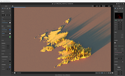
This next bit is about how to change the raster image before exporting it so that when we add it to Aerialod we can see the land as well. There are loads of ways to do this, but here's one simple way that works well. This step is only really necessary if you want land to appear. I prefer doing this because it then gives me the option of including the land, or not (i.e. you can make the land disappear by changing the Offset value in Aerialod to something like -2.0 in this case).
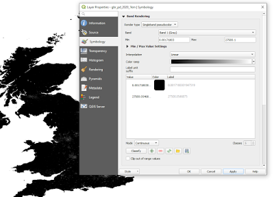
- Go to the original raster layer (in our case the one that goes from 0 to 27,500) and then in the Layer Properties, Symbology section, we change the Render type to Singleband pseudocolor.
- What you need to do here is edit the colours so that the ramp goes from almost black (but NOT black - so don't use RGB 0, 0, 0 or #000000) to white. Aerialod will interpret the darkest colours as low values and white as the highest values - see below for a screenshot on this.
 |
| This is one way to do it |
- Once you've done this, you can then save the layer as a Rendered image from QGIS, just like we did above. It will then add a new dark to light raster layer to QGIS, just like before. Unlike before, however, when you click on a cell in QGIS with the Identify Features (i) tool, you'll get a value from just above 0 to 255, instead of the population count.
- Check: are all your highest population spikes the same height, meaning they look truncated or flat-topped? If so, this means you probably need to adjust the light-dark colour gradient again in QGIS before exporting it and loading it in QGIS. This sometimes happens in the highest density areas so it's worth looking closely at it and then if it does happen, re-scale the data in QGIS using a different kind of classification (e.g. instead of Continuous you could try equal Interval or even Quantile). Also, just remember that this approach is quite a simplified visualisation approach to displaying population density data. The vertical extrusion is not super-precise, and of course depends upon the method you use to create the rendered tif. The idea with the approach outlined here is to give a good general overview of population distribution and density in a country.
- N.B. there are loads of different ways you could do this step, including the use of different colour ramp modes (e.g. continuous, equal interval, quantile) or you could re-classify the raster using a scaling factor (e.g. divide all values by 1,000), or do it in an image program, but here I am aiming at simplicity and a method that allows us to quickly arrive at a result that is both interesting and broadly representative of the spatial patterns of density on the ground.
- So, what does it look like when we add it to Aerialod now? Well, see below for the new image.
 |
| Reduce the Offset (on the right) to remove the land |
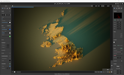
The point of this is to be able to create a 3D render of population density in any country, and this is one way of achieving that. For things like this, where I am striving for broad-brush patterns and workflow efficiency, rather than precise measurement from pixel values, I will often take shortcuts to achieve what I want - so for example, in the image below I have 'reprojected' the data by manually re-sizing it in IrfanView and then saving it as a png file, which ended up being 289KB in size. Try
downloading it and dropping it into Aerialod and then replicate the settings I've used below - I think this one has the makings of something quite nice, and you can replicate it for any country. I have also added a similar file for France (
as of 21 Nov 2020).
 |
| All this from a 289KB png file + Aerialod |
I want to map the whole world this way!
Okay, no problem. You can get global population density layers in a few places, but probably the most convenient are WorldPop or GHSL. The WorldPop ones can be found at the bottom of
this page - look for the 'Unconstrained global mosaics' link. For the Global Human Settlement Layer (GHSL) data, published by the European Commission, you'll want to head to their excellent
Download page. Once again, I'd advise anyone using this data, or any kind of data, to read about what it is and in this instance the FAQ page is particularly useful.
Most of my population density mapping in the past has used GHSL data. One great thing about the GHSL download options is the ability to pick different projections, so that you don't just have to use WGS84 - this is still good, but the further you go from the equator, the narrower the area represented by each cell. This is not the case with the Mollweide option, since it is an equal-area projection. But this is something you should look into further yourself if you're interested.
If you do download a global file, you need to be aware that Aerialod can handle images at a maximum of 16,384 pixels in width or height, and the world is more than 16,384km wide. So, if you do download a global population raster, you will need to re-size it in whatever software you use (I always use IrfanView for this) so that it is less than the maximum pixel size allowed in Aerialod - I normally just re-size to 16,000 pixels.
This means that the 1km cells are no longer 1km but closer to 2km, but at a global scale the pattern is very similar. I've created a small-file-size global raster (2.21MB), with the Pacific in the middle rather than the Greenwich Meridian, and
shared it via Dropbox so that you can experiment with it as well. See below for what it looks like when you drop it in to Aerialod with the settings as per the screenshots.
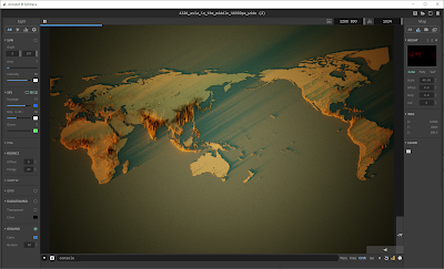 |
| This is the whole world, from a 2.2MB png |
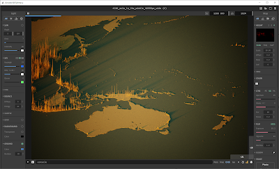 |
| Zoomed in, and exaggerated heights |
Recap
I could say a lot more about methods and how to tweak this and that, but the aim of this post was just to show you how to create a 3D population density render of any country in the world, and I've done that now, using the United Kingdom as the example country. All I would add is that if you're struggling with Aerialod, then you should go back to my
original blog post on it, plus the earlier one linked to in it. It's definitely also worth spending time reading about the data sources I have mentioned.
I hope you have found this useful. If you get a lot of use out of Aerialod, and you are able to, perhaps consider making a donation to
@ephtracy - the creator of this great piece of software. I have done so in the past and hope to do so again in the future.
Data sources
I've linked to the data sources throughout this post, but I'll do it again here so they're all in the same place. This is all open data, with each one licenced under the
Creative Commons - Attribution 4.0 licence (CC BY 4.0).
- Worldpop.org - WorldPop really is an amazing project and in fact one of the best data resources currently in existence, in my opinion. It has so much beyond population data, so even if you don't want to map population patterns it's 100% worth checking out. Note that in the data section of the website you'll see both 'Population Density' and 'Population Count' but here I've used the population density data. It's worth spending some time on the website to see what's available and also to understand what the data represent and how it is all collected. You can get this data either as a tif, like I've used above, or as a csv file.
- Also one of the best population data resources currently in existence, the Global Human Settlment Layer has the advantage of going further back in time, with a total of four time points - 1975, 1990, 2000 and 2014. The GHSL project is supported by the Joint Research Centre (JRC) and the DG for Regional and Urban Policy (DG REGIO) of the European Commission, together with the international partnership GEO Human Planet Initiative. If you download this data, there are LOTS of options, but what you need if you want to map population density is the GHS-POP option. I've mostly used the 2015 data, at 1km resolution, in Mollweide or WGS84 projection for the whole earth, but you can also just download single tiles. This data is available in tif format.
- NASA's Gridded Population of the World, version 4 - another excellent source of global population data. The GPW v4 home page explains everything about it, and all the different variants available, as well as previous versions.


