Showing posts with label animation. Show all posts

Tuesday, 28 December 2021

Map animations with ffmpeg

This post is about how to create video animations from a sequence of individual images, using a simple but extremely powerful command line tool called FFmpeg. If you're scared of code, command line stuff and weird computer language in general then this post is for you. Part of my sneaky plan here is to lure you in with enticing visuals so that you overlook a little bit of the complexity - which is really not that complex, I promise. If you're already a Jedi-level coder but maybe haven't used ffmpeg, welcome too. If you're somewhere in the middle, also hi.

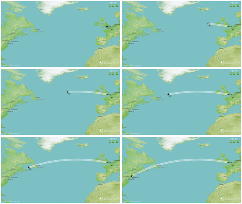
I'll try to demystify the mysterious and show you how to do some interesting things without too much pain. To begin with, here's a video I made using ffmpeg, from a series of map frames I exported from QGIS Atlas. But you don't need to know anything about QGIS to complete this tutorial - I've already exported all the individual map frames for you and shared them down below. We're going to fly from London to New York today, and also from London to Rome.


There are a few parts to this tutorial, as follows. If you found this post somehow randomly online and were just looking for how to install ffmpeg and how to run a couple of commands to turn a series of images into a video, then this post is also for you - please read on!


Sections


1. How to install ffmpeg on Windows, Mac or Linux (this can sometimes feel like the hardest part, but it's not very difficult at all, I promise). [Okay, let's be honest for a moment. It can feel a bit painful on Windows, but once you've done it once (in under 15 minutes) you're all set!]

2. Check ffmpeg is actually installed. This is important, but very quick.

3. Get some image frames that we can turn into a video. I've added the two flight-based image sets I refer to in this blog, as well as some additional bonus ones you can play with.

4. Use ffmpeg in Windows Command Prompt or Mac/Linux Terminal and run some commands to create videos.

5. Experiment with different settings to produce different results.

6. Some tips, such as how to name files if you're using QGIS Atlas to export the individual frames, and how to do a few other cool ffmpeg things.


1. Let's install ffmpeg 

I have ffmpeg installed on my Mac, on Linux (I use Ubuntu) and on Windows. I mostly work on Windows but when it comes to ffmpeg the syntax we'll use for entering commands is the same. I've covered each install method below, so you can just skip straight to the bit that matches your operating system. The Windows install may feel a bit complex if you're not used to it but it really doesn't take long.

To install ffmpeg on a Mac, the easiest way - and what I do - is to first install Homebrew and then type in a command into the Terminal (see below) wait a little while and then ffmpeg is installed.  
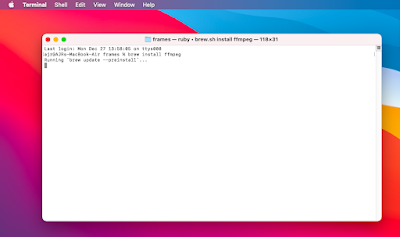
The command is brew install ffmpeg

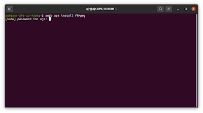
On my Linux machine (on Ubuntu), I just use the standard sudo apt install ffmpeg command in the Terminal (see below), enter my computer password and then wait a short while until ffmpeg is installed.
Windows user? You can ignore this one too

Okay, so you're on Windows and you want to know how to install ffmpeg? Here we go.

This can actually be pretty confusing as there are loads of different instructions online, and lots of different ways you can do it. And then the website and install links can be confusing too if you're new to it. So, if you are new to all this, here's what I recommend. 

  • Go to the ffmpeg download page and look for the Windows logo (probably in the 'More downloading options' section). As I write, the Windows logo is the blue and white squares one but this may change in future so, to be clear, it's in the 'Get packages & executable files' section of the download page. 
  • At this point things can get confusing because all you might actually want is a familiar .exe file you can click on to download and then run - it's not like this with ffmpeg though. BUT DON'T WORRY! Even though the ffmpeg project only provides source code (you can just ignore the Download Source Code link) there are ready-made exe files to download - see the next step. 
  • Now you can go to one of the options for downloading a Windows exe file - and for this you may see a couple of options - I went to the 'Windows builds from gyan.dev' link so I recommend you do too.
  • What now? Help! Which one do I download? Why are there so many download options!? What the heck does 'git master builds' mean? Don't worry about all that, just read on.
  • Scroll down the page a bit and you should see the release builds section and then one downloadable file called ffmpeg-release-essentials.zip (this is what it was called as of 27 Dec 2021) - when you click to download it I recommend saving it on your C drive in a new folder called ffmpeg, so the save location would be C:\ffmpeg - it doesn't actually matter too much where you save it, just so long as it's on the hard drive of your computer. I just find it easier to save it in a dedicated ffmpeg folder directly in the root of my C: drive.
  • Okay, almost there - once it downloads (it's about 77MB) you need to unzip the .zip file and then when you do you'll have a folder called something like ffmpeg-4.4.1-essentials_build. The numbers tell you what version of ffmpeg you have - currently (as of 27 Dec 2021) it's version 4.4.1. 
  • Look inside this folder and you'll see some more folders - and if you look inside the bin folder you'll see ffmpeg.exe, ffplay.exe and ffprobe.exe. How do we make ffmpeg actually run though? Well, not by clicking these exe files. See below, we're almost there.
  • Since we'll be running ffmpeg from the Windows Command Prompt (see below for an example of what this actually looks like) we first need to tell the Windows operating system where the ffmpeg binary files are (that's why the folder is called bin) so that when we type text into the Command Prompt later on it runs ffmpeg for us. We're almost done - I promise! Read on below.

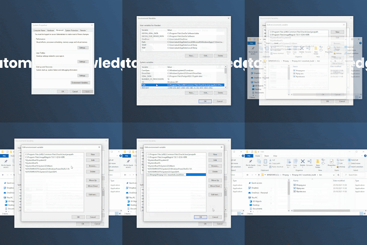
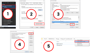
  • Now we need to tell Windows where the ffmpeg.exe file is on our computer by setting the Environment Variable. Enlarge the image below to see screenshots of the steps you need to follow now, as described here: - 1. Start typing environment variable into the Windows search box and then once you see the 'Edit the system environment variables' you can click it. 2. in the System Properties window click Environment Variables... towards the bottom and then 3. With Path selected in the list of System variables, click on the Edit... button at the bottom (this will allow any computer user to use ffmpeg - if you just want to be able to use it on your own Windows user profile you can click the other Edit... button in the User variables section of the window - also making sure Path is selected in the list of variables) then 4. we need to click New and then we paste in the folder location of the ffmpe.exe file on our computer (i.e. the path, hence why we're putting it in the Path section), as in 5. in the image below where I have right-clicked the address bar in Windows explorer and used Copy address as text so that I could paste it in at step 4 (so, I pasted in C:\ffmpeg\ffmpeg-4.4.1-essentials_build\bin as my New Environment Variable path because that's where I put my ffmpeg.exe file). Once we do all this we can click OK until all the windows are closed and then the Environment Variable for ffmpeg will be set and we don't have to do this again! Woo.
We only need to do this once!


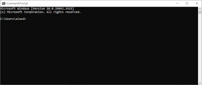
Windows Command Prompt (we'll get here soon)

How to set the Environment Variable (on Windows)


2. Check ffmpeg is actually installed

Now we need to open a Terminal or Command Prompt on our computer (in case anyone isn't clear - the thing we type ffmpeg commands into is called the 'Command Prompt' on Windows and the 'Terminal' on Mac or Linux - for some this will be obvious, for others it may be entirely new). On Windows this is easily done - I do it by typing cmd into the search tool in the bottom left of the taskbar and then click where it says Command Prompt - and voila! I see the Command Prompt window - all black and shiny and empty. It's also very easy on Mac and Ubuntu.

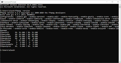
To check whether ffmpeg is actually installed on your computer just type the following text into the Command Prompt or Terminal window (note the dash before version here - this is a common feature of typing ffmpeg commands).

ffmpeg -version (there is no space between the '-' and 'version')

If you've installed ffmpeg correctly, you'll see some results telling you the ffmpeg version on your computer and lots of other stuff that may mean nothing to you. If you're on Windows and you get an error at this stage, just double check that you set the correct folder path for the Environment Variable at the step above. You can see that on one of the computers I did this on, I'm using version 4.2.3.
May I ask when the fun begins?

Okay, ffmpeg is installed so that's quite enough of that. Let's have some fun now!


3. Let's grab some image files we'll use to make the videos

I've created and shared some image sequences we can use to make videos from. There are two folders of images at the link below that we'll use here (I've added other image sets for you to play with afterwards). One is individual frames of a flight from London to New York and one is from London to Rome. In both folders you will just see a series of png image files. I made both of these using QGIS Atlas and you can find out more about how to do that in this QGIS training workbook I put together. 

Content folder

The lhr-jfk folder has 758 individual map frames so it's bigger in terms of file size and will produce a longer animation, whereas the lhr-rome folder has 161 images and is smaller and will make a smaller animation. But I have shared both of them so you can play around with them as you please. You can use either, or both - it's up to you. 

The easy way to get the files is just to click on the lhr-jfk.zip and download it and then the lhr-rome.zip and download it. Note: I mean it's quickest to download the already-zipped folders rather than trying to download the unzipped image folders.

Once you download the folders (and unzip them), you'll see lots of individual map files - I made these in QGIS and have named all the files sequentially with padded zeros - e.g. 001.png, 002.png and so on. This makes the animation process with ffmpeg a bit simpler.
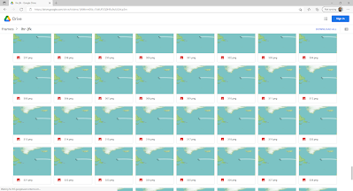

A snapshot of some of the lhr-jfk png files

I've also shared a txt file with ffmpeg commands that you can use to copy and paste stuff.


4. Let's run some commands in ffmpeg

At this stage I normally like to use a blank text document (e.g. Notepad on Windows) as a kind of intermediate copy/paste text editor so that I can be sure I've typed things correctly and can edit stuff there before pasting it or typing it into the Command Prompt or Terminal window to run a command. But of course just do what suits you best - this is just how I like to work.

Okay, so let's make a video in a couple of simple steps.

4.1. We need to make sure that the Command Prompt/Terminal is working in the correct folder. In Windows we can just type cd followed by the path of where our image files are - like in the example below where I have navigated to my lhr-jfk images folder

Copy the folder path with a right-click

cd C:\Users\XPS13\Downloads\lhr-jfk (I'm using this file path because that's where I saved the lhr-jfk image folder on my computer - you'll just need to type cd followed by the file path of the location you saved the images to)

Note that if you downloaded images to an external hard drive with a drive letter like G or F or something else, then you don't use cd to change hard drive location, you just type in the drive letter followed by a colon (e.g. f:) and then within an individual drive you can used the cd command followed by a file path to navigate to the correct folder.
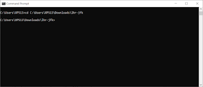
Now we're ready to roll

On Mac or Linux we can just right-click a folder and choose to open a Terminal at that folder's location and we're all set. 


4.2. Look at the command below and then read the explanation. After that you can just copy and paste it into the Command Prompt/Terminal on your own computer and it will create a video from the png file I've given you. This may look utterly baffling right now, but that's totally fine. It will become clearer.

ffmpeg -r 30 -i %03d.png -c:v libx264 -s 1920x1080 -r 30 -pix_fmt yuv420p flight-30-30.mp4


Explanation

The ffmpeg bit just means we're telling the computer to use ffmpeg.

The -r 30 bit means the input frame rate is 30 frames per second.

the -i %03d.png bit tells ffmpeg what the inputs are - in this case it is a series of sequentially-named png files with numerical names padded with zeros. That's why it says %03d.png - if we had files name 00001.png, 00002.png and so on then we'd use %05d.png

the -c:v libx264 bit tells ffmpeg to use the libx264 encoder. What? Just know that this will work and it works well.

the -s 1920x1080 bit is about the size of our video. Here I've used the standard 16:9 aspect ratio screen size of 1920x1080, even though the files I gave you are only 1020x583 pixels in size. But as you will see this doesn't matter - you could replace this with 1020x583 and see if it looks different. Just note that if you put in a dimension that isn't divisible by 2, you'll probably get an error message. Best to use even numbers here. You can just add or subtract pixel values by 1 so they are both even.

the -r 30 bit is the output frame rate. You don't have to enter this - ffmpeg will default to 30 if you don't but I like to include both input and output frame rate. This can be useful for low frame rate videos when, for example, you want Twitter to play them properly.

the -pix_fmt yuv420p bit relates to pixel format and all you really need to know is that this works and is a good choice. If you don't include it, ffmpeg will still produce a file but it may not actually play.

the flight-30-30.mp4 bit is the output file name - what our final mp4 file will be called. I've just called it flight-30-30.mp4 because this tells me the video is a video of a flight with an input and output frame rate of 30 frames per second. Call it whatever you want, but it's a good idea to give it a descriptive name that has some clue to what's in the file. I output the file to the mp4 format but you can export to all sorts of video formats, including mov, avi, wmv and many more. To do that you'd just write flight-30-30.mov instead of using flight-30-30-mp4.

Okay, so go ahead and paste the command below into the Command Prompt or Terminal and hit enter and then look in the same folder as your image files for the resulting video. See below for my screenshot before I hit enter. 

ffmpeg -r 30 -i %03d.png -c:v libx264 -s 1920x1080 -r 30 -pix_fmt yuv420p flight-30-30.mp4
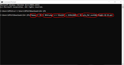
I've highlighted the different parameters here


Once you hit enter it will run for a little while, anyone walking past your computer will see complicated text scrolling down and think you're a coding genius, and then a few seconds later you'll see a mp4 video file in your working folder (this should be the same folder where all the images are). 
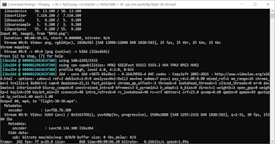
Is this The Matrix, or what?

And here's the video it produced - note that instead of the hundreds of megabytes of images we originally had, the video file size is very small - 693KB for mine.


5. Experiment with different settings

What now?

Well, I think it might be enjoyable to experiment a little, particularly because an input frame rate of 30 gives a pretty slow flight from London to New York (less so with London to Rome). If you're using the London to New York files, try this command to increase the flight speed (note that it's the input frame rate that determines the speed)

ffmpeg -r 120 -i %03d.png -c:v libx264 -s 1920x1080 -r 30 -pix_fmt yuv420p flight-120-30.mp4

Adjust the input -r frame rate (that's the -r parameter just after ffmpeg) and just experiment with the video size settings too if you like - but ideally keep it in the 16:9 aspect ratio and make sure you use even numbers for the -s size parameters. 

Let's say you want to have the flight arrive in New York or Rome and then have the video pause for two seconds. How might you do this? Well, once we have our initial video, the command below will do the trick - and you can adjust the number to increase or decrease the pause at the end. Just replace input-video.mp4 with the video you want to add the pause to and then replace output-video-with-pause.mp4 with your new file name.

ffmpeg -i input-video.mp4 -vf tpad=stop_mode=clone:stop_duration=2 output-video-with-pause.mp4

Want to reverse your video? Fine, try the command below (again, replace the input and output file names with your own). The -vf reverse command is the bit that reverses the video. In this instance, vf stands for video filter and you can always search for other ffmpeg video filters and try them too.

ffmpeg -i original-video.mp4 -vf reverse reversed-video.mp4

Planes don't generally fly backwards of course, but this technique can come in handy.


Finally, let's say you want to convert one of your new videos to another format, you can do this:

ffmpeg -i original-video.mp4 new-video-format.mov


How about a gif? Well, that's a bit more tricky. If you just do the same as above but use .gif as the output file type then ffmpeg will create a gif but it won't look good at all. Then if you search the internet on how to do it, you'll probably end up lost for days. 

So, to avoid any further pain, try the command below - replacing the input video file name with the one you want to convert - and see below for the resulting 1MB gif. Note I have used 960 as the image width in the scale= parameter below but you can always experiment with another value - bigger or smaller.

ffmpeg -i flight-90-90.mp4 -vf "fps=30,scale=960:-1:flags=lanczos,split[s0][s1];[s0]palettegen[p];[s1][p]paletteuse" -loop 0 flight-90-90.gif
Making gifs with ffmpeg can be quite confusing!


6. Some tips, notes etc

How to get good at this kind of stuff? Well, a lot of Googling and reading things on Stack Exchange and random blogs is the way to go mainly. But I'd also recommend trying to get to grips with one or two basic commands - like the ones above - by changing the settings and seeing what happens when you edit different parameters.

I'll end with a list of tips that I find useful.

  • If you're making a map and then plan to make it an animated mp4 or gif, then it's a good idea to think about where the file will end up so that you can plan ahead - e.g. does it need to be screen size like 1920x1080, does it need to be square, does it need to be a specific colour? Will the play and pause controls obscure any important bits of the video? I'd really just recommend thinking backwards from the end use before you begin.
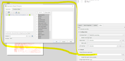
  • If you're exporting map frames from QGIS Atlas then you can easily export the files with numeric names, padded with zeros. That's what I normally do, by using an expression-based file name on export - as shown here, and see screenshot below: lpad(@atlas_featurenumber,3,0)
  • Save your ffmpeg commands in a text file and make a note of what they do. Use ffmpeg as a video converter if you ever need to convert, say, a mov file to an mp4. I've added a text file with commands to the Content folder so feel free do use this too.
  • Remember that there are loads of ways of doing things in computerland. There isn't normally one single, best way. There may be better ways than those I have shown you here, but these methods work well. However, from time to time things change with ffmpeg and sometimes you may need to do a bit more Googling.
  • Want to learn more about ffmpeg? Then why not take a proper course on Udemy - I like this one.
  • Want to extract a single frame from a video, as a png, at 8 seconds into a video? This will work: ffmpeg -ss 00:00:08 -i flight-30-30.mp4 -frames:v 1 out1.png (as with all examples here, you can replace the name of the input file after the -i parameter with the name of your own input file, and the name of the output file to whatever you want to call it)
  • Want to extract a 4 second section from a longer video, starting at 2.5 seconds into the video and ending at 6.5 seconds? Try this command: ffmpeg -i flight-90-90.mp4 -ss 00:00:02.500 -to 00:00:06.500 -c copy cut-4-sec.mp4
  • Note that in the example above, the format for time is hh:mm:ss.sss where there is a dot rather than a colon between the seconds and milliseconds units.

This makes the process much smoother

  • What else? Probably the most important things in all of this are a) making sure you have ffmpeg installed properly and b) that you take some time to play around with a command that works and then change the settings to see what it does.
  • You don't have to use a sequentially-named list of files, but if you don't then ffmpeg may not include files after a gap - e.g. if you run the command to create a video on a folder with files 001.png, 002.png, 003.png and then 007.png you'll just get a video with the first three files. You can search online for how to get round this.
  • Want to add a bit of visual 'noise' to a video? Try this (may be a bit slow) ffmpeg -i flight-30-30.mp4 -vf noise=c0s=60:c0f=t+u noise.mp4
  • How about when you want to add some audio to a video you've made - like if you have an mp3 file you want to add as music? Well, that's fairly simple and you can do it like this: ffmpeg -i input-video.mp4 -i input-audio.mp3 -map 0 -map 1:a -c:v copy -shortest video-with-audio.mp4 - and note that -shortest will trim the video to the duration of the shorter file - so if you have a 5 second video and only 3 seconds of audio, the video file will only be 3 seconds long. You can remove -shorten if you don't want this to happen.
  • Other tips? Just spend some time searching, but this is a good place to start. 
  • Sometimes animated maps are nice, sometimes they are a bit weird and sometimes they can be confusing - so just use your judgement and have fun!

This ended up a bit longer than expected but I'm hoping you may find it useful - I know I will when I inevitably forget some of this and have to come back here to remember. If you spot any errors or have any questions, just get in touch.

Read more About FFmpeg.


Postscript for geo nerds

Why do this? Well, it can be useful if you want to show how things change over time or space or when you are looking to emphasise movement or growth or change of any kind. Also, since we are not restricted to flat, paper maps like in the olden days it's sometimes interesting - and useful - to use animation. People have been doing this for decades and probably most famously Waldo Tobler in the 1960s and early 1970s, as in this video put online by Matthew Wilson. 

And, of course, the 1970 Tobler paper in which the famous 'first law of geography' is stated is actually called 'A Computer Movie Simulating Urban Growth in the Detroit Region' so I thought it would be useful to help demonstrate one way to make a 'computer movie' today - hence this ffmpeg post. I met Waldo in sunny Santa Barbara back in 2013 (and before that he was a reviewer on one of my papers) and he explained some of how they used to do things - so ffmpeg is incredibly easy by comparison!

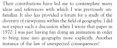
Anyway, about the 'first law of geography' thing - in a follow up collection of papers more than three decades after the original piece, Tobler wrote 'I was just having fun' in relation to some of the work reported in the original 1970 paper when he stated the 'first law'. This is the final section of text from the 2004 paper and I think it's quite interesting what he says, including the bit on diversity of viewpoints, and also on having fun with animations. 

It's also a good way to learn stuff, in my opinion, which is partly why I do this blog and tweet map stuff. For me, despite all the noise, acrimony, animosity and general shenanigans on twitter, the contributions of so many people in geo, data, viz and other fields have led me to contemplate many ideas and references with which I was previously unfamiliar so my hope is that in sharing some of what I know, others may find it useful in ways that I couldn't contemplate myself. But yeah, I was mainly just having fun making an animation.

Tobler, 2004, p. 308


Friday, 26 February 2021

A super-simplified US election map

I admit that the world needs no more election maps, so I'll keep this brief.

I've been experimenting with animations and different kinds of data for my current series of QGIS training sessions so I'm always looking for interesting data to use. The coming week I'm doing a short course on animated maps so I thought I'd use the US county-level election results (lower 48 states only) to create a super-simplified map. The spikes are sized by total population in each county (e.g. you can see Los Angeles county to the west as the big spike) and they're coloured red for the GOP and blue for the Democratic Party. I've done some gifs and some still images and posted them below.

This gif will loop forever - click to enlarge

I consider this something of an experimental play thing but I think it's quite interesting so I'm posting it here. Again, just to be clear: 

  • Colour = party
  • Vertical size = total number of votes for a party, within each county 
  • Direction = animated from west to east based on the x coordinate of country centroids
  • Speed = fast, over 3,000 counties in 10 seconds
  • Purpose = a little carto/data experiment for my training sessions

Here's the mp4 version, hopefully no weird compression on here, but there often is.


Here's a still frame showing blue and red spikes side by side - a bit crowded but you get the idea.

I've added some transparency to the spikes here


Here are some still images.

Easy to spot Los Angeles County

Population centres are quite clear

Chicago stands out

As does NYC


It's a fake 3D effect

Animated by longitude

Speed appears to vary, due to density

Possibly helps highlight voter density

A one second blinking gif

Another one of my experiments


Another simple map - top ten Dem, vote count


Tools: QGIS, ffmpeg.
Data: https://github.com/tonmcg/US_County_Level_Election_Results_08-20/blob/master/2020_US_County_Level_Presidential_Results.csv


Saturday, 30 January 2021

New QGIS training courses for 2021

A short post today about the new training courses I'm launching as part of my new business (Automatic Knowledge). In late February and early March 2021 we're putting on the first of our public QGIS training courses, as well as one in Aerialod. These are paid events, bookable via Eventbrite and are part of our mission to help improve geospatial software skills across the world. We'll make the training material available for all, plus the data - and we will continue to offer financial support to the QGIS project as a 'sustaining member' - as well as make further donations to the Aerialod project. The permanent url for our training pages is automaticknowledge.eventbrite.com and right now you'll see the first five courses advertised - all of which will be repeated on a fairly regular basis. Note: we offer discounts based on where you are in the world, plus a 50% discount for all students (the 50% student discount is in addition to any country-specific discount). Obviously this isn't a perfect solution but we do want to make our pricing structure as fair and accessible as possible. Feel free to get in touch if you have any questions - you can contact us here.

See our global pricing policy

You'll see full details of each course on the Eventbrite page. For now, we are running them online - see below for a brief look at each of the five courses - three are full day courses and two are half days. When the world opens up again we'll still be doing them online but will also start up our in-person training sessions again.

Our first five training courses


I've previously put on lots of public and corporate QGIS training events, as well as delivering thousands of hours of GIS training in Universities. Now that I've launched Automatic Knowledge I want to continue to do this as much as possible, so this is part of the reason for launching these public sessions. Part of my motivation also has to do with the fact that - in the UK at least - there is something of a skills gap in relation to geospatial skills - e.g. see p.8 from the 2019/20 Geospatial Commission Annual Plan.

I agree that there's a need for better skills


However, I'm not trying to turn everyone into a geospatial nerd, honestly. I just think that whilst many of us have access to great open data, and fantastic free and open source software like QGIS, there aren't always enough people with enough knowledge and skills to do the kinds of things they might want to. I've seen this need grow over the past few years as I've put on training courses for a variety of organisations - including the BBC, the FT, Savills, Regeneris, as well as teaching people who work for large global organisations such as Google. In addition, I always try to help people who come to me with queries and questions about tutorials I've posted previously on my blog - this happens on a fairly regular basis from people in different parts of the world (e.g. recently I helped people from Colombia, Bhutan and Nigeria with GIS-related queries).

With all of the above in mind, I can probably summarise my general training principles now, with a few bullet points.

  • Not for nerds: what I mean by this is that the Automatic Knowledge QGIS (and other) training sessions are not aimed at the uber-nerd but at competent IT users who want to get more into geospatial tools but are not really sure where to start or how to move beyond the basics. Even so, if you do self-identify as a nerd already you are still very welcome!
  • Fun - I really do think it's important to try to have fun, or at least enjoy things as you learn them, so this is an important part of my approach.
  • Fairness - it's difficult to offer an approach to timing (e.g. the first courses are on UK time) and price (I realise not everyone can afford full price) that helps everyone, so I have adopted a varied pricing structure so that it can at least be a little bit fairer than a flat global pricing structure. I also plan to put on sessions in other time zones - and in person when this is allowed again.
  • Inclusive - I welcome anyone and everyone, no matter who you are or where you come from or what you know or don't know. My view is that the geospatial world - particularly in education - should be about encouragement, positivity, mutual support and openness. 
  • I don't know everything - this is obvious, but important. Sometimes during a training session someone will ask 'what does this tool do?' and the answer I have to give is 'I don't know'. Sometimes this happens, but you may also be glad to hear that I do know quite a lot about the software I teach - but I realise this is all relative and I continue to look on in awe at so many people in the geospatial world. I'm always learning, and in cases where I do have to say 'I don't know', I always end up learning more in the end.
  • Flexibility - my training sessions are based on a very carefully prepared, tried-and-tested workbook format. This works really well but there is always a risk that it can turn us into robots - so I always make sure we can go off at tangents, explore new ideas and tools and generally get to grips with the software in a way that makes most sense for the user. 
  • Giving back - a cliché, I know. When people do my training sessions, they pay for my time and expertise developed over many years, but I will continue to share my knowledge more widely on my blog, on Twitter and elsewhere. I am often found in Twitter DMs sharing my knowledge or tips with users from across the world. Right now, Automatic Knowledge is in the 500+ Euros per year category of QGIS donors, but we always want to give more - our last donation to Aerialod was $200USD and we plan to continue to donate to the project. 

The courses currently listed on Eventbrite

Right now we're working on finalising our new training material (see below for a peek) and we're really looking forward to getting started. You can see who 'we' are on our website. The idea is to start small and then grow slowly over time as things develop. The training side of the business is only part of what we do but it is a very important part of our overall mission.

This is our intro-level QGIS course

We're currently using QGIS 3.10

Part of the intro section

A few introductory words

Finally, I've recently been re-writing my 'QGIS tips and tricks' sheet and thinking about a) what I know, b) what I think is important for users in different contexts, and c) how amazing QGIS is. Here are my notes on that so far - only some of this is going in; the rest will be part of different levels of the courses.

Messy handwriting, sorry

So, if you're looking to get into making maps from data, or want to get better at it, or just want to talk about it, feel free to get in touch with me.


Wednesday, 8 January 2020

Land, people and political maps

This is a final map wrap-up following the UK General Election at the end of 2019, but also a follow-on from my last blog post: Land doesn't vote but it does matter. I'll explain more below, but let's start with a little gif, which fades in and out between the new political map of the UK at the start of 2020 and a different version of the same map, but showing only where there are buildings (in an attempt to scale the data to the underlying population more closely). I've included some interesting facts about people and land below, so do keep reading. Teaser: only 4.4% of the UK land area is Labour constituencies, in contrast to the 32.8% of the population who live in Labour constituencies, which is very close to their 32.2% vote share at the election.


Land matters, but it's good to see both

Here are the individual frames from the gif, below, in case you want to look at them a little more closely. It's a bit of a balancing act deciding upon what line width to use for the buildings-only map - too thick and it's just massive blobs of colour. Too thin and everything disappears, so what you see here is a kind of compromise that is supposed to reflect the pattern of the underlying urban fabric that would be visible on a satellite view, for example.

Buildings file available here

The political map of the UK in 2020


How many people live in areas with a Conservative, Labour, SNP or Lib Dem MP?
This is an interesting question, but not one I came up with by myself. I was asked for an answer to this question, and because I'd compiled all the data already it was a relatively quick bit of analysis to arrive at some answers. So, here we go - below - based on the latest UK mid-year population estimates from 2018.


  • 55.3% of the UK population (36.7 million people) live in areas with a Conservative MP. The Conservatives have 56% of the seats (365 out of 650). The Conservatives won 43.6% of the UK vote in the 2019 General Election.
  • 32.8% of the UK population (21.8 million people) live in areas with a Labour MP. Labour have 31% of all UK seats. Labour won 32.2% of the UK vote in the 2019 General Election.
  • 7.4% of the UK population (4.5 million people) live in areas with an SNP MP. But of course that's a bit of a silly statistic because the SNP only stand in Scotland, obviously. So, the relevant figure here is shown below. The SNP won 3.9% of the UK vote in the 2019 General Election. Note: obviously, the % population and % seat shares will be quite similar owing to the sort-of-equal population per constituency. For Scotland, both figures are 7.4% of the UK in terms of seats and population living there.
  • 82.7% of the Scottish population (4.5 million people) live in areas with an SNP MP. The SNP won 45.0% of the Scottish vote in the 2019 General Election and have 81.4% of all Scottish seats.
  • 1.7% of the UK population (1.0 million people) live in areas with a Liberal Democrat MP. They also have 1.7% of all seats. The Liberal Democrats won 11.5% of the UK vote in the 2019 General Election.

You can see the full spreadsheet here if you like - it includes all parties and has separate tabs for England, Scotland, Wales and Northern Ireland and it has a map of the results. It looks like this (below). I've used total population here rather than electors because that was the question I was given and of course MPs are representative for all people.

More interesting than you may imagine, perhaps

None of this is of course particularly profound or surprising but I'm thinking about it in the context of the maps above and in relation to overall vote share, so I find it interesting. 


How much of the UK land area does each party 'hold'?
Describing this correctly is a bit tricky, but what I mean here is what percentage of the UK's land area does each party 'hold' or 'represent'? That is, what proportion of the new political map of the UK is shaded blue, red, yellow, orange, green and so on? I do like the different kinds of political maps we see these days (including the now-ubiquitous hex cartograms) but I also like to see things mapped in a more traditional manner, so long as we also have a different way of looking at it and are aware of the underlying numbers and settlement pattern (hence the gif at the very top of the page).

Okay, prepare to be blown away, or not, by this geographical trivia.

  • 62.4% of the UK land area is covered by Conservative constituencies.
  • 4.4% of the UK land area is covered by Labour constituencies - yes, 4.4% (but of course that's because they are mostly urban and therefore geographically small, but still this low figure surprised me).
  • 19.5% of the UK land area is covered by SNP constituencies.
  • 60.4% of the Scottish land area is covered by SNP constituencies.
  • 5.6% of the UK land area is covered by Liberal Democrat constituencies (with thanks to Caithness, Sutherland & Easter Ross, clearly).
  • The full spreadsheet above has the rest of the data, including the individual UK country breakdowns.

The mid-2018 population estimates from the ONS put the UK population at about 66.5 million, with 56 million in England, 1.8 million in Northern Ireland, 5.4 million in Scotland and 3.1 million in Wales.

For land area, the UK as a whole is about 244,000 sq km (about the same size as Oregon, or almost exactly the same as the total area of the Great Lakes in North America). England covers 130,000 sq km, Northern Ireland 13,600 sq km, Scotland 79,000 sq km and Wales 21,000 sq km. The figures are in square miles as well as sq km in the spreadsheet.

What was that? You want more gifs, but different speeds and different sizes. Okay then, see below. 

More seriously - and there is a rationale here - switching relatively quickly between the two maps in this way helps highlight the ways in which the standard map view can, if we're not careful, give a distorted view of political representation. That's why I think in political mapping a mix of methods and numbers works best. Also, where we can use different kinds of approaches to explain this (like gifs) we probably ought to.

Fast enough for you? 

A mini version

This is a bigger version - click to zoom

Help


Okay, one last stat. 

What percent of the UK population lives in Constituencies where more than 50% of the votes went to the Conservatives? 

By my calculations the answer to that is 28,258,422, so 42.5% of the UK population which, it so happens, is not so far away from the 43.6% share of the vote. But that is definitely not a defence of first past the post!

Bye for now. 


Wednesday, 2 January 2019

QGIS Atlas by Field

This post explains how to use the Atlas function in QGIS to automate the production of maps from a single layer in order to produce a map output for each column in an attribute table. The Atlas tool is designed to allow users to iterate through the rows in an attribute table, but not through columns so if you want to produce a map for each variable in a single dataset (e.g. annual house prices for small areas) then you may find yourself at a dead end, as I did. Then I saw how Ed Hampson at Savills very elegantly solved the problem so I'm sharing it here. I know of some other workarounds but this solution is my clear favourite as it allows for the production of as many map outputs as you need in a very efficient manner. I've shared the project file in this online folder so you can download it and play around with it yourself. This was done in QGIS 3.4. This is written with the assumption that you already know QGIS and how to use the Atlas tool, so I won't cover that here.

This is the final project, which you can download

The basic principle of this approach is that for the Atlas coverage layer you use a lookup file, which in my case was a table with one row for each of the column headers I wanted to map in my dataset (as shown below). As you can see, the individual rows follow the pattern md_1995, md_1996 and so on. This is because the layer I want to create maps from has one column for each of these fields, from md_1995 to md_2016 - this is the median house price for each area from 1995 to 2016. If you're at all confused and want to see how it works, just download the project folder and take a look yourself by opening the QGIS project I have shared - all the screenshots here come from that.

This is the table I used

Now here's the bit I really like - when setting up the Atlas in Print Layout, the coverage layer here is the table shown above and the Atlas 'Page name' is the 'Field' column in the table above. The normal way would be to set the coverage layer to be some kind of geographic layer and then QGIS would iterate through it spatially, but this is a kind of non-spatial solution that allows us to map by column instead.

The 'Field' here is the Field column in the table shown above

The really important thing you need to do to make this all work is to map the data using eval (  @atlas_pagename )  as the Column to be mapped. Since we have set our Page name in the Atlas as 'Field', and since the data in the Field column in our Atlas coverage layer has the same names as the attributes we want to map (i.e. md_2004, md_2005, md_2006, etc.) when we iterate through the Atlas it will map a different variable each time. Just remember to use a data range in the symbology that allows you to show the highest and lowest value across your entire dataset, otherwise you might find you have some missing values on some maps. For example, if I had set the symbology data range here using the 1995 house price, then by 2016 loads of areas would be above the max value from 1995 and they wouldn't show up on the map.

This is the clever bit

What does 'eval' do, I hear you cry... Well, it's basically this, as described in the QGIS documentation:


  • 'eval' - Evaluates an expression which is passed in a string. Useful to expand dynamic parameters passed as context variables or fields.

Once you've got everything looking the way you want, you can then export the Atlas in the usual way and do all sorts of interesting things with the outputs, like creating a gif for example as I have shown below. I did a tutorial for creating these in an earlier blog post.

How much!!!! Not inflation-adjusted, obviously.

I've added some comments to the expressions in the QGIS project I've shared and these are also shown below to give you a better idea of what's going on here. I know it's a bit tricky to understand without actually seeing it.

This is just how I set the output file names 

This is just what I used to automate the year label

This is what I used to set the highest value each year

This is how I dynamically sized the bars in the chart

This just shows you all the different layers - only 4

You'll see above that this is a normal Atlas, set up in the normal way. The only difference is the way I've set up the coverage layer and how I have set the column to be mapped using the eval expression. Everything else works in the same way. I have also used the aggregate function to pull out the highest value for each year (in the top right of the layout) and I used it to set the height of the individual bars in the chart. I have shared all the individual map outputs from this in the folder, and they look like this.

Final map output for 2016

Okay, I think we're done here but if you get stuck feel free to get in touch. I'm easy to find online or on twitter.


Notes: if you try to load the zipped project folder QGIS may throw up a warning saying it can't find the 'field_transposed_for_atlas' layer but don't worry, it's there. You just need to Browse to the folder where it is located (i.e. the layers folder in the download). I should perhaps really thank Jochen Schwarze here because of his StackExchange tip to Ed on this. The map colours are ones I borrowed from a very nice looking FT map by Steve Bernard. Note that you can add comments inside QGIS expressions using /*comment goes here*/ and after an expression using --comment goes here. In the file names I think it says 'MSOA' but the areas used are actually LSOAs. The house price data is from HM Land Registry but very helpfully compiled as median values by LSOA by the excellent CDRC team. I added a few place names using OS open data. Easy to remember url for the folder is bit.ly/qgis-atlas-by-field