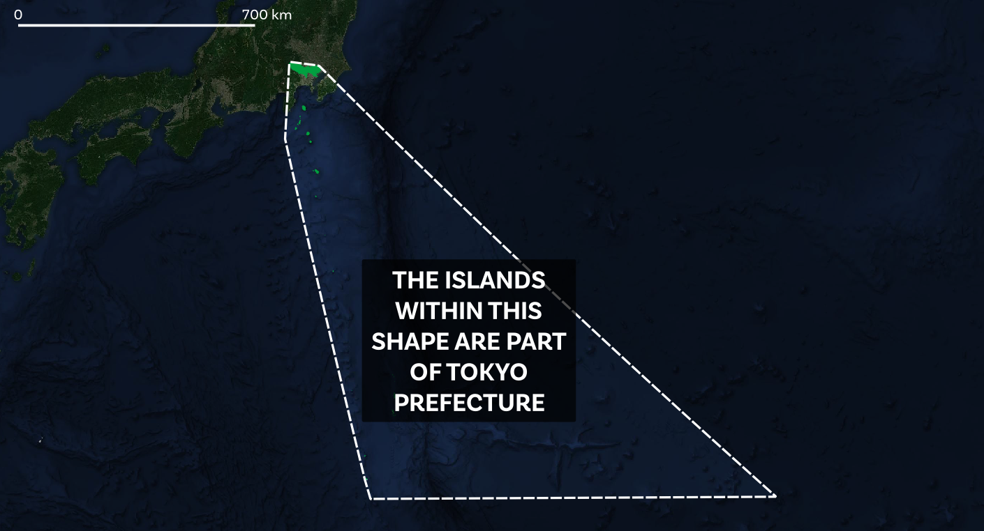
How big is Tokyo? What's the population of Tokyo? What even is Tokyo? All excellent questions, so in this long read I'll try to explain my answers to these questions by way of data and maps, including some new analysis I've done. But first, here's a photo of the urban area, plus a map of Tokyo prefecture - I'll say more about it later on - including a bit about the remote Tokyo island shaped like a shark's tooth.
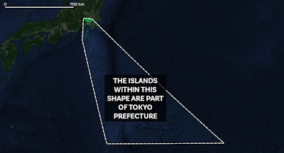 |
| The convex hull for Tokyo Prefecture |
The short-ish version
If you look at a satellite image of the wider metropolitan region that includes Tokyo, Yokohama and many other places and then calculate a population for that continous urban area, you'll get one big figure. If you calculate the population of Tokyo based on the commuter zone you'll get another big number. If you calculate it at the prefecture level you get another, lower, figure and if you use the '23 Special Wards' definition of Tokyo you get another figure.
But if you're reading this then you probably already know all that, so let's look at the latest numbers instead. For this, I derived four different 'Tokyo' populations using the most recent (2020) WorldPop data for Japan. There are actually four different versions of this data that you could use and I tried them all but the numbers differed very little between datasets so the figures here use the 2020 1km aggregated WorldPop data for Japan. So, based on this, here are some 'Tokyo' populations for 2020.
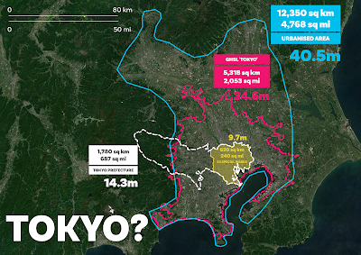
- 9.7 million people in the 23 Special Wards (this represents the inner-urban core of the Tokyo Metropolitan Area, and is part of Tokyo prefecture - i.e. the Tokyo Metropolitan Government (TMG) area).
- 14.3 million people in Tokyo prefecture (i.e. the 'city proper' - this is the official Tokyo Metropolitan Government area but a big chunk of it goes well beyond the urban fabric). The official Tokyo Statistical Yearbook 2020 figure for this area says there are 14.05 million people in Tokyo prefecture, so my calculation isn't far off. Given that my calculations are based on 1km squares, it's not surprising there are some differences, given the unmodifiable chunkiness of 1km chunks of city vs the very detailed prefecture boundary.
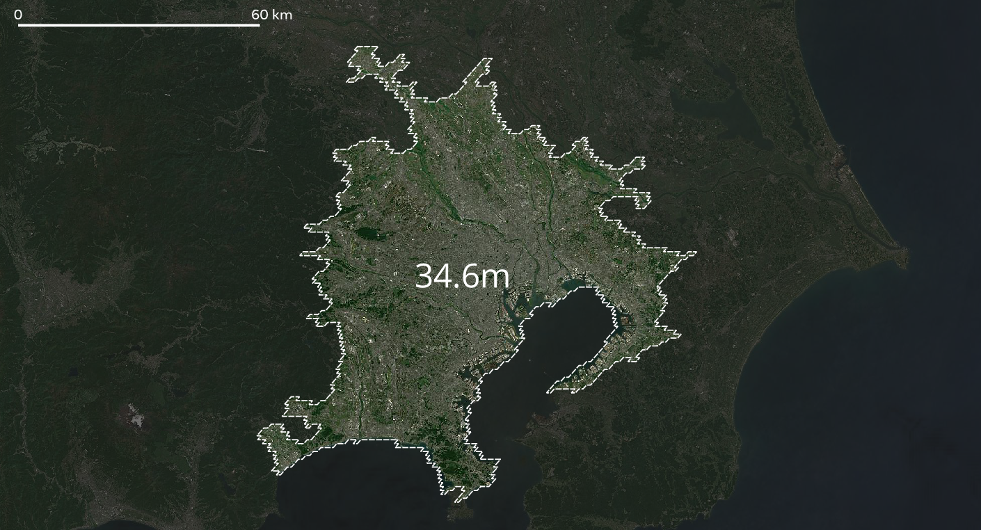
- 34.6 million people in the wider Tokyo urban area, as defined by the European Commission's Global Human Settlement Layer project - take a look at their web map. This area is highly urbanised and in fact if you look closely (see map below) it appears that there are many continuously urban areas adjacent to it which are not included - so it may not be picking up all of the Kanto continous urban area. In fact, it definitely isn't. That's why I give another figure, below.
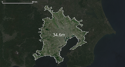 |
| The GHSL project's definition of 'Tokyo' urban area |
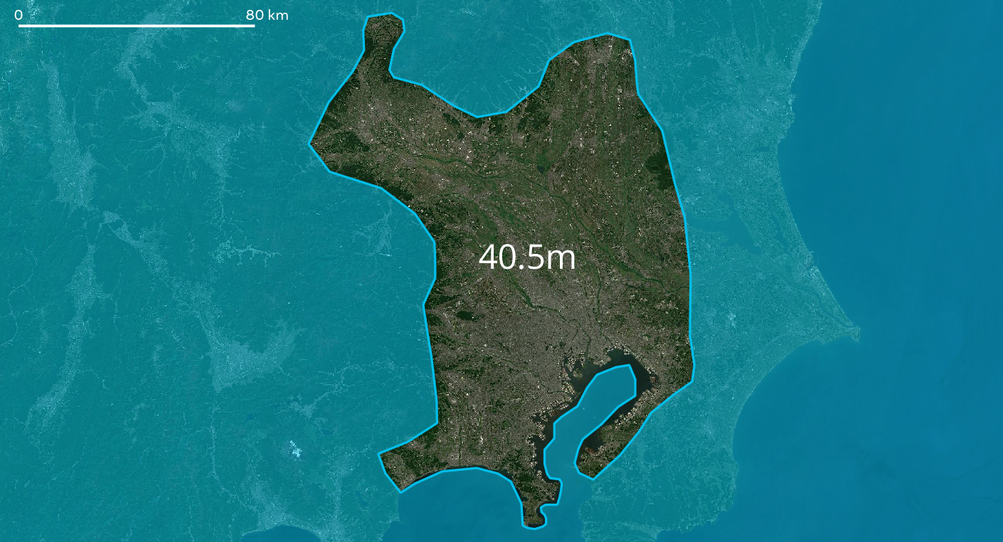
- 40.5 million people in a fairly continuously urbanised area within the much larger Kanto region. I drew this area very roughly myself based on the underlying satellite imagery but as you can see (below) it does appear to be a reasonable approximation for the wider urban area. Yes, there is a good bit of green in here but it's still very much an urban area.
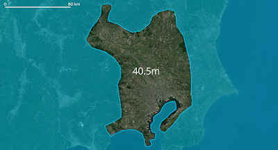 |
| The wider 'Tokyo' metropolitan area |
So is the population of Tokyo 40.5 million, or what? Well, we'll talk about Tokyo definitions a bit more below but here's the answer I'd give.
"The population of the wider metropolitan area in which Tokyo is situated is approximately 40 million people. The continuously urbanised Tokyo commuter zone has about 35 million people. The official Tokyo local government area (i.e. the prefecture, or TMG) has 14 million people and the '23 Special Wards' of Tokyo contain just under 10 million people."
But of course this also raises more questions, such as: how big are these areas in terms of square miles or square km? And, how does this compare to other cities or urban areas? And what about population density?
But for now, I think we've reached the conclusion that Tokyo is a big city. I think we can all agree on that much. Or can we? But what actually is 'Tokyo' anyway?
How big is Tokyo? The many Tokyos
Geography boffins can talk all day about formal regions, functional regions, ontologies, epistemologies, boundedness, agglomeration, conurbations and so on. We can even go on Reddit or elsewhere on the web to read about how big Tokyo is or isn't, including that famous image of the wider Kanto area plonked over the UK. But for most sensible urban watchers, the 'city proper' isn't really a great way of assessing 'cities' because it's often a fairly arbitrary boundary that goes well beyond the urbanised area itself (as in the case of Tokyo) or indeed doesn't actually include all of the urbanised area at all (also true in the case of Tokyo).
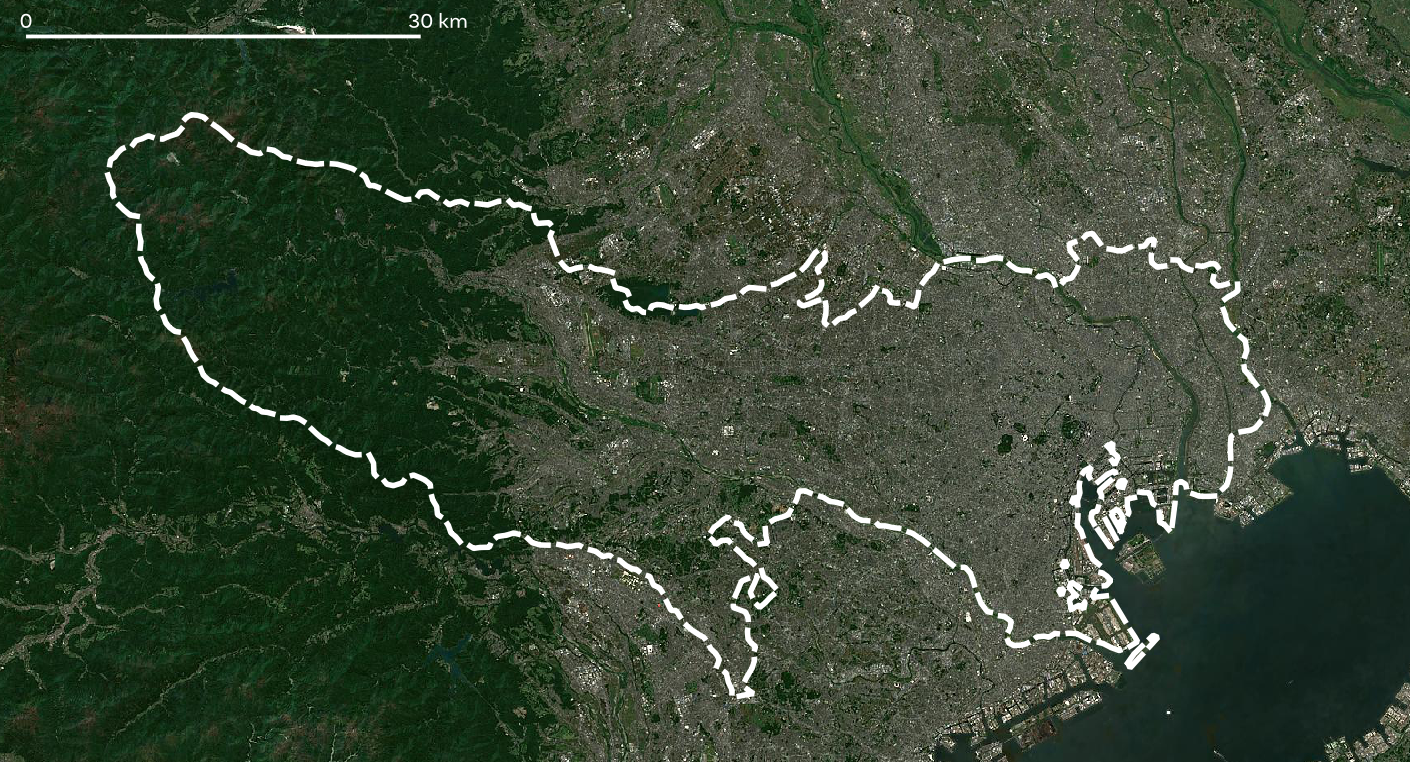
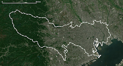
A prime example of this is shown in the map below, of the Tokyo Metropolitan Government area (the TMG, shown in white - this is the prefecture boundary for Tokyo) - I haven't shown the far-flung islands that are actually part of the TMG prefecture but you can see that the area around most of it is very dense. The area within the dashed white line is home to 14 million people, as of 2020. This is one of Japan's 47 prefectures and it is the most populous by far - Kanagawa (containing Yokohama) immediately south of Tokyo has about 9.2 million people.
 |
| Overbounded in the west, underbounded everywhere else |
If you Google 'Tokyo prefecture' this (above) is the boundary you should see on Google Maps. It is equivalent, in administrative terms, to the local government area covering Greater London or New York City. But of course it is an administrative, technical, political boundary and not one that makes much sense if we think about human activities. It's a formal boundary rather than a functional one.
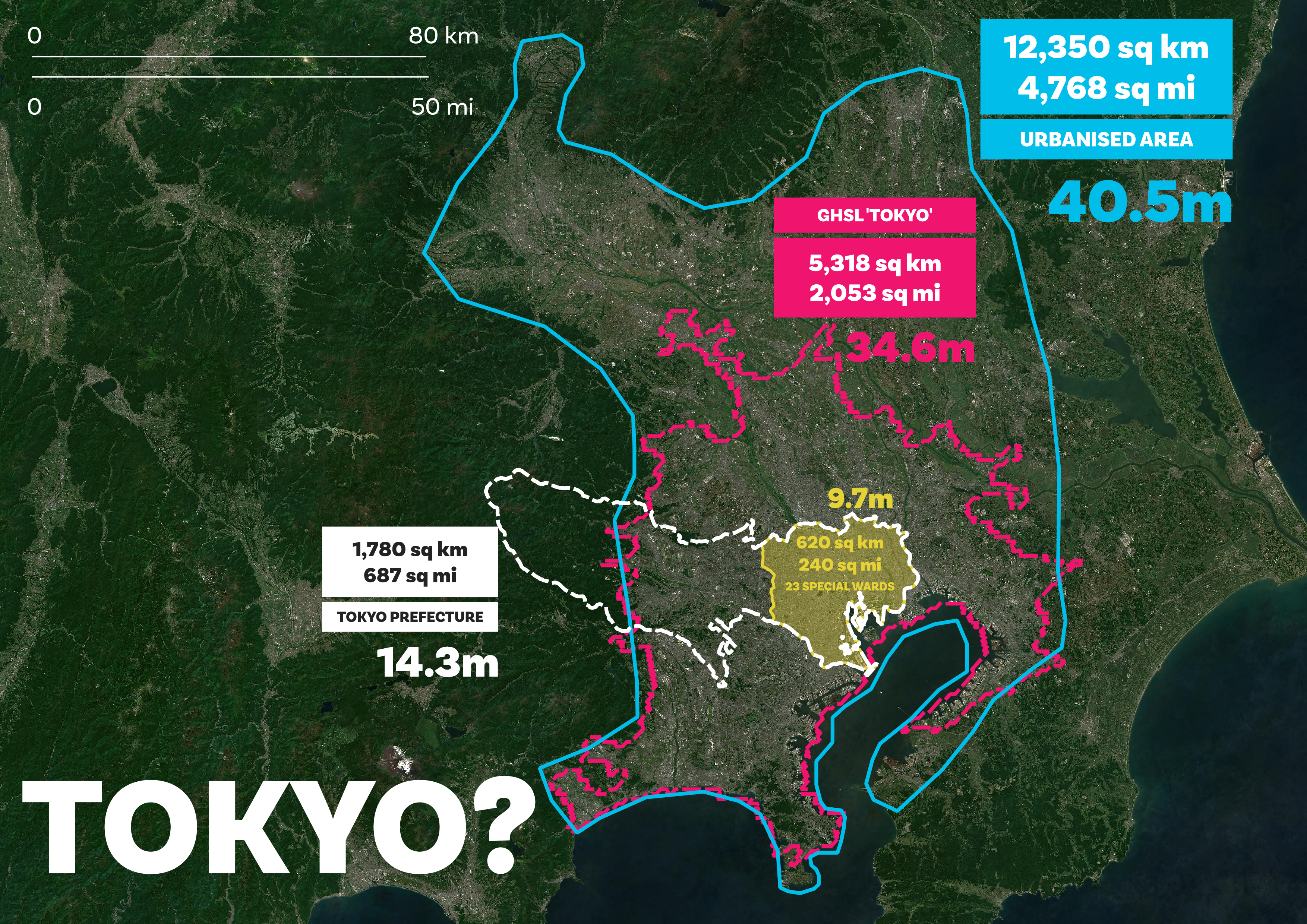
Nonetheless, this version of 'Tokyo' does exist and it is a real thing and within this space your local government authority is the Tokyo Metropolitan Government and the Governor is (at the time of writing) is Yuriko Koike. But really this section is more about the size of 'Tokyo' in areal units, so let's get to that. Note in the map below how the only 'Tokyo' that includes a big chunk of countryside is the official Tokyo Metropolitan Government area - i.e. the actual Tokyo prefecture itself).
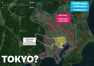
- The 23 Special Wards cover an area of approximately 620 sq km / 240 sq mi.
- The Tokyo Metropolitan Government area (TMG, also known as Tokyo prefecture) covers an area of approximately 1,780 sq km / 687 sq mi- note that this refers to the area shown in the map below and does not include the islands that are part of the prefecture.
- The Tokyo commuter zone (i.e. the European Commission's GHSL boundary for 'Tokyo') covers 5,318 sq km / 2,053 sq mi.
- The area I defined - very roughly - as being the continous urban fabric surrounding Tokyo covers an area of 12,350 sq km / 4,768 sq mi. Note that my drawn area is not the same as the Kanto region. The Kanto region covers an area of 32,423 sq km / 12,518 sq mi and has a population of 42 million - so if we used the Kanto region as a proxy for 'Greater Tokyo' or 'the wider Tokyo Metropolitan area' then it would be adding in loads of almost empty countryside and that wouldn't make much sense.
 |
| Look at the urban fabric vs the boundaries here |
But does any of this even help us? Do you know how big or how small 620 sq km or 240 square miles even is? Well done if you do, but I don't, so I need to have some way to compare it to something I know if I'm going to understand it. More on that below in relation to London but here are a few comparisons.
- New York City (i.e. the five Boroughs) covers 300 square miles (about 780 sq km). So, the 23 Special Wards (population just under 10 million) covers an area about 80% of the size of NYC but has more than a million extra people.
- Greater London (i.e. the 32 Boroughs plus the City of London) covers an area of about 1,570 sq km (606 sq mi) - that's about 90% of the size of the Tokyo Metropolitan Government prefecture area - and recall that the Tokyo prefecture area contains 14 million compared to about 9 million in Greater London. Add Scotland's population (about 5.4 million) to Greater London and you get roughly the same population as Tokyo prefecture.
- Delaware is about the same size is the the European Commission's GHSL boundary for 'Tokyo'. Delaware covers 1,982 sq mi or 5,133 sq km and has a population of just over 1 million as of 2021. By comparison, the GHSL 'Tokyo' area has almost 35 million people. Take Delaware, add in the population of Texas (almost 30 million as of 2020) and you're still not at metro Tokyo density levels. To get to that you'd also have to add Arkansas' 3 million residents. This would of course be a fascinating sociological experiment but in practice it may not work very well.
- Île-de-France (the the Région Parisienne / the Paris Region) covers an area of 12,012 sq km (4,368 sq mi) and has a population of just under 13 million people - compared to the 40 million in my self-drawn 'Tokyo continous urban area' shape. This is also roughly the same area as Los Angeles County (including the water bits), which is home to just under 10 million people.
So you're saying that Delaware has the same area (roughly) as the urbanised Tokyo commuter zone but 34 million fewer people? Yes, that's about right. and the continous urban fabric of Tokyo's extended metropolitan area has more people than California in an area not much bigger than Los Angeles County? Also yes.
Okay, but what's this in Londons? How many Londons is this? Can we make sense of this by using Londons? Perhaps, so do read on.
 |
| Note how the white boundary goes beyond the urban area |
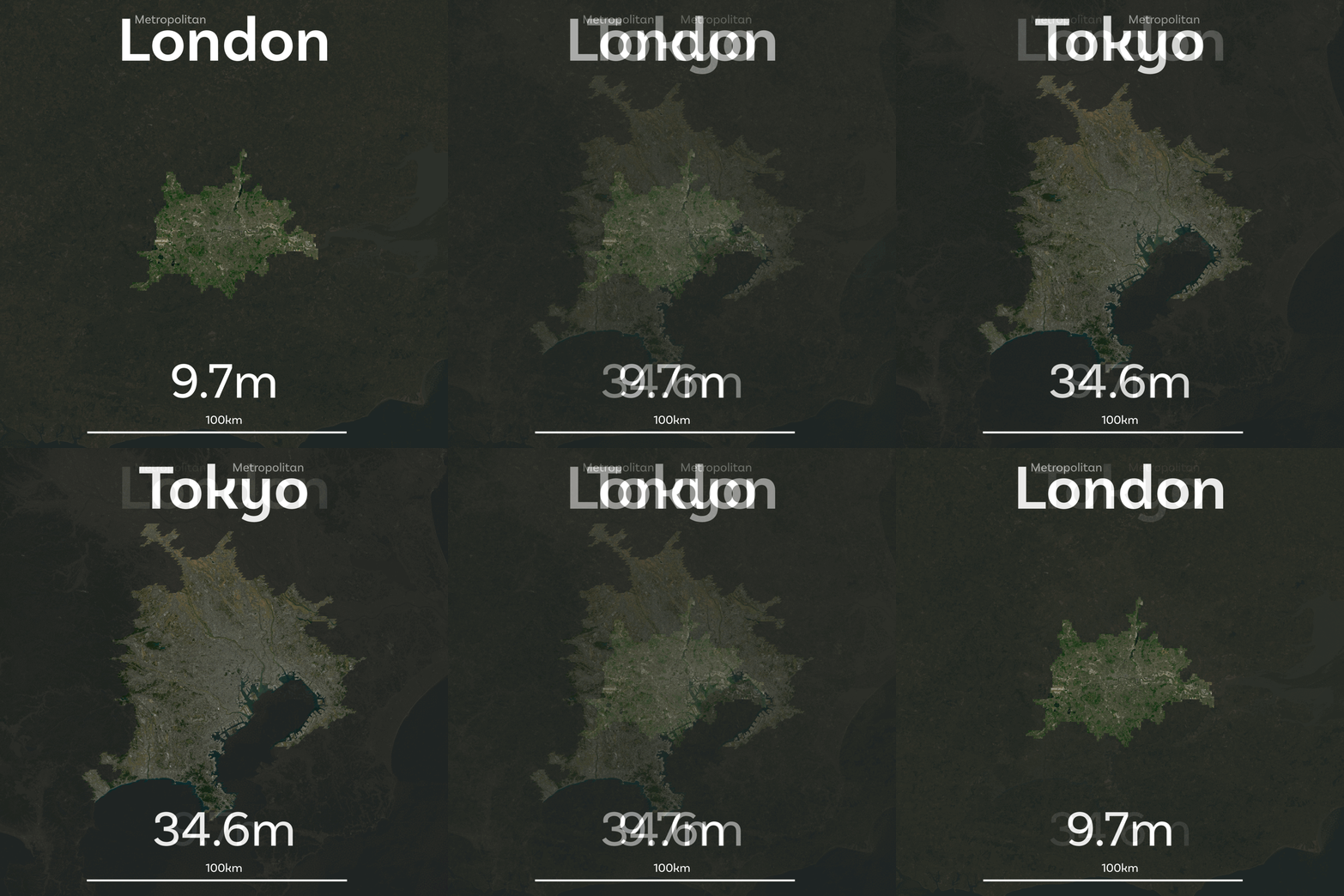
Tokyos as Londons
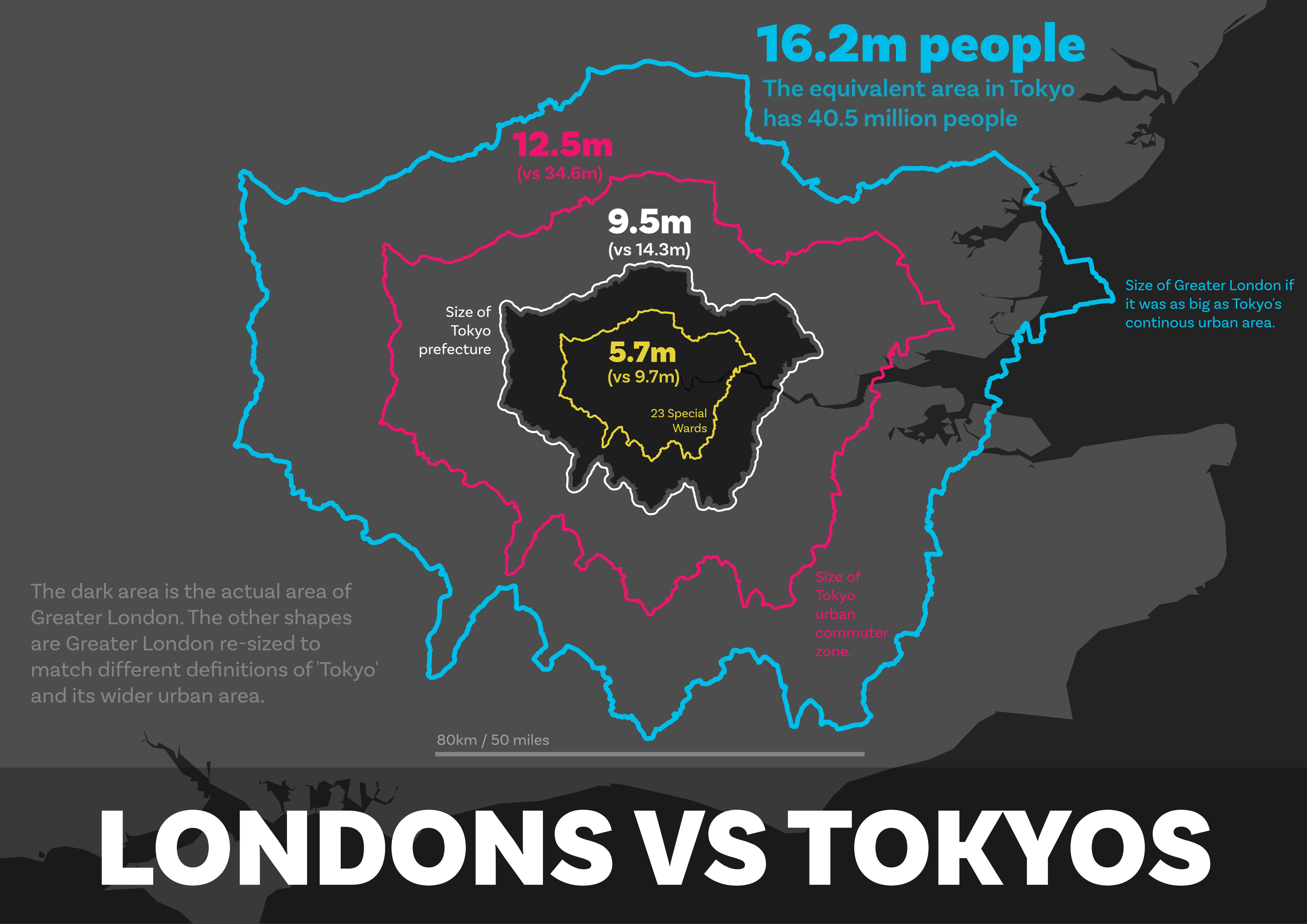
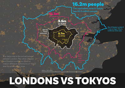
Because I live in the UK, about 175 miles from London, and because London is the only big city I know fairly well, I'm going to use Londons to make more sense of the Tokyos above. What I did was take the shape of Greater London and then resize it to match the four different definitions of 'Tokyo' above. To be clear, though, when I say 'London' I am using it as shorthand for Greater London - that is, the 32 Boroughs plus the City of London that have a combined population of 9 million people.
Once I had created four new Londons, re-sized to match the four different Tokyos above, I then calculated the population of these new Tokyo-based Londons using the same WorldPop 2020 data as I used for Tokyo. This gave me the following results.
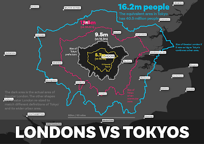
- The area of London re-sized to match the area covered by Tokyo's 23 Special wards has 5.7 million people (vs 9.7 million in Tokyo's 23 Special Wards).
- London re-sized to match the Tokyo Metropolitan Government area (i.e. the prefecture) has 9.5 million people in it. It's only just a bit bigger than Greater London itself. The real Tokyo has 14.3 million people in the same area.
- London re-sized to match Tokyo's GHSL-based wider urban area has 12.5 million people in it, compared to almost 35 million in the real Tokyo urban area.
- London re-sized to match my wider 'urban fabric' definition of Greater Tokyo has 16.2 million people in it, compared to 40.5 million in the actual 'urban fabric' of the wider Tokyo area.
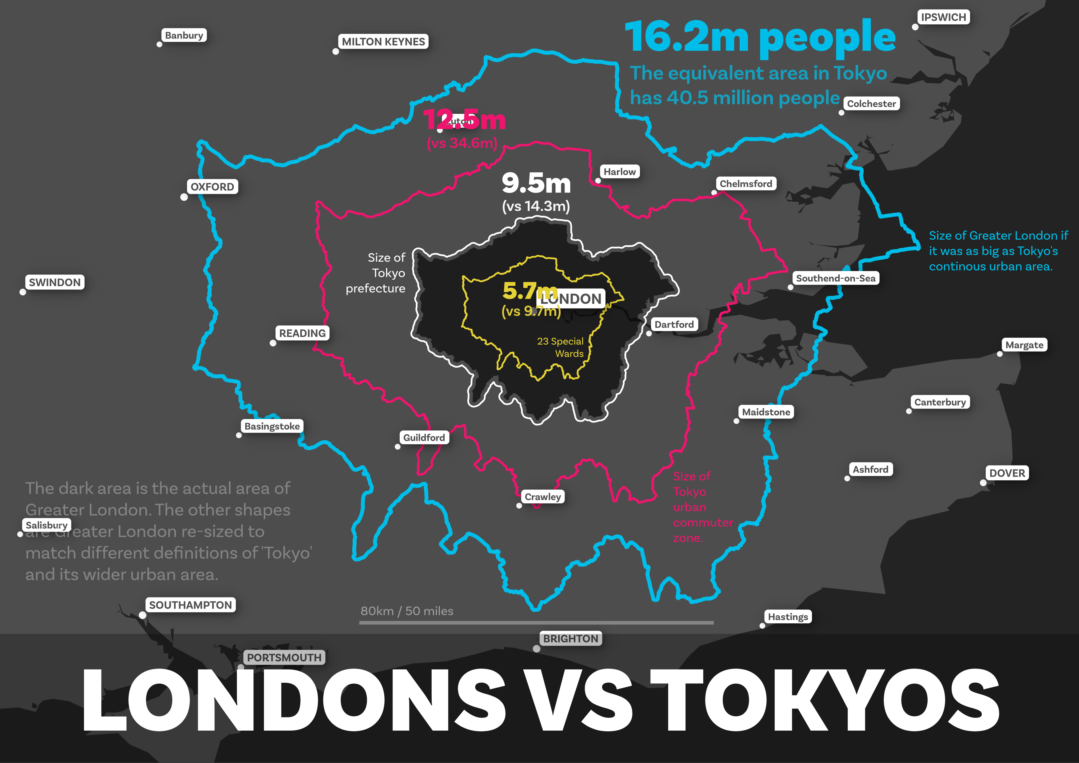
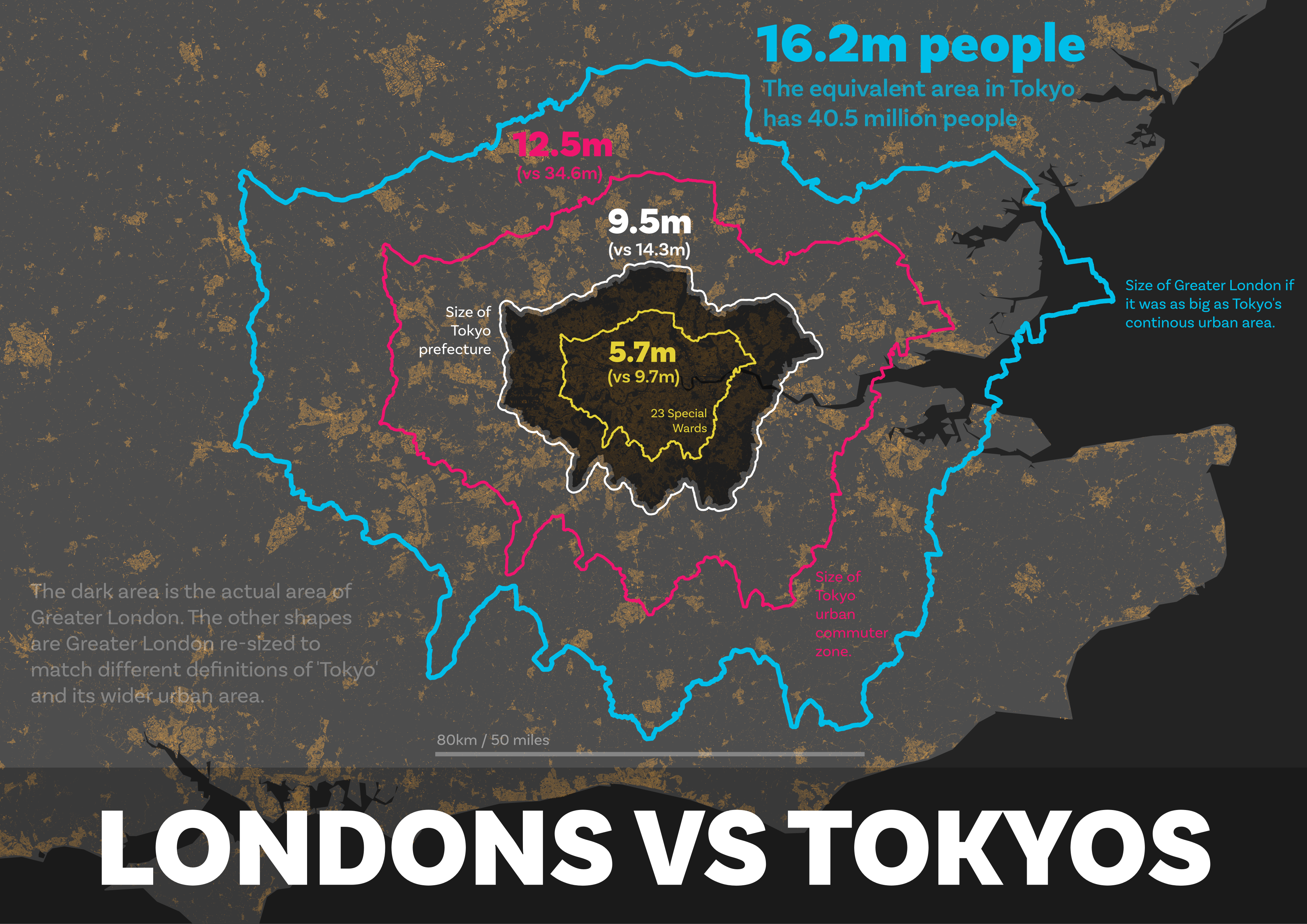
You can see all this on the maps below. The first one is just the re-sized Londons, the next one has labels too and the one after that shows the urban fabric to you can get a sense of the underlying settlement pattern in the south east of England.
 |
| Greater London re-sized to match different Tokyos |
 |
| With labels, for a bit of context (a bit messy, sorry) |
 |
| Same as the first one, but with building footprints added |
I realise this can all get a bit confusing at times but just remember that the coloured 'London' shapes above have been re-sized to match the areas covered by the four different definitions of 'Tokyo' used above. Now, although I'm not thinking about population density here, the last map in particular makes me think of it, not least because I've seen people say that London is more densely populated than Tokyo. Well, as you've seen above, that really depends upon what you mean by Tokyo, so let's talk a little bit about density.
Population density
We've seen above that the Tokyo prefecture boundary goes way into the non-urban part of the administrative area and that the population in this particular Tokyo is packed tightly together. This is just another example of where using an administrative boundary to derive population density data makes no sense, or at least not much sense to me. I have written on this in the past, in relation to what I call 'lived density'. The basic idea in that piece was that population density metrics often make no sense at all if we are thinking about it in relation to what people actually experience in their day-to-day lives.
If we go to the Tokyo prefecture page on Wikipedia, we will find the following information.
- Area: 2,194 sq km (847 sq mi)
- Population: 14.0 million
- Density: 6,363 people per sq km / 16,480 per sq mi
But of course the population distribution in Tokyo prefecture is very much not a good reflection of this.
The arithmetic mean here is a bad measure because:
a) it is not a good representation of the reality on the ground - i.e. the mean as a model is a bad fit here; and
b) the area figure includes loads of rural areas and offshore islands that are also very much not part of metropolitan Tokyo.
Yes, the maths are correct but the number is not very useful in my opinion. The density in the 23 Special Wards would be a much closer representation of lived experience for most Tokyo residents.
- 23 Special Wards area: 620 sq km / 240 sq mi
- 23 Special Wards population: 9.7 million
- 23 Special Wards population density: about over 15,000 per sq km / 39,000 per sq mi
Greater London's population density is about 5,666 per sq km or 14,670 per sq mi - so not as dense at all as the 23 Special Wards, or even as dense as the over-bounded Tokyo prefecture. I'm not sure of the original source of the claim that London has twice the population density of Tokyo but I saw it in
this twitter thread and it stood out to me. I suppose it's all a matter of getting your Londons and your Tokyos defined in different ways though.
Hmm, how where was I? Oh yes, the actual size of the official 'Tokyo' and by that I mean the prefecture, i.e. the
Tokyo Metropolitan Government area.
The official Tokyo is HUGE!
The version of 'Tokyo' that gets us to 35 million people includes the following places: Tokyo; Yokohama; Kawasaki; Saitama; Chiba; Setagaya; Nerima; Ota; Sagamihara; Edogawa; Adachi; Funabashi; Itabashi; Kawaguchi; Hachiōji; Suginami; Koto; Ichikawa; Katsushika; Machida; Fujisawa; Kashiwa; Shinagawa; Kita; Koshigaya; Tokorozawa; Kawagoe; and Nak. That's a big place, but of course it's not a single place, even if it is basically one huge urbanised area with no major gaps in between.
But there is another Tokyo that is MUCH bigger than that Tokyo (kind of), though on the face of it you'd think it was much smaller. You can read about this on the Tokyo prefecture Wikipedia page in the 'Geography and government' section but the basic facts are as follows.
- It contains 62 different municipalities: 23 Special Wards, 26 cities, 5 towns, and 8 villages.
- The most populous ward is Setagaya Ward (one of the 23), with a population of about 910,000.
- It contains three villages with populations under 500
- It contains islands hundreds of miles away from the Japanese mainland.
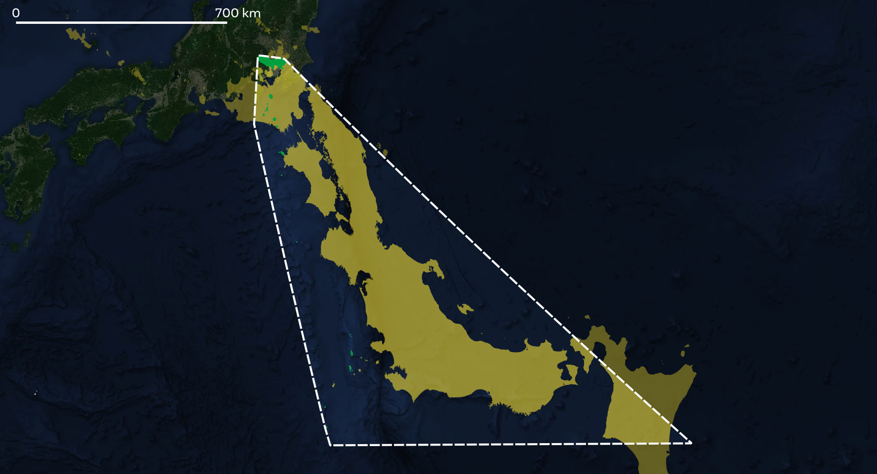
Here's a map showing the convex hull of the Tokyo prefecture area, like the one at the beginning of this piece. The dotted line encloses all mainland and island areas that is officially, from an administrative point of view, 'Tokyo' - i.e. the prefecture version of Tokyo that has just over 14 million people. The sea is of course not part of Tokyo.
 |
| Includes the Izu Islands and the Ogasawara Islands |
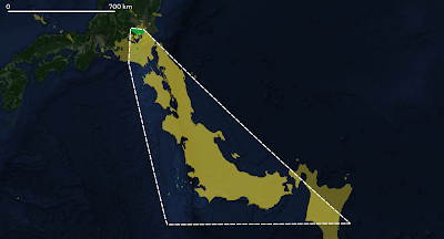 |
| Rotate Japan and put it inside Tokyo's convex hull |
What's the island at the far south east corner of the map above? Why, that would be Minamitorishima, the island shaped like a shark's tooth (see below).
Minami-Tori-shima
Here's a photo of Minamitorishima taken in 1987 by a US Air Force Sergeant. Also known as Marcus Island, it is 1,848 km / 1,148 miles southeast of Tokyo and covers an area of about 1 square mile - about the same size as the City of London - and the closest island to it is more than 1,000 km away. It is, as you might expect, the most easterly point of 'Tokyo' and nobody lives there. This makes it easier to calculate the population density. Unsurprisingly, there is no Google Street View imagery here, although the satellite image is quite good. It doesn't look like the best place to be when the weather is bad though.
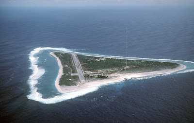 |
| Taken by Chief Master Sergeant Don Sutherland, U.S. Air Force |
Conclusions
1. Tokyo is a big city, however we define it. But to say that Tokyo has 10 million or 14 million people would be a big under-representation of the true size and scale of the continous urban area of which Tokyo is the biggest settlement.
2. Not all Tokyos are the same but only one Tokyo is the 'official' Tokyo - i.e. the prefecture.
3. Some Tokyos are much more than just Tokyo. That is, any sensible definition of the functional scale and size of Tokyo is much bigger than the Tokyo Metropolitan Government area defined by the prefecture boundary.
4. One Tokyo (the 23 Special Wards) is much smaller than the other Tokyos.
5. The urban area of 'Tokyo' or 'Greater Tokyo' or 'Tokyo Megalopolis' is very often considered to be the largest urban area on earth - and as we have seen here the population can be calculated at between 35 and 40 million people - that's about the same population as Canada or California. Note that the Global Human Settlement Layer (which my 34.6m Tokyo population comes from) has Guangzhou and Jakarta urban areas ahead of Tokyo in terms of population, at 40 and 36 million people respectively.
6. Tokyo includes loads of islands far away from what we think of as Tokyo. If we draw a shape around it (i.e. a convex hull) then that area is far bigger than Japan itself. Yes, Japan fits into Tokyo's convex hull (if we chop it up a bit). Tell your friends.
7. The population of Tokyo is 9.7 million, 14 million, 35 million or 40 million depending upon what you mean by 'Tokyo'. But if we're talking about the population of the large, continuous urban area then I'd say that 'Tokyo' has between 35 million people and 40 million people.
8. Has anyone done a list of countries where you can see the nation's highest peak from the capital city? You can see Mount Fuji from Tokyo, about 100km / 62 miles away. This must be my next challenge.
Here's a parting gif for you - the GHSL area of Tokyo compared to the GHSL London area - they are defined the same way so we are comparing like-with-like here.