Showing posts with label geography. Show all posts

Thursday, 2 February 2023

QGIS at 21

This post contains a few GIS related thoughts, offered in the spirit of sharing that's at the core of open source. A bit like QGIS itself, I hope. My goal is not to convince anyone that they should be using QGIS but rather to convince potential GIS users that QGIS is now, at 21 years old, a mature, robust, powerful product used by millions of users and thousands of major corporations and universities worldwide - as well as lots of small companies like my own. 

Like most open source software, it is free to download but for me that is very far down the list of reasons why I use it (see my list of 'Reasons I use QGIS' at the bottom of the page). Also, on the topic of free, I'm not going to explain how nothing is really 'free' because as we know everything has some kind of cost and with open source it is often in relation to training, maintenance and things like adoption friction, but I'm not going to talk about that here.

On the topic of 'which GIS software is best?' I've written before. I like to leave that to the end user, and there isn't one answer that is always correct. The answer will vary from person to person and from organisation to organisation, but in the past few years I'd say my experience working with lots of different people and organisations reflects what we see in these Google Trends charts. below. I first used GIS software as an undergraduate in the UK, using MapInfo. Then I got into ArcView in the United States as I continued my studies, and then continued with ArcGIS when I moved back to the UK. When I set up a MSc in Applied GIS in 2013/4 I taught using both ArcGIS and QGIS and now I only use QGIS. I think the QGIS line on the chart is a reflection of the maturity of the QGIS project at 21 - it's fully grown up!

This matches my own experience quite well

The situation is quite different in the US compared to the rest of the world, at least in terms of the Google Trends data (this also mirrors my own experience from working in this area over the past 15+ years). I've worked with lots of Google Trends data over the past decade - on a variety of news stories - and it's often a very close match with reality even if it's not perfect. 

But is this US chart a bad thing? Well, no. It's just different and it reflects different contexts and organisational structures and things like that. But it does also mean that perhaps there is an opportunity for lots of people to take a look at QGIS with fresh eyes, and that's never a bad thing. I think many people will be very pleasantly surprised. But really here I'd say if you're using the software you want to, it does what you want it to, and you're happy with it - that's all you need. I have noticed that some of my US colleagues and collaborators in large governmental organisations are very much embedded in the ESRI ecosystem, but equally I have worked with a lot of QGIS-only users across the private sector and academia in the US. There is plenty of room for a wide variety of GIS software, and indeed none at all. 


This seems to match my experience, perhaps others can comment

When I look at the desktop GIS landscape in the UK and nearby countries, it does feel very much like over the past decade - and past five years in particular - that things have switched more in the direction of QGIS. Again, the data here matches what I'm seeing on the ground and indeed what I'm seeing when I'm delivering training and advice to people across hundreds of organisation over the past decade, including well over 100 councils in England. But that's another story! Anyway, I really loved MapInfo when I first used it as an undergraduate so there's a bit of sadness here seeing its relative demise. I also very much enjoyed using the old ArcView (goodbye, old friend) and ArcGIS.


Early adopter?

Big recent QGIS jump

These are trends, not hard facts, but still useful info

Okay, so QGIS is on the rise, MapInfo has been on the wane for a while - if we go by the charts above and the experience of people on the ground, like me. And ESRI products have been changing and developing during this period and it seems like QGIS has filled a gap in the market. 

So, from a humble software project begun by Gary Sherman in 2002 to the GIS software of choice for newsrooms, corporations and governments worldwide, QGIS has truly come of age.

See below for a list of things I can't do in QGIS and then for a list of reasons I use QGIS.

QGIS is not 'free' in the sense that it costs money to produce, maintain and develop, of course, so that's why I encourage anyone who benefits from it to either contribute to the project directly or via their organisation. My own company (Automatic Knowledge) is a Sustaining Member of QGIS and we give money each year to the QGIS project, and I also try to contribute to the community in other ways - e.g. free tutorials, helping people directly with one-to-ones, and suchlike. Thousands of others do this too and that's part of why it's great software.


Exhaustive list of things I want to do in QGIS but can't

  •  
  •  
  •  
  •  
  •  
  •  
  •  
  •  
  •  
  •  
  •  
  •  
  •  


Reasons I use QGIS

1. Because it's powerful

2. Because it's fast: to download, install and use

3. Because it's cross-platform (I use it mainly on Windows but also on MacOS and Linux)

4. Because it's easy to get the job done with QGIS

5. Because it's regularly updated (okay, sometimes it feels like it's too regularly updated)

6. Because of all the great plugins that add extra functionality

7. Because when things go wrong a fix is never far away 

8. Because the documentation is great (and so many contributors help solve problems)

9. Because you can make stunning maps with QGIS

10. Because it can handle any data format I throw at it


...

99. Because the logo is nice

100. Because it's free and open source

Monday, 30 May 2022

Let's play Urble!

Today I'm letting Urble out into the wild. It's a little geography game in which a new city (displayed as a small square) appears every 5 seconds until there are 10 dots on screen (example below). The aim of Urble is to guess the country before the country shape appears - 50 seconds into the video. You can pause the video after the 10th dot (at 45 seconds) if you need more time. If you turn the sound on, you'll notice that when the 10th city is added it makes a different sound. I'm releasing this in video format, just for fun, so people can play it how they want to, and share them across platforms - I have lots of them! Some you might find easy, others no so much. As you might be able to tell, Wordle is part of the inspiration here, hence the colours. You'll see more on my Twitter, where I'll post each Urble using the hashtag #urble. I may give clues for some of the more difficult Urbles.

Are you a map genius?


This is what the end of an Urble looks like

As well as posting these on my Twitter (@undertheraedar) I'll also put each one in The Urble Archive too. Each Urble is numbered, so it's easier to keep track of them, and of course I won't keep you guessing forever - the answer is always revealed 5 seconds before the end of each video. They're all 60 seconds long, so you can get on with the rest of your day, or pause the Urble on 10 dots until you figure it out.

Here's Urble 1 - always best viewed with sound on (there's no music, just a few sound effects). There's also a gif version of each Urble, which I will also post in the archive - you'll always find the original, high-quality Urbles there. Can you guess which country this first one is?


You can see the full size, high-resolution video on The Urble Archive, where I'll put all Urbles after I share them on Twitter.


Urble - why?

Well, I make maps and look at geographic data a lot, and I'd always thought about doing some kind of fun game in a more formalised way. From time to time I've posted geography guessing games on my Twitter but until recently hadn't ever made something like Urble - but now I have. I've been playing this at home so far with my two sons and my wife, and since they like it I'm releasing it into the world now. In fact, my 9 year old son Isaac actually made a few of them himself, with me at his side giving instructions as he put them together in QGIS and Camtasia.

I've said more about Urble in the About file on The Urble Archive page. If you have a question, it may be answered below. Otherwise, check the About file.

The answer to the main 'why?' question here is that it's for fun, but also hopefully educational.


Questions you may have about Urble

What tools did you use to make Urble? I used QGIS for all the map stuff and Camtasia to create the mp4 and gif files. If you want to learn how to use QGIS, check out my Map Academy course on Udemy.

Surely you'll run out of countries pretty quickly? Well, this is sort of true but I can easily re-use countries by selecting a different configuration of cities, in a different order. Watch out for this as new Urbles are released. Maybe I'll repeat countries. Be mindful of this.

What about a country with more than one official capital? Good question. There aren't many of these, but where I do have an Urble for a country with more than one capital, I will only show one of them and it will still be the third city to appear, always as a green square. I will not show other capitals in the same Urble.

How do you decide which cities to show? The capital city is always included, as well as nine other cities that are - usually - among the top 30 by population in a country. In general, I try to make sure the cities give some hint to the shape of the country, but at times you'll need to wait until the 8th or 9th city to see it. Occasionally I add in other cities that help me show the shape of a country, even if they are smaller settlements. But this is the exception.

Why don't you add the city names at the end? Because part of Urble is guessing the cities as well as the countries. At the end you can try to figure it out, if you want to. I also want Urble to be as accessible as possible for an international audience, and adding more text (using place names written in English) wouldn't help with that. 

How do I win? I consider a true 'win' to be any Urble where you figure out what the country is before the country shape appears - i.e. before 50 seconds are up. But if you get it after pausing the video before the country shape appears, you can still count yourself a winner. In fact, if you don't get the country at all but you learn something new, then maybe you can count that as a kind of win as well. If you get the country before the capital appears, you are a true genius. If you get it before the fifth city appears, I salute you!

Can I steal Urble? Please don't, but I don't mind if people share Urbles, with a link back to my Twitter, The Urble Archive, or this page. 

Why didn't you make this into a website? I was going to, but in the end I decided it would be too much bother and actually I like the video-only approach as it's easier to share across different platforms and I don't have to mess around with code that I barely understand. I quite like the fact that you have 60 seconds to guess and also that you can just pause if you need more time.

Surely some countries will be impossible to guess? Well, I suppose that all depends where you're from and what you know. But even so, it is undoubtedly true that some countries are much more well known than others by the majority of people. But I see this as part of the fun - as an Urble unfolds, your brain is working overtime trying to figure out the country shape, country size, configuration of cities, possible patterns (e.g. coastal? river? borders?) and you're against the clock. If you're from Mongolia then you'll probably find it easy to guess Mongolia, but if you know nothing about Mongolia then you'll find it very difficult! But that's okay because if you do an Urble for Mongolia you'll learn something new.

Hasn't someone done this before? I wouldn't be surprised but when I went looking I couldn't find anything that looked like Urble. Lots of map quizzes and geography games online, but I didn't see anything Urble-esque. Obviously we have things like Worldle but that's a different kind of geography game where you guess the country from one big shape. This is something I thought about back in January 2022 when I made a few silly maps for Twitter (one of which is shown below).

This is not Urble


Happy Urbling!


Monday, 31 January 2022

Welcome to Map Academy!

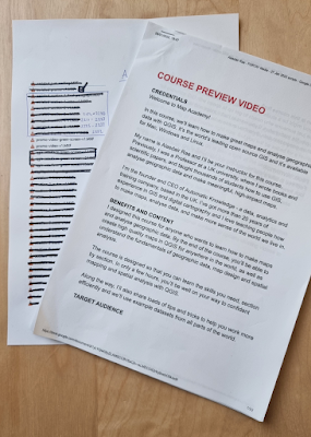
I've launched my second Udemy course and I'm so excited about it that I'm writing about it here! It's got nearly 150 videos in it, is over 15 hours long, and it took me about 10 months to complete while I was working on other stuff as well. See below for the promo video, but here's the direct link to Map Academy: Get mapping quickly, with QGIS on Udemy. It's a full introduction to mapping - and some spatial analysis - with QGIS and is aimed at people with no prior QGIS experience, those looking to get up to speed with QGIS, and people looking to make the switch to QGIS from other software. It's normally heavily discounted on Udemy (that's how their pricing works) and if I end up making any money I'll give back more to the QGIS project (I'm already a Small Member category Sustaining Member but I want to move up and give back more).


What is Map Academy?

Map Academy is an online 'learn QGIS, mapping and a bit of spatial analysis' course that you sign up to, and complete yourself online, with a Q&A section where you can ask me questions if you need to. I already offer training (online and in person) through Automatic Knowledge, and I've taught thousands of people this way, so this is the next stage of my training offer. It lets people learn at their own pace, in their own time zone, using example data from around the world. The course is organised into the following sections:

  • Introduction
  • Know your way around QGIS
  • Let's make a map
  • Data handling
  • Locator maps
  • 'Heat maps'
  • Election maps
  • Density maps
  • Fun map stuff
  • Vector tools in QGIS
  • Working with raster data
  • QGIS Plugins
  • Tips and tricks
  • Recap


I use data from lots of different countries, including India, Indonesia, New Zealand, the UK, the US, Australia, Belgium, Turkey, Nigeria - as well as datasets that cover the whole world. I've made quite a few of the videos free to view, so when you click on the course preview video, you should be able to see them by scrolling down the page.


Format

Each section contains an intro video, with me talking to the camera, and then screen recordings with voiceovers where I demonstrate lots of different QGIS skills and tools. There's also a 'Fun map stuff' section, because I think it's important to have fun while learning. There are also a couple of videos where I'm standing inside the QGIS interface giving you a tour of what's what!

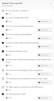
The Fun map stuff section

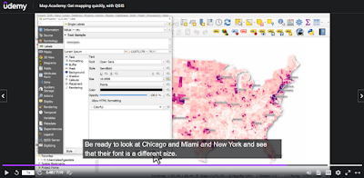
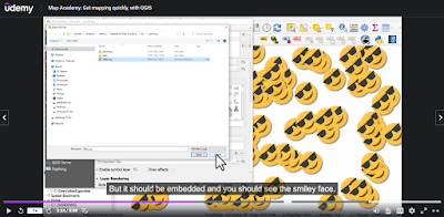
I've designed the course around four key themes - orientation, data handling, analysis, and design - or ODAD, as I like to call it. The idea is that after doing the first four sections, you can dip in and out as you choose, and you don't have to complete it sequentially - but it's good for that too. To give you an idea of what it looks like, here are a few screenshots.

A bit of spatial analysis stuff

A bit of US county mapping

Explaining the basics

Showing a few tricks, with fun stuff


There is a lot in there, but of course it's impossible to cover everything in one course and my focus is mostly on vector data - but there is a separate section on raster data that includes some of the analysis tools too.


A few behind-the-scenes images

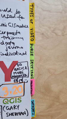
I planned, designed and produced the course over a period of about 10 months, so here is a little peek at some of the background to what went into it. Just to prove I actually planned it all out and put a lot of effort into it!

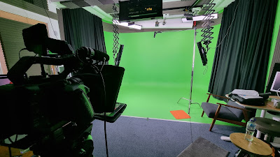
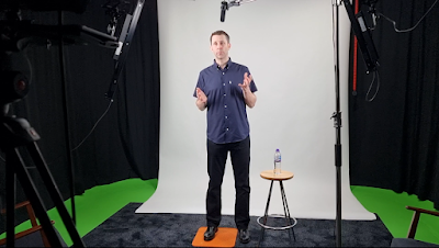
Yes, I did record the intros in a studio!

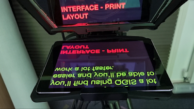
Autocue - I can't remember words now, can I?

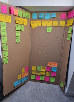
My slightly messy planning board

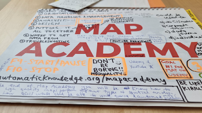
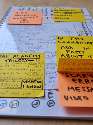
My Map Academy planning booklet - DON'T BE BORING!!

I may do more, we'll see

Me, in the studio in Jan 2022

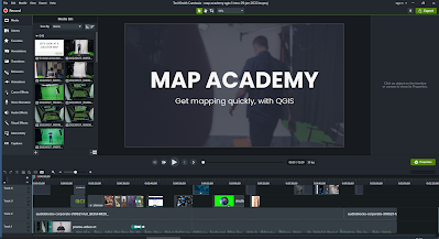
Me, editing the promo vid in Camtasia

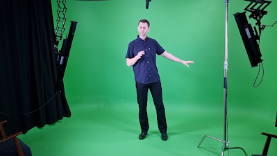
Me, doing some green screen stuff for a couple of vids

Script stuff and editing notes

Planning different sections


Well then, that's about all I have to say for now - please do check it out if you want to get up to speed with mapping and spatial analysis in QGIS.

Sunday, 11 October 2020

Hey, what's an MSOA?

This is a post about the English and Welsh statistical geography known as the MSOA. Yes, really. 

You might have seen it in the news recently, what with all the data and maps that are flying around at the moment. Not everyone knows exactly what an MSOA is, or what an MSOA looks like on the ground, so here I am to save the day, right? Not really, but I think there is some value in us understanding a bit better the geographical units we use to report statistics - so here goes. I'm going to focus on England here because most MSOA stats and maps I see at the moment relate to England.

MSOAs are very useful


If you don't want to scroll any further, here are the key stats for MSOAs at present:

  • There are 7,201 of them in England (6,791) and Wales (410) and they are used to report all kinds of data (including population, Covid-19 numbers and so much more).
  • English MSOAs have an average (mean) area of 19 sq km. BUT there are some giant ones so the mean is a bad measure here - the median size of an MSOA in England is 3.04 sq km.
  • The smallest MSOA is in Hammersmith and Fulham in London and covers an area of 0.295 sq km (they all have codes, and this one is E02000378).
  • The biggest one is in Northumberland (E02005727) and it is big - BIG - it covers 1,129 sq km. That's about 72% of the size of Greater London and it could fit about 800 of the smallest MSOAs in it.
  • But don't let the big Northumberland one fool you, it's a massive outlier. A typical MSOA might be somewhere like E02001562 in Doncaster, at 3.04 sq km (I've plonked it on top of London in the map below).
  • Population of MSOAs? Well, using the latest ONS mid-year population estimates, released 9 Sept 2020, the average (mean) population of an MSOA in England was 8,288. The median was 7,985. The max was 26,513 (E09000025 in Newham) and the minimum was 2,224 (E06000053, Isles of Scilly - a single MSOA). Next smallest population is 4,854 in Stoke-on-Trent (E06000021). For the population of MSOAs in England the standard deviation was 1,991.
  • We can easily work out a population density figure for MSOAs, although when using population per sq km we need to remember that 574 (just over 8%) of MSOAs in England cover an area of less than a single square kilometre. 417 of these (73%) are in Greater London.
  • Densities max out at over 28,000 people per sq km (in one Westminster MSOA), but like I said many of the most dense MSOAs cover areas of less than 1 sq km.
One of them is REALLY big

Okay, let's get into the really exciting stuff now. MSOA stands for 'middle layer super output area' but we always abbreviate it to MSOA. I have no idea why the L is discriminated against here but that's just the convention and the L didn't make the cut. I don't make the ruLes. Here is a simple map of some MSOAs in and about London.

They can vary in size, a lot


As you can see above, MSOAs can vary quite a lot in size. This is because they were intended to have roughly equal amounts of people. Because of this, in denser areas MSOAs are smaller and in suburban and rural areas they cover much larger areas. They have a smaller sibling (the LSOA) and they fit neatly within local authority boundaries, as you can see below.

They fit neatly within bigger areas!


Let's take a closer look now to see what MSOAs look like on the ground. The map below shows MSOAs, with building footprints, looking at central Newcastle and Gateshead. The numbers show the population for each MSOA (top) with the area in sq km below that. Below that, you can see one for Brighton and another showing Cheltenham, Gloucester and some of the Cotswolds - just to give an idea of MSOA size in rural locations. 

They are not de facto 'neighbourhoods' - as in, they do not necessarily/normally/always align with what we might think of as our own neighbourhood areas - but they can offer a useful approximation for a neighbourhood geography, of sorts. However, I'd always steer clear of calling them 'neighbourhoods' and instead just call them 'small areas'. That's not very sexy but it's probably safer.

Newcastle and a bit of Gateshead
Some MSOAs in Brighton

Cheltenham, Gloucester + bit of Cotswolds

MSOAs don't have warm, cuddly names like wards do - instead we have codes such as 'E0200594' and 'Oxford 008'. But, the immensely clever data folk at the House of Commons Library recently completed a project where they solicited suggestions for MSOA names and they have also published an interactive map of them where you can go and see yours - if you live in one.

Take a look at this cool map


Right, I think that's all I've got to say about that.

Friday, 16 December 2016

The 8 English Regions of a Federal UK

The political geography of England can be a contentious topic, particularly when it comes to the craft of drawing boundaries on maps. In fact, people can get quite agitated about it, and probably with good reason. But it’s too important to ignore, particularly at a time when the very nature of the UK as a political entity is being questioned and challenged. In this short essay I outline what I think new regions of a Federal England could look like, based on a combination of cultural, historic, administrative, economic and geographic factors. The boundaries you see below are my interpretation of ideas sent to me by Philip Brown and Nathan Pearce, two former students of the then Department of Town and Regional Planning in Sheffield (since re-named) who now work in professional planning practice. This doesn’t mean they are right, but they do at least have some grounding in the subject, and an unhealthy interest in regional maps and planning. I do too, so I have taken their note and turned it into a series of maps. The final map is shown below, to kick things off. Read the full text to see how I got there. You can see high resolution images of all maps here. You should also be able to right-click maps to open them in larger format in a new browser tab.

Read the rest of the post for the full story

Let’s put the names to one side for a minute because I'll come back to that later. Let’s forget too the big differences in size you can see in the first map. There is some logic there too, I promise. The question of what the English regions should look like is not one with a single correct answer, but I think it is possible to arrive at some kind of best fit compromise where everyone is happy. Okay, that was a lie. But I do think we can draw lines that people can live with and that make sense and work well for governing, planning and economic activity that also reflect historic and cultural factors - and without the need to re-draw local authority boundaries once again. 

Previous regional boundaries have made some sense, but I feel they have never been quite right, for a number of reasons. For example, when I did my PhD it was about the North West region of England, which at the time had recently inherited Cumbria from the old ‘North’ region. Westmorlanders may have been aghast, but it happened anyway so I think we need to revisit a bit of the history of all this before going any further, lest we repeat the mistakes of the past.


Background
I recently co-authored a paper on US megaregions with Garrett Nelson, and after seeing the level of interest it generated, it struck me once again just how much people care about this kind of thing. In England, I think people may care even more, particularly because there has never really been a suitable regional structure - and because pre-existing geographies are layered through the centuries and embedded in our minds. In the context of devolution for other parts of the UK, I can understand why there is unease in parts of England - particularly when there is the perception of ‘London vs the rest’ - though I won’t dwell on that here. What I will say is that the idea of the English regions as ‘the dog that never barked’ by Christopher Harvie (1991), is one that resonates strongly today. Some kind of federal arrangment makes sense, but the question of how to make it work is a vexed one.

I saw in the news recently the leader of the Scottish Labour Party raise the question of a future Federal England within a UK and giving more power to the English Regions. It’s a sentiment echoed elsewhere and in the context of the post-Brexit/Indyref 2 question of what the UK will look like in the future it’s a very important one. On the whole, I’m in favour of this kind of federal arrangment, if only we can just figure out what shape the regions should take, how such a system would function and who would decide how it all works. This structure could provide a useful political and economic counterbalance to London, going beyond the current ‘powerhouse’ or 'engine' style plans for the North and Midlands in England and making permanent a decentralised, fairer political power structure across the country.

As I said above, though, this is a difficult topic to discuss because boundaries drawn the ‘wrong’ way can end up threatening people’s identity, among other things. I was reminded of this recently when Jonn Elledge of the New Statesman and CityMetric published a small English Regions map and Twitter responded somewhat impolitely. So, it’s a difficult topic, but that shouldn’t stop us discussing it. That’s why I waded in to a Twitter discussion between Jonn Elledge, Duncan Weldon and Chris Cook the other day to offer my thoughts, as you can see below.

See some more comments on this on Twitter

Before going any further, though, I think it is useful if we look briefly at some historic, ceremonial and administrative boundaries to see a little bit of what has come before. 


Old boundaries
At this point, I could post any number of different maps that define English ‘regions’, but I’m going to stick to three geographies. You can see lots of others via a quick search, including some interesting telephone call-based ones for the entire country. I use the term ‘region’ somewhat loosely here of course.

First, let’s look at what are termed ‘ceremonial counties’, available from Ordnance Survey. These counties include modern-day Greater London but also a big mix of other, less familiar shapes. These counties have an important history so I wanted to make sure I took them into account and referred to them when making the Brown-Pearce regions of England you see below and above.
These should be pretty familiar

Second, we have what are considered ‘historic counties’, such as Westmorland. These have largely disappeared from our maps, but not from our minds, and this is important. In fact, they often retain a special significance in people’s minds and it’s common to see letters addressed, or goods labelled using these historic names. This kind of emotional attachment is both logical and understandable, so we should pay attention to it in any regional rejig. For example, Middlesex is a name that pops up regularly but it’s much rarer to see it on a modern map. Nonetheless, it is an important mental and historic geography, even if it is no longer an official administrative one. I mention this to highlight the fact that the sense of identity tied to historic place names is powerful and significant. The way modern Greater London intersects with these historic counties is particularly interesting because it has mostly been forgotten, though not by many who live there or who are from there.

Yorkshire is as big as ever

Note the Middlesex/Hertfordshire 'wiggle'

The two examples above may not be ‘regions’ in a formal administrative sense, but they fit my definition here, which is basically bounded spaces that go beyond the local. That sounds a bit waffly, but we must remember that ‘region’ is a term we could apply to Uttar Pradesh, with over 200 million people, or to the old North East Government Office Region of England, with 2.6 million people. Talking of which, the first map below shows English Government Office regions before they were abolished in 2010. As you can see when I add in some of the earlier boundaries in the second map, these align with historic notions of regions in places, but not in others. It’s also worth remembering that ‘region’ itself is often an extremely loaded term. Try arguing that Scotland is just another region, for example, and you’ll see what I mean.

Ye Olde Regions of England

Once again, with meaning

These GOR boundaries weren’t loved; and most administrative geographies aren’t. They were at times a useful governing device but they are not the kind of regions we could get excited about, or angry about; unlike, say, the 1974 reorganisation of local government in England. One issue that strikes me here is how London is too ‘small’ from an economic geography point of view - for more on this, read this excellent piece by Barney Stringer. That is, it’s ‘underbounded’. Greater London contains about 8.6 million people but its economic power and orbit stretches much further beyond the boundary, into and beyond the metropolitan green belt.

I mention this here not to annoy everyone in Berkshire or Surrey, but because it features as one of the guiding principles in the Brown-Pearce regionalisation below. I also agree that if there were to be some kind of Federal England with new regions, then London should be bigger. But how big? 13.42 million people big, that's how big. Read on.

After watching the ‘regions of England’ Twitter exchange from the sidelines, Philip Brown got in touch to say that he and Nathan Pearce (a proud Janner) had something up their sleeves on this subject. Here’s a little extract of what Philip wrote.

"Basically Nathan Pearce and I, when we probably should have been studying for our coursework or something, once had the exact same discussion you, Chris Cook, Duncan Weldon and John Elledge have just had on Twitter."

"Except we were in a University computer room so spent far too long on it as we tried to solve the question of English devolution on cultural ties, geography, and also whilst largely respecting history too, lol! Hopefully these factors combined would make it tolerable to most in modern day England too."

The Brown-Pearce plan splits England into eight ‘Kingdoms’ and promises to ‘solve UK wide devolution forever’… (I like their confidence, albeit tongue-in-cheek). Thankfully, Philip still had the original Word document from when he did this in about 2010, so he sent me it and I republish it below for everyone to marvel at. Please don’t send him hate mail. He’s a very nice chap and a proud Yorkshireman.

"Each Kingdom to have an Assembly of similar powers to those presently in Greater London or Wales, but Parliament shall remain sovereign.

Dumnonia: The counties of Cornwall & Devon.

Wessex: All of the South West England Government Region bar Dumnonia.

Thames & Solent: The counties of Berkshire, Buckinghamshire, Oxfordshire and Hampshire.

Southern: The counties of Surrey, Sussex & Kent.

East Anglia: The East of England Government Region.

Northumbria: Everything from the Scottish border south to the southern borders of Cheshire, Greater Manchester, South Yorkshire & North Lincolnshire with the Dark Peak of the Peak District National Park also included within Northumbria (see Peak District Core Strategy for map of the Park's three regions, namely the Dark Peak, White Peak and South West Peak).

Mercia: Largely the Government Regions of the East Midlands and West Midlands, minus the Dark Peak. Notes on Mercia: the former coalfields of North Derbyshire/North Nottinghamshire are welcome to join Northumbria if they wish. Similarly Lincolnshire is welcome to join East Anglia if they wish - perhaps via a referendum.

County of London: The present county of Greater London plus approximately 10 miles in all directions, pending appropriate boundaries, but with the Mayor of London given strategy over the entire Metropolitan Green Belt. Any modifications outside of the County of London must be made in conjunction with the appropriate local authority and Kingdom. If existing District Councils fall approximately within this 10 mile extension, they shall become new London Boroughs by right, other areas shall either be subsumed within existing or newly created Boroughs, pending appropriate boundaries.

Reflecting on this 5 years on it still largely works so feel free to create it as a map for Messrs Cook, Elledge and Weldon; if you genuinely are so inclined."


Unless you have an encyclopaedic knowledge of English administrative geography, this is quite hard to visualise, so here’s a second map of the Brown-Pearce regions, this time with population figures for each region, which I calculated using 2015 mid-year estimates from the ONS, plus some towns and cities. A brief word or two on methods follows this.

I've added in a few towns and cities this time


Methods
This is not a serious policy proposal for the re-establishment and re-organisation of English regions, but I am serious about provoking discussion on the subject. So, for practical reasons, I used existing local authority boundaries as the basis for creating the regions you see above. There are 326 in total across England and in the map legend you can see how many local authorities fall into each region.

For Dumnonia (from the Brythonic kingdom in Sub-Roman Britain), Wessex and Thames & Solent I followed the spirit of the Brown-Pearce plan to the letter. Dumnonia covers the same area as the present counties of Devon and Cornwall, for example. Their Southern region and East Anglia are as described but minus those local authorities which are within 10 miles of the Greater London boundary. This may seem like an arbitrary cut-off, but when you look at where the metropolitan green belt is and the wider commuting patterns of the area, it makes a lot more sense. This can be seen reasonably well in the County of London zoomed-in map below.

The bright lines are commuting flows. The dark green is green belt.

Mercia and Northumbria are more straightforward - I kept these as described but made sure to put High Peak in the Northumbria region, rather than in Mercia - as I think this makes sense on a number of fronts, including the geographic. Note Philip’s generosity when he writes ‘the former coalfields of North Derbyshire/North Nottinghamshire are welcome to join Northumbria if they wish’. I’m not massively keen on some of the names, so I’ve had a go at re-branding them at the end.

Following their instructions and using precise measurements with my GIS toolbox, I ended up with a pleasingly round shape for the County of London, apart from a couple of areas which I thought shouldn't be in the ‘County of London’ (for fear of civil war, but also functional economic reasons). One example was Royal Tunbridge Wells, so I removed this and put it back into the Southern region. Once I’d sorted this little tweak I was left with something I was happy with. I also calculated the land area of each region, as you can see in the third iteration of the map, below.

This time with area metrics, in square kilometres

At first glance, this map might seem somewhat odd, but I think it is actually a pretty good representation of what a Federal England could look like. For example, we have three very large regions in terms of population, with the County of London (13.42m), Mercia (10.34m) and Northumbria (15.28m) the big hitters all with more than 10 million people. Northumbria has the most local authorities, at 73, one more than the County of London which could be thought of as some kind of symbolic gesture, but it’s just a coincidence. The Brown-Pearce plan threrefore increases the number of ‘London Boroughs’ from 33 to 72. I'm sure that won't cause any political problems.

The County of London is quite a nice shape but of course it kind of tramples over some important historic and ceremonial boundaries as you could see above. But I would argue - and have before - that on a functional economic basis London is actually much bigger than Greater London. Things like commuting, housing and economic growth need appropriate economic geographies if they are to be governed and planned properly. Too many important issues are stifled by inappropriate boundaries - a topic not unrelated to the wider political turmoil we find ourselves in here and in the United States. 

The way spaces are divided has very significant implications in the real world. In the same way that political gerrymandering can skew the balance of power in elections, economic underbounding can limit growth and opportunities for development. This is not a new argument, of course, and I’m making it simplistic here, but there is a need to engage with this question more seriously, particularly for London.

Set in contrast to the three big regions are five others with varying characters, histories and identities. The large variations in population I don’t consider to be a problem. So long as the structures are right, this can work well. The examples of US states or German Lander may offer useful comparators here even if they are far from perfect.

But, like I said above, this is really just food for thought for now because I was intrigued and impressed with the regions set out by Philip and Nathan. One thing I wasn’t so keen on was the names, so I’ll end by addressing that.


Summing up
The slightly experimental, playful nature of this piece got lost somewhere above when I began talking about gerrymandering and economic underbounding, so to bring it back down to earth and in the slightly frivolous pre-Christmas spirit that I approached this in, I decided to take the liberty of re-naming and/or re-branding some of the regions. I’ve therefore posted the map below, followed by some further explanation.

Definitely not entirely serious

Northumbria becomes The North of England, because I think it fits better. I know that the historic area of Northumbria covers a much wider region than what we think of today, but it would be a stretch for me or anyone else in South Yorkshire or Merseyside to accept this. I think most people could live with this new name, particularly if they still have a local authority or city region to cling to.

Mercia suffers slightly from the same issues as Northumbria so I have re-named this rather grandly as The Heart of England. There is some historical basis for this and I think it sounds nice, so that’s that.

Dumnonia? Well, I give Philip and Nathan credit for knowing this but it’s just too obscure for me. So, I’m going to go with The Sunshine Coast. Hmmm. What about the inland bits? That is a good point, but I couldn’t think of anything better so I’m happy to receive suggestions but I like the positive vibes generated by the word and the image. And, also, as a native Highlander it's always seemed a very sunny place to me.

Wessex is a difficult one because it’s so fixed in the popular imagination without people really having a precise idea of where it is. Somewhere near Bristol? Something to do wtih Thomas Hardy? That’s why I’ve changed it to Greater Wessex. Including Great or Greater in things always seems to work as people like to be Great. But, slightly more seriously, I think it adds a nice bit of fuzziness that helps soften the blow for non-Wessexian Wessexers.

Thames and Solent works for me and I can’t think of an improvement so I’m leaving it at that. I may just change the ‘and’ to ‘&’. This may actually have been part of the original plan anyway.

For East Anglia, I’m going with Greater again because I think this helps highlight its size and scale. It means that we have Greater Anglia the region and also the train operating company but that’s unavoidable. Greater Anglia it is. This 'Greater' thing really is a winner.

Southern is just bit vague for my liking as it could just refer to the south of England so since it draws from the existing historic counties there I have just added that to the end to make it Southern Counties. I like the way this sounds and we need one that pays homage to historic counties in this way by actually having the word 'counties' in the name.

Finally, we had County of London. If London is going to trample over existing or historic county boundaries that people know and love, I think we at least have to respect that and not use the county designation for the name of a new region. For that reason, and drawing upon international examples, I simply re-named this Metro London. This partly gets to the fact that these areas are definitely not ‘London’ proper but part of its wider economic sphere of influence. They may still be in (e.g.) historic Buckinghamshire but they retain very powerful, important ties to the London metropolitan area. We also have the Metropolitan Green Belt here, which made me think the name was a good fit. Here are those regions one final time, then, with the old Government Office Regions overlaid on top.

New ones are better than the old, I feel

So, that’s that. As I’ve said, this is entirely experimental and is intended to provoke discussion. I’d be very keen to see what other people come up with, either in relation to drawing different boundaries or re-naming the ones presented here. The reason I used the year 2020 in the maps and title of the blog post is that, post-Brexit, we might actually need some ideas on all this. Maybe, if it happens.

Also, in case you were wondering, Wales remains Wales, Scotland remains Scotland and Northern Ireland remains Northern Ireland. This was deliberately just about England. 

If you made it this far, thanks for reading.