Showing posts with label shapefile. Show all posts

Sunday, 5 March 2023

Geometry generators in QGIS

So, you've heard about the mysterious 🌏 geometry generator πŸŒin QGIS and you want to know more? You're in the right place. No idea what I'm talking about but you do use QGIS? Well you're still probably in the right place because I'm going to explain things here, with examples you can try yourself. I've put this post together for anyone who really wants to know what a geometry generator in QGIS can do. So before going any further here's a map of US states where I have used a geometry generator style to move Alaska and Hawaii below the lower 48 states as they often appear on US maps. Read all the way down to the bottom of the post if you also want to know how to use a geometry generator expression to create an entirely new layer where AK and HI are in the location shown below permanently!

The expression moves Alaska and Hawaii

Geometry generator? Generators?

Let me say a little about terminology here, because it can be a bit confusing hearing people talk about 'geometry generator', 'the geometry generator', 'geometry generators' and various other terms. Don't worry about the precise term, it's all the same. Regardless of precise terminology The Geometry Generator in QGIS allows you to use expressions to create new points, lines or polygons on the fly during the rendering process. 

Hmm, okay. What does this actually mean? It means that if you have, say, a shapefile of US states and you want to move Alaska and Hawaii to a position below the continental states you can do this using a geometry generator expression - no new shapefile is created and you aren't editing the original file, it's all done 'on the fly' - i.e. you make changes to the appearance of the layer without actually having to modify it's original properties or edit any features. That's why geometry generator appears within the Symbology option in map layers in QGIS.

So using a geometry generator is simply about changing the symbology of a layer in QGIS by using an expression, but without having to a) create any new files or b) edit the existing layer in any way? Yes, that's basically it.

I've found that the best way to understand what the geometry generator can do in QGIS is to have a go yourself, so with that in mind see if you can download the file below and add it to a new QGIS project. Once you've done that, go into the layer's Symbology and then once you're there click on Geometry Generator to look at the expression I've used to move Alaska and Hawaii. You can then edit the settings to see what happens.

Just note that in the example layer above the layer itself is in a coordinate reference system that uses metres, so the large numbers in the geometry generator expression (see below) refer to metres. If you are doing this kind of thing with a layer that has degrees as the map unit you will need to be aware of it. So, for example, you may want to move Alaska just a few degrees south, and not 1200000 as in the example I've given you!

Hopefully this makes things a bit clearer


Some more geometry generator examples

If you search 'geometry generator' in the blog search box here you'll find some examples, but they are quite complex if you're new to it, so let me share some simpler ones now, starting by saying a little more about the US example I've provided above. In the first image below you can see where Alaska and Hawaii actually are (in yellow) and where I've moved them to using a geometry generator expression - and note that I've also scaled Alaska down 50% and rotated them so they look like other maps where AK and HI have been moved.


Original position vs new geometry generator position

Once again, this explains the expression used to move AK and HI

Loads of examples that have AK and HI below the lower 48

So what about other examples? Well I actually created a US lower 48 states file with loads of different geometry generator expressions in it that you can have a play around with, as well as a video that shows you how to do it. Here's the file - just download it and add it to a fresh, blank QGIS project:


Look out for the dancers at the end of the video above, by the way.

So, watch the video, download the file and then you'll see in much more detail than I can say here how things work. But, if you did want to make Texas much bigger - and only Texas - this is how you'd do it.

BIG TEXAS!

If you wanted to take things a lot further and do strange stuff, see below - the point here is that once you know how it works you can use your imagination to do all sorts of things. Note that for all the expressions I've used you will be able to replicate them if you are on the latest version of QGIS (currently 3.22 or above).

An up to date version of QGIS is required

Okay, here's a version where I've got a plain US states layer in the background and then one on top that uses a geometry generator expression to create little needle shapes that relate to population change between the 2010 and 2020 US Census. I have a much more detailed post on this kind of thing here.

See, you can do all sorts of cool stuff

Since I'm in the UK, and since people sometimes move Shetland, you may find it useful to know how to do that if you were working with a UK local authorities file. If you want to replicate this, then here's the UK districts layer
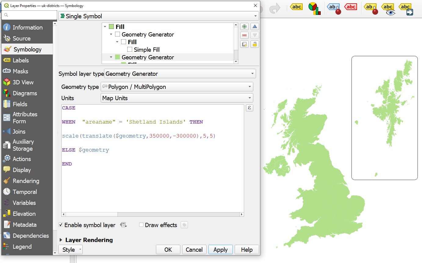
I made Shetland 5 times bigger, just because

Note that in the example above I also added a box round Shetland - a rounded box - if you look closely you'll see that I have two separate geometry generator symbols in the one layer here. See below for the expression I used to add the box - it's basically the same as the one I used to move Shetland but then I added a bounding box and a buffer distance too.

Shetland is indeed in a box, but it's also 5x bigger here

For loads more examples, take a look at the video I posted above, which relates to the US lower 48 states layer I created with TONS of example expression in it that you can play with. This is a great way to learn more about the possibilities of geometry generator in QGIS. Here are a couple of screenshots showing you what's in that file. All you need to do is delete the -- in front of any of the expressions so that only one expression is active at a time and then you'll see what it does. 


I put together loads of different expressions in this file

Tons of different potential uses for this


Wait, I can actually create new layers using geometry generator?!?! Yes!

This is a very important section. Yes, you can use geometry generator to style a layer to make it appear totally different from its original shape but if you want to create an entirely new layer that permanently looks different, based on a geometry generator expression then you can do this. Let's say you wanted to create a new US states layer where Alaska and Hawaii are always located below the lower 48 states. You can do this easily in QGIS by opening the Processing toolbox and then searching for 'Geometry by expression' and then you enter your geometry generator expression, choose where to save your new layer to and then that's that! It's amazingly easy and also very useful.

Create a new, modified layer using Geometry by expression

If you wanted to create a new shapefile, say - or any other type of geo file - with Alaska and Hawaii permanently moved below the lower 48 states, you could just take the original US file I shared at the start of this post, then copy/paste the expression into the Geometry by expression tool as shown above and then run it. See below for a screenshot of where I've done this in QGIS myself.

A layer with AK and HI permanently moved

Help! My shapes are disappearing

You may find that when using geometry generator expression in symbology that things disappear. This can be confusing and worrying and confusing. It happens when you zoom in too far, basically. What do I mean? Well, in the case of the US example above, if you zoom in to the lower 48 states then you will find that Alaska and Hawaii disappear because you have zoomed in to a map extent beyond their actual  position. To get round this, in the Print Layout in QGIS, you can just set the map frame much wider so that it includes the original positions of AK and HI, for example - as shown below. In the main map canvas in QGIS, in this case, just don't zoom in too far or at least move the lower 48 states to the lower right of the map canvas. Once you know what causes this it's easy to deal with and then if it's really causing problems you can just use Geometry by expression to create a layer with the shapes actually moved and then this won't be an issue anyway!

Stop AK and HI disappearing


You may also find that your shapes (points, lines, polygons) disappear when you use a geometry generator expression even if you do it correctly and not for the zoom-in-too-far reason above. In this case it will be because you have used an expression such as centroid($geometry) on a polygon layer to display the polygon centroids but you have forgotten to change the geometry type - as shown in the screenshot below. So, if you are using a geometry generator expression to change the geometry type (e.g. polygons to points) you need to let QGIS know but all it involves is clicking on the Geometry type drop-down and then picking the right one. 

Sometimes you also need to change the Geometry type


Where can I find out more?

There aren't a huge number of resources out there on using geometry generators in QGIS. Well, maybe there are but they are kind of scattered across the internet and they vary in quality. But if you do want to know a bit more and see examples of all sorts of interesting use cases then here are a few resources I recommend.


And of course you will also find lots of great geometry generator stuff if you search twitter. I have particularly enjoyed the examples from Keith Jenkins.


Friday, 16 August 2019

Constituency cards

Everything is fine 
This blog post provides some background to my attempt to create a simple 'constituency card' for every UK constituency in the run-up to an election that may or may not happen. This is at a time when, if I may be so bold, it can seem like everything is not as fine as it perhaps once was. I had the idea for this when I saw that there was a new set of official MP portraits that anyone could download and use but then other things got in the way. So, this is part open data experiment and part election prep, though mostly the former. Consider it my attempt to take lots of ugly data and turn it into useful information in an easy-to-digest way. See, I told you everything was fine.

Just want to see the maps? Okay, here you go. Want the underlying data files ? No problem.

An example of one of the constituency cards

Things keep changing

Here's an easy-to-remember short url you can use to go straight to the cards: bit.ly/constituencycards

What's the point of this?
I'm not a member of a political party and never have been so there is no underlying conspiracy here. Or at least, if there is, nobody told me about it. Aha, but why did I put the '% Swing required' figure on the individual constituency cards? I put it there because I think it's an important thing to know, for everyone with an interest in politics, regardless of whether you're the MP for Knowsley (George Howarth, Labour, majority: 42,214) or the MP for North East Fife (Stephen Gethins, SNP, majority: 2).

The point of this project (which is a spare time thing, not part of my day job) is to provide a single card for all 650 UK constituencies, which tells us who the MP is, what they look like, how they did at the last election or by-election, what it would take for the seat to change hands, plus a bit of other information.

On the last point, I calculated the straight-line distance from the centre of each constituency to the Palace of Westminster. The closest, unsurprisingly, is Cities of London and Westminster at 0.86 miles and the furthest is Orkney and Shetland at 581 miles.

Ideally, people will be able to click the link to the image files on their phone, tablet or computer and then flick between individual cards and make comparisons between places, find out more about individual constituencies and generally learn stuff.


How did I do this?
I compiled a list of official portraits using this blog post on the API, spent ages trying to figure it all out and then once I had a list of official photos, I added to it with other photos in the public domain because there isn't an official photo for every MP. Then I supplemented this data with information on current MPs from mySociety, then I put together a UK-wide geo file and chopped out the loughs of Northern Ireland so it looked right. I then added information on distance to Parliament and the size of each constituency, and mashed it all together. Then, in QGIS, I spent a while sorting the layout, editing and editing and tweaking and tweaking until arriving at the final result. The image below shows you what I ended up with.

The labelling is always tricky

Stuff wot I got wrong or not quite right enough
Sometimes the labelling isn't perfect. That is, sometimes places you might expect to be labelled are not, and some that you think should not be actually are. My labels file has 42,000 or so place names and I use a variety of rules and filters to decide what gets placed on each map but occasionally this doesn't work that well. I could devote tons of hours to it and make further improvements but I think I'm at the point where I'm happy enough with it.

Independent MPs. I'm sorry not to have given the different MPs, who are in different independent groupings, different colours but too many colours would not work well in my opinion. So this is not quite right but to be honest I found it hard to keep track of who is in what independent grouping and who is not.

Occasionally my swing figures are 0.1% out or so compared to some of the figures I've seen elsewhere online but in general they agree with the Target Seats lists on Election Polling.

Colours, maybe. I tried a few different versions without a white dim surrounding the featured constituency on each map but it became a riot of colour at times so I've gone with a 33% opacity white mask layer to dim it a bit. Sometimes this isn't perfect but I like it better than the alternatives, including a dark dim.


Style stuff, etc.
This can be controversial! But I'm quite chilled about it really. I tried my best to make them look good and also to build in some kind of logic and flow to the individual cards but of course they're never going to be perfect but I'm happy enough with them.

If you want to play around with the files you can find them in the files repo. You can style the files using the html colour codes in these - there is a colour for the winning party and one for the second placed party.

Decisions, etc. Well, the name of the constituency goes at the top left and the whole top row of each card is reserved for these names. I have sized everything so the longest constituency names (e.g. Cumbernauld, Kilsyth and Kirkintilloch East) don't run beyond the end of the map image below it. I have also placed the little black-dot-locator inset there as it is close to the name of the constituency and your eyes don't have to move much to locate it, and then you can scan down to the main map image.

I've given the sea a muted blue colour, which also applies to Northern Ireland loughs. I decided not to add lochs and lakes elsewhere as I couldn't decide where I would place the size cut off (e.g. include Loch Morar but not Loch Shin?). Too messy, but I made an exception for Northern Ireland because people are forever making maps without their loughs and they are really big and important.

I included a 1 mile scale bar not because I'm a devotee of the imperial system but because people know how far it is and for most constituencies the bar is big enough. The one mile scale bar is of course tiny on the Ross, Skye and Lochaber card and some of the other huge constituencies.

I included a bit of foreshore for Great Britain (didn't have the foreshore data for Northern Ireland) as I think this makes things look a bit better - usually - in coastal areas although of course it gives some places the appearance of having a lovely sandy beach when they actually don't. But I like to bequeath beaches to people who don't have them - in the spirit of mending the nation's divides.

You'll notice that in lots of maps you can see a nearby city. This is because I wanted people to be able to look at a map and say, for example, "Ah, so Aberavon is near Swansea" or "Oh, right, Meon Valley is kind of between Southampton and Chichester". I don't know about you but some of the constituency names I find quite baffling as they give little clue to the uninitiated where they actually are.

I also included a fairly dull building mask layer. The idea here is you can see the layout and form of the built environment and say things like "this is quite a densely built up area" or "this constituency is quite sparsely populated". You may know this already but I think it adds an extra dimension of knowledge for places I'm unfamiliar with so I like it. Just hard to get the balance right so it doesn't mess too much with the colours.

I decided it would be good to add a party-coloured frame round each photo in lieu of a legend and then the MP's majority below that in large bold text. The MP name and party go in the coloured box below the image. But then I thought it would be useful to show who came second and what kind of swing would be needed for the second place party to win. In some cases they are not likely to win, to say the least, but in a good few things are very close. I make it 171 constituencies (out of 650, so 26% of the total) where the required swing is less than 5%.

The descriptive text below each map has some other information I found useful and I thought I'd add some geographical context with distance from parliament and also area in square miles - these figures make more sense when you compare them with others I suppose. I calculated these in QGIS.

I also added a sources box to the bottom right of the image so it's clear where the data come from.

The font is Montserrat.


Nerd notes
Not too much else to say here but I did use Excel for some vlookup type stuff but basically everything was done in QGIS using the Atlas tool and a range of quite messy looking functions. For example, where the required swing was below 0.05% I had to make sure two decimal places were displayed instead of the default one I used otherwise it would say 0.0% there. For that, I used this:

 format_number( "REQSWING"  ,  if( "REQSWING"< 0.06, 2,1))||'%'

Making sure there were no 0.0% swing figures was fiddly

I used a rule-based symbology for the place name labels - using this rule to only show places in the current Atlas feature:

intersects( @atlas_geometry ,$geometry) 

And then to make sure cities outside the current Atlas feature were always showing I used this on a copy of the same layer, filtered to only show cities:

NOT intersects( @atlas_geometry ,$geometry) 


But how on earth do you get data defined text colours? Well, I couldn't figure out a way to make this happen in QGIS Print Layout as it's not a default option on font colour so I figured out a workaround.

What I did was add the swing figure to the layout using the  "REQSWING" variable in the layer driving the Atlas. I added this as black text. Then I added a white text box over the top of it. Then what I did was set the colour of this text box overlay to match the colour of the party that came second. This was easy because I already created a field called "secondcol" with the html colour code of the party that came second. Then I changed the Rendering blend mode to Screen so that the black text changes to whatever the colour of the second placed party is. Sounds complex but works perfectly - see below for screenshot.

A workaround that works - I couldn't figure out another way

You may also notice that in the five constituencies that have had a by-election since 2017 there is a little '(By-election)' indicator below each Majority figure. Since I created a field in my data table with data on when the last election was (i.e. either 2017, 2018 or 2019) I was able to add a text box with '(By-election)' in it and then set it to be 100% transparent if the value was 2017. Otherwise it is displayed. This is the text I used in the data defined over-ride box on Rendering for that.

CASE 

WHEN  "last_vote" = 2017 THEN  0

ELSE  100

END

Again, a bit fiddly but effective

That's about it really. There's nothing super-fancy going on behind the scenes and of course I still haven't really figured out how to make friends with date and time formats. Drives me mad, but I got there in the end. See below for the mess that makes up the data-driven text at the bottom of each card (using the 'Render as HTML' tick box in QGIS).


  • '<b>' ||  replace(  "cname1" ,'Kingston upon H','H')  || '</b> had an electorate of ' ||  format_number("elect17" ,0) || ' and a population of ' ||  format_number("pop17",0)  || ' in 2017. The distance from the centre of the constituency to Parliament is ' ||  format_number( "mi_fr_pow" ,0)  || ' miles, and the constituency covers an area of ' ||     format_number("sq_mi" ,0)  || ' square miles. At the 2017 general election, this constituency was number ' ||  "dec_order"  || ' out of 650 to declare the result, at ' || format_date( "just_time" ,'hh:mm') || ' on ' ||  format_date(  "dec_time" ,'dddd d MMMM') || '.'


Whose shoulders am I standing on here?
Ordnance Survey, mySociety, the amazing team at the House of Commons Library, Philip Brown, Elvis Nyanzu, Alex Parsons, the Parliamentary Digital Service, the very nice voters of the UK, and of course the team who make QGIS.

Without the hard work, expertise, knowledge and experience of a wide variety of people and organisations it is impossible to do stuff like this. I am simply trying to bring data together and make it into useful information. Trying to contribute to the open data ecosystem I suppose.


Who will win the next General Election?
Nobody.


Wednesday, 13 June 2018

How many people live in the English green belt?

There was a blog post here about the total population living on land in England that is designated as green belt.

I decided to take it down because I wasn't as confident as I wanted to be about my original estimate and I don't want to spread misinformation. 

The problem is that it's impossible to know for sure with the data we have available, which is a shame. Perhaps in future we'll move to a position where we can easily answer these questions with better open data.

For now, I am just leaving this here as a note to anyone who might have seen the original post or tweet (also deleted).

Normal service shall resume soon.

15 June 2018

Update 26 October 2023: I think the figure is 1.2 million, as I explain in this post


Note
You can find some English green belt shapefiles on this page, though they seem to mostly be historic ones (e.g. 2007-08) unless you click 'Show more' in which case you'll get everything from 2007-08 to 2016-17.

Tuesday, 19 September 2017

Buildings of Great Britain

One of the great things about Great Britain is of course Ordnance Survey, our 225 year old national mapping agency. Since a lot of their data was made open in the last decade it has become easier than ever to explore and map the country (particularly if you're some kind of GIS boffin). I should point out before going any further that Ordnance Survey covers Great Britain only, not Northern Ireland. For that, you'll need to look at Ordnance Survey Northern Ireland, who also have a good selection of open data. In the past, I've created sets of building data for English cities, done some calculations on how much land is taken up by golf courses, and a variety of other things, including creating 3D building models using OS open data. Today I'm sharing some shapefiles of all buildings in Great Britain


London has lots of red buildings

Why have I done this? The main reason is that I want to share these complete files with others who might need them and don't want to - or know how to - patch together separate tiles of Ordnance Survey open data. If you need some building footprint data, you can just download the set you need and zoom to your chosen area, or extract what you need from an individual shapefile. I used the OS OpenMap - Local product for this, so the detail in the buildings is very good, as you can see below in the zoomed-in extract.

The reason I did this in the first place was because I wanted to come up with a number for the percentage of the land area of Great Britain that is covered by buildings. There has been some debate about this topic, and it was covered in an FT Fact Check piece in 2016 by Kate Allen partly in response to the claim that golf courses cover more land than housing. My calculations using new OS data revealed that Great Britain is 0.54% golf course (1,256 sq km, about the same area as Greater Manchester). But do buildings cover more than this? Yes they do. 


Click to enlarge - you can see lots of detail

Using the data I'm sharing here, I calculated that buildings in the UK cover 1.35% of the land. I reported this previously in a tweet that was quite widely shared. To my embarrassment, for the GB figure I used the UK area as the denominator so the figure reported there was a little low, though the England, Scotland and Wales figures were and are accurate. Here's the important information you need, if you're ever faced with an awkward silence at a party.

> Great Britain is 1.35% buildings

> England is 2.0% buildings
> Scotland is 0.4% buildings
> Wales is 0.9% buildings

The Great Britain figure equates to about twice the area covered by Greater London - 3,150 sq km. However, the OS OpenMap - Local product isn't the most detailed building-level data covering Great Britain. For that, you'd need to look at OS MasterMap, a much bigger job. That is, unless you are Mike Gale and Tom Armitage at Edina and you have all this information in a lightning-fast database ready to query. They very kindly went beyond the call of duty and did some calculations and confirmed that my figures are pretty much spot on. They did loads of other really cool stuff too, but more on that another time perhaps.

If you click on the link, you'll see the set of shapefiles I created in a Dropbox folder. It contains some licence information, a few sample images, plus the following shapefile sets:

  • All buildings in Wales in a single shapefile
  • All buildings in Scotland in a single shapefile
  • All buildings in the North of England in a single shapefile
  • All buildings in the Midlands in a single shapefile
  • All buildings in the South West of England in a single shapefile
  • All buildings in the South East of England in a single shapefile

The complete set, and individual files, are pretty big, since they cover large areas and have millions of individual polygon features in them. This isn't exactly the best way to view and map this data, I know. That's obviously an understatement. But I also know that it's the format many people know and love, and want to work with. So, if you want to play around with buildings or use this as background mapping, be my guest. 


Data notes
Giant shapefiles make the world go round, okay. More seriously, there are better ways to download and view this data, but that's for another blog post. On a related note, see this from Emu Analytics on a very cool project which utilises OS building data. If you download the files and look at the attribute table in your GIS of choice, you'll see that I've added an area column for each polygon showing the area in square metres. 

Using this to query the dataset can be interesting - e.g. to find the largest building. Be aware, however, that the OS OpenMap - Local data still has a degree of generalisation in it so sometimes separate buildings can be merged together - e.g. if they are very close together. But I know from what Mike and Tom did with MasterMap data that this doesn't affect the final calculation much at all, thankfully.

As for the golf courses vs. housing thing, I know that's not strictly-speaking solved definitively either. The reason for this is that we have no way of knowing exactly what area houses cover vs non-residential buildings. As far as I know, even Ordnance Survey don't know this, and probably can't know this from what data we have available to us. However, the vast majority of buildings are residential (not sure on the %) and I'm very confident that housing covers a much bigger area than golf courses, I just can't say how much.


Sunday, 7 May 2017

General Election 2015: the view from second place

In my last blog post I shared a shapefile with the current UK constituency boundaries, which included a lot of other data. One of the variables included was who came second in the 2015 UK General Election. I thought it would be interesting to map this and also include a couple of widgets using the new Builder tools in CARTO (formerly CartoDB). I wanted to do this because I knew UKIP came second in 120 constituencies and I wanted to see where. I also wanted to post an interactive version of the data from my shapefile so people could explore it themselves. The first map below shows who came second in each constituency in 2015 and if you click an area you'll get more information - winner, MP, and so on. Using the widgets below you can then select by winning party and margin of victory, should you want to quickly identify marginal seats, for example.


Here's what the pop-up looks like

In the next map, I've used the 'Majority in 2015' widget to select only those areas with a majority of 3,000 or less and this then updates the 'Winner in 2015' widget so that you can see 41 of these constituencies voted Labour in 2015 and 36 were Conservative.

Many of these could be considered true marginals

At the other end of the scale, I then used the widget slider to select all those constituencies in 2015 which had a majority of 15,000 or more. The final map below shows this. As you can see, 153 of these were Conservative constituencies and 59 were Labour. The colours on the map - remember - are who came second in 2015. So is this a 'no chance of winning here' map? Possibly. I wouldn't be holding out for any shocks though.

Fiddle around with this map here

Here's what the map looks like when you show Labour, Conservative and then UKIP second place finishes.

Labour came second in 253 constituencies in 2015

The Conservatives came second in 181 constituencies in 2015

UKIP came second in 120 constituencies in 2015


I didn't make this so that I could comment on it so have a go yourself in the full screen version.

Sunday, 23 April 2017

Getting ready for #GE2017 - a big shapefile

I'm probably as unmoved as anyone else about the forthcoming General Election, but to get my head back into gear for it I thought I'd try to put together a full UK constituency shapefile of all 650 constituency results from the 2015 General Election, using data from a variety of sources. I'm sharing it here in the hope that people will find it useful, and that it might save you some work. If you spot an error, let me know and I'll try to fix it. There are other shapfiles out there, but to my knowledge there isn't a detailed complete UK (as opposed to GB) file that has all results, MPs and so on. I'm also sharing this here in the hope that we can move away from hex maps. I think they are nice and useful in many cases but I'd like to see a move back to the standard geographic representation in this election - hence, I am trying to promote Hexit. Anyway, here's an obligatory geogif I made with the file, using the 'time results declared' field.

The 2015 General Election in 30 seconds - phew

So, what's in the file? Well, I've tried to include a lot of stuff, sourced variously from the British Election Study, from the UK Parliament Data website, the Census and the devolved administrations of the UK. I have also calculated some variables myself, such as constituency area and the order in which results were declared. Key variables include:

  • PCONCODE - this is the ONS code for each constituency. It makes it possible to join lots of other data to the file. 
  • REGN - name of the sub-UK region each constituency is in - i.e. the old Government Office Regions in England, plus Northern Ireland, Scotland and Wales.
  • SECOND - which party came second in a constituency in 2015.
  • ELECT15 - the number of people in the electorate in 2015.
  • MAJ - size of the majority for the sitting MP.
  • TIME - time the results were declared. The very last column has this in 24H format, but you can also see from the ORDER2015 field which order they are actually in.
  • MPFIRST, MPLAST, MPNAME - the first, last and full name of each MP.
  • Winner15 - this contains the full party name of the winning party. The WINNER field contains the abbreviated party name.
  • POP2015 - this contains the mid-year population estimate for each constituency for 2015. I also added in the 18+ population, since it makes a bit more sense to do this, even though it is not the same as the electorate figure. 
  • Others - they should be self-explanatory but the list of Sources below will help if you are confused by any of these.

I hope you find this useful. If you want to download it, it can be accessed here. If you spot any glaring errors, please let me know. Who is going to win the 2017 General Election? My only prediction is that there will be lots of interesting maps and that the patterns on them may look a bit different.


Data notes: I have added a QGIS qml style file to the zipped data folder. This means that if you add the shapefile to QGIS it will display in the familiar colours of each political party. This happens because the qml file has the same name as the shapefile. The colours are matched from the BBC election results page from 2015. I tried very hard to ensure complete UK coverage, so I have patched data together from multiple UK sources but in a few cases I don't have variables for Northern Ireland. This is because the spreadsheet from the British Election Study I sourced some data from covers only GB. The zipped folder name for the current file version is uk_650_wpc_2017_full_res_v1.8.

Sources: General Election 2015 results, from the UK Parliament Data pages. The British Election Study updated Excel file. Northern Ireland constituency boundaries were sourced from OpenDataNI, via their resources page. For Great Britain, I used the constituency boundaries available on the ONS Geography Portal pages - the 2016 boundaries. For the most recent mid-year population estimates, I used data from the National Records of Scotland, NISRA data for Northern Ireland mid-year population estimates and ONS mid-year population estimates for England and Wales. The map data contains OS data © Crown copyright and database right 2017. Similarly, the other data contains National Statistics data © Crown copyright and database right 2017.

Acknowledgements: I would like to thank Ian Turton for suggesting the little QGIS Atlas function tweak which enables the cumulative animation you see above. For more on this, see the related Stack Exchange post where I asked the question.

Thursday, 22 December 2016

Creating a 3D city model using open data for England

This is a short informational post on how to derive building heights using open data, for areas in England. I am also sharing the data in the visuals you see below. However, if you have access to similar data in your country then you can replicate the method. It's basically the same as others have posted elsewhere, so I don't claim this is a first - I'm just posting it in case others find it useful. And I've also added local authority names to the building outline files, hence the different colours you see. First of all, though, here's an example of what you get at the end of the process.

You can find the raw data in shapefile format here

Of course, this alone would be no fun without having a little interactive version in the web browser, so here you go - knock yourself out! The buildings are coloured by local authority - blue for Trafford, purple for Salford and green for Manchester.

Click for a little interactive extract of the first image

Here's the basic method for adding heights to the building polygons.

  • Download some building footprint data. I used OpenMap Local from OS OpenData and this comes in named tiles (as per the naming conventions of the British National Grid - NH, NN, NS and so on). I used data from the SJ tile, covering Greater Manchester. When you download it you'll get loads of layers but in the data folder you should see one called Building.
  • This building data doesn't come with any height attributes so we need to find a way to add that in. This can be done by using free, open LIDAR data available for England and Wales via the Environment Agency. You can also get aerial photography here, by the way. The data come in a variety of resolutions but I chose the 1m version as I wasn't overly concerned about precision. If you download the 25cm resolution LIDAR data the files will be huge. I downloaded tile SJ89 and both the DSM and DTM products. The DTM is a digital terrain model so it gives us the lay of the land, as it were, and the DSM is a digital surface model so includes the height of anything on the land beneath. The image below probably explains it best.
Source: StackExchange

  • I then add the DSM and DTM files to QGIS (I used version 2.14) as a virtual raster. Otherwise you'll end up with loads of individual raster tiles if you add them one by one because the SJ89 LIDAR data comes in lots of little chunks. You can find out more about this - and how to add a virtual raster - in this extremely useful blog post. The brilliant Owen Boswarva also has some really useful info and links on his mapgubbins site, so check that out too.
  • Because the DTM gives us the height of the land and the DSM the height of any features on it, we need to use the Raster Calculator in QGIS to calculate the height of buildings. But fear not! This is also very simple, and is explained in the blog post linked to in the last bullet point. The only thing I did differently is I just manually selected the area of buildings that covered the SJ89 tile using the Selection tools in QGIS (and then saved it as a new shapefile layer).
  • Before using Zonal Statistics in QGIS to calculate building heights - and bear in mind they are not exact - I just had a virtual raster which was obtained by subtracting the DTM from the DSM layer in QGIS, plus a buildings layer which covered the same area, as you can see below. It was these two layers I used to derive the building heights.
This area is centred on Greater Manchester
  • Then I used the Zonal Statistics tool in QGIS to calculate a mean, min and max height for each building polygon from the LIDAR data. You could just use the mean but I wanted more information so I just left checked these boxes when running Zonal Statistics. The method is also described by Brendan, here, but you should note that in version 2.14 this tool will be in the Raster menu. Note that you may find nothing happens after running Zonal Statistics - don't worry, QGIS has just added the new fields (max, etc) to your shapefile without any fuss so check the attribute table.
Here's an example of my final shapefile, with new height attributes

  • Once you've done that, you should have the ability to analyse building heights and produce a fairly credible 3D model of your area of interest. Just bear in mind that things like pitched roofs, curved roofs and other shapes will not come out when using this Zonal Statistics method. For that, you could of course use the raw DSM data if you wanted.

That's it really. I'll finish with a final big version to which I have added some labels. Right click and you should be able to see it full size in a new window or browser tab.

Hastily patched together, but I hope you get the idea...


Friday, 4 November 2016

The 435 Congressional Districts of the United States in one giant poster

In his last State of the Union Address, President Barack Obama called for an end to gerrymandering - the process of drawing political boundaries in a way that favours one party over another. I knew a bit about the topic from my time in the US, but I wanted to see what all 435 Congressional Districts looked like, so I ran off a set of maps. This was later picked up by WIRED* and shared quite widely. This week, I saw US elections guru Stephen Wolf had published a new shapefile of Congressional Districts which included the revised Florida, North Carolina and Virginia boundaries. I had a few extra moments due to something being cancelled at the last minute, so I ran off a set of maps and turned them into a gif and a poster. I shared the gif on twitter but am posting more material here in case anyone is interested. First of all, here's the massive poster with all 435 Congressional Districts, arranged alphabetically by state and District number.

Not to scale - it's about comparing shapes - bigger version

You should be able to click on the above image to see the labels more clearly. If you want to download a really gigantic version, have a look here for the 13MB, 16,527x16,841 pixel monstrosity. Shapes alone can't necessarily tell us whether an area is clearly 'gerrymandered' or not but it's fair to say that in some cases it's a pretty good sign!

I also created two gifs which animate through all 435 Districts at different speeds. The first one below is the one I previously shared on Twitter and the other one is a slightly slower version. The intention of the first was to leave just enough dwell time on each frame so that you can perceive the variety of shapes but also see all 435 in under a minute. In the second, I'm trying to allow more cognitive processing time.

It's supposed to be somewhat hypnotic

The first one is pretty fast, with only a tenth of a second for each Congressional District. The version below shows each District for half a second, so might be a little bit more useful but then again it takes longer to run through.

The definitive gerrymandering gif? Maybe not, but it's a quick summary

Here I have been experimenting with display techniques partly as a way of educating myself on an important subject but also partly to figure out what the best way of representing the data in an easily digestible way is. I also posted each of the individual frames from the gifs to a Google Drive folder in case anyone wants to use them.

I like the small multiple approach of the poster better in many ways because you don't have to wait to scroll through the images and also you can make visual comparisons between, say, frame 2 and frame 200 without having to wait for the gif to loop through to it. Also, you don't have to interact with it in the same way so I find it more accessible and actually made it this way so that it could be printed out as a large poster and used as a focal point for discussion and debate - which I think is one of the things maps can be very useful for.

Finally, here's the poster in two different colours. There's also a folder with all three versions in different sizes.

Does it look better or worse in green? Bigger version

A classier colour, I feel - bigger version

Here's the Obama 'gerrymandering' part - source


*The person who wrote that WIRED piece has since been 'moved on' owing to some sub-optimal journalistic practices but the piece remains online under an editorial note.