
You may not know it, but you've probably seen the Valeriepieris circle - it's that circle on a map of the world, alongside the text 'There are more people living inside this circle than outside of it'. The name 'Valeriepieris' is from the Reddit username of the person who posted it and in 2015 the circle was looked at in more detail by Danny Quah of the London School of Economics under the heading 'The world's tightest cluster of people'. But of course it's not actually a circle because it wasn't drawn on a globe and it's also a bit out of date now so I thought I'd look at this topic because I like global population density stuff. I'll begin by posting a map of what I'm calling 'The Yuxi Circle' and then I'll explain everything else below that - with lots of maps. As in the original circle, I decided to use a radius of 4,000 km, or just under 2,500 miles. Why Yuxi? Well, out of all the cities I looked at (more than 1,500 worldwide), Yuxi had the highest population within 4000km - just over 55% of the world's population as of 2020. All maps were done in QGIS, which I have been experimenting with a lot more lately because I just launched Map Academy on Udemy, to help more people get up and running with maps and data.
 |
| The Yuxi Circle on a globe |
The shape above is a circle because it's plotted on a globe but in the examples below you can see how it looks when drawn on different kinds of flat map projections.
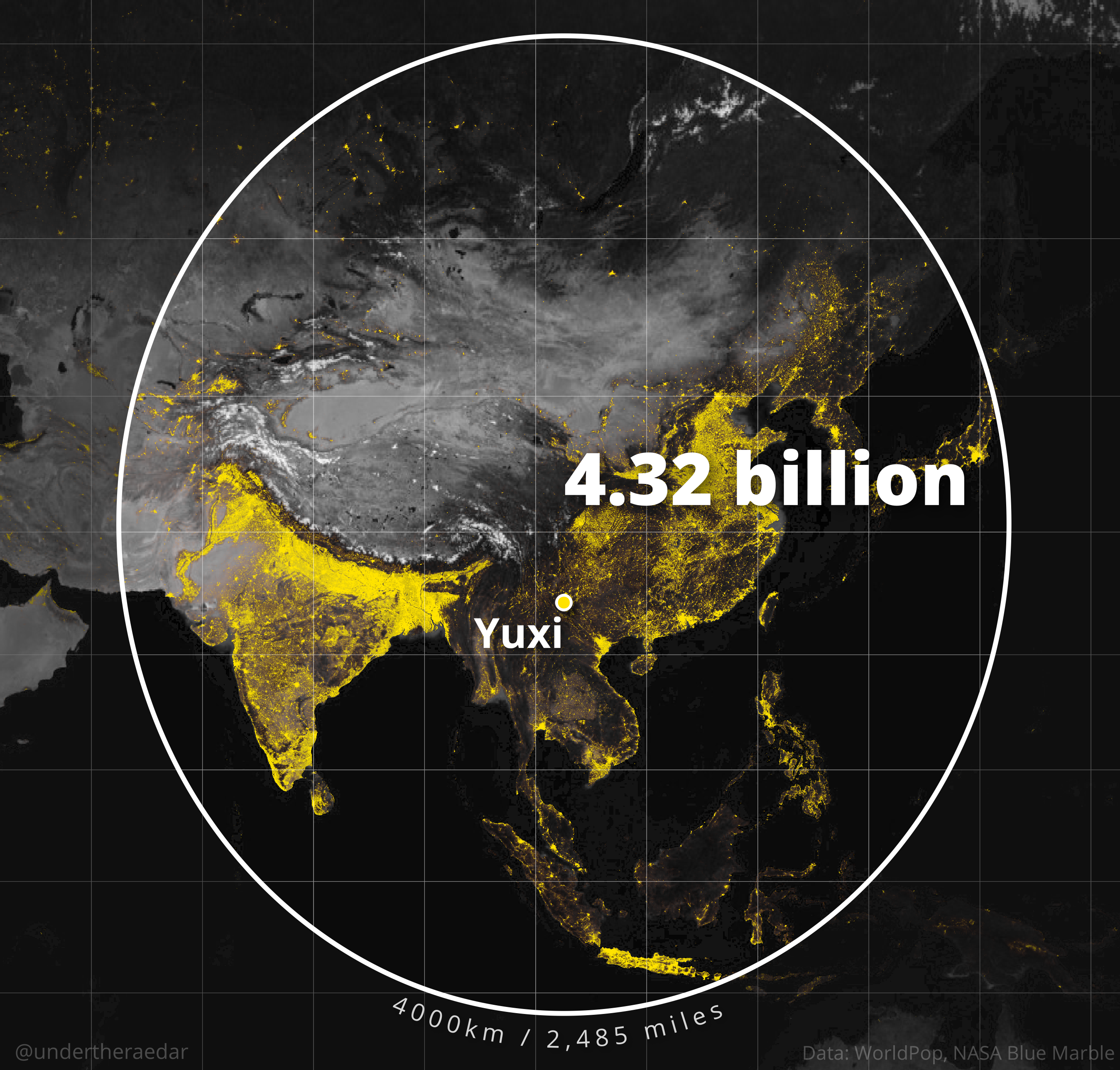 |
| A web Mercator projection |
 |
| Robinson projection |
 |
| WGS84 |
 |
| Winkel Tripel |
There is more than one Yuxi in China, but the one on the map is in Yunnan province and has a population of about 2.5 million. Obviously, when you draw a simple 4000km buffer you always get a lot of sea, so I also tried to see what kind of ellipse I could draw around Yuxi that still included more than half of the world population - see below for the results of this.
 |
| The Yuxi Ellipse with the Yuxi Circle behind it |
 |
| More than half the world lives in the Yuxi Ellipse |
Okay, so what else? Well quite a lot actually but for now let's do something different.
When looking at this I started to think 'what if someone built a tool like True Size Of but then also combined it with NASA's SEDAC Population Estimation Service?', where you could take the shape of one country, overlay it somewhere else in the world, and then get the population within it. Well, I had a little go at this with the lower 48 US states, which I moved south - and scaled geodesically - and then calculated the population within it when placed over China and India. I also did this with the US flipped horizontally, just because the US west coast is a reasonably close fit for the Chinese east coast when you do this. Quite interesting results I think - and a lot of people in the US this way - and still a lot of empty space!
 |
| Please someone build a web tool for this |
 |
| Nice coastal alignment here |
Okay, so then I wondered - because I've been looking at coastal things in the UK but also globally - 'how far in from the coast do you have to go until you capture more than 50% of the world's population?
Well, I got 200km for that (124 miles). This was done using the very latest WorldPop 1km gridded population data, from 2020, just like the rest of the maps.
 |
| More than 50% of the world lives here. |
Okay, fine. Now I was thinking even more silly thoughts - like 'where is the world's centre of population'? This is not easy to calculate at a global level, but I did do a bit of research before attempting it and then my first attempt was totally wrong because I didn't do it on on a spherical world. The internet doesn't have any great answers on this, but you can find a few things if you look hard enough and they say something along the lines of Almaty, Kazakhstan or thereabouts.
Well, I got a world centre of population of just by Aktobe in Kazakhstan, using 1km gridded 2020 population data. Is this correct? Well, it is based on a complete 1km dataset and a spherical world but remember that I'm just some guy on the internet and before you go and locate your global business there because of my analysis you might want to double check the data yourself, although it is a bit tricky. But I'm fairly confident that the global centre of population is either here or close to it - certainly in this region is what I'd say.
 |
| Centre of the human world? Possibly. |
Hey, what about my city? Why haven't you done a 4000km blob map of my favourite place? Well, it would have taken a long, long time to do everywhere but I did do a few more so see below for that. I calculated over 1,500 4000km population circles overall and 148 had populations of 4 billion or greater within 4000km - including cities in China (loads), Vietnam (e.g. Hanoi), Myanmar (Mandalay), Vientiane (Laos), Bangladesh (Chattogram), India (Agartala) and Bhutan (Thimpu). I have to say, despite taking a while to do all this, I have found it pretty interesting so I hope you do too. Just remember that the white line shapes on all the maps below (and above) are actually circles - but they will only look like circles when plotted on a globe.


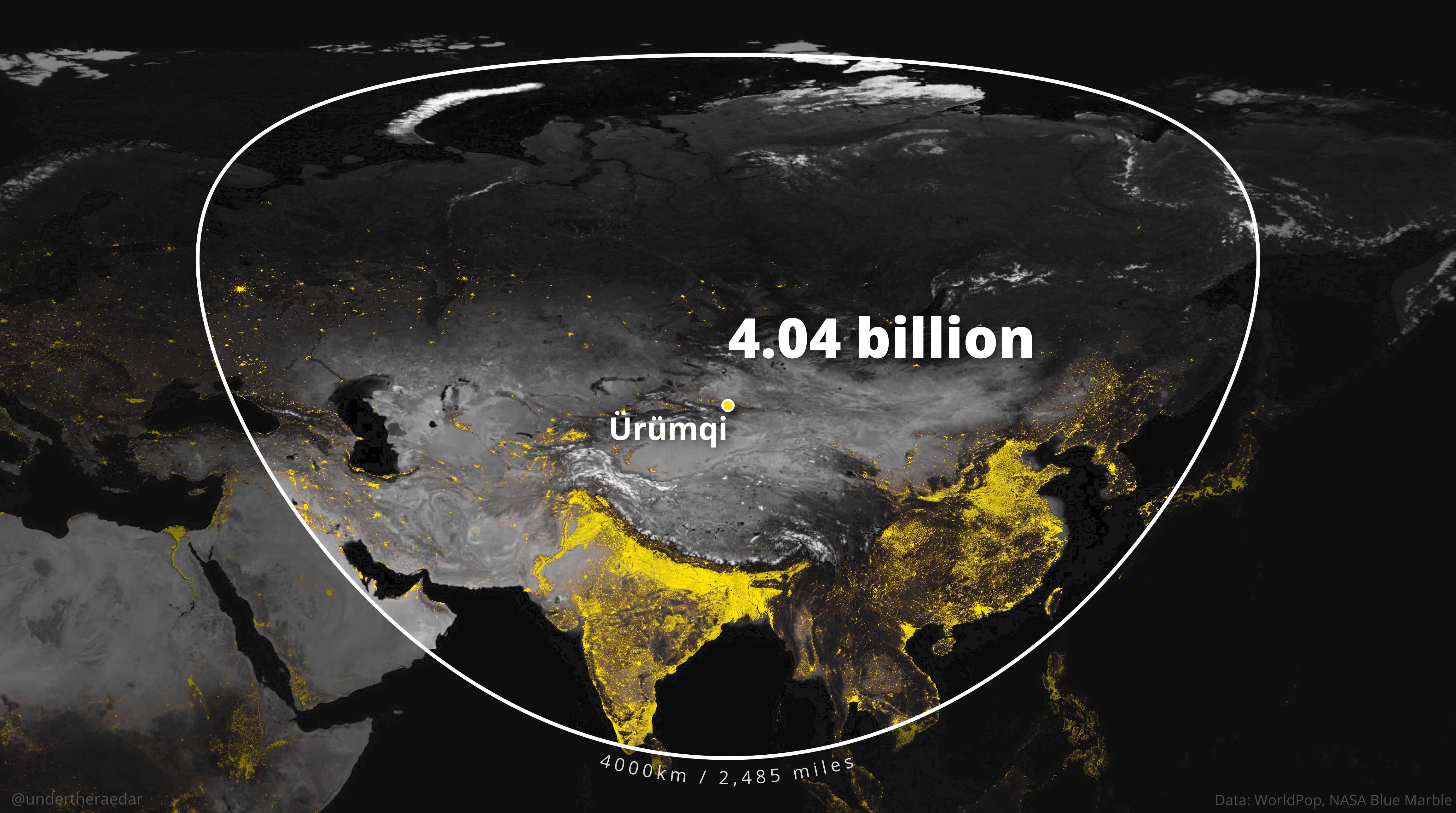
That's all for today. I did all the maps in QGIS (free GIS software) using open data - if you want to learn how to use QGIS, check out my Map Academy course.
Notes: does any of this look different if you use a different data source? Well, I ran the analysis again using the GHSL2015 1km population data and still Yuxi came out on top. I only included capitals plus those cities with 400,000 people or more so you could do this forever with settlements of all sizes but I had to draw the line somewhere otherwise it would have taken forever, plus I thought using larger cities makes some kind of sense. The data I used is WorldPop 2020 1km grid data and that gives us a world population of 7.8 billion. How do we deal with the projection of rasters issue if we need to? Well, we use the GHSL warp tool for that. Why do the shapes seem to differ in size? That's to do with where they are in the world in terms of latitude. The further north or south they are, the more distorted the shapes will be, but they are all circles when plotted on a globe. You can check this out yourself if you measure it manually on Google Maps. Did I use a geodesic buffer? Yes, and I think I got it right but feel free to check my results. The backdrop mapping is NASA's blue marble from August 2004, converted to greyscale. Some places I didn't do maps for because the circle crossed the international date line and so the result was messy, and these include Toyko (1.82 billion within 4,000km), Auckland (26.8 million within 4,000km), Sydney (49.1 million within 4,000km), Melbourne (49.5 million within 4,000km). WorldPop data is open data, licensed under the Creative Commons Attribution 4.0 International License (CC BY 4.0).


