Showing posts with label map projection. Show all posts

Monday, 7 February 2022

The Yuxi Circle

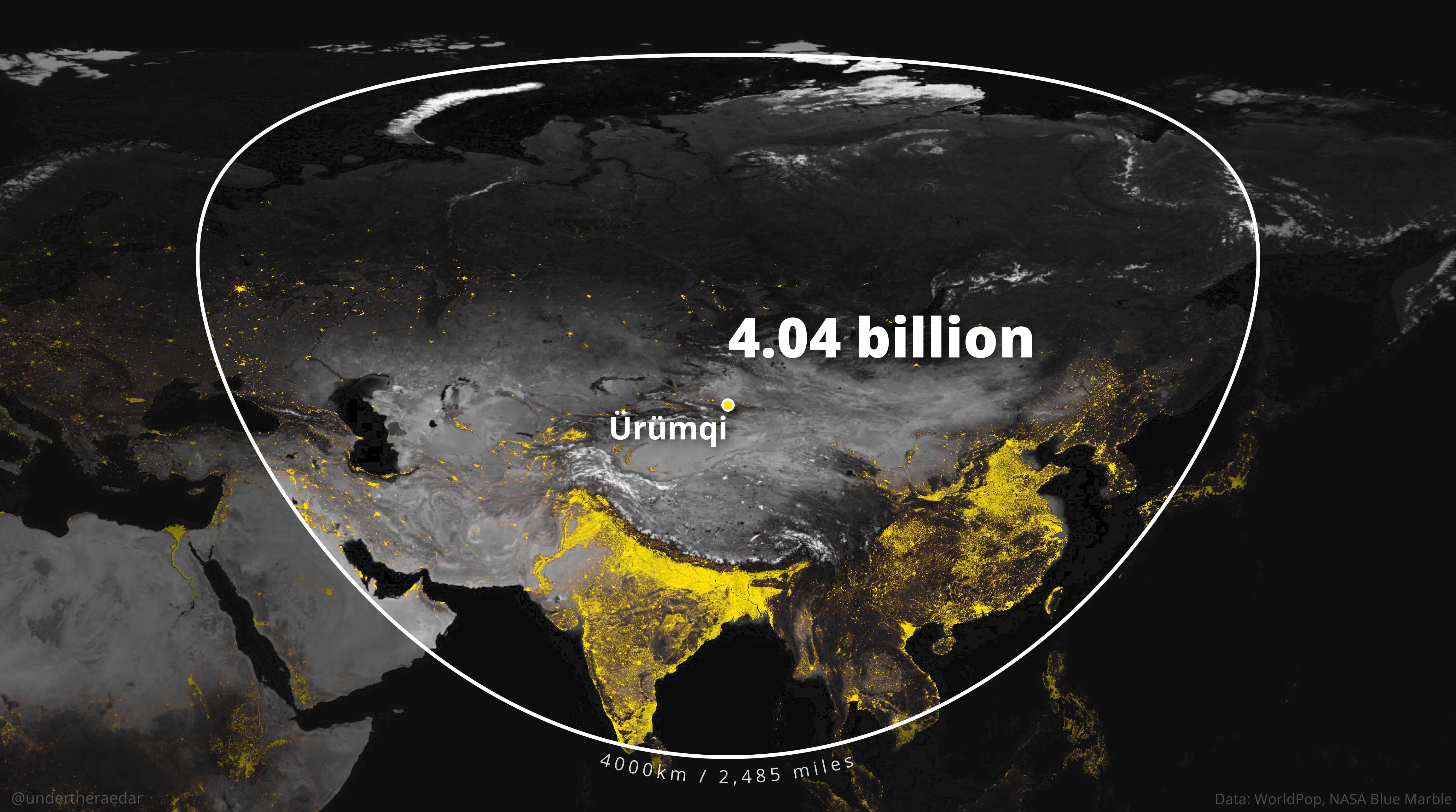
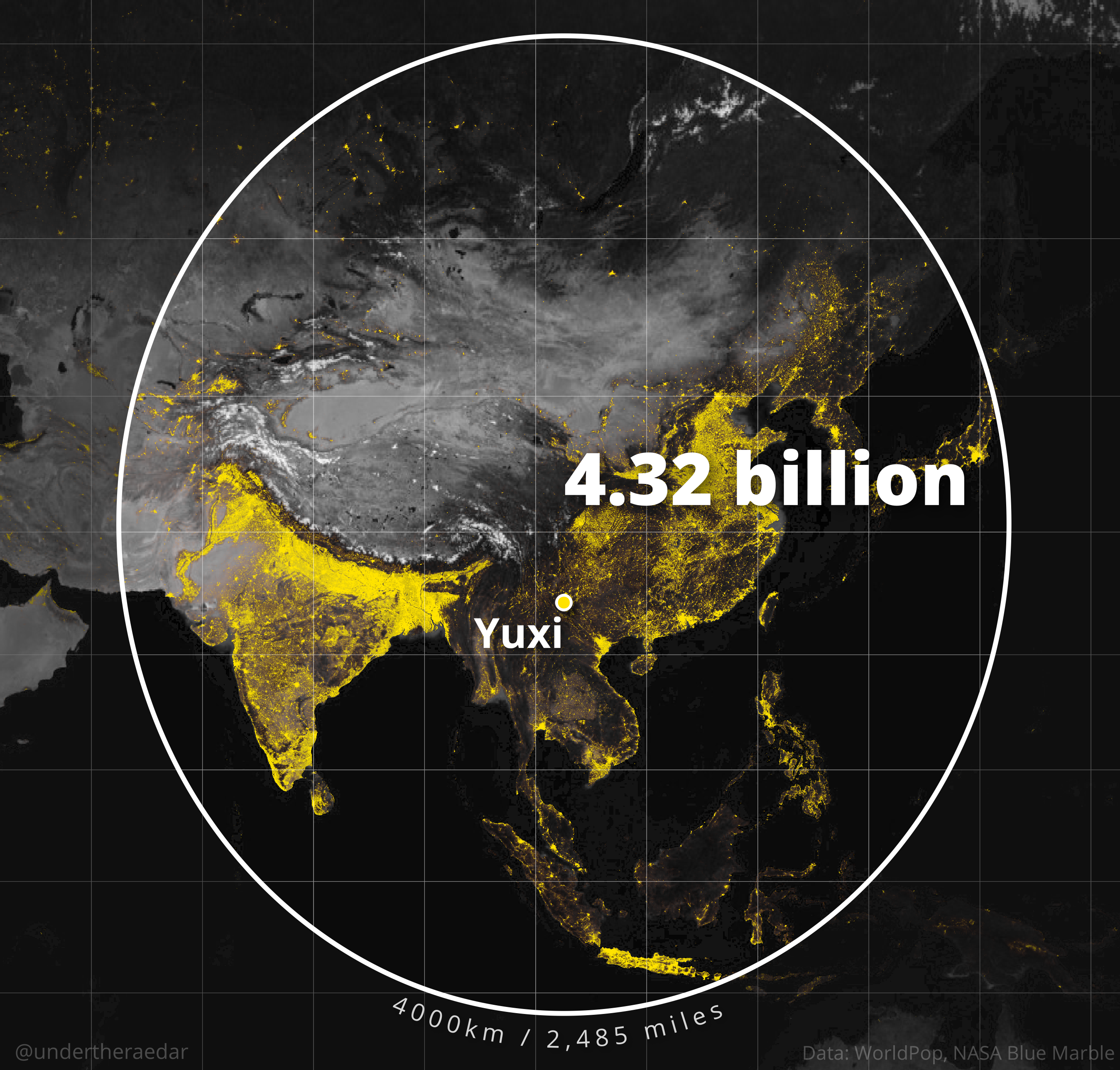
You may not know it, but you've probably seen the Valeriepieris circle - it's that circle on a map of the world, alongside the text 'There are more people living inside this circle than outside of it'. The name 'Valeriepieris' is from the Reddit username of the person who posted it and in 2015 the circle was looked at in more detail by Danny Quah of the London School of Economics under the heading 'The world's tightest cluster of people'. But of course it's not actually a circle because it wasn't drawn on a globe and it's also a bit out of date now so I thought I'd look at this topic because I like global population density stuff. I'll begin by posting a map of what I'm calling 'The Yuxi Circle' and then I'll explain everything else below that - with lots of maps. As in the original circle, I decided to use a radius of 4,000 km, or just under 2,500 miles. Why Yuxi? Well, out of all the cities I looked at (more than 1,500 worldwide), Yuxi had the highest population within 4000km - just over 55% of the world's population as of 2020. All maps were done in QGIS, which I have been experimenting with a lot more lately because I just launched Map Academy on Udemy, to help more people get up and running with maps and data. 

The Yuxi Circle on a globe

The shape above is a circle because it's plotted on a globe but in the examples below you can see how it looks when drawn on different kinds of flat map projections.
A web Mercator projection

Robinson projection

WGS84

Winkel Tripel

There is more than one Yuxi in China, but the one on the map is in Yunnan province and has a population of about 2.5 million. Obviously, when you draw a simple 4000km buffer you always get a lot of sea, so I also tried to see what kind of ellipse I could draw around Yuxi that still included more than half of the world population - see below for the results of this.

The Yuxi Ellipse with the Yuxi Circle behind it

More than half the world lives in the Yuxi Ellipse

Okay, so what else? Well quite a lot actually but for now let's do something different. 

When looking at this I started to think 'what if someone built a tool like True Size Of but then also combined it with NASA's SEDAC Population Estimation Service?', where you could take the shape of one country, overlay it somewhere else in the world, and then get the population within it. Well, I had a little go at this with the lower 48 US states, which I moved south - and scaled geodesically - and then calculated the population within it when placed over China and India. I also did this with the US flipped horizontally, just because the US west coast is a reasonably close fit for the Chinese east coast when you do this. Quite interesting results I think - and a lot of people in the US this way - and still a lot of empty space!


Please someone build a web tool for this

Nice coastal alignment here


Okay, so then I wondered - because I've been looking at coastal things in the UK but also globally - 'how far in from the coast do you have to go until you capture more than 50% of the world's population? 

Well, I got 200km for that (124 miles). This was done using the very latest WorldPop 1km gridded population data, from 2020, just like the rest of the maps.


More than 50% of the world lives here.

Okay, fine. Now I was thinking even more silly thoughts - like 'where is the world's centre of population'? This is not easy to calculate at a global level, but I did do a bit of research before attempting it and then my first attempt was totally wrong because I didn't do it on on a spherical world. The internet doesn't have any great answers on this, but you can find a few things if you look hard enough and they say something along the lines of Almaty, Kazakhstan or thereabouts. 

Well, I got a world centre of population of just by Aktobe in Kazakhstan, using 1km gridded 2020 population data. Is this correct? Well, it is based on a complete 1km dataset and a spherical world but remember that I'm just some guy on the internet and before you go and locate your global business there because of my analysis you might want to double check the data yourself, although it is a bit tricky. But I'm fairly confident that the global centre of population is either here or close to it - certainly in this region is what I'd say.


Centre of the human world? Possibly.

Hey, what about my city? Why haven't you done a 4000km blob map of my favourite place? Well, it would have taken a long, long time to do everywhere but I did do a few more so see below for that. I calculated over 1,500 4000km population circles overall and 148 had populations of 4 billion or greater within 4000km - including cities in China (loads), Vietnam (e.g. Hanoi), Myanmar (Mandalay), Vientiane (Laos), Bangladesh (Chattogram), India (Agartala) and Bhutan (Thimpu). I have to say, despite taking a while to do all this, I have found it pretty interesting so I hope you do too. Just remember that the white line shapes on all the maps below (and above) are actually circles - but they will only look like circles when plotted on a globe. 


That's all for today. I did all the maps in QGIS (free GIS software) using open data - if you want to learn how to use QGIS, check out my Map Academy course.


Notes: does any of this look different if you use a different data source? Well, I ran the analysis again using the GHSL2015 1km population data and still Yuxi came out on top. I only included capitals plus those cities with 400,000 people or more so you could do this forever with settlements of all sizes but I had to draw the line somewhere otherwise it would have taken forever, plus I thought using larger cities makes some kind of sense. The data I used is WorldPop 2020 1km grid data and that gives us a world population of 7.8 billion. How do we deal with the projection of rasters issue if we need to? Well, we use the GHSL warp tool for that. Why do the shapes seem to differ in size? That's to do with where they are in the world in terms of latitude. The further north or south they are, the more distorted the shapes will be, but they are all circles when plotted on a globe. You can check this out yourself if you measure it manually on Google Maps. Did I use a geodesic buffer? Yes, and I think I got it right but feel free to check my results. The backdrop mapping is NASA's blue marble from August 2004, converted to greyscale. Some places I didn't do maps for because the circle crossed the international date line and so the result was messy, and these include Toyko (1.82 billion within 4,000km), Auckland (26.8 million within 4,000km), Sydney (49.1 million within 4,000km), Melbourne (49.5 million within 4,000km). WorldPop data is open data, licensed under the Creative Commons Attribution 4.0 International License (CC BY 4.0).

Thursday, 11 November 2021

A few QGIS geometry, label and style tips

I haven't done a QGIS how-to blog post in a while, so it's time for another one because I'm working on a lot of training material right now. The end result is just a plaything, so it's more about the methods used. 'Learning by play' is a key concept in early years learning for a very good reason and I'm a big proponent of learning things this way, no matter how old we are. Okay, so what are we going to do? Well, see below for the end result and then we'll work it up step by step. This is for people already fairly familiar with QGIS, but you can probably follow it even if you're not. 

A stylised world cities and population map

The point of this exercise is mostly to demonstrate some methods, but first you need to grab some data from Natural Earth - just two layers are needed, plus one we'll make ourselves.

  1. Natural Earth populated places (simple version) .
  2. Natural Earth countries (without boundary lakes - this means we can see the Great Lakes on the map, and so on).
  3. A 10 degree grid layer, which we'll make in QGIS - it's very easy.

Step 1 - add the two layers

Add layers 1 and 2 above to QGIS, and make sure the places layer is on top - i.e. make sure the dots aren't under the land. 

Your colours may be different, it's not a problem


Step 2 - create a grid layer

Make a 10 degree global lat/long grid by going via Vector > Research Tools > Create Grid... and then entering the settings you see below. Make sure you create a polygon grid, as shown in my screenshot and then once it appears in QGIS, drag it underneath the other layers in the Layers panel. You'll notice that the grid extent in the screenshot below goes from -180 to 180 in longitude and -90 to 90 in latitude. It doesn't matter if you see decimal places in the box, just be sure to use these numbers otherwise your grid won't cover the whole world.

I chose 10 degree grid spacing, but feel free to us what you like

Step 3 - duplicate the layers

Then we're going to want to duplicate the layers - as shown below - and then change the styles. We will have three copies of the places layer, two copies of the countries layer and two copies of the grid layer. I'll share the colour and style information below as well. Don't know how to duplicate a layer? Just right-click a layer on the left and hit Duplicate Layer. They won't look like what you see below (yet) with the colours and filters on them but we'll do that next.

Only three data layers here, duplicated

Step 4 - style the point layers

There are three copies of the points layer. One is filtered to only show major world cities, and is represented by a square marker 2.0 size, 0.4 stroke width) with an upper case label and a semi-transparent background, with rounded corners. One is represented as spikes, based on population. And one is represented as fake shadows for the spikes. The spike and shadow layers use the QGIS Geometry Generator to convert the original point data to line data. See below for a screenshot of each layer's symbology.

The label settings for the point layer (font size is 10)

The main symbol settings for the point layer

Label background settings: #333333 is the label background colour, I used 45.2% opacity (in the Opacity slider in the Background options, rather than the Opacity slider in the colour options, but it probably doesn't matter which way you do it. I like the slightly rounded corners, so that's why the 2.0 values are in the Radius X,Y boxes.

To display only the cities you want, an easy way is to right-click a layer and use a filter (right-click > Filter...) and then here's what I used below to filter it, but you can add any cities you want of course, so long as they are in the dataset. 

Note that I used two different rules here - the second one is a list of city names that are also recorded as having a 1 in the "worldcity" column in the attribute table for the layer, but then I also wanted to add a few more that weren't classified this way, so I added a few more using the first "name" IN rule. Note that I have sometimes put an x or a city name with XXX after it when I decide to hide a city that I previously wanted to be on the map. This is just to remind me of what I was doing. Confused? Then either take some time to understand it by looking closely at the text, OR, just copy and paste it in and then play around with adding and deleting places. 


"name" IN ('Karachi','Dakar','Kinshasa','Tehran','x') OR

"name" IN ('Shanghai','New York','Madrid','Beijing','Tokyo','Paris','Moscow','Auckland',

'Sydney','Brasilia','Mexico City','Los Angeles','São Paulo','Buenos AiresXXX','Lagos','Cape Town',

'Cairo','Jakarta','TorontoXXX','Istanbul','Manila','Tunis','Nairobi','Dakar','Melbourne','Lima','Bogota',

'Santiago','Berlin','Mecca','New Delhi','London','Seoul','Rome','Mumbai','Hong Kong','Singapore'

) AND "worldcity" = 1


The bits of text in the double quotes are columns from the layer's attribute table

Okay, but how do you turn a point layer into spikes, or fake shadows? You use the Geometry Generator options in QGIS to do this, as shown below.

Here's the text you need to input for the spikes (below), which are based on the "pop_max" variable in our Natural Earth populated places shapefile. This makes a line from the points and the length is set to the value of the population, divided by 1 million. Why? Well, because the map units here are in degrees, and because the Tokyo metro area has about 35 million people, that means the biggest spike will be set to 35 degrees - if your dataset was in metres this would be too small and you wouldn't see any spike! 

If you're unsure exactly where  to find the Geometry Generator option, just right-click a layer, go to Properties... > Symbology and then where it says Marker towards the top you should see Simple Marker below that. If you then select Simple Marker look below that to see Symbol layer type - which should say Simple Marker right now, and then change it to Geometry Generator. Then you'll be able to replicate the screenshot below and add the text you see in the bullet point.

  • make_line($geometry,make_point(x($geometry),y($geometry)+ ("pop_max"  /1000000)))


This is for the vertical spike layer

Symbology for the spikes: 0.15 line width, #333333 colour. 

I decided I'd quite like to have some fake shadows for the spikes on my map as well, so I used a similar approach to generate these - I just added an offset angle. Note that for the symbology on the shadows I made them 0.35 thick (compared to 0.15 for the actual spikes) and also 10% opacity, so they are quite faint and not too visually dominant. Here's the Geometry Generator text I used to create these, and note the screenshot of it below as well.

  • rotate( make_line($geometry,make_point(x($geometry),y($geometry)+ ( "pop_max"  /1000000) )),110, start_point( $geometry))

This is the same as above, but it has rotate at the start because I want it to be rotated to a certain angle (in this case 110 degrees) but it also has start_point because I want it to be rotated from the point itself rather than another axis which would mean the shadow wasn't cast from the base of the spike, as it is here.

This is the fake shadow layer

Symbology for the spikes: 0.35 line width, #333333 colour, 10% opacity.

Obviously, these are fake spikes and you may not even want them, though that's not the point here. The point is just to demonstrate some of the capabilities with QGIS in relation to turning a point into a line, or any of the other Geometry Generator things you can do (e.g. simplify polygons, buffer, etc etc). Also note that this spike/shadow hack is not going to work if you change to a different kind of projection - e.g. anyone where the lines of longitude are not vertical - see below for a bit of Winkel Tripel!

Thanks to Oswald Winkel for his projection

Okay, that's the points layers - these were the trickiest ones so now let's look at the countries layers.


Step 5 - style the countries layers

The use case I'm imagining here is where someone wants to produce a locator map, with some cities named and then a country highlighted. The spikes I added above is just a way to demonstrate how you can use the Geometry Generator options to do interesting things. For the countries, we have two layers, one of which is filtered to only show China (and this is China based on the definition of China in the Natural Earth dataset).

  • The top layer is just filtered using "NAME" = 'China' (remember, right-click the layer, then Filter...) then a fill colour of #ef452f with opacity set to 38%. Stroke colour is #c93a27, 0.46 width. Nothing fancy.
  • The lower countries layer is just colour #e6daa1 for both fill and stroke, with stroke width 0.26. The only extra thing here is the slight drop shadow I used, to continue with the fake 3D effect. This is done by using the Draw effects options, as in the screenshots below.
You can do all sorts of great things with Draw effects

You may prefer other colours but this is what I used


And that's how I styled the countries layers. Nothing very complicated at all, but the drop shadow just lifts the map off the page a little and adds to the 3D effect, for a bit of fun.


Step 6 - style the grid layer

I decided to make the grid serve as a kind of canvas, as well as a geographical reference point, and I wanted to give it a drop shadow too. You can do this using only one layer with Draw effects but I found it works better using the drop shadow on a separate layer, so here's what I did.

  • The top grid layer is #70c8df fill colour and #ffffff (pure white) line of width 0.1. This gets us a nice blue grid with white map markers every 10 degrees of lat/long on the map.
  • For the grid shadow layer, that was done via the Draw effects options and all I had turned on here was the drop shadow itself, as you can see from the screenshot below. The drop shadow colour is #000000 (black) with 75% opacity and you can see how this lifts it off the page for another bit of 3D effect.
Again, this isn't essential, but it can be quite nice to do


Okay, great - we should now have a nice grid layer, some countries, China highlighted, city spikes and shadows, plus a number of city labels. Just a few more things and we're ready to export the final map.


Step 7 - background and QGIS logo

I wanted the map background to be darker than the map canvas so I went to Project > Properties and on the General tab on the left I set the Background color to #5facbf. That's just a darker shade of blue.

To add the logo, which is an svg file, I went to View > Decorations > Image... and then added the logo that I downloaded from the QGIS website, although you can also just paste in the path or url into the Image path box (see below). You can add other image types but you'll probably find that svg gives the best output quality in your final map.

Add a logo to your map layout

After that, all I did was make sure I'd zoomed out enough so that there was a bit of dark blue map canvas surrounding my whole world map. See below for a closer look at that.


Step 8 - save your map as a high quality png file

We're not going to bother with the QGIS Print Layout here at all. Sometimes we don't need to and one of the great things that the QGIS team has done in recent years (among many, many things!) is add more options for exporting high quality images directly from the main map view. So, to export the final image you see below, I just went to Project > Import/Export > Export Map to Image... and then changed the Resolution to 300dpi and unticked the Append georeference information (embedded or via world file box because I don't need that file, but it's not a problem if you keep it ticked, it just generates a small extra file. Note you could just as easily copy and paste the map using the Copy to Clipboard button.

And there we have it - one version of our world


Final notes

Obviously I haven't included every single little click, but there should be more than enough detail to replicate these methods if you have a basic familiarity with QGIS already. If you are left scratching your head though, please feel free to get in touch.

Don't like the cities I used? That's fine, they are not particularly well thought through - the idea here is more about showing how to pick your own ones.

Don't like the boundaries I used? Again, this is for demonstration purposes but of course that is something we still need to be aware of. 

Don't like the spikes? That's fine, they may be too much for this map but they can be useful in other situations and it's more about understanding what the QGIS Geometry Generator tools can do.