It has been said that making a map is 80% labelling, and 20% everything else. Okay, I just made that up, but if you've spent any time at all using GIS software you'll see the truth in this. Sometimes I end up spending far too much time on labelling, but then again it's usually time well spent because it makes things clearer. Too many labels and we're overwhelmed, too few and we're left guessing. I put this post together for anyone who uses QGIS and wants to know a bit more about labelling - just some tips and tricks for general use, regardless of what QGIS version you're on. I'm going to do this on a Pacific-centric world map, because there aren't enough of them and it's nice to look at things from a non-Greenwich perspective. Here's a little example map below, and then everything is explained after that. I'm working on this kind of thing for my next Map Academy course on Udemy.
The data
As you can see, I'm using a Pacific-centric world map layer. This is based on the Natural Earth land layer and I just clipped it at 30 degrees west so that when I projected it using the Sphere Equal Earth Asia Pacific CRS in QGIS it didn't go all weird with Greenland and Antarctica split across the meridian. But of course you don't need to do this if you want to follow along - you can just add any world map layer, or none at all, because this is about labelling places.
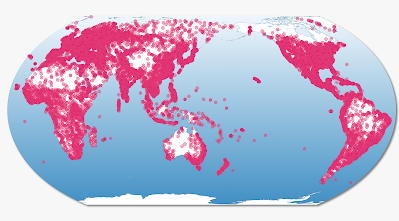
For the cities layer, you can get it at simplemaps.com as a csv and then load it into QGIS, but I already converted it to a world cities GeoPackage so you can just download that directly and add it to QGIS if you want to follow along here. There are over 26,000 places in the file though, so when you add it you'll see too many places to make sense of - but we'll filter the layer to sort that out in a moment. For now, here's what the whole lot looks like.
 |
| Lots and lots of dots |
Okay, so this is fairly typical when we add a cities or places layer to QGIS - or indeed any GIS software. We're overwhelmed with dots so we need to think about how to filter it somehow. That's next.
Filtering the data
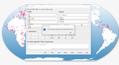
Before we label, let's filter the data. You can use the columns (also known as Fields) in the Attribute Table to filter the data - and you can see below that I've done this using "capital" = 'primary' so that only capital cities are showing on the map.
 |
| Okay, this is looking a bit better |
But let's say we only want larger capital cities to appear - e.g. those with more people. We can use the population field in the dataset to filter further, like I've done below to show only capital cities with 1 million people or more.
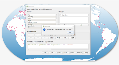 |
| You can see how to use the AND operator here |
We also have a latitude and longitude column in this dataset, so we can use that to filter the data too. This time I'm going to filter it to show only those cities within 10 degrees of the equator that have more than 1 million people (according to the population column in our dataset).
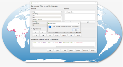 |
| You can filter using any of the columns in your dataset |
One more filter now - this time we're looking at cities in Brazil, Australia, Canada and Japan with more than 700000 people - according to the simplemaps dataset.
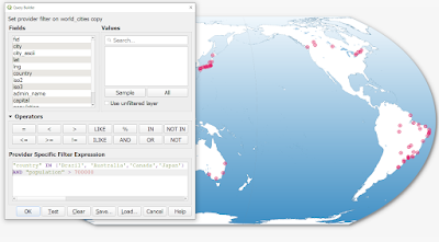 |
| Using IN as well as AND this time |
What about labelling?
This post is supposed to be about labelling, so let's talk about that in a moment. I just want to emphasise that BEFORE doing any labelling it really is worth thinking about what you want to label - and how many features there are as well as where exactly they are - e.g. are they overlapping?
I wrote a filter expression so that I'm only showing the cities you saw at the top of the post - a selection of cities on or close to the Pacific Ocean.
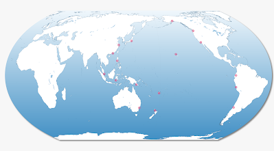 |
| I filtered the dataset to focus on only a few cities |
The next few images show you what label settings I've used here - a variety of different methods, including a slightly transparent white background to the labels.
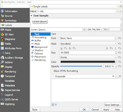 |
| I'm using the city field to label the cities, size 14 font |
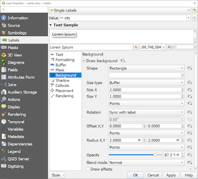 |
| Note the Size X and Y variables, and the Radius X, Y too |
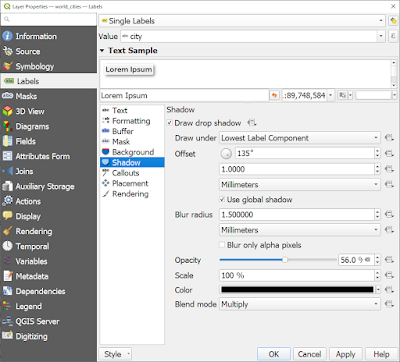 |
| Drop shadow on the labels, with Opacity turned down |
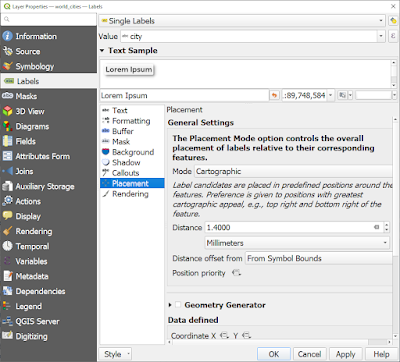 |
| I've moved the labels away from the symbols a bit here |
Visual hierarchy
There are so many things you can do with labels in QGIS, but one really useful thing is the ability to set the size of labels based on a variable. So let's do this with the cities above so that larger cities have bigger labels. There are many ways to achieve this but I'll do it a fairly simple way. I'm using the Data defined override button beside the Text size option, as you can see below. Look at the expression I've used and you'll see how I modified the size of the labels this way, starting off initially with just Tokyo being in large font.
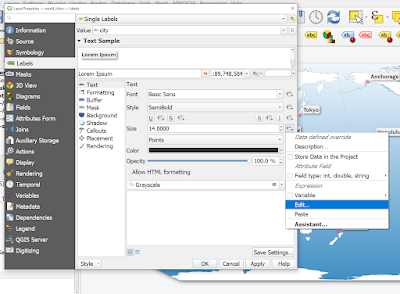 |
| The Edit button (via the Size section) is how I change things |
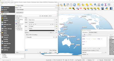 |
| Note the format of this - e.g. CASE, WHEN, ELSE, END |
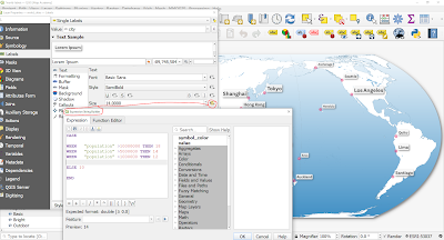 |
| Now I'm starting to get a more useful visual label hierarchy |
Now in the map below I've made the largest cities a different colour, using the same kind of approach - as you can see.
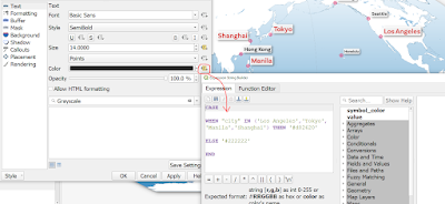 |
| I'd normally use just a single colour, but you don't have to |
In the example below, I'm only using a label background on cities with more than 5 million people, using the same kind of approach.
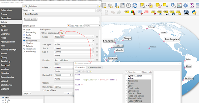 |
| Note the 1 and 0 values here, where 1 = true |
And then in the final image below I've added a thin line around the label backgrounds, just to make it a little bit crisper on the screen.
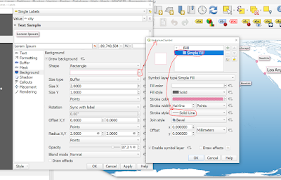 |
| This require a few clicks, as well as editing the Stroke style |
Here's the final version of this simple label map experiment, in high resolution. What I'd normally do beyond the labelling is also apply some kind of size hierarchy to the city symbols, and this can be done using exactly the same approach - i.e. edit the symbol size using the Data defined override and then setting it based on city populations or city names - or whatever variable you want.
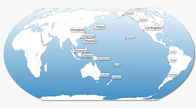 |
| Hopefully this has been useful for you |
That's all for today, but if you're new to it and need some help, feel free to get in touch.


