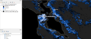
This is a brief introduction on how to work with Facebook's high resolution population density data in QGIS, for anyone who needs a bit of help getting started. It's one of the datasets I'm using in my upcoming QGIS and Aerialod training sessions so I've been working with it recently. I won't do analysis here but the basic workflow is simple - download it, load it, explore it, visualise it, analyse it. Here's a couple of examples of the data for the New York City area and the San Francisco Bay Area - these show the general density patterns in 3D. When I said 'high resolution' above, I mean one arc-second. At the equator, this is just under 31 metres square so that's very small areas. As you go further from the equator the cell size is of course smaller, but you can read more about the methodology here if you want to. To save you a click: 'These maps aren’t built using Facebook data and instead rely on combining the power of machine vision AI with satellite imagery'.
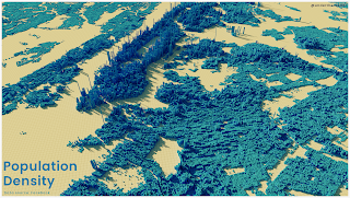 |
| An example for the wider NYC area |
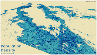 |
| Same as above but for the SF Bay Area |
Download it
Yes, this step is obvious but it's not always easy to remember where to find stuff on the internet so I'm putting this here for my benefit as much as anyone else. Also, the data are available in more than one place but here's where I go to get it.
- Go to the Humanitarian Data Exchange (HDX) home page and search 'high resolution population density' and you'll get see lots of results - the data are available by country.
- To get data for use in QGIS, I normally filter my search by looking for only Facebook data and in GeoTIFF format - here's an example search result, which returns 194 country datasets.
- And then I go to the results page for the United States - this is a good example to look at because there is so much data. It's hard to know which data to download and how to work with it.
- You can also get the data via the AWS open data registry, but I'm aware this is too technical for some people so I'll concentrate on the click-to-download approach.
- The US data - unlike many other countries - is split into chunks, so the best way to get it into QGIS is to download the virtual raster file (population_usa_2019-07-01.vrt (16.1K)) and then download all the the files for the US that begin with 'population_usa18_' - there should be 32 of them if I've counted correctly.
- For the US, put the .vrt file in a folder and then unzip all the tif files into the same folder that the .vrt file is in. For countries where you just have one tif file for the whole country you don't have to do this.
No matter what,
this Facebook page takes you straight to what you need to know to download the data and start working with it in QGIS. Note that as well as data on total population, you can also get a population breakdown by age.
Load it
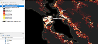
I then open QGIS (I'm using version 3.10 right now) and then load the data. I do this by dragging and dropping the .vrt file directly into QGIS but you can also do it via the data source manager. If you don't see anything when you do this, it's probably because your tif files aren't in the same folder. When you add it to QGIS (it's about 1.2GB of tif files) you will see something decidedly unimpressive - but don't worry, that's easy to fix. Notice that the upper value shown in the legend in the Layers panel will probably be way lower than the actual highest value in the dataset. There are also some instructions from Facebook on how to load the data in QGIS.
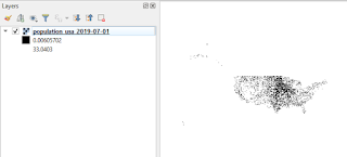 |
| Don't be fooled - this is great data |
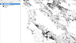 |
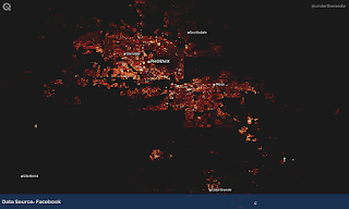
| Now zoomed in to the SF Bay Area |
Explore it
Actually, I did explore this data after adding it to QGIS, but because it's just a black and white mess by default, I actually made it a bit nicer so that I could explore it properly. I added a couple of other layers, turned the background black and did a bit of styling - otherwise it would be a bit difficult to explore meaningfully. Here's what that looks like, including a screenshot of how I styled the population density .vrt layer.
 |
| I've just styled the layer quickly here |
 |
| This is how it was done in QGIS |
 |
| Same idea, different colour scheme |
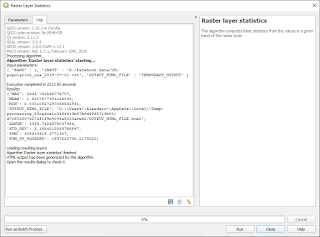
After I did this, I spent quite a while panning, zooming, clicking and just getting to grips with the data. The highest cell value I could find in the entire dataset was over 3000, which seems like quite a lot for a 30m x 30m cell. This may of course be an anomaly so it's always worth doing a bit of a deep dive on any new dataset like this to check for values that don't seem right - e.g. like I did previously when the GHSL global population density dataset came out. Here's a screenshot of the results when I ran some raster stats on it in QGIS - you can see the max and min values and also the sum of the population, which looks about right based on the time period the data relate to.
 |
| Is this max value possible? Well, theoretically |
Visualise it
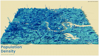
I'm not really going to say much here other than that I did a series of maps in QGIS (see below) and also some quite quick and rough 3D visuals in Aerialod. The 3D ones are more schematic and abstract than anything else but with a bit more time they can be quite useful and also very accurate.
 |
| The wider SF Bay Area |
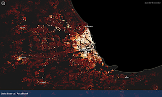 |
| Chicago and beyond |
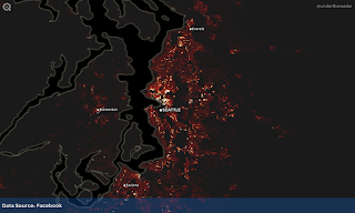 |
| Seattle and the Puget Sound area |
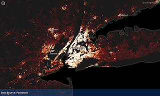 |
| The NYC metro area - and beyond |
 |
| Boston and a chunk more |
 |
| A bit of ye olde megalopolis |
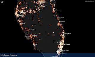 |
| South Florida (mostly) |
 |
| The Texas Triangle |
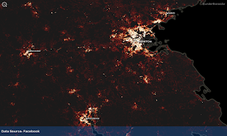
 |
| Phoenix metro area |
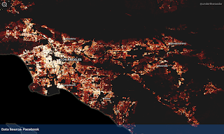 |
| Los Angeles |
I also (of course) did a few visuals in Aerialod, which you can see at the top of the page. I did one for London as well (below) but this didn't work out quite right but I'm posting it here anyway because it looks like some kind of Minecraft output and I think it's quite interesting to look at.
 |
| I think I need to stretch the values a bit more |
Analyse it
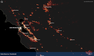
You can do all sorts of analysis with this data, but half the battle with anything like this can be knowing how to get the data and how to work with it. I'm not going to cover any analysis here but thankfully the Facebook data team have an excellent example of using the data to identify at-risk populations. There's a full tutorial based on using the data in QGIS. If you want to look more at movement data, particularly during the period associated with Covid-19, Facebook has some great movement range data as well. Regardless of what you do in terms of analysis, this is certainly a very useful dataset for the visualisation of urban spatial structure.
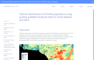 |
| This is a very useful tutorial |
And that's about it for today - I'll finishing by adding in a few more maps of population density for the United States, for areas not included above.
Related
I've written about this kind of thing quite a bit in the past, and also shared similar data, so these links might be of interest.
Citation
Facebook Connectivity Lab and Center for International Earth Science Information Network - CIESIN - Columbia University. 2016. High Resolution Settlement Layer (HRSL). Source imagery for HRSL © 2016 DigitalGlobe. Accessed 20 January 2021."
The Facebook data I've used here is open data (CC BY).


