This is my second post on
Aerialod - the interactive path tracing renderer for height maps, by
@ephtracy. It's available in 32 and 64-bit versions on Windows and it's super-lightweight but you can do some really amazing things with it. My
previous post covers more of the basics, including controls and interface settings, so here I'll share some more information on how to tweak the settings (of which there are many) to create nice looking vistas. But as a quick reminder, hold down your right mouse button to rotate the map and use the space bar plus the left mouse button to move it around. Scroll wheel to zoom in and out. Keyboard shortcuts are
here.
First I'll show you some new visuals I created in Aerialod, then I'll show you some of the settings I used to create them - in screenshots and in a small slide set. All the images I've posted below are in
a shared folder, as well as a sample Lidar dataset for Cheddar Gorge in England that you can just drop in to Aerialod and then tweak the settings as you wish. You can of course create these kinds of images in other software (notably
Blender) but Aerialod is much easier to use, though can be confusing at first.
Update (3 Nov 2020): here's an
alternative shared folder on Dropbox, just in case either one is blocked where you are. The Dropbox folder is the best one to use though. I've left the other one above online as an archive.
So, let's begin with the highest peaks in Scotland, England and Wales, plus one other view that I like.
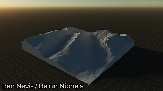 |
| I did this using a 5m DTM (not open data) |
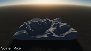 |
| See the curved horizon? - that's the SG lens setting |
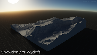 |
| A very nice looking mountain |
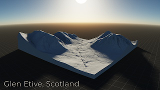 |
| I've added Glen Etive because it's so lovely |
But of course we don't always have to map things like mountains. If we have good quality Lidar data, as we do in much of the UK, we can create quite interesting cityscapes, as you can see below.
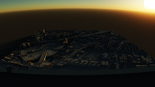 |
| Here's a little Salford Sunset to get things rolling |
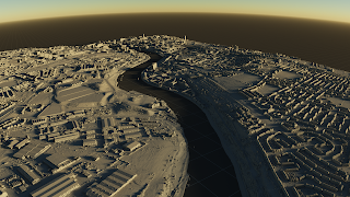 |
| A Newcastle-Gateshead vista, along the Tyne |
The
example data I've put in the shared folder is of
Cheddar Gorge in the south west of England, and it looks like this once you fiddle with a few settings.
 |
| Sun low in the sky, dusky effect |
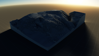 |
| I've tweaked some of the settings here to make it glow |
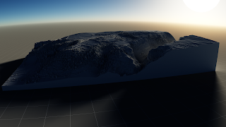 |
| Different angle, light filtering through the gorge |
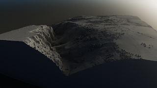 |
| A foggier, early morning effect |
So how do you do all this?
If you've not used Aerialod before then you'll really need to read my
first blog post on it in order to get to grips with the controls, etc. Once you've done this, look closely at the screenshots below as the settings in them show you how I achieved the effects in the four images above. Study them closely and then see further below for a short slide set with more annotation on the settings options in Aerialod.
Take some time to Google some of the different terms and they'll begin to make a lot more sense - e.g. the Rayleigh setting refers to Rayleigh scattering, which relates to the blue colour we see in the sky. So, using the default Rayleigh setting in Aerialod you'll see a blue sky but if you reduce the number to, say 10, it will become more blue and if you put it up to 90, for example, it will look a lot less blue and instead more like a lovely glowing orange/yellow sunset.
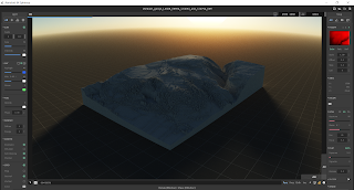 |
| This relates to the first Cheddar Gorge image |
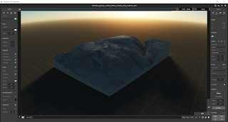 |
| This also relates to the first image |
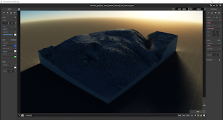 |
| Notice the glowing light at the corners here |
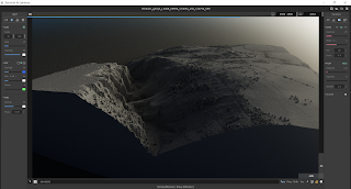 |
| This is the fourth Cheddar Gorge image above |
In addition to reading this, it's a good idea to check out the
@ephtracy Twitter account for other tips, plus the
#aerialod hashtag on Twitter. There are also now a few good video tutorials online, including
this one by Steven Scott.
Here is the small set of slides, with annotated screenshots, that I made in order to help you get to grips with the settings a little better - direct link
here.
All this, including the data, can be found in the
Aerialod tutorial folder I made for this short blog post. Just drag and drop the .asc file I provided into Aerialod and start playing around.
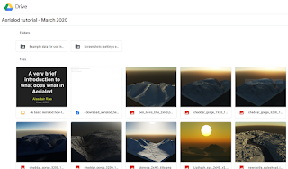 |
| I've put everything in here |
The information above should be all you need to create more realistic, impressive 3D landscape or city models. It all depends of course upon being able to get good quality data at a high resolution - I've provided an example in the folder, but you can get a lot more on the
Defra Lidar download page for England. You can use the
OpenDem searcher to find suitable data for other parts of the world.
To end, I'm just going to post a few more images that I haven't shared anywhere else before, before a few final comments.
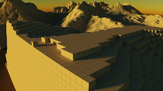 |
| This is done by keeping the 'Map' option on in Grid settings |
In the example above, I have all the options on in the Grid settings (Map, Ground, Vertical) and then I have used a value in the 'Step' settings on the right to match the resolution of the underlying data (in this case 5 metres) so that I get a blocky kind of effect - see below.
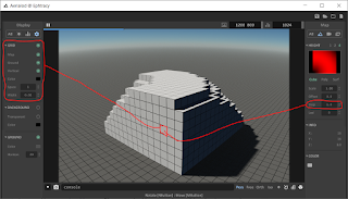 |
| This works if you want to Minecraft your map |
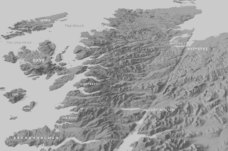 |
| The Western Highlands of Scotland |
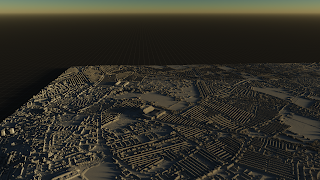 |
| This city is home to two football teams, as you can see here |
In the example above, I've just taken some Lidar open data of Liverpool and created a view looking down on Anfield and Goodison - home to Liverpool and Everton respectively. They are very close together and the densely packed terraced housing nearby also makes for an interesting example use case with this kind of data.
And, last but not least,
St Kilda - a very wild and remote archipelago off the Western Isles of Scotland that is now a World Heritage Site.
 |
| In this example, I've added some fog |
Notes: you can add a
single file to Aerialod (it can handle PNG, JPG, TIF, IMG and ASC formats) or you can add
multiple files at once using the little button on the top right that looks like a folder. That is covered in
my previous blog post. If you try to load humongousbytes of data then it may crash. Sometimes it won't crash but just won't load. Generally I find it just works and the Scotland 1:50,000 terrain model above is over 600MB and worked fine for me. Just remember that when you hover over any of the tools in Aerialod you will get information on what it is and what it does at the bottom of the window.
Citation: Blackwood, Carol. (2017). Scotland Land-Form PANORAMA® DTM, [Dataset]. EDINA. https://doi.org/10.7488/ds/1929.


